1. Achieve results
2. Prompt component
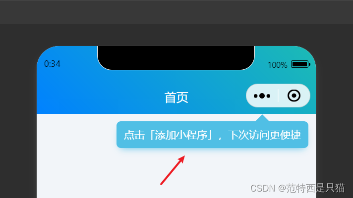
- Add in
components Prompt to add mini program componentstruggler-uniapp-add-tip
- Displayed by default, click to store
SHOW_TIP locally to hide
<template>
	<view>
		<view class="uni-add-tips-box" v-if="showTip">
		  <view class='uni-add-tips-content' @tap='hideTip'>
		    <text>{

   {tip}}</text>
		  </view>
		</view>
	</view>
</template>

<script>
	const SHOW_TIP = "SHOW_TIP"
	export default{


		data(){


			return{


				showTip:false,
			}
		},
		mounted() {


			this.showTip = !uni.getStorageInfoSync().keys.includes(SHOW_TIP)
		},
		props:{


			tip:{


				type:String,
				default:"点击「添加小程序」,下次访问更便捷",
				required:true
			},
			duration:{


				type:Number,
				default:5,
				required:false
			}
		},
		methods:{


			hideTip(){


				uni.setStorageSync(SHOW_TIP,true)
				this.showTip = false
			}
		}
	}
</script>

<style lang="scss" scoped>
	$themeColor:#34b5e2; //主题色
	.uni-add-tips-box {


	  position: fixed;
	  top: CustomBar + 20rpx;
	  right: -20rpx;
	  z-index: 99999;
	  opacity: 0.8;
	  display: flex;
	  justify-content: flex-end;
	  align-items: flex-end;
	  flex-direction: column;
	  width: 600upx;
	  animation: opacityC 1s linear infinite;
	}
	.uni-add-tips-content::before{


		content: "";
		position: absolute;
		width: 0;
		height: 0;
		top:-38upx;
		right:105upx;
		border-width: 20upx;
		border-style: solid;
		display: block;
		border-color:  transparent transparent $themeColor transparent;
	}
	.uni-add-tips-content {


	  border-width: 0upx;
	  margin-top: 20upx;
	  position: relative;
	  background-color: $themeColor;
	  box-shadow: 0 10upx 20upx -10upx $themeColor;
	  border-radius: 12upx;
	  display: flex;
	  align-items: center;
	  justify-content: center;
	  padding: 18upx 20upx;
	  margin-right: 40upx;
	}
	.uni-add-tips-content > text {


	  color: #fff;
	  font-size: 28upx;
	  font-weight: 400;
	}
	@keyframes opacityC{


		0%{

      opacity: 0.8;}
		50%{

      opacity: 1;}
	}
</style>