echarts modifies the width of the histogram

echarts modifies the width of the histogram

series-bar. barWidth = adaptive
numberstring
column width, adaptive when not set.
Can be an absolute value such as 40 or a percentage such as '60%'. Percentages are based on automatically calculated widths for each category.
This property is shared by multiple 'bar' series on the same coordinate system. This property should be set on the last 'bar' series in this coordinate system to take effect, and it will take effect on all 'bar' series in this coordinate system.

Insert image description here

 series: [
                        {
    
    
                            name: 'aaa',
                            type: 'bar',
                            stack: '广告',
                            itemStyle: {
    
    
                                normal: {
    
    
                                    color: '#6485CA',
                                    // barBorderRadius: [10, 10, 0, 0], //依次表示 左上,右上,右下、左下
                                    label: {
    
    
                                        show: false, //开启显示
                                        position: 'top', //在上方显示
                                        textStyle: {
    
     //数值样式
                                            color: '#aaa',
                                            fontSize: 14
                                        }
                                    }
                                }
                            },
                            data: investmentCompleteRate
                        },
                        {
    
    
                            name: 'bbb',
                            type: 'bar',
                            barWidth:'30%',
                            stack: '广告',
                            itemStyle: {
    
    
                                normal: {
    
    
                                    color: '#FF774B',
                                    barBorderRadius: [10, 10, 0, 0], //依次表示 左上,右上,右下、左下
                                    label: {
    
    
                                        show: false, //开启显示
                                        position: 'top', //在上方显示
                                        textStyle: {
    
     //数值样式
                                            color: '#aaa',
                                            fontSize: 14
                                        }
                                    }
                                }
                            },
                            data: budgetCompleteRate
                        },
                    ]

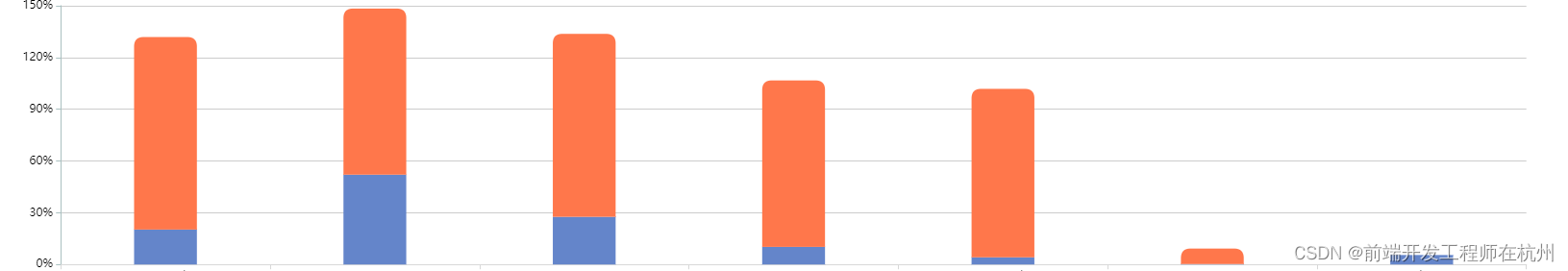
The modified chart looks like this

Insert image description here

Guess you like

Origin blog.csdn.net/weixin_45506717/article/details/124820936