Table of contents
Introduction
- Flex layout
- CSS3 Flexible Box (Flexilble Box or flexbox) is a layout method that is commonly used when the page needs to adapt to different screen sizes and device types to ensure that elements have appropriate behavior.
- effect
- Can control the alignment and arrangement of elements more efficiently and conveniently
- Whether the size of the element is fixed height or dynamic, the size of the elements within the layout can be automatically calculated
- Control the layout direction of elements within the page
- Rearrange elements on the screen according to different sorting methods specified by the DOM
- benefit
- You can arrange the child elements in a row
- Make child elements the same height
1. Flex layout syntax
1.1,display: flex
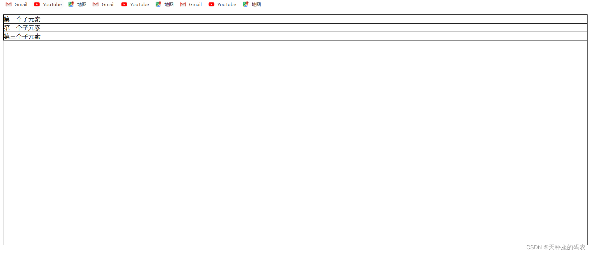
- Create an html
<!DOCTYPE html>
<html lang="en">
<head>
    <meta charset="UTF-8">
    <meta name="viewport" content="width=device-width, initial-scale=1.0">
    <title>Document</title>
    <style>
        .box{


            width: 100%;
            height: 600px;
            border: 1px solid black;
        }
        .box>div{


            border: 1px solid black;
        }
    </style>
</head>
<body>
    <div class="box">
        <div>第一个子元素</div>
        <div>第二个子元素</div>
        <div>第三个子元素</div>
    </div>
</body>
</html>
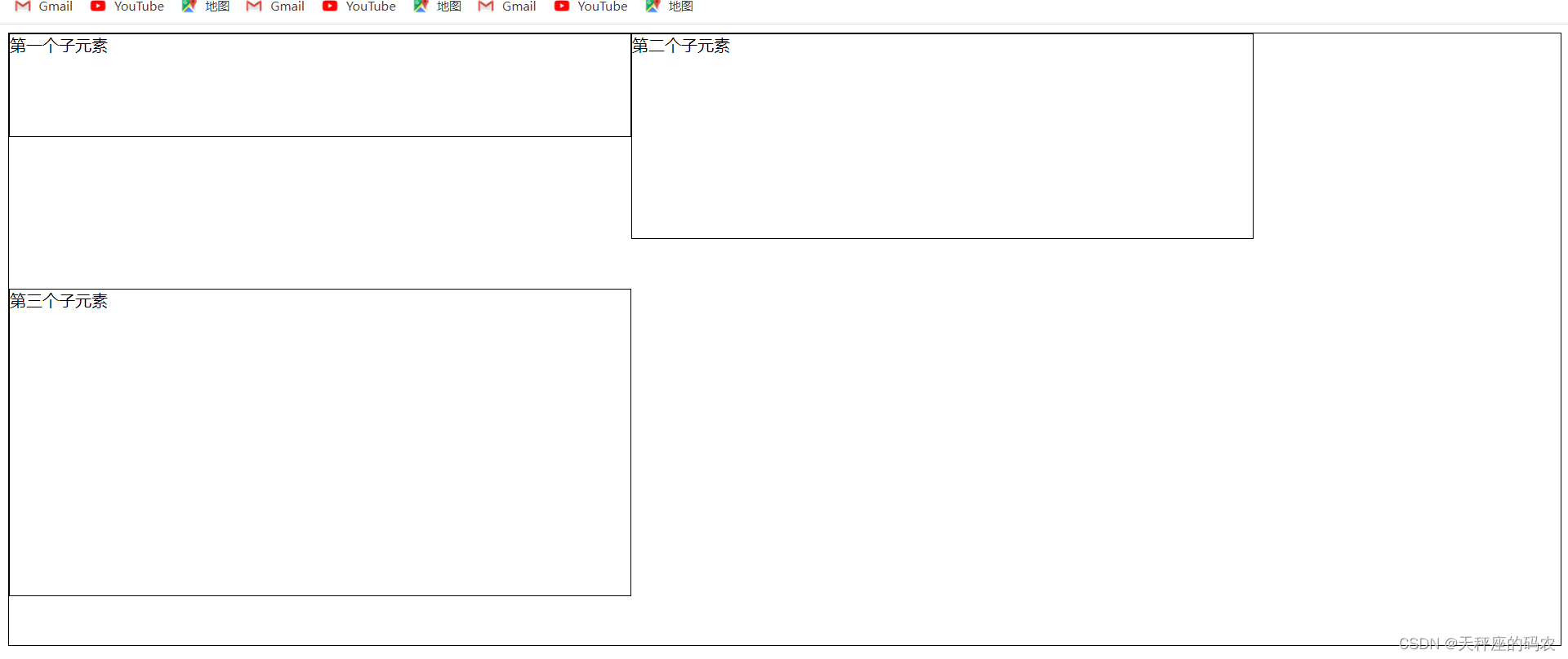
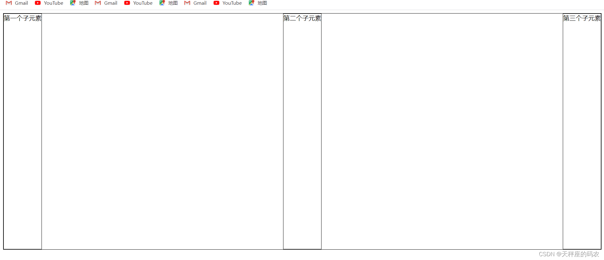
- This is a look without any description

- It turns out that if you want to move content, you need to float it. Now we add the display: flex attribute to the box.
<!DOCTYPE html>
<html lang="en">
<head>
    <meta charset="UTF-8">
    <meta name="viewport" content="width=device-width, initial-scale=1.0">
    <title>Document</title>
    <style>
        .box{


            width: 100%;
            height: 600px;
            border: 1px solid black;
            display: flex;
        }
        .box>div{


            border: 1px solid black;
        }
    </style>
</head>
<body>
    <div class="box">
        <div>第一个子元素</div>
        <div>第二个子元素</div>
        <div>第三个子元素</div>
    </div>
</body>
</html>
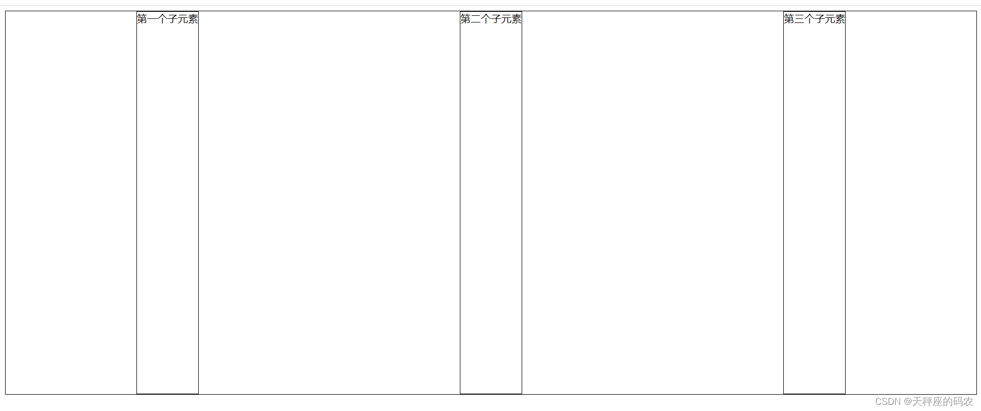
- Now add display: flex content automatically floats, but we do not do float floating, nor do we do border collapse processing
- The display: flex attribute is written in two places:
the first parent is written in the container,
and the second is written in the child element.
Conclusion
With just this line, the child elements can be arranged side by side in a row, and the height of the elements will be the same! ! !
2. Flex attributes
- Container properties
- Attributes set to the parent element
- Project properties
- Set attributes to child elements
3. Container properties
| Container properties | illustrate |
|---|---|
| flex-direction | Determine the direction of the main axis (i.e. the direction in which items are arranged) |
| flex-wrap | Define how to wrap the line if it does not fit on one axis |
| flex-flow | Composite properties: shorthand for flex-direction and flex-wrap properties |
| justify-content | Define the alignment of items on the main axis |
| align-items | Defines the alignment of items on the vertical axis |
| align-content | Define the alignment of multiple axes |
3.1,flex-direction
- Determine the direction of the main axis (i.e. the direction in which items are arranged)
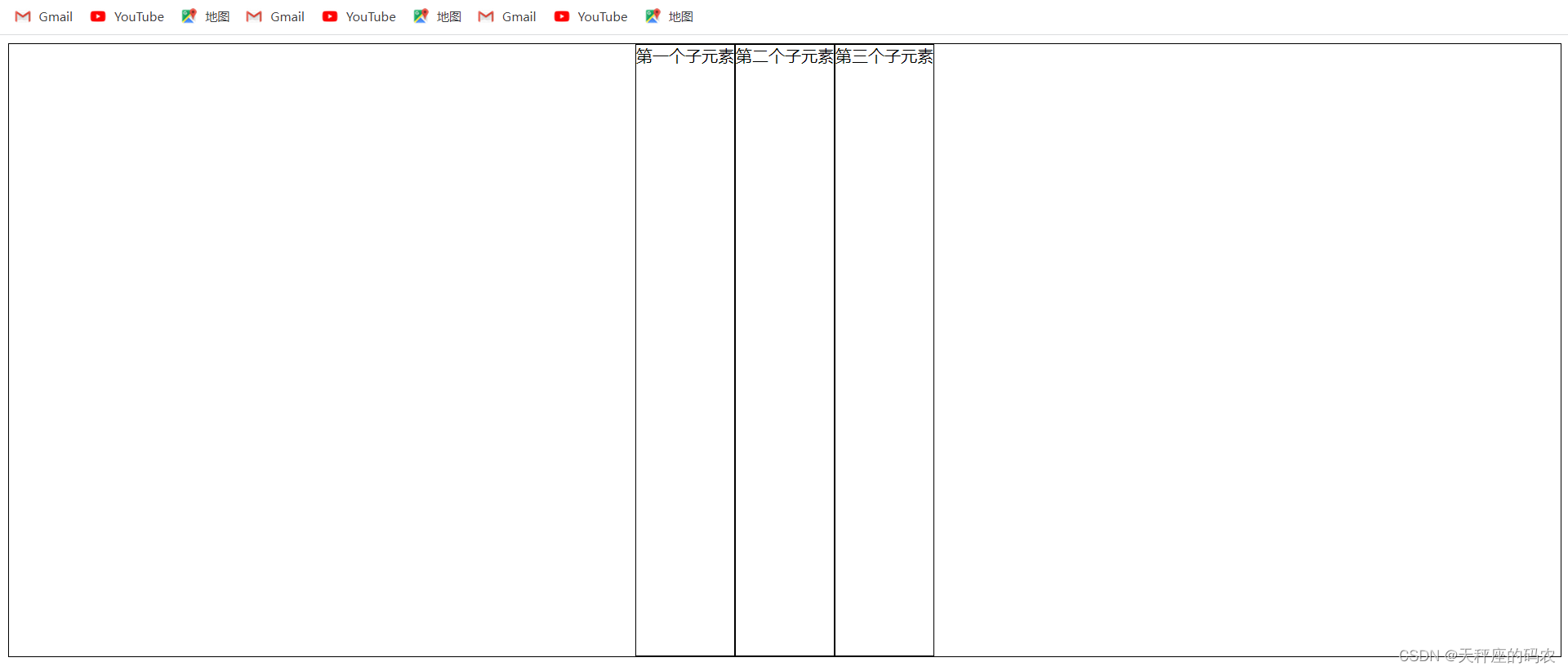
- row: arranged horizontally from left to right (left aligned), the default arrangement method
- row-reverse: reverse the horizontal arrangement (right-aligned), from back to front, with the last item at the front
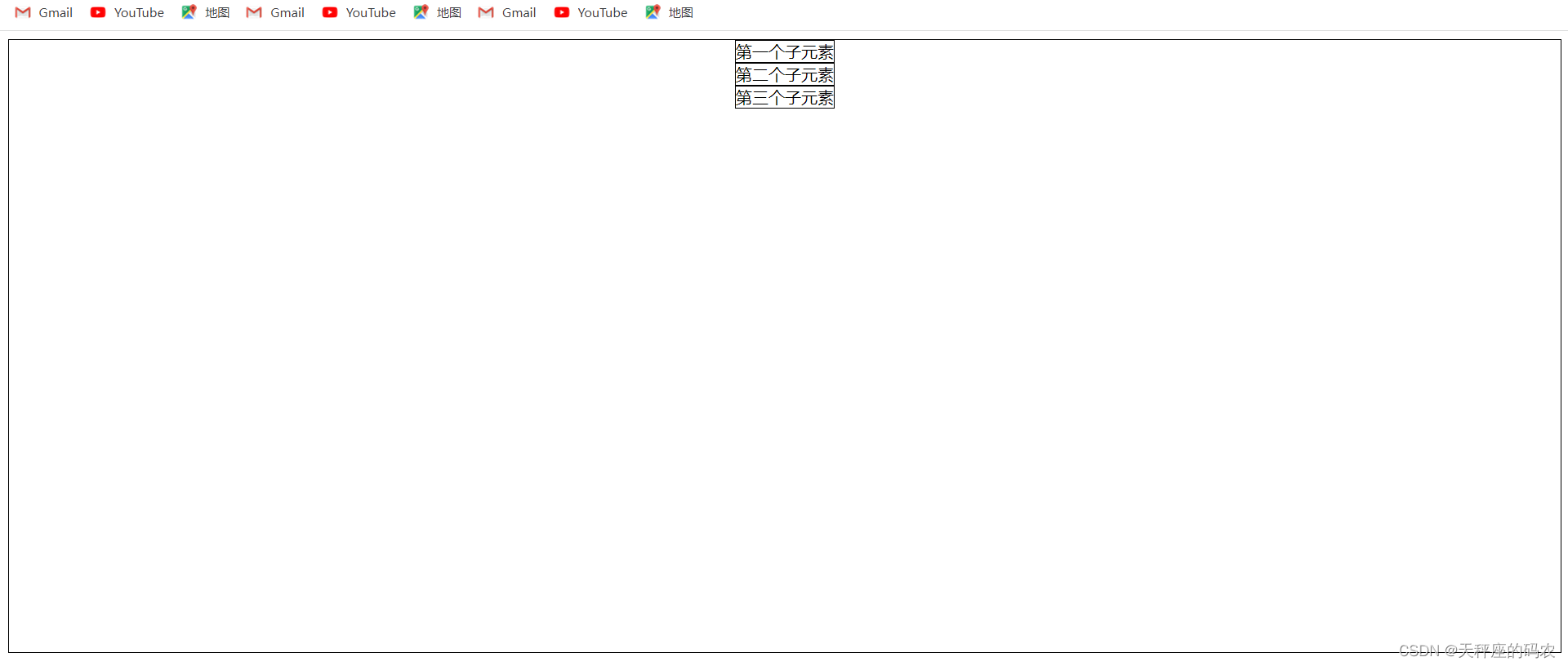
- column: vertical arrangement
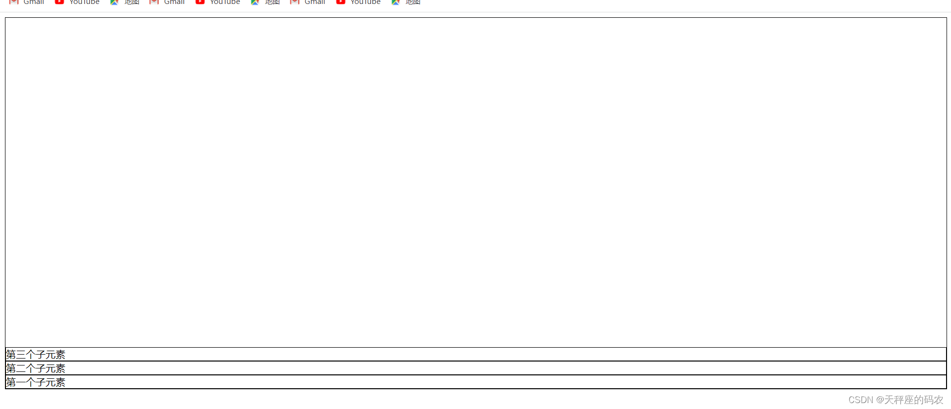
- column-reverse: reverse the vertical arrangement, from the queen to the front, with the last item on top
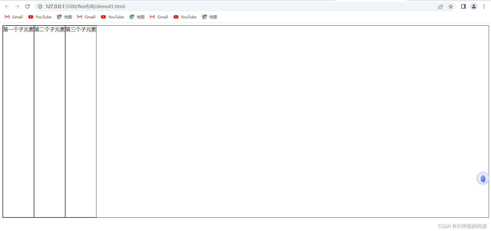
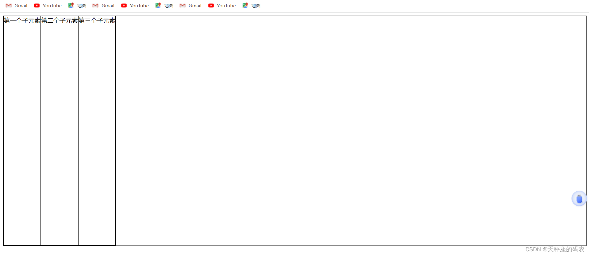
3.2,flex-direction:row;
<!DOCTYPE html>
<html lang="en">
<head>
    <meta charset="UTF-8">
    <meta name="viewport" content="width=device-width, initial-scale=1.0">
    <title>Document</title>
    <style>
        .box{


            width: 100%;
            height: 600px;
            border: 1px solid black;
            display: flex;
            flex-direction:row;

        }
        .box>div{


            border: 1px solid black;
        }
    </style>
</head>
<body>
    <div class="box">
        <div>第一个子元素</div>
        <div>第二个子元素</div>
        <div>第三个子元素</div>
    </div>
</body>
</html>
Arrange horizontally from left to right (left aligned), the default arrangement method
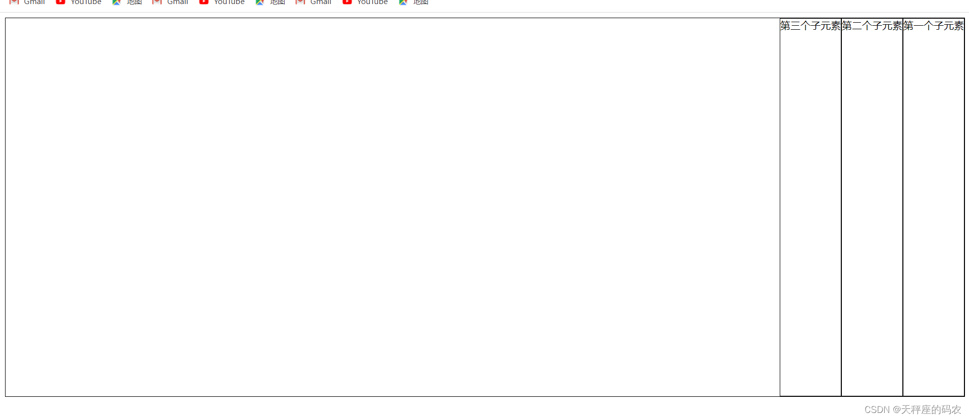
3.3,flex-direction:row-reverse;
<!DOCTYPE html>
<html lang="en">
<head>
    <meta charset="UTF-8">
    <meta name="viewport" content="width=device-width, initial-scale=1.0">
    <title>Document</title>
    <style>
        .box{


            width: 100%;
            height: 600px;
            border: 1px solid black;
            display: flex;
            flex-direction:row-reverse;

        }
        .box>div{


            border: 1px solid black;
        }
    </style>
</head>
<body>
    <div class="box">
        <div>第一个子元素</div>
        <div>第二个子元素</div>
        <div>第三个子元素</div>
    </div>
</body>
</html>
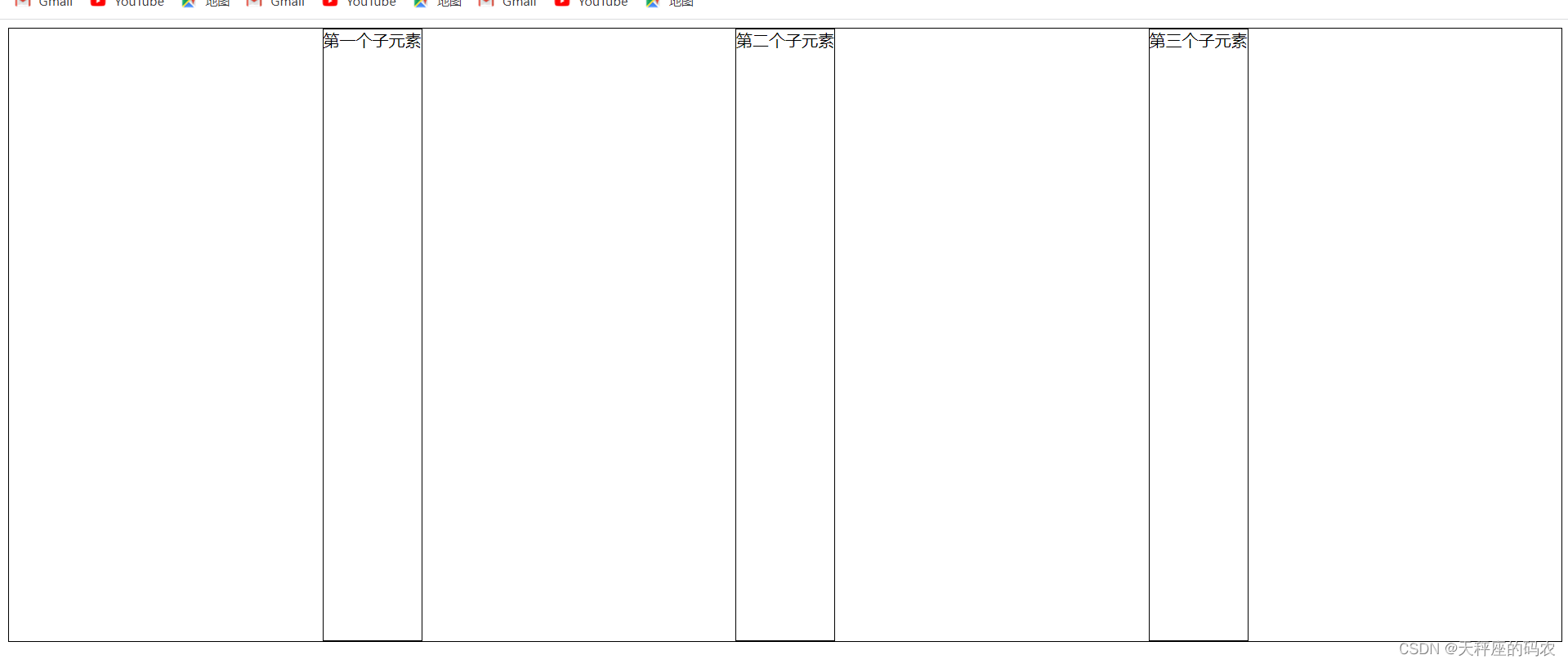
row-reverse: reverse the horizontal arrangement (right-aligned), from back to front, with the last item at the front
3.4,flex-direction:column;
<!DOCTYPE html>
<html lang="en">
<head>
    <meta charset="UTF-8">
    <meta name="viewport" content="width=device-width, initial-scale=1.0">
    <title>Document</title>
    <style>
        .box{


            width: 100%;
            height: 600px;
            border: 1px solid black;
            display: flex;
            flex-direction:column;

        }
        .box>div{


            border: 1px solid black;
        }
    </style>
</head>
<body>
    <div class="box">
        <div>第一个子元素</div>
        <div>第二个子元素</div>
        <div>第三个子元素</div>
    </div>
</body>
</html>
Vertically arranged
3.5,flex-direction:column-reverse;
<!DOCTYPE html>
<html lang="en">
<head>
    <meta charset="UTF-8">
    <meta name="viewport" content="width=device-width, initial-scale=1.0">
    <title>Document</title>
    <style>
        .box{


            width: 100%;
            height: 600px;
            border: 1px solid black;
            display: flex;
            flex-direction:column-reverse;

        }
        .box>div{


            border: 1px solid black;
        }
    </style>
</head>
<body>
    <div class="box">
        <div>第一个子元素</div>
        <div>第二个子元素</div>
        <div>第三个子元素</div>
    </div>
</body>
</html>
Reverse the vertical arrangement, from queen to front, with the last item on top
Four, justify-content-main-axis-horizontal layout
Before using this, you must first adjust flex-direction: row to default.
4.1,justify-content:center;
<!DOCTYPE html>
<html lang="en">
<head>
    <meta charset="UTF-8">
    <meta name="viewport" content="width=device-width, initial-scale=1.0">
    <title>Document</title>
    <style>
        .box{


            width: 100%;
            height: 600px;
            border: 1px solid black;
            display: flex;
            flex-direction:row;
            justify-content:center;

        }
        .box>div{


            border: 1px solid black;
        }
    </style>
</head>
<body>
    <div class="box">
        <div>第一个子元素</div>
        <div>第二个子元素</div>
        <div>第三个子元素</div>
    </div>
</body>
</html>
flex items are centered horizontally
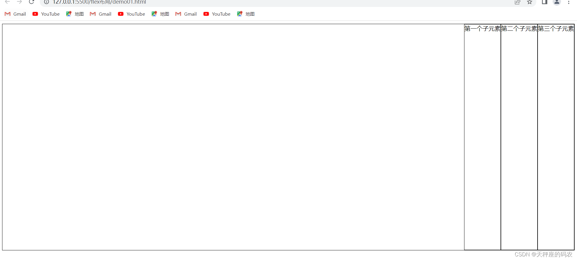
4.2,justify-content:flex-end;
<!DOCTYPE html>
<html lang="en">
<head>
    <meta charset="UTF-8">
    <meta name="viewport" content="width=device-width, initial-scale=1.0">
    <title>Document</title>
    <style>
        .box{


            width: 100%;
            height: 600px;
            border: 1px solid black;
            display: flex;
            flex-direction:row;
            justify-content:flex-end;

        }
        .box>div{


            border: 1px solid black;
        }
    </style>
</head>
<body>
    <div class="box">
        <div>第一个子元素</div>
        <div>第二个子元素</div>
        <div>第三个子元素</div>
    </div>
</body>
</html>
flex items aligned to the right
4.3,justify-content:flex-end;
<!DOCTYPE html>
<html lang="en">
<head>
    <meta charset="UTF-8">
    <meta name="viewport" content="width=device-width, initial-scale=1.0">
    <title>Document</title>
    <style>
        .box{


            width: 100%;
            height: 600px;
            border: 1px solid black;
            display: flex;
            flex-direction:row;
            justify-content:space-between;

        }
        .box>div{


            border: 1px solid black;
        }
    </style>
</head>
<body>
    <div class="box">
        <div>第一个子元素</div>
        <div>第二个子元素</div>
        <div>第三个子元素</div>
    </div>
</body>
</html>
Align both ends of flex items
4.4,justify-content: space-around;
<!DOCTYPE html>
<html lang="en">
<head>
    <meta charset="UTF-8">
    <meta name="viewport" content="width=device-width, initial-scale=1.0">
    <title>Document</title>
    <style>
        .box{


            width: 100%;
            height: 600px;
            border: 1px solid black;
            display: flex;
            flex-direction:row;
            justify-content: space-around;

        }
        .box>div{


            border: 1px solid black;
        }
    </style>
</head>
<body>
    <div class="box">
        <div>第一个子元素</div>
        <div>第二个子元素</div>
        <div>第三个子元素</div>
    </div>
</body>
</html>
Flex items are aligned at both ends, and the distance between items is twice the distance between the two ends and the container.
4.5,justify-content: space-evenly;
<!DOCTYPE html>
<html lang="en">
<head>
    <meta charset="UTF-8">
    <meta name="viewport" content="width=device-width, initial-scale=1.0">
    <title>Document</title>
    <style>
        .box{


            width: 100%;
            height: 600px;
            border: 1px solid black;
            display: flex;
            flex-direction:row;
            justify-content: space-evenly;

        }
        .box>div{


            border: 1px solid black;
        }
    </style>
</head>
<body>
    <div class="box">
        <div>第一个子元素</div>
        <div>第二个子元素</div>
        <div>第三个子元素</div>
    </div>
</body>
</html>
Flex items are aligned at both ends, and the item spacing is equal to the distance between the two ends of the container.
Five, align-items-cross axis-vertical layout
- Set the alignment of the flexbox element in the side axis (vertical axis) direction
- stretch: Default value. If the item is not set to a height higher than auto, the child elements will be stretched to fit the container.
- flex-start: The element is at the beginning of the container
- flex-end: The element is at the end of the container
- center: The element is located in the center of the container
- baseline: The element is located on the baseline of the container.
Before using this, you must first adjust flex-direction:column to vertical.
5.1,align-items:center;
<!DOCTYPE html>
<html lang="en">
<head>
    <meta charset="UTF-8">
    <meta name="viewport" content="width=device-width, initial-scale=1.0">
    <title>Document</title>
    <style>
        .box{


            width: 100%;
            height: 600px;
            border: 1px solid black;
            display: flex;
            flex-direction:column;
            align-items:center;

        }
        .box>div{


            border: 1px solid black;
        }
    </style>
</head>
<body>
    <div class="box">
        <div>第一个子元素</div>
        <div>第二个子元素</div>
        <div>第三个子元素</div>
    </div>
</body>
</html>
vertically centered
5.2,align-items:flex-end;
<!DOCTYPE html>
<html lang="en">
<head>
    <meta charset="UTF-8">
    <meta name="viewport" content="width=device-width, initial-scale=1.0">
    <title>Document</title>
    <style>
        .box{


            width: 100%;
            height: 600px;
            border: 1px solid black;
            display: flex;
            flex-direction:column;
            align-items:flex-end;

        }
        .box>div{


            border: 1px solid black;
        }
    </style>
</head>
<body>
    <div class="box">
        <div>第一个子元素</div>
        <div>第二个子元素</div>
        <div>第三个子元素</div>
    </div>
</body>
</html>
Cross axis bottom alignment
5.3,align-items:flex-end;
Before using this, you must first adjust flex-direction: row to default
and then add height to the div.
<!DOCTYPE html>
<html lang="en">
<head>
    <meta charset="UTF-8">
    <meta name="viewport" content="width=device-width, initial-scale=1.0">
    <title>Document</title>
    <style>
        .box{


            width: 100%;
            height: 600px;
            border: 1px solid black;
            display: flex;
            flex-direction:row;
            align-items:flex-end;

        }
        .box>div{


            border: 1px solid black;
        }
    </style>
</head>
<body>
    <div class="box">
        <div style="height: 100px;">第一个子元素</div>
        <div style="height: 200px;">第二个子元素</div>
        <div style="height: 300px;">第三个子元素</div>
    </div>
</body>
</html>
Default value. If the item is not set to a height greater than auto, the child elements will be stretched to fit the container.
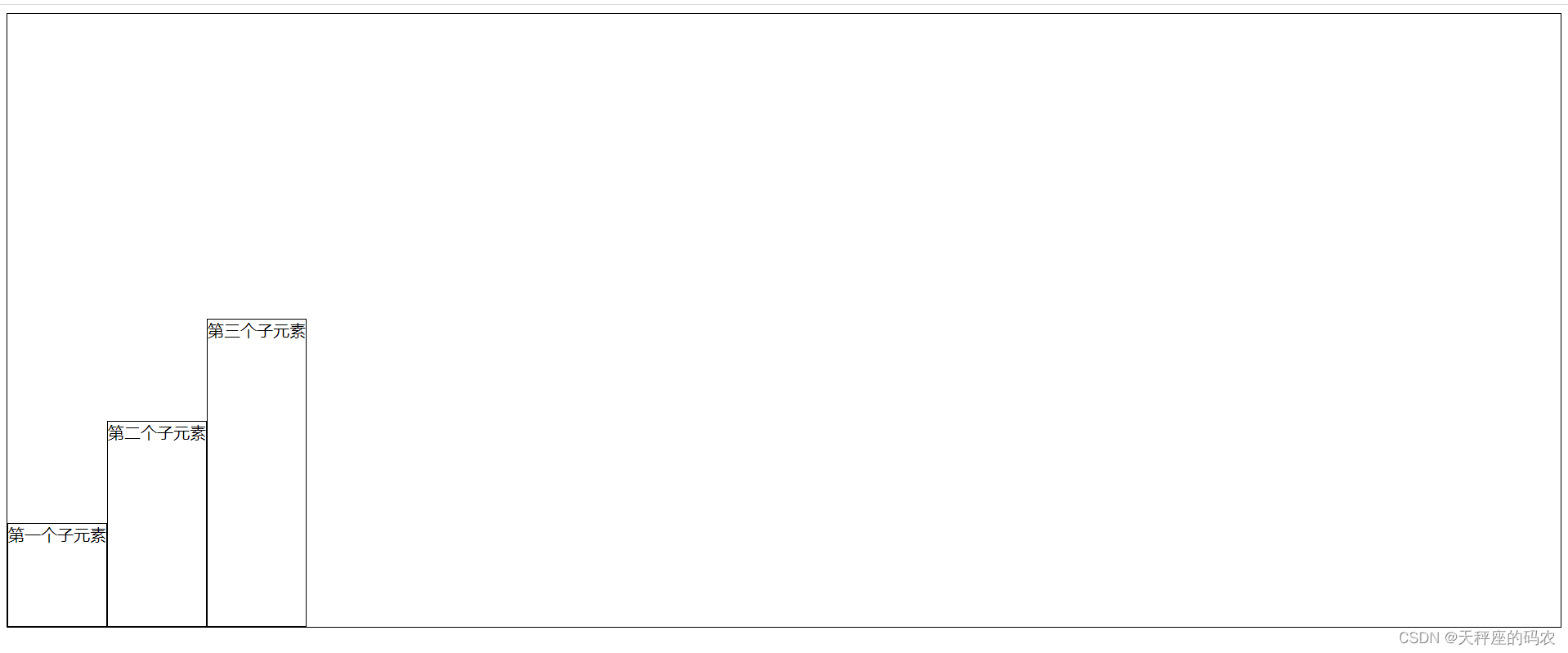
5.4,align-items:flex-start;
<!DOCTYPE html>
<html lang="en">
<head>
    <meta charset="UTF-8">
    <meta name="viewport" content="width=device-width, initial-scale=1.0">
    <title>Document</title>
    <style>
        .box{


            width: 100%;
            height: 600px;
            border: 1px solid black;
            display: flex;
            flex-direction:row;
            align-items:flex-start;

        }
        .box>div{


            border: 1px solid black;
        }
    </style>
</head>
<body>
    <div class="box">
        <div style="height: 100px;">第一个子元素</div>
        <div style="height: 200px;">第二个子元素</div>
        <div style="height: 300px;">第三个子元素</div>
    </div>
</body>
</html>
The element is at the beginning of the container
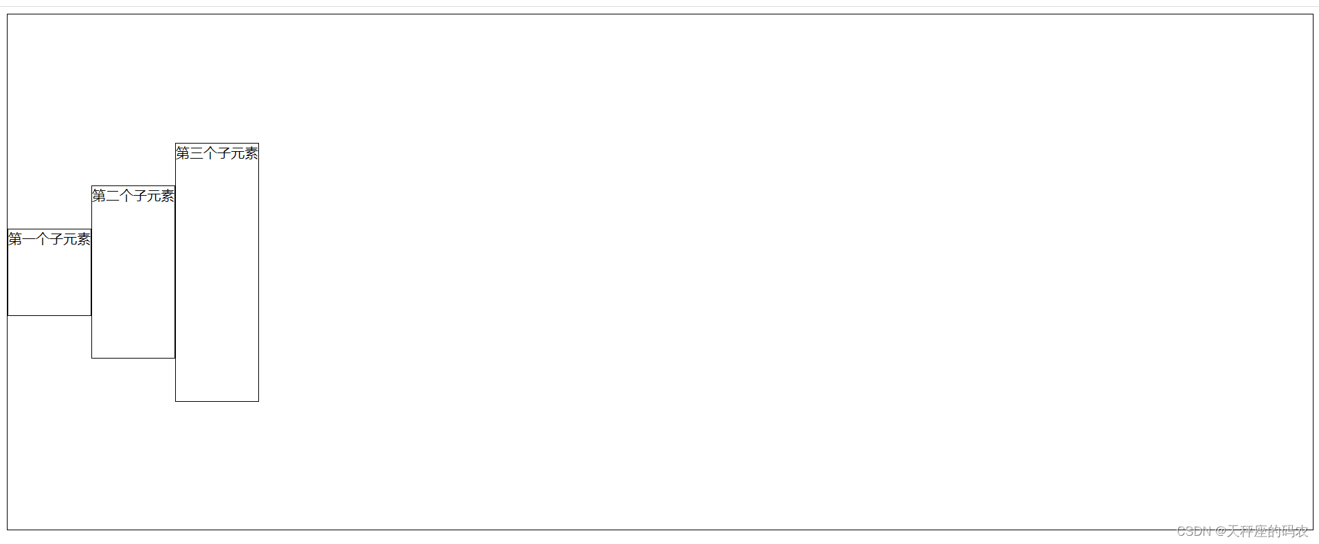
5.5,align-items:center;
<!DOCTYPE html>
<html lang="en">
<head>
    <meta charset="UTF-8">
    <meta name="viewport" content="width=device-width, initial-scale=1.0">
    <title>Document</title>
    <style>
        .box{


            width: 100%;
            height: 600px;
            border: 1px solid black;
            display: flex;
            flex-direction:row;
            align-items:center;

        }
        .box>div{


            border: 1px solid black;
        }
    </style>
</head>
<body>
    <div class="box">
        <div style="height: 100px;">第一个子元素</div>
        <div style="height: 200px;">第二个子元素</div>
        <div style="height: 300px;">第三个子元素</div>
    </div>
</body>
</html>
The element is in the center of the container
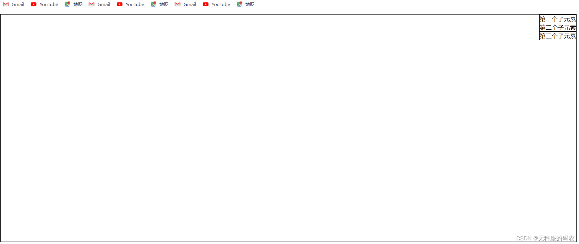
5.6,align-items:baseline;
<!DOCTYPE html>
<html lang="en">
<head>
    <meta charset="UTF-8">
    <meta name="viewport" content="width=device-width, initial-scale=1.0">
    <title>Document</title>
    <style>
        .box{


            width: 100%;
            height: 600px;
            border: 1px solid black;
            display: flex;
            flex-direction:row;
            align-items:baseline;

        }
        .box>div{


            border: 1px solid black;
        }
    </style>
</head>
<body>
    <div class="box">
        <div style="height: 100px;">第一个子元素</div>
        <div style="height: 200px;">第二个子元素</div>
        <div style="height: 300px;">第三个子元素</div>
    </div>
</body>
</html>
The element is on the baseline of the container
6. flex-wrap - line wrapping and column wrapping
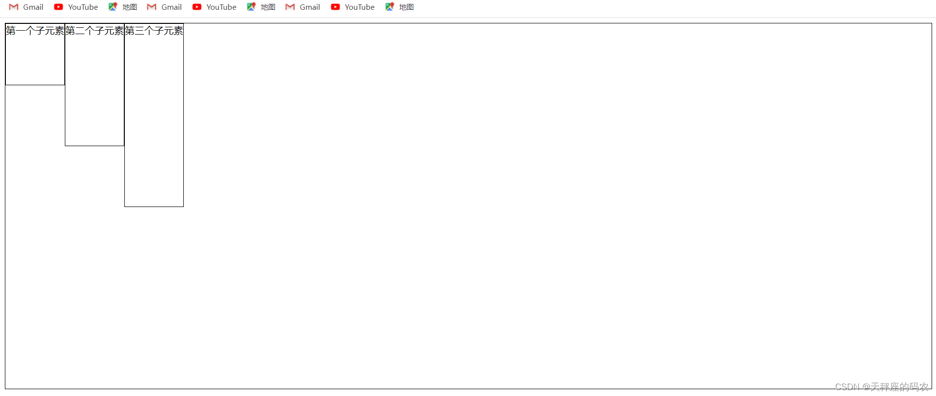
6.1,align-items:stretch;;
Note
that adding width to the div
<!DOCTYPE html>
<html lang="en">
<head>
    <meta charset="UTF-8">
    <meta name="viewport" content="width=device-width, initial-scale=1.0">
    <title>Document</title>
    <style>
        .box{


            width: 100%;
            height: 600px;
            border: 1px solid black;
            display: flex;
            flex-direction:row;
            align-items:stretch;

        }
        .box>div{


            border: 1px solid black;
        }
    </style>
</head>
<body>
    <div class="box">
        <div style="height: 100px; width: 40%;">第一个子元素</div>
        <div style="height: 200px; width: 40%;">第二个子元素</div>
        <div style="height: 300px; width: 40%;">第三个子元素</div>
    </div>
</body>
</html>
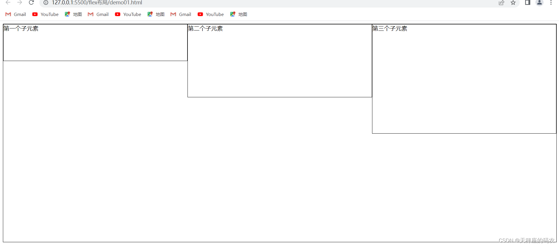
6.2,flex-wrap:wrap;
<!DOCTYPE html>
<html lang="en">
<head>
    <meta charset="UTF-8">
    <meta name="viewport" content="width=device-width, initial-scale=1.0">
    <title>Document</title>
    <style>
        .box{


            width: 100%;
            height: 600px;
            border: 1px solid black;
            display: flex;
            flex-direction:row;
            align-items:stretch;
            flex-wrap: nowrap;

        }
        .box>div{


            border: 1px solid black;
        }
    </style>
</head>
<body>
    <div class="box">
        <div style="height: 100px; width: 40%;">第一个子元素</div>
        <div style="height: 200px; width: 40%;">第二个子元素</div>
        <div style="height: 300px; width: 40%;">第三个子元素</div>
    </div>
</body>
</html>
default value. It means no line breaks or column breaks.
When the total width of the flex items exceeds the width of the container, the flex items will be forcibly divided into equal parts according to the original proportions without wrapping.
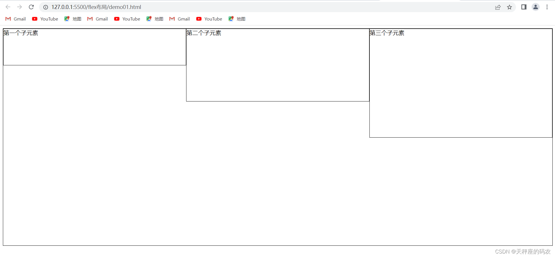
6.3,flex-wrap:wrap;
<!DOCTYPE html>
<html lang="en">
<head>
    <meta charset="UTF-8">
    <meta name="viewport" content="width=device-width, initial-scale=1.0">
    <title>Document</title>
    <style>
        .box{


            width: 100%;
            height: 600px;
            border: 1px solid black;
            display: flex;
            flex-direction:row;
            align-items:stretch;
            flex-wrap: wrap;

        }
        .box>div{


            border: 1px solid black;
        }
    </style>
</head>
<body>
    <div class="box">
        <div style="height: 100px; width: 40%;">第一个子元素</div>
        <div style="height: 200px; width: 40%;">第二个子元素</div>
        <div style="height: 300px; width: 40%;">第三个子元素</div>
    </div>
</body>
</html>
Line break, column break. When the total width of flex items exceeds the width of the container, rows and columns will be naturally wrapped. And each row (column) divides the container equally.