The left menu bar is a requirement that is basically encountered in front-end projects. This article is based on antdcomponents and combines vuethe concept of recursive components to encapsulate a universal left menu bar component. The menu directory can be freely configured in levels.
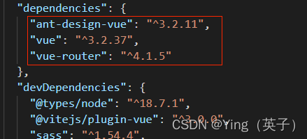
The versions used in the project are as follows:
1. Implement sideBar.vuecomponents
<template>
  <a-layout-sider v-model:collapsed="collapsed" collapsible>
    <a-menu
      :selectedKeys="selectedKeys"
      @update:selectedKeys="updateSelectedKeys"
      theme="dark"
      mode="inline"
      :openKeys="openKeys"
      @update:openKeys="updateOpenKeys"
    >
      <template v-for="item in menuList" :key="item.key">
        <template v-if="!item.children">
          <a-menu-item :key="item.key" @click="menuItemClick(item)">
            <template #icon>
              <SettingOutlined />
            </template>
            {

    {

     item.title }}
          </a-menu-item>
        </template>
        <template v-else>
          <sub-menu
            :key="item.key"
            :menu-info="item"
            @menuItemClick="menuItemClick"
          ></sub-menu>
        </template>
      </template>
    </a-menu>
  </a-layout-sider>
</template>

<script lang="ts" setup>
import SubMenu from './subMenu.vue';

import {

     SettingOutlined } from '@ant-design/icons-vue';
import {

     log } from 'console';

interface MenuItem {


  key: string;
  title: string;
  path?: string;
  icon?: string;
  children?: MenuItem[];
}

interface Props {


  menuList: Array<MenuItem>;
  selectedKeys: string[];
  openKeys: string[];
  collapsed?: boolean;
}

withDefaults(defineProps<Props>(), {


  collapsed: false
});

const emit = defineEmits([
  'menuItemClick',
  'update:selectedKeys',
  'update:openKeys'
]);

const updateSelectedKeys = (...res: string[][]) => {


  emit('update:selectedKeys', ...res);
};

const updateOpenKeys = (...res: string[][]) => {


  emit('update:openKeys', ...res);
};

const menuItemClick = (item: MenuItem) => {


  emit('menuItemClick', item);
};
</script>
2. Implement sideBar.vuethe subcomponent used in the component SubMenu.vue, and the subcomponent is a recursive component
<template>
  <a-sub-menu :key="menuInfo.key">
    <template #icon><SettingOutlined /></template>
    <template #title>{

    { menuInfo.title }}</template>
    <template v-for="item in menuInfo.children" :key="item.key">
      <template v-if="!item.children">
        <a-menu-item :key="item.key" @click="menuItemClick(item)">
          {

    {

     item.title }}
        </a-menu-item>
      </template>
      <template v-else>
        <sub-menu
          :key="item.key"
          :menu-info="item"
          @menuItemClick="menuItemClick(item)"
        ></sub-menu>
      </template>
    </template>
  </a-sub-menu>
</template>

<script lang="ts" setup name="SubMenu">
import {

     SettingOutlined } from '@ant-design/icons-vue';

interface MenuInfo {


  key: string;
  title: string;
  path?: string;
  icon?: string;
  children?: MenuInfo[];
}

defineProps<{


  menuInfo: MenuInfo;
}>();

const emit = defineEmits(['menuItemClick']);

const menuItemClick = (item: MenuInfo) => {


  emit('menuItemClick', item);
};
</script>
3. Usage examples
<template>
<a-layout style="min-height: 100vh">
<side-bar
:menuList="menuList"
v-model:openKeys="openKeys"
v-model:selectedKeys="selectedKeys"
@menuItemClick="menuItemClick"
></side-bar>
<a-layout>
<a-layout-header style="background: #fff; padding: 0 0 0 16px">
{
{
title }}
</a-layout-header>
<a-layout-content style="margin: 0 16px"> 内容展示区 </a-layout-content>
</a-layout>
</a-layout>
</template>
<script lang="ts" setup>
import {
reactive, ref } from 'vue';
import SideBar from '../components/sideBar.vue';
interface MenuItem {
key: string;
title: string;
children?: MenuItem[];
[x: string]: any;
}
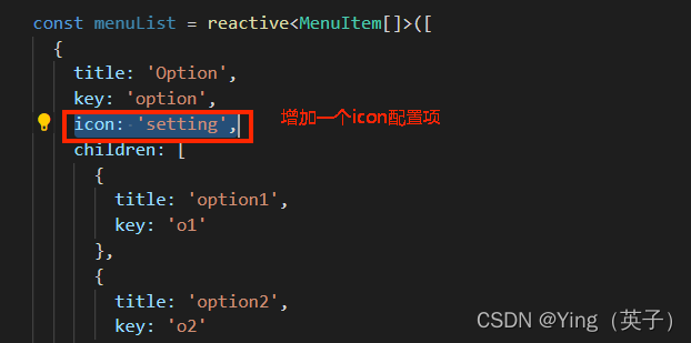
const menuList = reactive<MenuItem[]>([
{
title: 'Option',
key: 'option',
icon: '<SettingOutlined />',
children: [
{
title: 'option1',
key: 'o1'
},
{
title: 'option2',
key: 'o2'
}
]
},
{
title: 'User',
key: 'user',
children: [
{
title: 'user1',
key: 'user1'
},
{
title: 'user2',
key: 'user1',
children: [
{
title: 'user3',
key: 'user3'
}
]
}
]
},
{
title: 'Team',
key: 'team'
}
]);
const openKeys = ref<string[]>(['option', 'user']);
const selectedKeys = ref<string[]>(['option']);
const title = ref<string>('');
const menuItemClick = (item: MenuItem) => {
title.value = item.title;
};
</script>
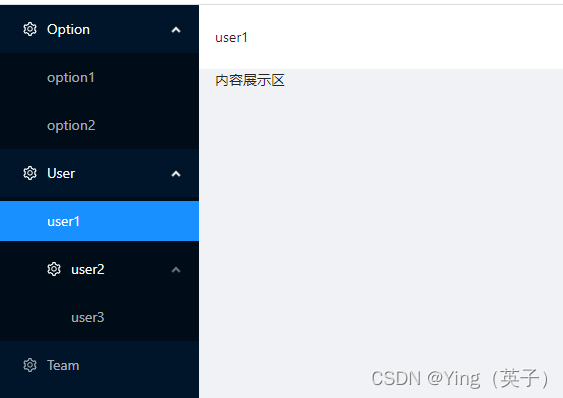
4. Effect display
5. Shortcomings
From the final effect display, we can see that a universal component function with a customizable menu level has been implemented. However, we can also see from the implemented code that the small icon in front of each menu is still fixed. This is because of the use of The icons that come with the antd component library are not easy to implement through dynamic parameter configuration. If you want to implement small icons, you can also configure them and then render them dynamically. You can introduce external iconFont icon implementation. The approximate implementation is as follows: 1) Introduce the iconFont icon. The steps are as follows
: See: Ant Design Vue introduces external IconFont icons , which will not be detailed in this article;
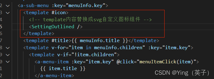
2) Replace sidBar.vueand SubItem.vue中use icons respectively, as follows:

3) When using, you can add a configuration item iconto indicate the corresponding icontype name.