What are the applications of viewing behavior analysis during video playback in educational institutions?
Viewing behavior analysis
Viewing behavior analysis means that our platform is based on video big data analysis and can show how viewers watch your videos at the granularity of seconds. The video viewing heat map is a graphical representation of a single viewing behavior. Every time a cloud on-demand video is played on our platform, a heat map will be generated. This is a powerful tool because the heat map not only displays statistical results such as viewing completion, but also visually restores the entire viewing process. It can help you gain a more comprehensive and in-depth understanding of your audience and their views on video content. Different preferences, thereby mining greater data value and helping business operations to run better.
Video analysis heat map example:
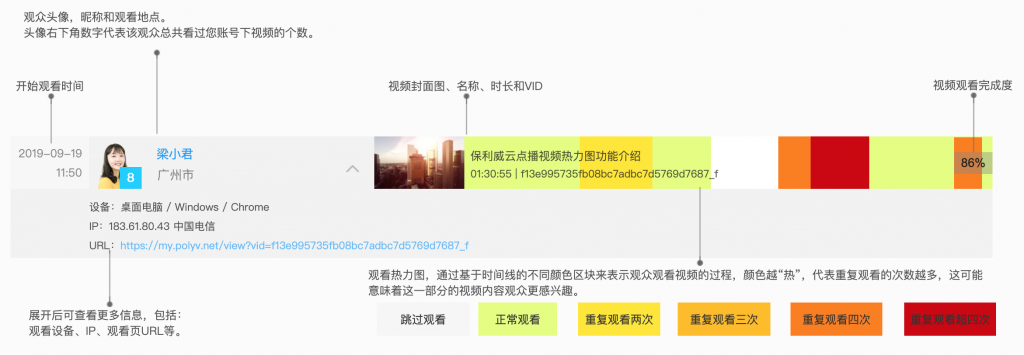
The video viewing heat map contains audience information, device environment-related information (video playback time, location, playback device, etc.) and different color blocks based on the timeline.
The time on the far left of the heat map indicates the time when the video starts playing.
Next is the audience information, including the audience's avatar, the total number of videos under your account that the audience has watched, the audience's nickname, and the viewing location. Click on the avatar or nickname to jump to the audience analysis page.
Note: The prerequisite for the audience avatar and nickname to be displayed in the heat map is that the audience information is transmitted to the player (see audience information settings and statistics for details). If no avatar information is sent, the avatar will be replaced by a blue square; if no nickname is sent, the nickname will be replaced by the audience ID; if there is no audience ID, the avatar will be replaced by a gray square, and the nickname will be unified as "Visitor" .
Click the expand button to the right of the viewer's nickname to view more information, including:
- Viewing device information: device type (including desktop computers and mobile devices), operating system, browser type;
- View IP and network operator information;
- Watch page URL
Video information includes video cover image, video name, video duration and video ID.
The viewing heat map uses different color blocks based on the timeline to represent the process of the audience watching the video. The "hotter" the color means the more times the video has been watched repeatedly, which may mean that the audience is more interested in this part of the video content.
- The white block indicates that the viewer skipped this part of the video content and did not watch it;
- The green block indicates that the audience has watched this part of the video content normally;
- The yellow block indicates that this part of the video content has been watched twice;
- Orange, red, and dark red indicate that the video content has been watched three, four, and more than four times respectively.
Heat map video analysis
Heat maps show how individual viewers watch your videos, while video analytics charts let you see how your entire audience watches your videos.
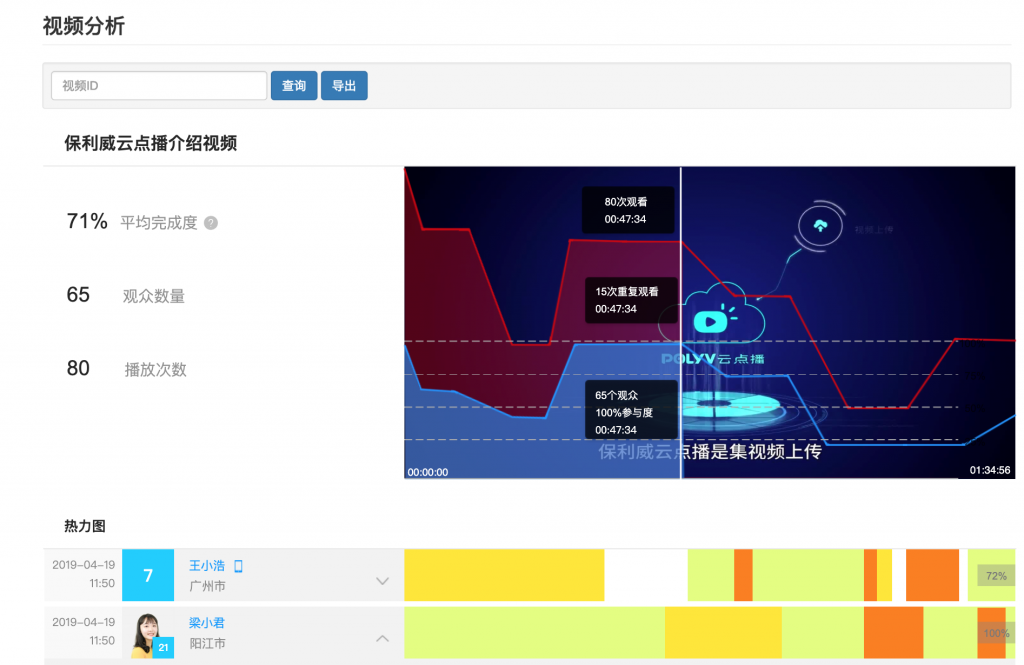
The red polyline represents the number of times the video content at the corresponding time point has been viewed. The blue line represents the number of viewers who have watched the video content at the corresponding time point. So the blue area in the video analytics chart represents the overall engagement of all viewers, and the red area represents the number of times that portion of the video content was re-watched. Move your mouse over the graph to see each frame of the video and its corresponding viewing statistics (number of viewers, engagement, and repeat views).
Video analytics charts let you see which parts of your video are watched multiple times and which parts are not. For example, a falling line in the chart may mean that the audience is no longer interested in this part of the video content, while an increase may mean that this part of the video content has attracted the audience's attention. All this information can help you optimize your video content and provide guidance for creating more engaging video content in the future.
On the left side of the chart are several important indicator statistics of the overall playback data of the video, allowing you to understand the playback status of the video so far from a macro level. The calculation formula for the average completion degree is: average completion degree = total actual play time of the video / (total number of plays x video duration). The average completion degree represents the average viewing time as a percentage of the total video duration. The higher the completion degree, the more interested the audience is in the video.
Note: The average completion indicator should use different criteria for different types of videos. According to experience, the average completion rate of the help center video is about 50%, because people will leave after getting the required information; for the product introduction video on the official website homepage, a completion rate of more than 70% is considered a healthy value; if It is found that several videos have a very high degree of completion, so we must analyze the reasons and use this to take corresponding actions.
My article recommendations:
- [Video + Graphics] What is an online seminar? Can companies use online seminars for internal and external training?
- [Picture and text] What are the network bandwidth requirements for enterprise live broadcast?
- [Picture and text] How OBS achieves millisecond-level ultra-low latency live broadcast
- Live broadcast player API (player calling methods, parameters, interfaces and events)
- How to encrypt company internal training course videos to prevent downloading? 10 ideas
- Ultra-low latency/no latency live broadcast (PRTC Web SDK mobile version) compatibility instructions