Article directory
Introduction to line charts
Echarts is an open source visualization library based on JavaScript, developed and maintained by Baidu. It provides a variety of chart types, among which line chart is one of the commonly used chart types.
A line chart shows the trend of data by connecting data points to form a line. In a line chart, the x-axis is usually used to represent time or category, and the y-axis represents the size of the data. Line charts can clearly display data fluctuations and help users discover data trends and patterns.
Echarts line chart has the following characteristics:
-
Highly customizable: Echarts provides a wealth of configuration options, allowing you to customize the style, color, labels, etc. of the polyline, as well as the title, legend, etc. of the entire chart. Users can customize the line chart as needed.
-
Rich interactive functions: Echarts supports a variety of interactive operations, including zooming, panning, data brush selection, etc. Users can operate the line chart through the mouse or touch screen, observe the data from different angles, and explore the relationship between the data.
-
Animation effects: Echarts can add animation effects to line charts, so that the charts present a smooth transition effect when loading or data is updated, enhancing the user's visual experience.
-
Cross-platform compatibility: Echarts is compatible with mainstream browsers and provides responsive layout capabilities that can adapt to different screen sizes. Whether on PC or mobile, it can be displayed and interacted normally.
-
Strong scalability: Echarts provides a wealth of extension plug-ins and themes, and users can customize the functions and appearance of charts according to their needs. At the same time, Echarts also supports integration with other front-end frameworks (such as Vue, React) to facilitate developers to better use and expand.
In short, Echarts line chart is a powerful, flexible, customizable, and interactive data visualization tool. It is widely used in various fields, including data analysis, data display, business reports, etc. By using Echarts line charts, users can intuitively understand the trends and changes in data, allowing them to make more accurate decisions and analyses.
Configuration steps
The specific configuration process of Echarts line chart is as follows:
- Introduce the Echarts library: Introduce the JavaScript file of the Echarts library into the HTML file.
<script src="echarts.min.js"></script>
- Creates a DOM container with specified width and height for displaying the line chart.
<div id="chart" style="width: 600px; height: 400px;"></div>
- Initialize the echarts instance and bind it to the specified DOM container.
var chart = echarts.init(document.getElementById('chart'));
- Configure the relevant parameters of the line chart:
var option = {


  title: {


    text: '折线图示例'   // 图表标题
  },
  xAxis: {


    type: 'category',   // x轴类型,可以是 'category'(类目轴)或 'value'(数值轴)
    data: ['周一', '周二', '周三', '周四', '周五', '周六', '周日']   // x轴数据
  },
  yAxis: {


    type: 'value'   // y轴类型,可以是 'category'(类目轴)或 'value'(数值轴)
  },
  series: [{


    type: 'line',   // 图表类型为折线图
    data: [120, 200, 150, 80, 70, 110, 130]   // 折线图数据
  }]
};
- Apply the configuration to the line chart and display it.
chart.setOption(option);
The above is a simple line chart configuration process. More configurations can be performed according to needs, such as adding legends, setting line styles, setting animation effects, etc. For detailed configuration options, please refer to Echarts official documentation.
Simple example
Here's an example showing a simple line chart:
<!DOCTYPE html>
<html>
<head>
  <title>Echarts折线图示例</title>
  <script src="echarts.min.js"></script>
</head>
<body>
  <div id="chart" style="width: 600px; height: 400px;"></div>
  <script>
    var chart = echarts.init(document.getElementById('chart'));
    var option = {


      title: {


        text: '折线图示例'
      },
      xAxis: {


        type: 'category',
        data: ['周一', '周二', '周三', '周四', '周五', '周六', '周日']
      },
      yAxis: {


        type: 'value'
      },
      series: [{


        type: 'line',
        data: [120, 200, 150, 80, 70, 110, 130]
      }]
    };
    chart.setOption(option);
  </script>
</body>
</html>
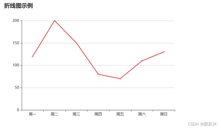
The above code will display a line chart with a width of 600px and a height of 400px on the page. The x-axis displays the data from Monday to Sunday, and the y-axis displays the corresponding data size, as shown in the figure below.