Let me talk nonsense first. I wrote this article because I used the matrix in the transform animation when I was studying a Vue online class, so I went to study it. This article was learned in the blog of the boss Zhang Xinxu, and I recorded and consolidated it. After a while, most of the content comes from the blog of the boss. Without further ado, let's get to the point!
1. What is a matrix
In mathematics, a matrix (Matrix) is a set of complex or real numbers arranged in a rectangular array [1] , which originated from the square matrix formed by the coefficients and constants of the equation system . This concept was first proposed by Kelly, a British mathematician in the 19th century. Matrices are a common tool in advanced algebra and in applied mathematics disciplines such as statistical analysis . . . . . .
When you see the above "Matrix (matrix)", will you be afraid (even if you have learned it), it is normal. Actually, this stuff is a bit complicated. [cover face]
simple understanding
A matrix can be understood as a square matrix, except that usually people stand in the square matrix, and the matrix contains values: 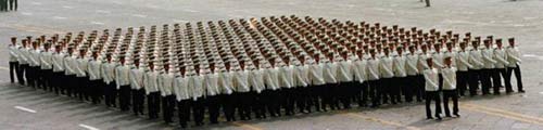 →
→
The calculation of the so-called matrix is that people in two phalanxes (can be imagined as ancient phalanx soldiers) rush to kill each other.
The matrix in CSS3 The
matrix in CSS3 refers to a method, written as matrix()and matrix3d(), the former is the movement transformation (transform) of the 2D plane of the element, and the latter is the 3D transformation. The 2D transformation matrix is 3*3, as shown in the matrix diagram above; the 3D transformation is a 4*4 matrix.
Are you confused? Well, I also think the above description is a bit out of date. Well, let's look at other things first, layer by layer- transformattributes.
There are several attribute methods in the transform we commonly use in css :
.trans_skew { transform: skew(35deg); }
.trans_scale { transform:scale(1, 0.5); }
.trans_rotate { transform:rotate(45deg); }
.trans_translate { transform:translate(10px, 20px); }
Skew, scale, rotate and translate.
Have you ever wondered why transform: rotate(45deg);elements are rotated 45°, and what is the mechanism behind it?
matrix()Whether it is rotation or stretching, it is essentially implemented by the applied method (the modification matrix()method fixes several values), but similar to transform: rotatethis form of expression, it is easier for us to understand, remember and get started. In fact, it is equivalent to using matrix() to achieve.
In other words, understanding transformthe matrix()matrix method is conducive to a thorough understanding of CSS3 transformproperties.
Although the title is written as " transformChinese matrix", in fact, in the world of CSS3 and HTML5, this stuff is quite extensive, such as SVGandcanvas。
Two, transformand the coordinate system
Those who have used transformrotation can find out that the default is to rotate around the center point, and this center point is transform-originthe point corresponding to the attribute, and it is also an important basis point for all matrix calculations (see the figure below from dev.opera.com ).
When we transform-originset it through properties, the matrix related calculations will also change. It is reflected in the actual graphic effect that the center point of the rotation and stretching has changed!
For example, if we set:
-webkit-transform-origin: bottom left;
Then, the coordinate center point is the position of the lower left corner. Then the animation (such as shrinking the picture) is based on the lower left corner of the picture.
To give another example that is a little more difficult to understand, if we set it like this:
transform-origin: 50px 70px;
Then, the position of the center point has been moved to a distance of 50 pixels from the left and 70 pixels from the top (see the figure below), and the (30, 30)coordinates at this time are the positions indicated by the white dots (this position will be used later).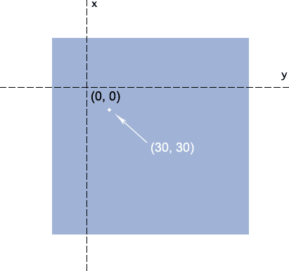
3. Are you ready? The highlight is here, let’s officially enter the learning matrix
The CSS3 transformmethod matrix()is written as follows:
transform: matrix(a,b,c,d,e,f);
Get scared, haha..., there are so many parameters that you can't count them in one slap.
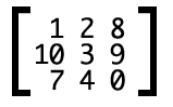
In fact, the corresponding matrix for these 6 parameters is: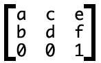
Note that the writing direction is vertical .
As mentioned above, the matrix can be imagined as the ancient soldier phalanx. To change it, the only thing is to fight with another soldier formation, even if it is a small formation.
The reaction here is the following conversion formula: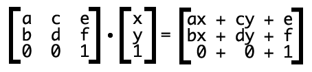
Among them, x, yrepresents all the coordinates (variables) of the transformed elements. How did it come from behind ax+cy+e?
// Linear algebra knowledge in college, those who understand can skip it here ( I don’t understand and I started learning from here [cover mouth laugh] )
The first value of each row of the 3*3 matrix is multiplied by the first value of the following 1*3, the second value is multiplied by the second, the third is multiplied by the third, and then added.
ax+cy+eWhat's the point of that ?ax+cy+eis the transformed horizontal coordinate,bx+dy+frepresenting the transformed vertical position.
Suppose the matrix parameters are as follows:
transform: matrix(1, 0, 0, 1, 30, 30); /* a=1, b=0, c=0, d=1, e=30, f=30 */
Now, we offset the center point of the element according to this matrix, let's say (0, 0), ie x=0, y=0.
Then, the transformed xcoordinates are ax+cy+e = 1*0+0*0+30 =30, and ythe coordinates arebx+dy+f = 0*0+1*0+30 =30。
Thus, the coordinates of the center point (0, 0)changed from → (30, 30). Comparing with the (30, 30)white dot picture above, imagine carefully, the original (0,0)position has been moved to the white dot (30, 30), how about it, is it shifted 30 pixels to the bottom right at the same time! !
In fact, transform: matrix(1, 0, 0, 1, 30, 30);it is equivalent to transform: translate(30px, 30px);. Note: translate, rotateand other methods all require units, and the units of matrixmethod e, fparameters can be omitted.
1. Offset translate()
Smart you may have realized that the matrix performance offset is:
transform: matrix(与我无关, 哪位, 怎么不去高考, 打麻将去吧, 水平偏移距离, 垂直偏移距离);transform: matrix(0, 0, 0, 0, 10, 10);
Equivalent to
transform: translate(10px, 10px)
You only need to care about the latter two parameters. As for the first four parameters, it doesn’t matter whether it is a cow or a horse, male or female.
2. Zoom scale()
The above offset only cares about the last two parameters, and this scaling also only cares about two parameters. Which two?
transform: matrix(1, 0, 0, 1, 30, 30);
Did you find that matrix(1, 0, 0, 1, 30, 30);the ratio of the elements is the same as before, 1:1, and there are two of these parameters 1, ahaha! That's right, these two 1are scaling-related parameters.
where the first scales xthe axis and the second scales ythe axis.
It is very clear with the formula, assuming that the ratio is s, then there is matrix(s, 0, 0, s, 0, 0);, so, applying the formula, there is:x' = ax+cy+e = s*x+0*y+0 = s*x;y' = bx+dy+f = 0*x+s*y+0 = s*y;
别看上面一堆挺复杂的其实结果就是如下:
transform:
matrix(0.8, 0, 0, 0.7, 0, 0);Equivalent to
transform:
scale(0.8, 0.7);
3. Rotaterotate()
Rotation is more advanced than the previous two, using trigonometric functions (which may recall the shadows of student days). Follow the boss ( of course not me ) -> (Zhang Xinxu boss) to learn, for a scumbag like me, I have long forgotten...
The method and parameters are used as follows (assuming the angle is θ):
matrix(cosθ,sinθ,-sinθ,cosθ,0,0)
Combined with the matrix formula, we have:
x' = x*cosθ-y*sinθ+0 = x*cosθ-y*sinθ
y' = x*sinθ+y*cosθ+0 = x*sinθ+y*cosθ
However, to be honest, as far as rotation is concerned, rotate(θdeg)this form of writing is matrixmuch simpler, firstly, it is easy to remember, and secondly, it does not require calculation. For example, to rotate 30°, the former directly:
transform:rotate(30deg);
Whereas using matrixthe representation would also compute costhe sinvalue:
transform: matrix(0.866025,0.500000,-0.500000,0.866025,0,0);
To sum up, it is to rotate 30 degrees, rotate(30deg)
transform: rotate(30deg);

等同于

transform: matrix(0.866025,0.500000,-0.500000,0.866025,0,0);

上面的数据是利用公式

matrix(cos30°,sin30°,-sin30°,cos30°,0,0)

得出结果

matrix(0.866025,0.500000,-0.500000,0.866025,0,0);
4. Stretch skew()
Stretching also uses trigonometric functions, but it is tanθ, and, as for b, cthe two parameters, it is written as follows (note that ythe axis tilt angle comes first):
matrix(1,tan(θy),tan(θx),1,0,0)
The result of applying the matrix formula is:
x' = x+y*tan(θx)+0 = x+y*tan(θx)
y' = x*tan(θy)+y+0 = x*tan(θy)+y
corresponds to skew(θx + "deg",θy+ "deg")this notation.
Among them, θxrepresents xthe angle of inclination of the axis, and θyrepresents ythe axis, and the two are not related.
In summary stretching is as follows:
transform: skew(40deg, 30deg);

等同于

transform: matrix(1, 0.577350, -0.839099, 1, 0, 0);

上面的数据是利用公式

matrix(1, tan30°, tan40°, 1, 0, 0)

得出结果

matrix(1, 0.577350, -0.839099, 1, 0, 0);
According to the conclusions above, the final results can be summarized as follows:
transform: matrix(1, 0, 0, 1, 30, 30);
// matrix的参数可以理解为如下:
transform: matrix(x方向的缩放, y方向的倾斜, x方向的倾斜, y方向的缩放, x方向的偏移, y方向的便宜);
The above is the result of my study. If there are mistakes, there are big guys who can point out the problems and mistakes. Thank you for reading.
Another learning record written by myself (hahaha)

Finally, here is the original address of Mr. Zhang Xinxu