Use css to realize the dynamic gradient color effect of the border, I hope it will be of some help to you.
border.html
<!DOCTYPE html>
<html lang="en">
  <head>
    <meta charset="UTF-8" />
    <meta http-equiv="X-UA-Compatible" content="IE=edge" />
    <meta name="viewport" content="width=device-width, initial-scale=1.0" />
    <title>边框</title>
    <link rel="stylesheet" href="css/动态边框.css">
  </head>
  <body>
    <div>鼠标移入此处,边框变色</div>
  </body>
</html>
Dynamic Border.css
    /* 初始状态,注意设置相对定位 */
    div {
      width: 300px;
      height: 100px;
      line-height: 100px;
      text-align: center;
      box-sizing: border-box;
      position: relative;
    }
    /* 渐变色边框 */
    div::before {
      content: "";
      position: absolute;
      left: 0;
      top: 0;
      border-top: 1px solid;
      border-left: 1px solid;
      border-image: linear-gradient(to bottom, #eda901, #d16cc7) 1 10;
      width: 0;
      height: 0;
      transition: all 0.4s ease-out 0s;
      visibility: hidden;
      box-sizing: border-box;
    }
    div::after {
      content: "";
      position: absolute;
      right: 0;
      bottom: 0;
      border-right: 1px solid;
      border-bottom: 1px solid;
      border-image: linear-gradient(to bottom, #eda901, #d16cc7) 1 10;
      width: 0;
      height: 0;
      transition: all 0.4s ease-out 0s;
      visibility: hidden;
      box-sizing: border-box;
    }
    div:hover::before {
      width: 100%;
      height: 100%;
      visibility: visible;
    }
    div:hover::after {
      width: 100%;
      height: 100%;
      visibility: visible;
    }
In fact, it is to add another layer on the original div, which will have a dynamic effect of the border. If there are buttons you want to click in the original div, you can add a relative positioning position: relative; Then give the z-index property a little higher.
This is what it looks like originally: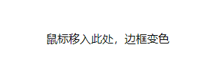
This is what it looks like after mouseover: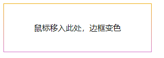
There will also be a frame in the middle that will gradually produce the effect, but I didn't make a gif, so let's just make do with it.