In actual development, we often encounter operations such as adding or querying. We need to add icons to buttons.
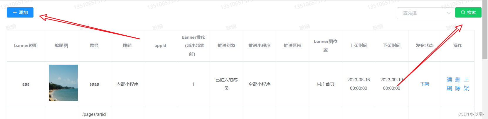
TDesign naturally has such operations.
First, we open the document and see the icons.
For example, if we use some icons first, we can click on the following code, and we
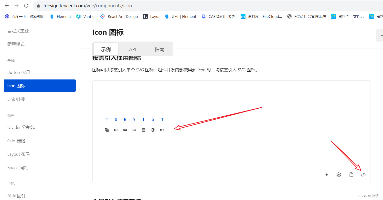
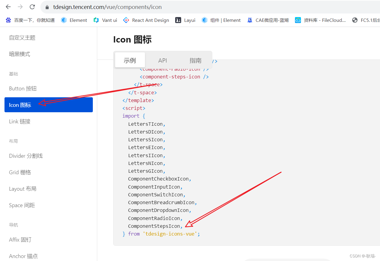
can see that most of our icons are directly imported into its components with tdesign-icons-vue,
and we have designed an icon property for our button, we can set one The function returns the corresponding icon component.
The reference code is as follows
<template>
    <t-button
      class="filter-item"
      theme="danger"
      size="small"
      :icon="renderIcon"
      @click="dom"
    >搜索</t-button>
</template>

<script>
import {

       SearchIcon } from 'tdesign-icons-vue';
export default {


  data() {


    return {


    };
  },
  methods: {


    renderIcon() {


      return <SearchIcon />;
    },
    dom(){


      console.log("数据输出");
    }
  },
};
</script>
The running results are as follows
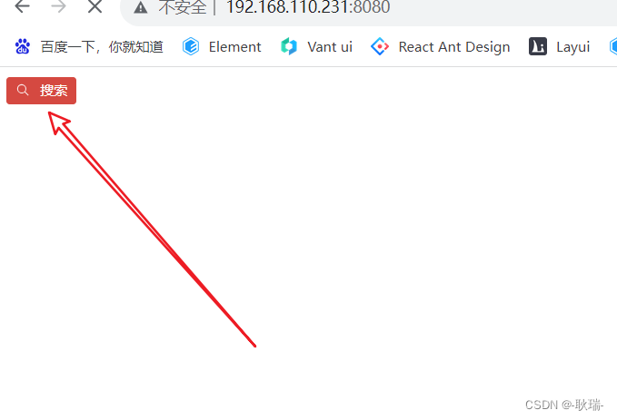
Here we introduced the SearchIcon icon component and then defined a renderIcon function to return the SearchIcon component entity and then bound
the renderIcon function to the icon property of the button to achieve the function