In front-end development, centering layout is an essential skill, whether it is vertical centering, horizontal centering, or both vertical and horizontal centering. Not only is this essential for building responsive web pages, but it also comes in handy when designing popups, creating navigation menus, and designing login screens. Mastering centered layouts will add to your front-end skills and add a professional touch to your projects. In addition, the centered layout is also a high-frequency interview question in the front-end interview. Understanding it and writing it skillfully without looking at the blog will definitely help you make a good impression on the interviewer during the interview, so as to win the interview !
Let's start this exciting journey of centering layout together! Whether you are just getting started or are eager to further improve your front-end skills, this blog will bring you value and inspiration. Let us enter the wonderful world of centered layout together and add more luster to your front-end road!
center horizontally
inline element
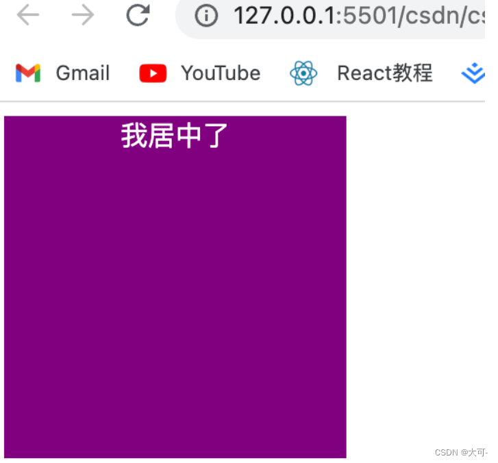
For inline elements, you can use text-alignattributes to achieve horizontal centering. You can achieve horizontal centering of child elements text-alignby setting the property of the parent element containing the inline element to .center
text-align: center;
Suitable
- inline element
line - inline block
inline-block - inline table
inline-table inline-flexelement
<!DOCTYPE html>
<html lang="en">

<head>
    <meta charset="UTF-8">
    <meta name="viewport" content="width=device-width, initial-scale=1.0">
    <title>Document</title>
    <style>
        .block {
            width: 200px;
            height: 200px;
            background-color: purple;
            text-align: center;
        }

        span {
            color: #fff;
        }
    </style>
</head>

<body>
    <div class="block">
        <span>我居中了</span>
    </div>
</body>

</html>
Example:
advantage
- Simple and fast, good compatibility
shortcoming
- Only valid for inline content
- Attributes will inherit and affect descendant inline content
- If the width of the child element is greater than the width of the parent element, it will be invalid, but when the width of the descendant inline content is set to the element width of the text-align attribute, it will also inherit the horizontal centering
block level elements
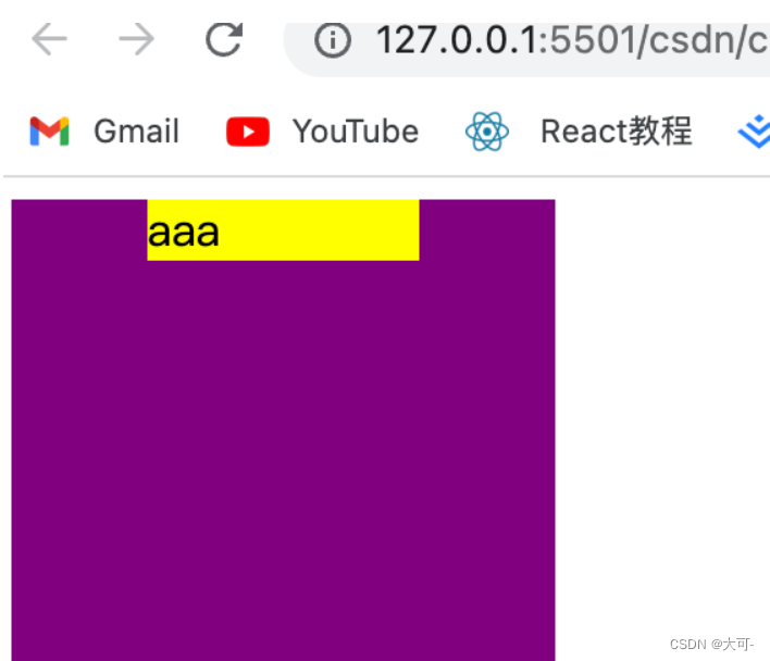
By setting the margin-left and margin-right of a fixed-width block-level element to auto, the block-level element can be centered horizontally. \
<!DOCTYPE html>
<html lang="en">

<head>
    <meta charset="UTF-8">
    <meta name="viewport" content="width=device-width, initial-scale=1.0">
    <title>Document</title>
    <style>
        .block {
            width: 200px;
            height: 200px;
            background-color: purple;
        }

        .yb {
            background-color: yellow;
            width: 100px;
            margin: 0 auto;
        }
    </style>
</head>

<body>
    <div class="block">
        <div class="yb">
            aaa
        </div>
    </div>
</body>

</html>
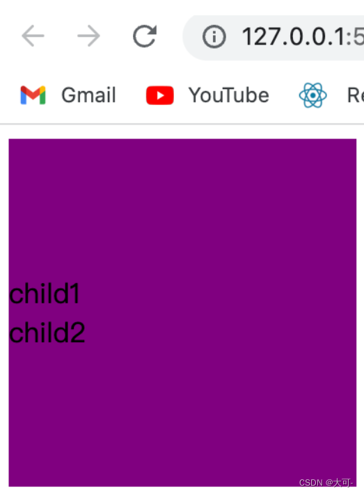
multiple block-level elements
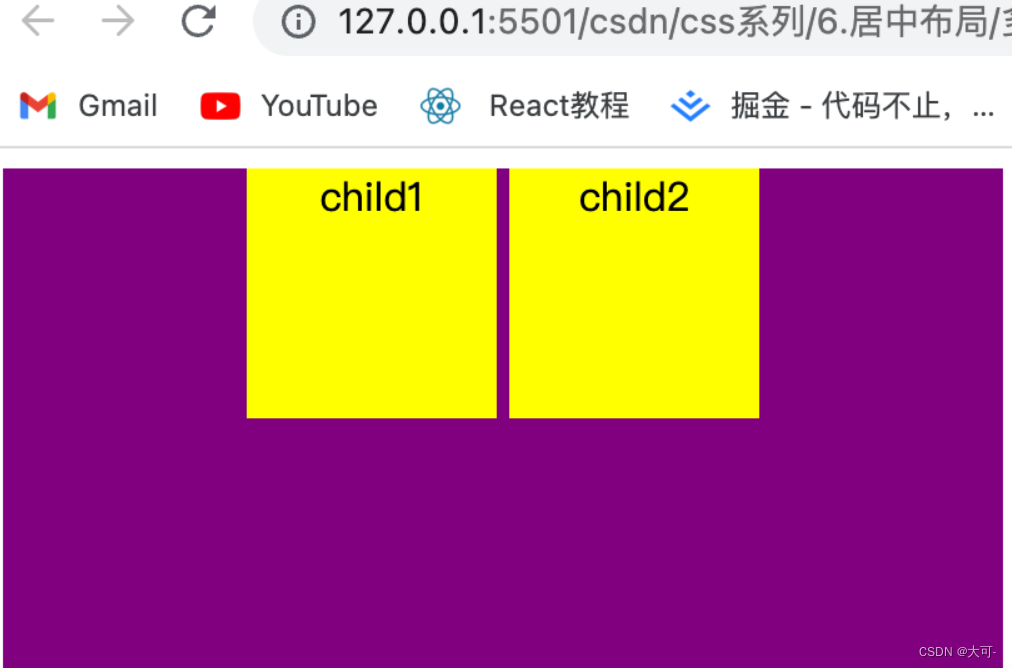
If there are two or more block-level elements in a line, set the display type of the block-level elements to inline-block and the text-align property of the parent container to center the multi-block-level elements horizontally.
<!DOCTYPE html>
<html lang="en">

<head>
    <meta charset="UTF-8">
    <meta name="viewport" content="width=device-width, initial-scale=1.0">
    <title>Document</title>
    <style>
        .dad {
            width: 400px;
            height: 400px;
            background-color: purple;
            text-align: center;
        }

        .child {
            width: 100px;
            height: 100px;
            background-color: yellow;
            display: inline-block;
        }
    </style>
</head>

<body>
    <div class="dad">
        <div class="child">child1</div>
        <div class="child">child2</div>
    </div>
</body>

</html>
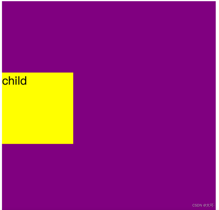
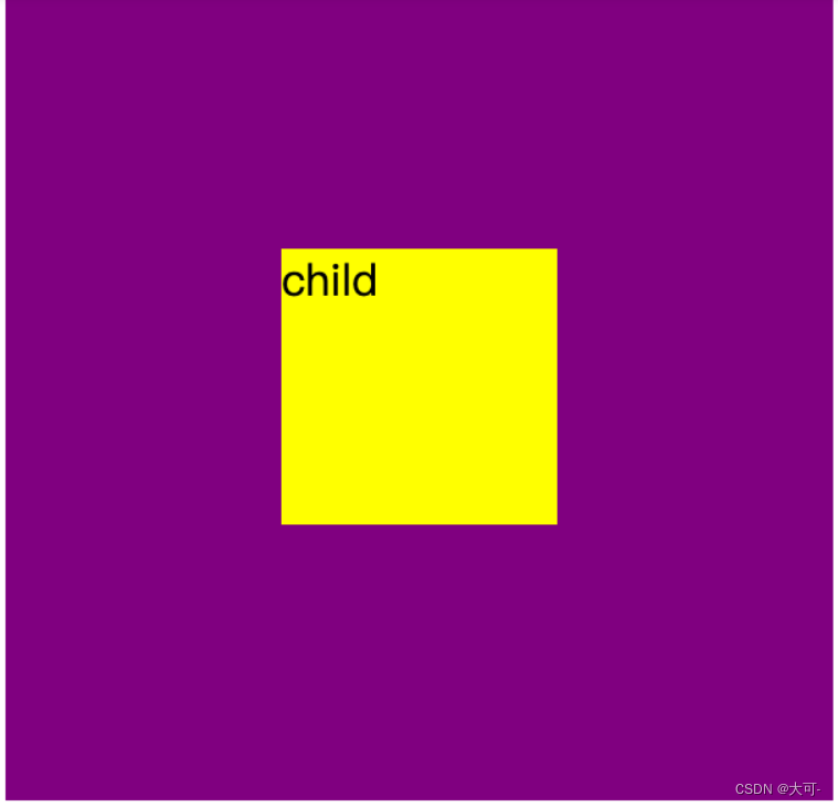
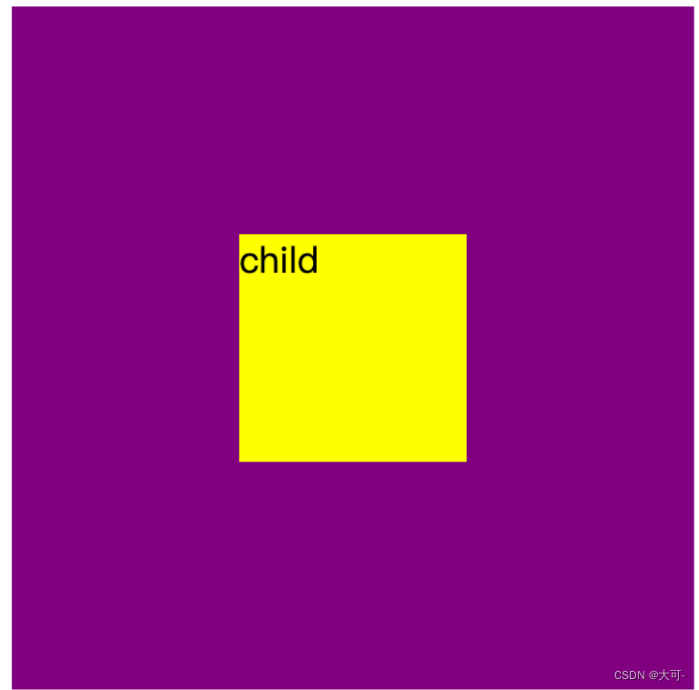
flexible layout
Use elastic layout to achieve horizontal centering, where align-items is used to set the alignment of the elastic box elements in the direction of the main axis.
<!DOCTYPE html>
<html lang="en">

<head>
    <meta charset="UTF-8">
    <meta name="viewport" content="width=device-width, initial-scale=1.0">
    <title>Document</title>
    <style>
        .dad {
            display: flex;
            justify-content: center;
            width: 300px;
            height: 300px;
            background-color: purple;
        }

        .child {
            width: 100px;
            height: 100px;
            background-color: yellow;
        }
    </style>
</head>

<body>
    <div class="dad">
        <div class="child">child</div>
    </div>
</body>

</html>

advantage
Applies to any number of elements
shortcoming
Poor PC compatibility
Fixed Width - Margin Offset
First offset half the width of the parent element to the right relative to the parent element, and then use a negative left margin to correct the offset of the centered element
<!DOCTYPE html>
<html lang="en">

<head>
    <meta charset="UTF-8">
    <meta name="viewport" content="width=device-width, initial-scale=1.0">
    <title>Document</title>
    <style>
        .dad {
            position: relative;
            width: 300px;
            height: 300px;
            background-color: purple;
        }

        .child {
            width: 100px;
            height: 100px;
            background-color: yellow;
            position: absolute;
            left: 50%;
            margin-left: -50px;
        }
    </style>
</head>

<body>
    <div class="dad">
        <div class="child">
            child
        </div>
    </div>
</body>

</html>
advantage
- good compatibility
- Can be implemented regardless of block level or inline elements
shortcoming
- out of document flow
- To use margin-left, you need to know the width value
unknown width - margin offset
<!DOCTYPE html>
<html lang="en">

<head>
    <meta charset="UTF-8">
    <meta name="viewport" content="width=device-width, initial-scale=1.0">
    <title>Document</title>
    <style>
        .dad {
            position: relative;
            width: 300px;
            height: 300px;
            background-color: purple;
        }

        .child {
            background-color: yellow;
            margin-left: 50%;
            transform: translateX(-50%);
        }
    </style>
</head>

<body>
    <div class="dad">
        <div class="child">
            child
        </div>
    </div>
</body>

</html>
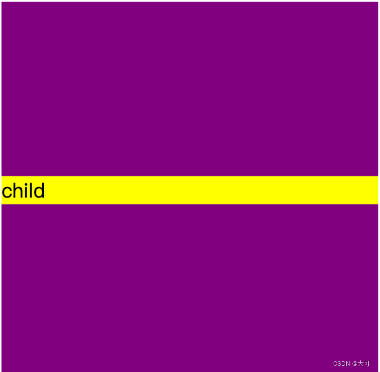
vertical center
inline element
You can use the line height attribute line-height
<!DOCTYPE html>
<html lang="en">

<head>
    <meta charset="UTF-8">
    <meta name="viewport" content="width=device-width, initial-scale=1.0">
    <title>Document</title>
    <style>
        .dad {
            height: 300px;
            width: 300px;
            line-height: 300px;
            background-color: purple;
        }
    </style>
</head>

<body>
    <div class="dad">
        child
    </div>
</body>

</html>
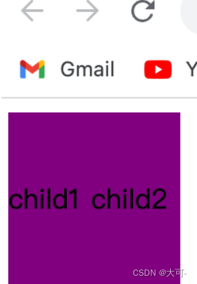
multiline element
table layout
Use the vertical-align: middle of the table layout to achieve vertical centering of child elements.
<!DOCTYPE html>
<html lang="en">

<head>
    <meta charset="UTF-8">
    <meta name="viewport" content="width=device-width, initial-scale=1.0">
    <title>Document</title>
    <style>
        .table-common {
            display: table;
            height: 100px;
            width: 100px;
            background: purple;
        }

        .table-child {
            display: table-cell;
            vertical-align: middle;
        }
    </style>
</head>

<body>
    <div class="table-common table-parent">
        <div class="table-child">child1</div>
        <div class="table-child">child2</div>
    </div>
</body>

</html>
flexible layout
Use elastic layout to achieve vertical centering, where flex-direction: column defines the main axis direction as vertical.
<!DOCTYPE html>
<html lang="en">

<head>
    <meta charset="UTF-8">
    <meta name="viewport" content="width=device-width, initial-scale=1.0">
    <title>Document</title>
    <style>
        .dad {
            width: 200px;
            height: 200px;
            background-color: purple;
            display: flex;
            flex-direction: column;
            justify-content: center;
        }
    </style>
</head>

<body>
    <div class="dad">
        <div>child1</div>
        <div>child2</div>
    </div>
</body>

</html>
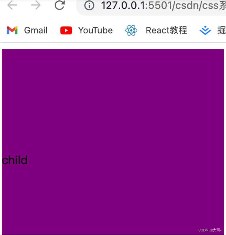
block level element
Fixed Height-Position-Margin-Offset
The vertical centering problem is simple when the height and width of the centered element are known. Vertical centering can be achieved by absolutely positioning the element 50% from the top and setting margin-top to offset half the height of the element upwards.
<!DOCTYPE html>
<html lang="en">

<head>
    <meta charset="UTF-8">
    <meta name="viewport" content="width=device-width, initial-scale=1.0">
    <title>Document</title>
    <style>
        .dad {
            width: 300px;
            height: 300px;
            background-color: purple;
            position: relative;
        }

        .child {
            position: absolute;
            top: 50%;
            margin-top: -50px;
            width: 100px;
            height: 100px;
            background-color: yellow;
        }
    </style>
</head>

<body>
    <div class="dad">
        <div class="child">child</div>
    </div>
</body>

</html>
unknown height-margin offset
It is similar to the effect of block-level elements with scroll bars, except that the offset of the positioning element itself is implemented using transform
<!DOCTYPE html>
<html lang="en">

<head>
    <meta charset="UTF-8">
    <meta name="viewport" content="width=device-width, initial-scale=1.0">
    <title>Document</title>
    <style>
        .dad {
            width: 300px;
            height: 300px;
            background-color: purple;
            overflow: hidden;
        }

        .child {
            background-color: yellow;
            margin-top: 50%;
            transform: translateY(-50%);
        }
    </style>
</head>

<body>
    <div class="dad">
        <div class="child">
            child
        </div>
    </div>
</body>

</html>
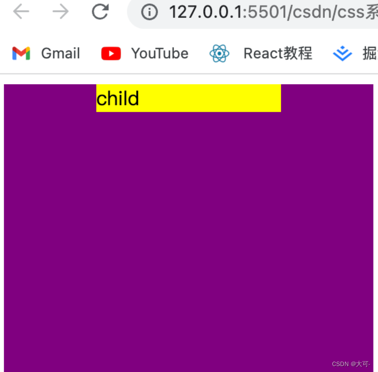
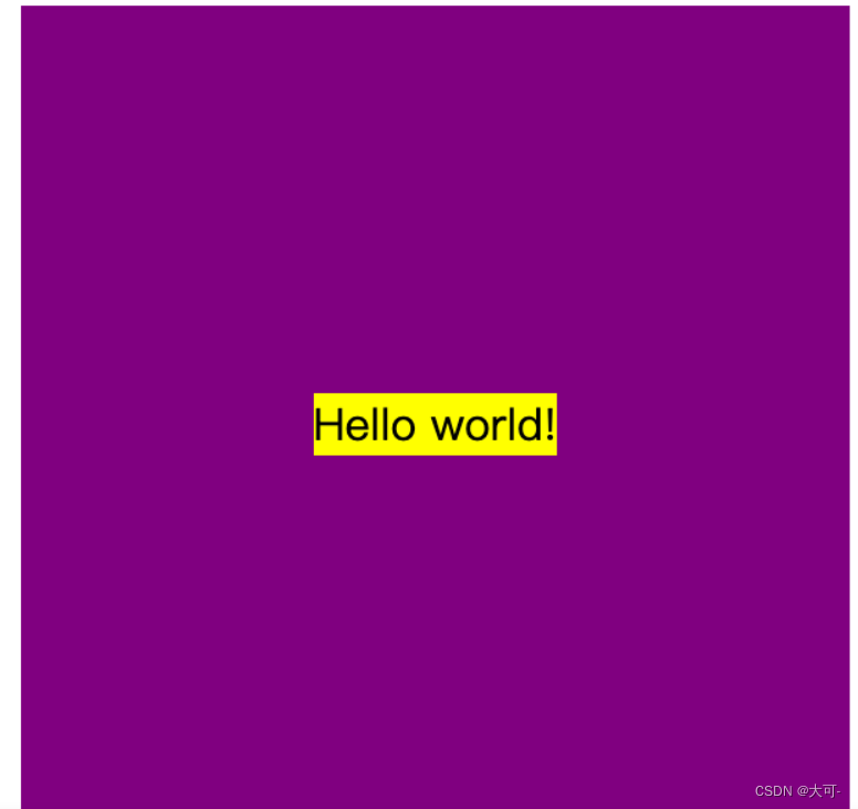
Centered horizontally and vertically
center text vertically
By setting the parent element container text-align to achieve horizontal centering, setting a consistent height (height) and line height (line-height) to achieve vertical centering of child elements, setting vertical centering elements vertical-align and implementing line-height vertical centering of the reference line inside the child element for initial
<!DOCTYPE html>
<html lang="en">

<head>
    <meta charset="UTF-8">
    <meta name="viewport" content="width=device-width, initial-scale=1.0">
    <title>Document</title>
    <style>
        .dad {
            width: 300px;
            height: 300px;
            background-color: purple;
            text-align: center;
            line-height: 300px;
        }

        .child {
            display: inline-block;
            vertical-align: middle;
            line-height: initial;
            background-color: yellow;
        }
    </style>
</head>

<body>
    <div class="dad">
        <div class="child">Hello world!</div>
    </div>
</body>

</html>
Fixed width and height elements
Use absolute positioning to position right and down to 50% of the width and height of the parent element, and then use margin to shift up and left by 50% of itself
<!DOCTYPE html>
<html lang="en">

<head>
    <meta charset="UTF-8">
    <meta name="viewport" content="width=device-width, initial-scale=1.0">
    <title>Document</title>
    <style>
        .dad {
            width: 300px;
            height: 300px;
            background-color: purple;
            position: relative;
        }

        .child {
            width: 100px;
            height: 100px;
            background-color: yellow;
            position: absolute;
            left: 50%;
            top: 50%;
            margin-left: -50px;
            margin-top: -50px;
        }
    </style>
</head>

<body>
    <div class="dad">
        <div class="child">
            child
        </div>
    </div>
</body>

</html>
Unknown width and height elements
Use marginto offset itself to the right and down by 50%, use transform + translate to offset the vertically centered element itself by negative 50%
<!DOCTYPE html>
<html lang="en">

<head>
    <meta charset="UTF-8">
    <meta name="viewport" content="width=device-width, initial-scale=1.0">
    <title>Document</title>
    <style>
        .dad {
            width: 300px;
            height: 300px;
            background-color: purple;
            overflow: hidden;
        }

        .child {
            width: 100px;
            height: 100px;
            background-color: yellow;
            margin-top: 50%;
            margin-left: 50%;
            transform: translate(-50%, -50%);
        }
    </style>
</head>

<body>
    <div class="dad">
        <div class="child">
            child
        </div>
    </div>
</body>

</html>
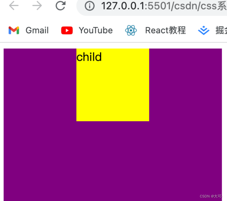
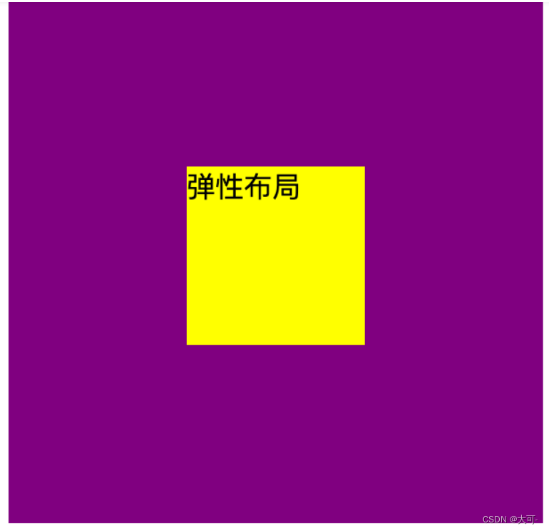
flexible layout
The parent element is set to the flexible layout container, and the sum justify-content is align-items set to center
<!DOCTYPE html>
<html lang="en">

<head>
    <meta charset="UTF-8">
    <meta name="viewport" content="width=device-width, initial-scale=1.0">
    <title>Document</title>
    <style>
        .dad {
            width: 300px;
            height: 300px;
            background-color: purple;
            display: flex;
            align-items: center;
            justify-content: center;
        }

        .child {
            width: 100px;
            height: 100px;
            background-color: yellow;
        }
    </style>
</head>

<body>
    <div class="dad">
        <div class="child">
            弹性布局
        </div>
    </div>
</body>

</html>
Summarize
This blog introduces in detail a variety of implementations of centering layouts, covering scenarios of horizontal centering, vertical centering, and horizontal centering and vertical centering, and provides practical sample codes. Whether you are a front-end novice or an experienced developer, mastering these centered layout skills will benefit you in front-end development. I hope that through this blog, you can better understand and use the centered layout, improve your front-end skills, and build more beautiful and professional web pages.