WeChat applet component - view container
Article directory
The WeChat Mini Program consists of six major components: view container , basic content , navigation , form , interaction and navigation . These components can be laid out and styled through WXML and WXSS, so as to build a rich applet interface and interactive experience.
- Among them, the view container components include view and scroll-view, etc., which are used to realize the structure and scrolling effect of the page;
- The basic content components include text and image, etc., which are used to display text and image content;
- Form components include button, input and checkbox, etc., for user input and selection;
- Interactive components include contact and action-sheet, etc., which are used to realize the interaction and operation between users.
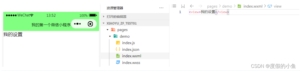
View container, equivalent to div in html.
WeChat Mini Program Official Documentation - Components

view container
WeChat applet view container components include view and scroll-view, etc., which are used to realize the structure and scrolling effect of the page.
- Attributes
| name | Function |
|---|---|
| cover-image | An image view overlaid on top of a native component |
| cover-view | A text view overlaid on top of a native component |
| grid-view | Grid layout container under Skyline |
| list-view | List layout container, only supported as scroll-viewa direct child node in custom mode or sticky-section component direct child node |
| match-media | Media query matching detection node |
| movable-area | Movable area of movable-view |
| movable-view | Movable view container, which can be dragged and slid on the page |
| page-container | page container |
| root-portal | Make the entire subtree out of the page, similar to the effect of using fixed position in CSS |
| scroll-view | scrollable view area |
| share-element | shared elements |
| sticky-header | Ceiling layout container, only supported as scroll-viewa direct child node in custom mode or sticky-section component direct child node |
| sticky-section | Ceiling layout container, only supported as scroll-viewa direct child node in custom mode |
| swipe | slider view container |
| swiper item | It can only be placed in the swiper component, and the width and height are automatically set to 100% |
| view | view container |
view view container
property description
| Attributes | type | Defaults | required | illustrate | minimum version |
|---|---|---|---|---|---|
| hover-class | string | none | no | Specifies the pressed style class. At the hover-class="none"time , there is no click state effect |
1.0.0 |
| hover-stop-propagation | boolean | false | no | Specify whether to prevent the ancestor nodes of this node from appearing in the click state | 1.5.0 |
| hover-start-time | number | 50 | no | How long does the click state appear after pressing and holding, in milliseconds | 1.0.0 |
| hover-stay-time | number | 400 | no | Click state retention time after the finger is released, in milliseconds | 1.0.0 |
Bug & Tip
tip: If you need to use scroll view, please use scroll-view
case code
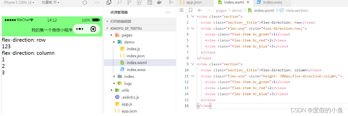
We replace the newly created page in the previous chapter with the sample code
<view class="section">
  <view class="section__title">flex-direction: row</view>
  <view class="flex-wrp" style="flex-direction:row;">
    <view class="flex-item bc_green">1</view>
    <view class="flex-item bc_red">2</view>
    <view class="flex-item bc_blue">3</view>
  </view>
</view>
<view class="section">
  <view class="section__title">flex-direction: column</view>
  <view class="flex-wrp" style="height: 300px;flex-direction:column;">
    <view class="flex-item bc_green">1</view>
    <view class="flex-item bc_red">2</view>
    <view class="flex-item bc_blue">3</view>
  </view>
</view>
The official website does not explain the style code, we paste the following code into the .wxsscorresponding
- style
/* pages/demo/index.wxss */
.page-section{


margin-bottom: 20rpx;
}
.flex-wrp {

    display: flex;}
.bc_green {

    background: green;width:100px; height: 100px;}
.bc_red {

    background: red;width:100px; height: 100px;}
.bc_blue {

    background: blue;width:100px; height: 100px;}
- renderings

swiper slider view container
Functional description
Slider view container. Only the swiper-item component can be placed in it, otherwise it will cause undefined behavior.
property description
Skyline only lists differences from WebView properties, properties not listed are consistent with WebView.
| Attributes | type | Defaults | required | illustrate | minimum version | |
|---|---|---|---|---|---|---|
| indicator-dots | boolean | false | no | Whether to display panel indicator points | 1.0.0 | |
| indicator-color | color | rgba(0, 0, 0, .3) | no | cue point color | 1.1.0 | |
| indicator-active-color | color | #000000 | no | The currently selected cue point color | 1.1.0 | |
| autoplay | boolean | false | no | Whether to switch automatically | 1.0.0 | |
| current | number | 0 | no | The index of the current slider | 1.0.0 | |
| interval | number | 5000 | no | Automatic switching time interval | 1.0.0 | |
| duration | number | 500 | no | Swipe animation duration | 1.0.0 | |
| circular | boolean | false | no | Whether to use joint sliding | 1.0.0 | |
| vertical | boolean | false | no | Whether the sliding direction is vertical | 1.0.0 | |
| previous-margin | string | "0px" | no | Front margin, can be used to expose a small part of the previous item, accepts px and rpx values | 1.9.0 | |
| next-margin | string | "0px" | no | Back margin, can be used to expose a small part of the back item, accepts px and rpx values | 1.9.0 | |
| snap-to-edge | boolean | false | no | When the number of swiper-item is greater than or equal to 2, when circular is turned off and previous-margin or next-margin is turned on, you can specify whether this margin is applied to the first and last element | 2.12.1 | |
| display-multiple-items | number | 1 | no | Number of sliders displayed simultaneously | 1.9.0 | |
| easing-function | string | “default” | no | Specify swiper to switch easing animation type | 2.6.5 | |
| Legal value description default default easing function linear linear animation easeInCubic ease-in animation easeOutCubic ease-out animation easeInOutCubic ease-in and ease-out animation | ||||||
| bindchange | eventhandle | no | The change event will be triggered when the current changes, event.detail = {current, source} | 1.0.0 | ||
| bindtransition | eventhandle | no | The transition event will be triggered when the position of the swiper-item changes, event.detail = {dx: dx, dy: dy} | 2.4.3 | ||
| bindanimationfinish | eventhandle | no | The animationfinish event will be triggered when the animation ends, and event.detail is the same as above | 1.9.0 |
changeevent sourcereturn value
Starting from 1.4.0 , an changeevent sourcefield is added to indicate the cause of the change. The possible values are as follows:
autoplayAutoplay causes swiper to change;touchThe user swipes to cause the swiper to change;- Other reasons will be represented by an empty string.
Bug & Tip
tip: If you change the valuebindchangein the event callback function of , it may cause to be called continuously, so usually please check the field before changing the value to determine whether it is caused by user touch.setDatacurrentsetDatacurrentsourcetip: On the mac applet, if theenablePassiveEventconfiguration item is enabled on the page where the current component is located or globally, the built-in component may have unexpected behavior (for details, refer to the enablePassiveEvent document )
case code
wxml
<swiper indicator-dots="true" autoplay="true" interval="3000" duration="500">
  <swiper-item>
    <image src="../image/202306001.png" width="375" height="170" />
  </swiper-item>
  <swiper-item>
    <image src="../image/202306002.png" width="375" height="170" />
  </swiper-item>
</swiper>
- renderings

indicator-color
indicator-colorSet an indicator point color according to the attribute
<swiper indicator-dots="true" autoplay="true" indicator-color="#80ff80" interval="3000" duration="500">
  <swiper-item>
    <image src="../image/202306001.png" width="375" height="170" />
  </swiper-item>
  <swiper-item>
    <image src="../image/202306002.png" width="375" height="170" />
  </swiper-item>
</swiper>
- renderings

Next Chapter Common Components of WeChat Mini Programs - Basic Components