Matlab draws histogram + fitting curve
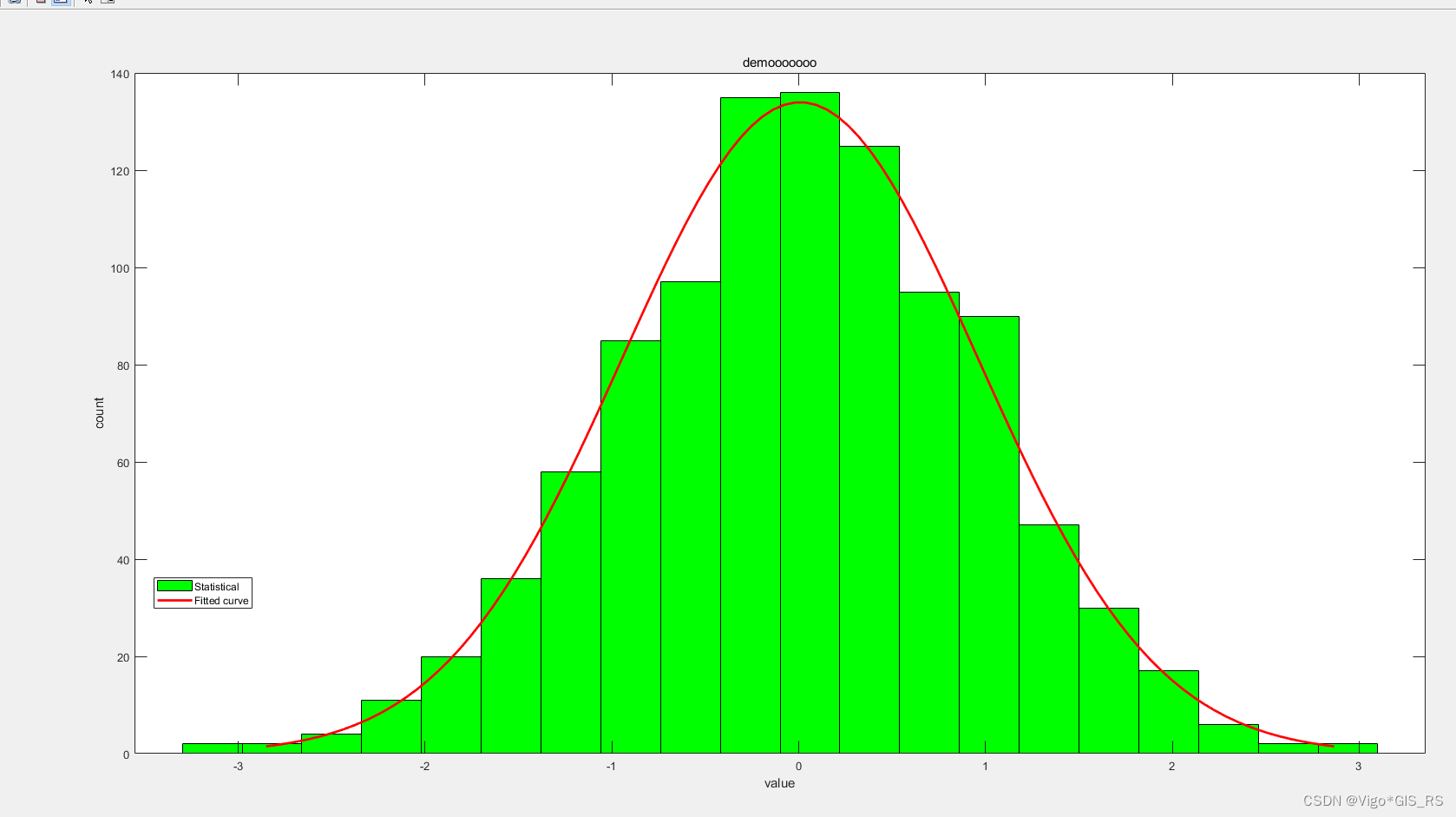
Picture effect
1 Data format
An array should be prepared double. If it is csv or xlsx directly dragged into matlab, it is a table type, which cannot be used as a drawing parameter.
If it is a table type, it can be table2array(data)converted using
2 Drawing steps
This article does not use scripts, only uses the command line , and only one function is needed to draw a simple histogram with a fitting curve histfit, which is also the combined abbreviation of histogram and fitting.
- To load your data, first drag the data in, no matter what method you use, and drag it into the workspace on the right.
For example, I have a data exported by Excel called demo, then I willdemo= table2array(demo)get the double demo and work at this time The demo of double will be displayed in the area. - drawing
% 简单出图
histogram(demo)

% 修改直方图柱子数量,想写多少写多少
histogram(demo,20)

% 改变柱子颜色,这个语法和histogram不同!!!
h(1).FaceColor = "g";

% 简化代码,令h代表histogram
h = histogram(demo,20)

% 为了出图好看,限制x轴的区间范围
xlim([-5, 5])

% 改变滤波算法为'kernel'
h = histogram(demo,20,'kernel')

% 添加xy轴的标题,大标题
xlabel('value')
ylabel('count')
title('demooooooo')

% 添加图例,这个需要自己调整图例的指向顺序
legend({

    'Statistical','Fitted curve'},'Location','southwest')
3 postscript
Most of the syntax of histfit and histogram is the same, but there are some differences in the color of the bar
References:
https://ww2.mathworks.cn/help/stats/histfit.html
https://ww2.mathworks.cn/help/matlab/ref/matlab.graphics.chart.primitive.histogram.html?s_tid= doc_ta#d124e606591
The pictures made in matlab can be exported as eps in the later stage and then refined in AI, so it is enough to make a rough picture in matlab
Thanks to roommate Xianqiang for his help! ! Thanks to roommate Xianqiang for his help! !Thanks to roommate Xianqiang for his help! !
thanks for reading