Table of contents
1. The reference methods of components are divided into: local reference and global reference
Second, the difference between components and pages:
Fourth, the difference between data and properties:
Five, custom components - data listener
1. The reference methods of components are divided into: local reference and global reference
Local reference: the component can only be used in the currently referenced page
Global reference: components can be used in every applet page
Local references:

Second, the difference between components and pages:
- From the surface, components and pages are composed of four files: .js.json.wxml.wxss, but there are obvious differences
- The component's .json file needs to declare "component": true,
- The Component() function is called in the .js file of the component
- The event handler function of the component needs to be defined in the methods node, the method list of the component
3. Component style isolation
By default, the style of a custom component only takes effect for the current component and will not affect the UI structure outside the component
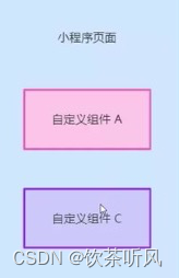
- Component A's style won't affect component C's style
- The style of component A will not affect the style of the applet page
- The style of the applet page will not affect the styles of components A and C
benefit:
- Prevent external styles from affecting the styles inside the component
- Prevent component styles from breaking external styles
Notes on component style isolation:
Global styles in app.wxss have no effect on components
Only class selectors will have the effect of style isolation , and id selectors, attribute selectors, and label selectors will not be affected by style isolation
Suggestion: use class selectors in components and pages referencing components, do not use id selectors, attribute selectors, label selectors
Style isolation settings:
options: {
styleIsolation: "isolated" //Modify the style isolation option of the component
},
- isolated means that style isolation is enabled, and the styles specified by class will not affect each other inside and outside the custom component
- apply-shared means that the page wxss style will affect the custom component, but the custom component wxss style will not affect the page
- shared means that the page wxss style will affect the custom component, and the custom component wxss style will also affect the page and other settings apply-shared
Fourth, the difference between data and properties:
- The usage of data and properties data is the same, both are readable and writable
- data is more inclined to store private data of components
- Properties are more inclined to store data passed to components from the outside world
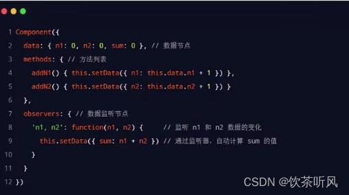
// components/test4/test4.js
Component({
  observers: {
    'n1,n2': function(n1, n2) {
      this.setData({
        sum: n1 + n2
      });
    }
  },
  options: {
    styleIsolation: "isolated" //修改组件的样式隔离选项
  },
  /**
   * 组件的属性列表(properties是组件的对外属性,用来接受外界传递到组件中的数据)
   */
  properties: {
    max: { //完整定义属性的方式【当需要指定默认值时,建议使用此方式】
      type: Number, //属性值的数据类型
      value: 10 //属性默认值
    },
    min: Number //简化定义属性的方式【不需要指定属性默认值时,可以使用简化方式】
  },

  /**
   * 组件的初始数据【组件的私有数据】
   */
  data: {
    count: 0,
    n1: 0,
    n2: 0,
    sum: 0,
  },

  /**
   * 组件的方法列表
   */
  methods: {
    addN1() {
      this.setData({
        n1: this.data.n1 + 1
      });
    },
    addN2() {
      this.setData({
        n2: this.data.n2 + 1
      });
    },
    addCount() {
      this.setData({
        count: this.data.count + 1
      });
      this._showCount();
    },
    _showCount() {
      wx.showToast({
        title: 'count值为:'+this.data.count,
      });
    }
  }
})
Five, custom components - data listener
Data listeners are used to monitor and respond to changes in any attributes and data fields, thereby performing specific operations.
5.1, the basic syntax of the data listener:

5.2, the basic usage of the data listener:
5.3, monitor changes in object properties
Data listener supports monitoring changes of single or multiple properties in an object

5.4, monitor the change of the specified attribute in the object
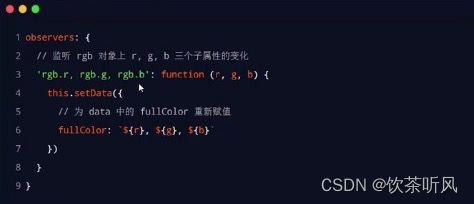
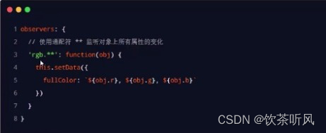
5.5, monitor the changes of all properties in the object
If there are too many properties that need to be monitored in an object, for convenience, you can use the wildcard ** to monitor the changes of all properties in the object
6. Pure data fields
6.1 Concept: Pure data fields refer to those date fields that are not used for interface rendering
Application scenario: In some cases, the fields in some data will neither be displayed on the interface nor passed to other components.
Used internally by the former component. A data field with this feature is suitable to be set as a pure data field.
Benefit: Pure data fields help improve page update performance
6.2. Rules of use
Specify pureDataPattern as a regular expression in the options node of the Component constructor , and fields whose field names match this regular expression will become pure data fields

Seven, component life cycle
7.1. All lifecycle functions available to components

In the applet component, there are three most important life cycle functions, namely created, attached, and detached:
//生命周期函数
  lifetimes: {
    //在组件实例刚被创建时执行,此时还不能调用setData,通常在此时给组件this添加一些自定义的属性字段
    created() {
      console.log('created');
    },
    //在组件完全初始化完毕,进入页面节点树时执行,此时this.data已经初始化完毕,这个生命周期很有用,绝大多数初始化工作可以在此时进行
    attached() {
      console.log('attached');
    },
    //在组件实例被移除节点树时执行,适合做一些清理性质的工作
    detached() {
      console.log('detached');
    }
  },
7.2. The life cycle of the page where the component is located
Sometimes the behavior of custom components depends on changes in the state of the page. In this case, the life cycle of the page where the component is located needs to be used.
For example: whenever the page's show lifecycle function is triggered, we want to be able to regenerate a random RGB color.
// 组件所在页面的生命周期函数
  pageLifetimes: {
    // 页面被展示
    show() {
      this._randomColor();
      console.log('show');
    },
    // 页面被隐藏
    hide() {
      console.log('hide');
    },
    // 页面尺寸变化
    resize() {
      console.log('resize');
    }
  }
8. Slot
In the wxml structure of the custom component, a <slot> node (slot) can be provided to carry the wxml structure provided by the component user
8.1. Single slot
In the applet, by default, only one <slot> is allowed to be used in each custom component. This limit on the number is called a single slot
<!--components/test2/test2.wxml-->
<!-- 组件的封装者 -->
<view class="wrapper">
<view>这里是组件的内部节点</view>
<!-- 对于不确定的内容,可以使用<slot> 进行占位,具体的内容由组件的使用者决定-->
<slot></slot>
</view>
<!--组件的使用者需要再json文件中-->
{
"usingComponents": {
"Test2":"../../components/test2/test2"
},
}<Test2>
<view>这是插入到组件slot中的内容</view>
</Test2>The final display result:

8.2. Multiple slots
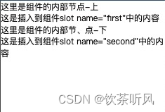
<!--components/test2/test2.wxml-->
<view>
  <view>
    这里是组件的内部节点-上
  </view>
  <!-- 对于不确定的内容,可以使用<slot>进行占位,具体的内容由组件的使用者决定 -->
    <slot name="first"></slot>
    <view>
      这里是组件的内部节、点-下
    </view>
    <slot name="second"></slot>
</view>
<Test2>
<view slot="first">这是插入到组件slot name="first"中的内容</view>
<view slot="second">这是插入到组件slot name="second"中的内容</view>
</Test2>The final display effect: