Article directory
written in front
In fact, the 3D card stacking switching effect is a kind of carousel effect that I have always liked since I entered the front-end pit. I have also sorted it out before, but there are always other trivial things that are delayed. I will organize it for you on Thursday based on jquery How to achieve 3D card switching effect. This article mainly talks about the implementation process, hoping to inspire you.
Knowledge points involved
How Jquery realizes card stacking carousel switching, how to realize 3D graphics and text card stacking carousel effect, js realizes 3D card stacking switching effect, 3D card stacking carousel demo.
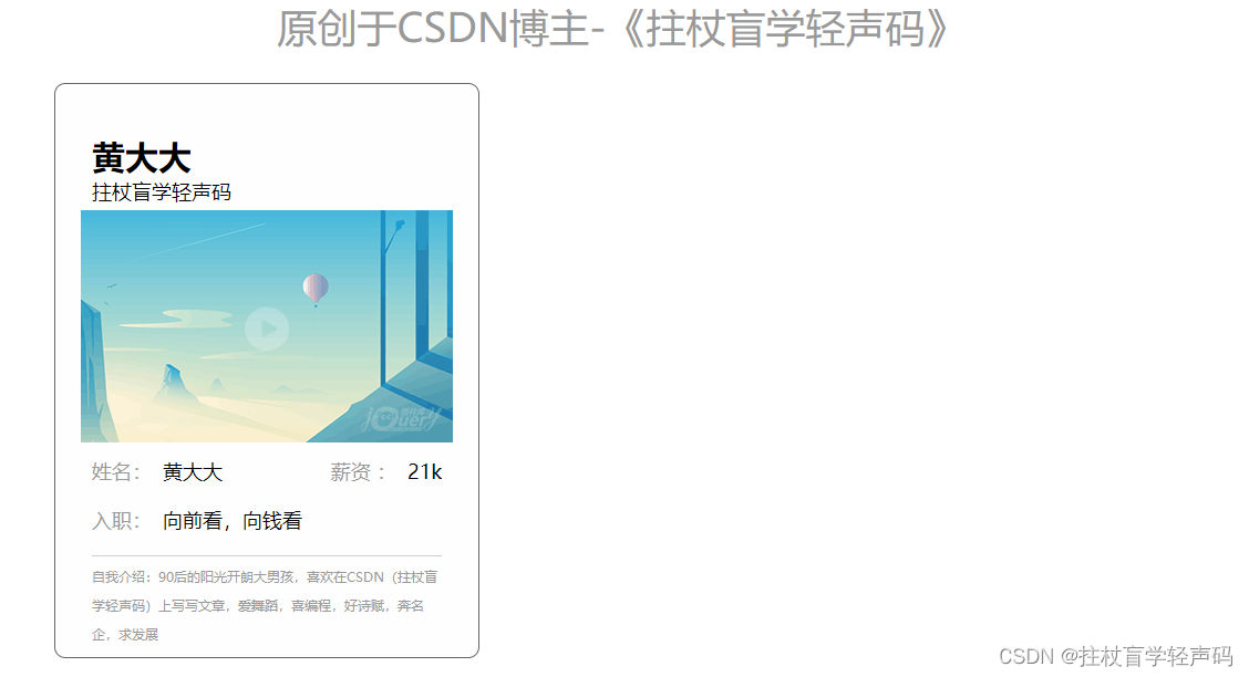
版权声明:此文原创于CSDN博主-《拄杖盲学轻声码》,主页有很多分享的代码,期待您的访问。
achieve effect
This is mainly to give you a feedback on the final implementation effect, and the sharing link of the complete code package is attached at the end of the article.

1. Build the page
1.1 Create ul li node
First of all, I create a node. I use the floating layout method, mainly by setting the style and html, and the effect is as follows:

1.2 Rich elements
From step A, we have created a container, and the next step is to put things in it. The first thing I think of is the title part, picture part, personal basic information and introduction part.
Html code as shown
<div class="lb_gl">
        <div class="container">
            <h1 class="turn_3d">原创于CSDN博主-《拄杖盲学轻声码》</h1>
            <div class="pictureSlider poster-main">
                <!-- <div class="poster-btn poster-prev-btn"></div> -->
                <ul id="hdpturn" class="poster-list">
                    <li class="poster-item hdpturn-item">
                        <p class="xxgy">黄大大</p>
                        <p class="say">拄杖盲学轻声码</p>
                        <div class="for_btn">
                            <img src="img/a0.png" width="100%">
                            <a href="#" class="in_page"><img src="images/iconin.png"></a>
                        </div>
                        <div class="students_star">
                            <p class="cell_list"><span class="lf">姓名:<span class="darks">黄大大</span></span> <span
                                    class="rt">薪资 :<span class="darks">21k</span></span>
                            </p>
                            <p class="cell_list"><span>入职:<span class="darks">向前看,向钱看</span></span>
                            </p>
                            <div class="zwjs">
                                自我介绍:90后的阳光开朗大男孩,喜欢在CSDN(拄杖盲学轻声码)上写写文章,爱舞蹈,喜编程,好诗赋,奔名企,求发展
                            </div>
                        </div>
                    </li>
                </ul>
            </div>
        </div>

    </div>
CSS code shown
/*轮播*/
// 原创于CSDN博主-《拄杖盲学轻声码》
.lb_gl {


    margin-bottom: 30px;
    background: url(../images/bg_3d.png);
    background-size: 100% 100%;
    height: 725px;
}

.container {


    width: 1024px;
    margin: 0 auto;
    position: relative;
}

.pictureSlider {


    height: 518px;
    margin-bottom: 24px;
}

.poster-item {


    background: #fefefe;
    height: 453px;
    width: 336px;
    border-radius: 10px;
    border: 1px solid #666;
    padding: 45px 23px 20px 23px;
    transition: all 0.5s;
    cursor: default;
    -moz-transition: all 0.5s;
    cursor: default;
    -webkit-transition: all 0.5s;
    cursor: default;
    -o-transition: all 0.5s;
    cursor: default;
}

.turn_3d {


    text-align: center;
    color: #999;
    font-weight: 400;
    font-size: 36px;
    padding: 28px 0;
}

.xxgy {


    font-size: 30px;
    font-weight: 900;
    padding-left: 10px;
}

.poster-item .say {


    font-size: 18px;
    margin-bottom: 5px;
    padding-left: 10px;
}

.students_star {


    padding: 10px 10px 0 10px;
}

.cell_list {


    margin-bottom: 20px;
    color: #999;
    font-size: 18px;
    overflow: hidden;
}

.darks {


    color: #000;
    padding-left: 10px;
}

.zwjs {


    border-top: 1px solid #d0cddb;
    line-height: 26px;
    padding-top: 5px;
    color: #999;
    font-size: 12px;
    max-height: 84px;
    overflow: hidden;
}

.for_btn {


    position: relative;
    height: 214px;
    overflow: hidden
}

.in_page {


    position: absolute;
    left: 50%;
    top: 50%;
    width: 40px;
    height: 40px;
    margin-left: -20px;
    margin-top: -20px;
}

.in_page>img {


    width: 40px;
    height: 40px;
}

.check_more {


    width: 180px;
    height: 50px;
    line-height: 50px;
    text-align: center;
    color: #fff;
    background: #bc241d;
    margin: 0 auto;
    display: block;
}
page realization effect
2. JS implements stack switching
Because there are multiple patches, if you write according to normal people, it is probably copy and paste, and then form a stacked state, but the blogger is not a normal person, so I want to simulate the data returned by the background (use fake data), and then use the traversal method To assign values to achieve the effect of stacking multiple cards, so the implementation code is as follows:
var aa;
        $(function () {


            //动态加载元素
            var _keyData = [{


                name: "黄大大",
                money: "21k",
                tiptxt: "拄杖盲学轻声码",
                ming: "向前看,向钱看",
                textar: "自我介绍:90后的阳光开朗大男孩,喜欢在CSDN(拄杖盲学轻声码)上写写文章,爱舞蹈,喜编程,好诗赋,奔名企,求发展"
            }, {


                name: "黄小小",
                money: "22k",
                tiptxt: "何惧风飞沙",
                ming: "向前看,向钱看",
                textar: "自我介绍:90后的阳光开朗大男孩,喜欢在CSDN(拄杖盲学轻声码)上写写文章,爱舞蹈,喜编程,好诗赋,奔名企,求发展"
            }, {


                name: "黄大中",
                money: "23k",
                tiptxt: "天地无涯",
                ming: "向前看,向钱看",
                textar: "自我介绍:90后的阳光开朗大男孩,喜欢在CSDN(拄杖盲学轻声码)上写写文章,爱舞蹈,喜编程,好诗赋,奔名企,求发展"
            }, {


                name: "黄大小",
                money: "21.5k",
                tiptxt: "谁怕,一蓑烟雨任平生",
                ming: "向前看,向钱看",
                textar: "自我介绍:90后的阳光开朗大男孩,喜欢在CSDN(拄杖盲学轻声码)上写写文章,爱舞蹈,喜编程,好诗赋,奔名企,求发展"
            }, {


                name: "黄小小",
                money: "21.5k",
                tiptxt: "拄杖盲学轻声码",
                ming: "向前看,向钱看",
                textar: "自我介绍:90后的阳光开朗大男孩,喜欢在CSDN(拄杖盲学轻声码)上写写文章,爱舞蹈,喜编程,好诗赋,奔名企,求发展"
            }, {


                name: "黄中小",
                money: "21.5k",
                tiptxt: "一生有爱",
                ming: "向前看,向钱看",
                textar: "自我介绍:90后的阳光开朗大男孩,喜欢在CSDN(拄杖盲学轻声码)上写写文章,爱舞蹈,喜编程,好诗赋,奔名企,求发展"
            }, {


                name: "黄中中",
                money: "21.5k",
                ming: "向前看,向钱看",
                tiptxt: "拄杖盲学轻声码",
                textar: "自我介绍:90后的阳光开朗大男孩,喜欢在CSDN(拄杖盲学轻声码)上写写文章,爱舞蹈,喜编程,好诗赋,奔名企,求发展"
            }];
            var kstr = "";
            for (var k = 0; k < _keyData.length; k++) {


                kstr += `<li class="poster-item hdpturn-item">
                        <p class="xxgy">`+ _keyData[k].name + `</p>
                        <p class="say">`+ _keyData[k].tiptxt + `</p>
                        <div class="for_btn">
                            <img src="img/a`+ k + `.png" width="100%">
                            <a href="#" class="in_page"><img src="images/iconin.png" /></a>
                        </div>
                        <div class="students_star">
                            <p class="cell_list"><span class="lf">姓名:<span class="darks">`+ _keyData[k].name + `</span></span> <span
                                    class="rt">薪资 :<span class="darks">`+ _keyData[k].money + `</span></span>
                            </p>
                            <p class="cell_list"><span>入职:<span class="darks">`+ _keyData[k].ming + `</span></span>
                            </p>
                            <div class="zwjs">
                                `+ _keyData[k].textar + `
                            </div>
                        </div>
                    </li>`;
            }
            $("#hdpturn").html("").html(kstr);
            aa = new hdpturn({


                id: "hdpturn",
                opacity: 0.9,
                width: 382,
                Awidth: 1024,
                scale: 0.9
            })
        })
It is not difficult to find that there is also a hdpturn function in it. Of course, this is packaged by myself. I need to introduce hdpturn.js. The specific packaging code is as follows (the complete code package is at the end of the article):
(function (win, doc, undefined) {


    var hdpturn = function (turn) {


        this.turn = turn
        this.hdpturn = $("#" + turn.id)
        this.X = 0
        this.hdpturnitem = this.hdpturn.children(".hdpturn-item")
        this.num_li = this.hdpturnitem.length//轮播元素个数 hdpturnPy为每个的偏移量
        this.hdpturnPy = turn.Awidth / (this.num_li - 1)
        this.init()
        this.turn_()
        return this
    }
    hdpturn.prototype = {


        constructor: hdpturn,
        init: function () {


            var _self = this;
            this.hdpturn.children(".hdpturn-item").each(function (index, element) {


                //index是第几个元素 X是选取的中间数 num_li是总数
                var rt = 1//1:右侧:-1:左侧
                if ((index - _self.X) > _self.num_li / 2 || (index - _self.X) < 0 && (index - _self.X) > (-_self.num_li / 2)) {

     rt = -1 }//判断元素左侧还是右侧
                var i = Math.abs(index - _self.X);//取绝对值
                if (i > _self.num_li / 2) {

     i = parseInt(_self.X) + parseInt(_self.num_li) - index; }//i:是左或者右的第几个
                if ((index - _self.X) < (-_self.num_li / 2)) {

     i = _self.num_li + index - _self.X }
                $(this).css({


                    'position': 'absolute',
                    'left': '50%',
                    'margin-left': -_self.turn.width / 2 + _self.hdpturnPy * rt * i + "px",
                    'z-index': _self.num_li - i,
                    'opacity': Math.pow(_self.turn.opacity, i),
                    'transform': 'scale(' + Math.pow(_self.turn.scale, i) + ')',
                    '-webkit-transform': 'scale(' + Math.pow(_self.turn.scale, i) + ')',
                    '-webkit-transform': 'scale(' + Math.pow(_self.turn.scale, i) + ')',
                    '-moz-transform': 'scale(' + Math.pow(_self.turn.scale, i) + ')',
                    '-ms-transform': 'scale(' + Math.pow(_self.turn.scale, i) + ')',
                    '-o-transform': 'scale(' + Math.pow(_self.turn.scale, i) + ')'
                })
                $(this).attr("data_n", index)
            })
        },
        turn_: function () {


            var _self = this
            this.hdpturnitem.click(function () {


                _self.X = $(this).attr("data_n")
                _self.init()
            })
        },
        prev_: function () {


            var _self = this
            this.X--
            if (this.X < 0) {

     this.X = this.num_li - 1 }
            this.init()
        },
        next_: function () {


            var _self = this
            this.X++
            if (this.X >= this.num_li) {

     this.X = 0 }
            this.init()
        }
    }
    win.hdpturn = hdpturn;
}(window, document))
The final effect is as follows:

3. Source code sharing
3.1 Baidu Netdisk
Link: https://pan.baidu.com/s/1coCkeOlHV3zxxU9vTGuwOw
Extraction code: hdd6
3.2 123 cloud disk
Link: https://www.123pan.com/s/ZxkUVv-0xI4.html
Extraction code: hdd6
3.3 Email message
Leave your email account in the comment area, and the blogger will send it to you as soon as he sees it. I wish you a happy life!
Summarize
The above is what I want to talk about today. This article mainly introduces the special effects of 3D card stacking carousel switching based on jquery, the process of realizing carousel switching, how js realizes 3D superimposed card carousel switching, and the demo of 3D superimposed card carousel switching. I also look forward to everyone making progress together, let's work together in 2023! ! !
版权声明:此文原创于CSDN博主-《拄杖盲学轻声码》,主页有很多分享的代码,期待您的访问。