Article directory
1. Animation sequence
When defining an animation, you need to set the animation sequence, and the following 0%and 100%set the label element style status when the animation runs to a certain percentage node;
@keyframes element-move {


  0% {

     transform: translateX(500px); }
  100% {

     transform: translateX(0); }
}
Animation sequence rules:
0%is the start state of the animation;100%is the termination state of the animation;- Nodes that can define animation style changes using percentages, or using
fromandtokeywords; - The number of styles for the initial state and end state of the animation is any number;
- The number of executions of the animation is any number of times;
2. Code example - using from and to to define animation sequences
Using the fromand tokeywords to define an animation sequence is equivalent to using 0%and 100%defining an animation sequence;
Code example:
<!DOCTYPE html>
<html lang="en">

<head>
    <meta charset="UTF-8">
    <meta http-equiv="X-UA-Compatible" content="IE=edge">
    <meta name="viewport" content="width=device-width, initial-scale=1.0">
    <title>定义动画</title>
    <style>
        div {


            /* 设置动画的主要作用元素 */
            width: 200px;
            height: 200px;
            background-color: pink;
            /* 设置动画相关样式 */
            animation-name: element-move;
            animation-duration: 1s;
        }

        @keyframes element-move {


            /* 定义动画 */
            from {


                transform: translateX(500px);
            }
            to {


                transform: translateX(0);
            }
        }
    </style>
</head>

<body>
    <div>
    </div>
</body>

</html>
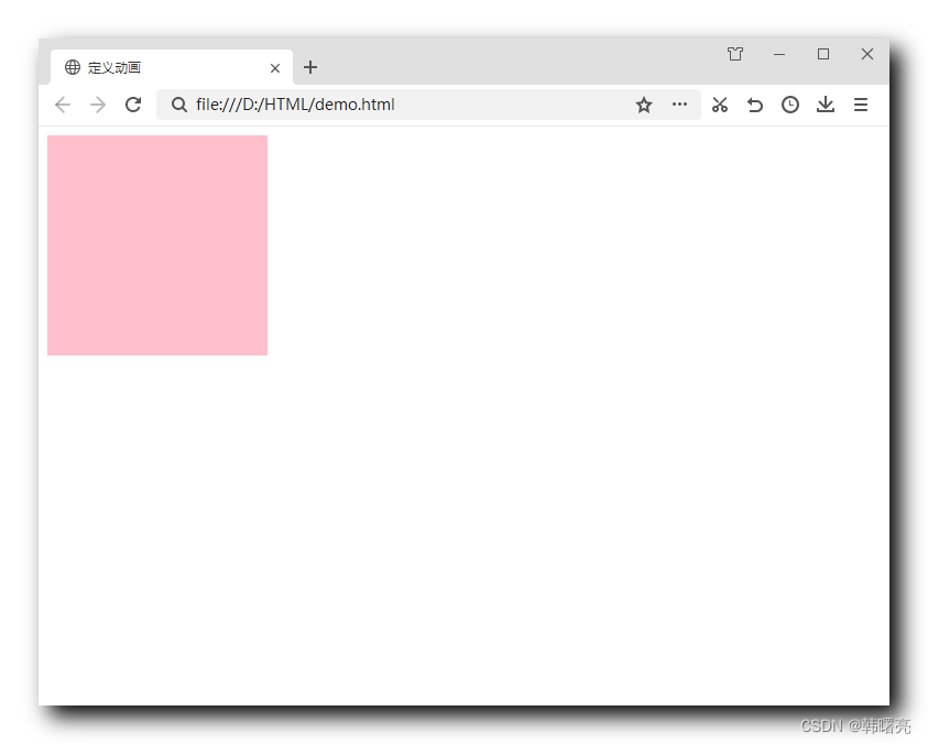
Results of the :
- Just after entering the page, the div box model appears on the right;
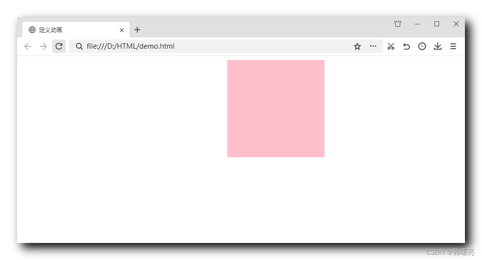
- Within 1 second, the above box model will automatically go to the far left;
3. Code example - define multiple animation nodes
Multiple animation nodes in an animation sequence defined using 0%, 25%, 50%, ;75%100%
Code example:
<!DOCTYPE html>
<html lang="en">

<head>
    <meta charset="UTF-8">
    <meta http-equiv="X-UA-Compatible" content="IE=edge">
    <meta name="viewport" content="width=device-width, initial-scale=1.0">
    <title>定义动画</title>
    <style>
        div {


            /* 设置动画的主要作用元素 */
            width: 200px;
            height: 200px;
            background-color: pink;
            /* 设置动画相关样式 */
            animation-name: element-move;
            animation-duration: 1s;
        }

        @keyframes element-move {


            /* 定义动画 */
            0% {


                /* 第一状态 / 默认状态 在左上角 */
                /* 没有任何变化 也可以空着 */
                transform: translate(0, 0);
            }
            25% {


                /* 第二状态 走到右上角 */
                transform: translate(400px, 0);
            }
            50% {


                /* 第三状态 走到右下角 */
                transform: translate(400px, 200px);
            }
            75% {


                /* 第四状态 走到左下角 */
                transform: translate(0, 200px);
            }
            100% {


                /* 回到初始状态 */
                /* 第五状态 走到左上角 */
                transform: translate(0, 0);
            }
        }
    </style>
</head>

<body>
    <div>
    </div>
</body>

</html>
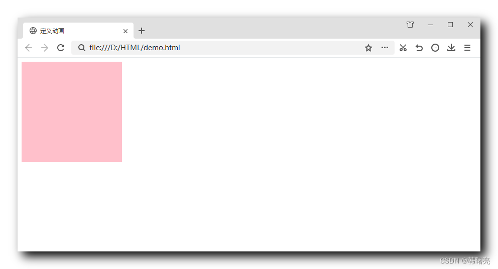
Execution effect: after execution, the box model goes around in circles;