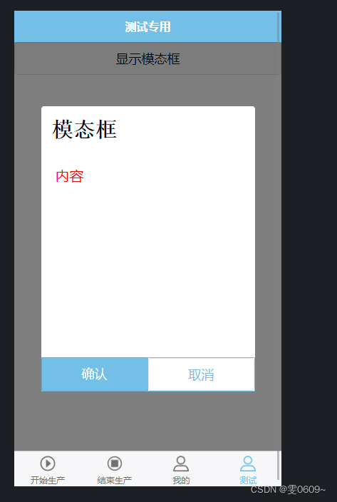
renderings
the code
Label
<template>
	<view>
		<!-- 按钮用于触发模态框的显示 -->
		<button @click="showModal = true">显示模态框</button>
		<!-- 模态框组件 -->
		<view class="modal" v-if="showModal">
			<view class="modal-content">
				<view>{

   { modalTitle }}</view>
				<view>{

   { modalContent }}</view>
				<view class="modal-buttons">
					<button @click="handleConfirm">确认</button>
					<button @click="handleCancel">取消</button>
				</view>
			</view>
		</view>
	</view>
</template>
Note:
@click="showModal = true"
What this code means is to show the modal box by
showModalsetting the value of to when the button is clicked.trueIn the above code example, we used the Vue.js event binding syntax
@clickto listen to the click event of the button.showModal = trueis the action performed when the button is clicked, itshowModalsets the value oftrueto trigger the display of the modal box. This way, when the user clicks the button, the modal box will be shown.
style
<style scoped lang="scss">
	/* 遮罩层 */
	.modal {
		position: fixed;
		top: 0;
		left: 0;
		width: 100%;
		height: 100%;
		background-color: rgba(0, 0, 0, 0.5);
		display: flex;
		justify-content: center;
		align-items: center;
	}
	/* 窗口 */
	.modal-content {
		background-color: white;
		/* padding: 20px; */
		width: 600rpx;
		height: 800rpx;
		border-radius: 8rpx;
		position: relative;
		//modal-content下的第一个view
		view:first-child{
			padding:30rpx;
			font-size:60rpx;
			font-weight:bold;
			font-family:'宋体';
		}
		//modal-content下的第二个view
		view:nth-child(2){
			padding:40rpx;
			font-size:40rpx;
			color:red
		}
	}
	/* 按钮 */
	.modal-buttons {
		width: 100%;
		display: flex;
		bottom: 0;
		position: absolute;
	}
	.modal-buttons button {
		width: 100%;
		border: none;
	}
	.modal-buttons button:first-child {
		background-color: #74bfe7;
		color: #fff;
		border-radius: 0;
	}
	.modal-buttons button:last-child {
		width: 100%;
		border: 2rpx solid #74bfe7;
		border-radius: 0px;
		background-color: #fff;
		color: #74bfe7;
	}
</style>
js
<script>
	export default {
		data() {
			return {
				showModal: false,
				modalTitle: '模态框',
				modalContent: '内容'
			};
		},
		methods: {
			//确认
			handleConfirm() {
				// 处理模态框确认按钮点击事件
				// 可以在这个方法中执行你需要的操作
				this.showModal = false; // 关闭模态框
			},
			//取消
			handleCancel() {
				// 处理模态框取消按钮点击事件
				// 可以在这个方法中执行你需要的操作
				this.showModal = false; // 关闭模态框
			}
		}
	};
</script>
analyze
In the HTML section:
- Use
buttonan element as a button that triggers the modal to be shown. - Use
v-ifdirectives to decide whether to show the modal. - Modal components are
viewwrapped with elements and styled accordingly.
In the JavaScript section:
dataThe function returns the initial state of the component, which includes a variable that controls whether to display the modal boxshowModal, as well as the title and content of the modal box.handleConfirmThe andhandleCancelmethods are respectively used to handle the click events of the confirmation button and the cancel button, and the required operations can be performed in these methods.- In this example, after clicking the confirm or cancel button, close the modal by
showModalsetting to .false
In the styles section:
- Use
scopedkeywords to scope styles to components. .modalThe class styles the overlay so that it covers the entire page and uses flex layout to center the content vertically..modal-contentClass to set the style of the modal box, including background color, width and height, etc..modal-buttonsclass to style the button, including making it sit at the bottom of the modal box, and using a flex layout to stretch the button to its full width- The first button uses
#74bfe7a background color and white text to confirm the action - The second button uses
#74bfe7a border and a white background color to indicate a cancel operation.
full code
<template>
	<view>
		<!-- 按钮用于触发模态框的显示 -->
		<button @click="showModal = true">显示模态框</button>
		<!-- 模态框组件 -->
		<view class="modal" v-if="showModal">
			<view class="modal-content">
				<view>{

   { modalTitle }}</view>
				<view>{

   { modalContent }}</view>
				<view class="modal-buttons">
					<button @click="handleConfirm">确认</button>
					<button @click="handleCancel">取消</button>
				</view>
			</view>
		</view>
	</view>
</template>
<script>
	export default {
		data() {
			return {
				showModal: false,
				modalTitle: '模态框',
				modalContent: '内容'
			};
		},
		methods: {
			//确认
			handleConfirm() {
				// 处理模态框确认按钮点击事件
				// 可以在这个方法中执行你需要的操作
				this.showModal = false; // 关闭模态框
			},
			//取消
			handleCancel() {
				// 处理模态框取消按钮点击事件
				// 可以在这个方法中执行你需要的操作
				this.showModal = false; // 关闭模态框
			}
		}
	};
</script>

<style scoped lang="scss">
	/* 遮罩层 */
	.modal {
		position: fixed;
		top: 0;
		left: 0;
		width: 100%;
		height: 100%;
		background-color: rgba(0, 0, 0, 0.5);
		display: flex;
		justify-content: center;
		align-items: center;
	}

	/* 窗口 */
	.modal-content {
		background-color: white;
		/* padding: 20px; */
		width: 600rpx;
		height: 800rpx;
		border-radius: 8rpx;
		position: relative;
		//modal-content下的第一个view
		view:first-child{
			padding:30rpx;
			font-size:60rpx;
			font-weight:bold;
			font-family:'宋体';
		}
		//modal-content下的第二个view
		view:nth-child(2){
			padding:40rpx;
			font-size:40rpx;
			color:red
		}
	}
	/* 按钮 */
	.modal-buttons {
		width: 100%;
		display: flex;
		bottom: 0;
		position: absolute;
	}
	.modal-buttons button {
		width: 100%;
		border: none;
	}
	.modal-buttons button:first-child {
		background-color: #74bfe7;
		color: #fff;
		border-radius: 0;
	}
	.modal-buttons button:last-child {
		width: 100%;
		border: 2rpx solid #74bfe7;
		border-radius: 0px;
		background-color: #fff;
		color: #74bfe7;
	}
</style>