How to use multiple choice buttons to simulate radio selection and implement custom skins
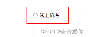
1. Unselected state preview
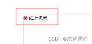
2. Selected state preview
upper code
- HTML:
 <div class="diyCheckbox">
    <label>
          <input type="checkbox" name="box1" id="box1">
          <i></i>
          <span>线上机考</span>
      </label>
  </div>
- CSS
.diyCheckbox{


    display: flex;
    }
label{


        position: relative;
        display: flex;
        align-items: center;
        justify-content: center;
        box-sizing: border-box;
        cursor: pointer;
    }
    input[type='checkbox']{


        display: none;
    }
    i{


        display: flex;
        justify-content: center;
        align-items: center;
        width: 12px;
        height: 12px;
        background: #fff;
        border: 1px solid #999;
        border-radius: 50%;
        margin-right: 6px;
    }
    input[type='checkbox']:checked + i::before{


        content: '';
        background: #b4222d;
        width: 8px;
        height: 8px;
        border-radius: 50%;
    }
    input[type='checkbox']:checked + i{


        border: 1px solid #b4222d;
    }
    input[type='radio']:checked + i{


        color: red;
    }
- Finally, js monitors the selected state
  $("input[name=box1]").change(function () {


        console.log(this.checked);  //ture 选中
     })