Table of contents
1. The characteristics of floating
Two, flexible box (flex) layout
1. The basic properties of flex
1. Float layout
1. The characteristics of floating
There are only two properties of floating left and right that can be set
floa:left
float:right
Floats break out of the standard flow, which can cause layout difficulties
Floating will turn the element into an inline block element, which can set the width and height of the element
2. Clear floating
There are several ways to clear floats
1.overflow:hidden
2. Set a div box directly in the parent element and use clear: both to clear the float
3. Set the height of the parent element
4. Pseudo class selector clear float
Two, flexible box (flex) layout
1. The basic properties of flex
flex-direction: You can set the order of the elements in the box
row: from left to right
row-reverse: from right to left
column: from top to bottom
column-reverse: from bottom to top
flex-wrap: You can design the wrapping of elements in the box
wrap: wrap
no-wrap: do not wrap
wrap-reverse: wrap, the first line is below
justify-content: You can set the alignment of elements
flex-start (default): left-aligned
flex-end: right alignment
center: centered
space-between: Both ends are aligned, and the intervals between items are equal.
space-around: Equal spacing on both sides of each item.
3. Examples
1. Floating layout demo
Renderings:
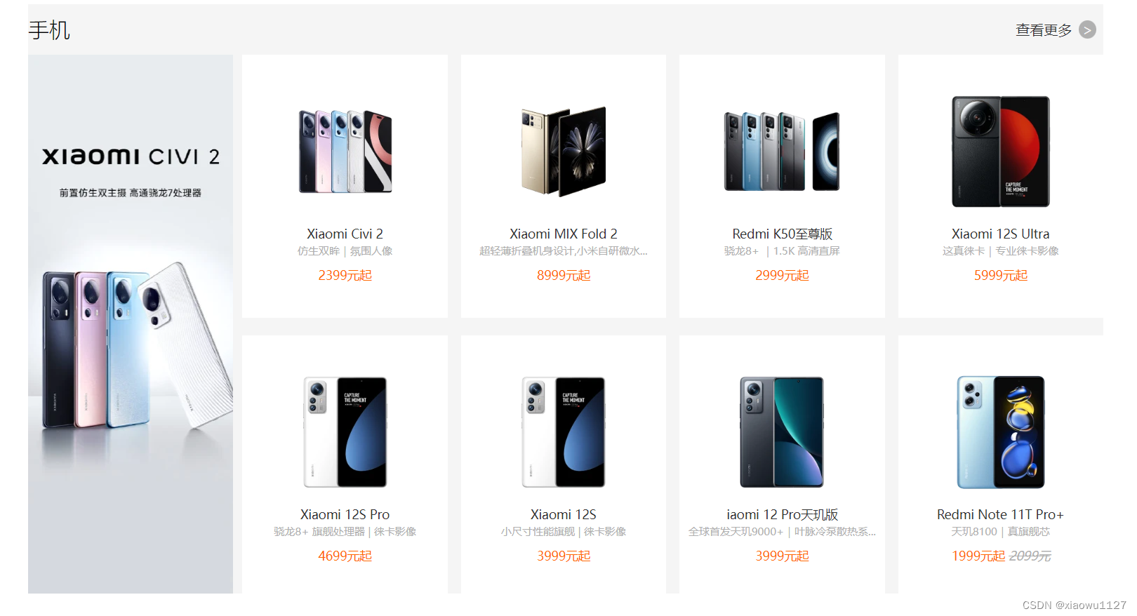
code:
<!DOCTYPE html>
<html lang="en">

<head>
    <meta charset="UTF-8">
    <meta http-equiv="X-UA-Compatible" content="IE=edge">
    <meta name="viewport" content="width=device-width, initial-scale=1.0">
    <title>Document</title>
    <style>
        * {
            padding: 0;
            margin: 0;
            box-sizing: border-box;
        }

        .phone {
            width: 1226px;
            margin: 10px auto;
            background-color: #f5f5f5;

        }

        .phone .title {
            width: 100%;
            height: 58px;
        }

        .phone .title h2 {
            float: left;
            font-weight: lighter;
            line-height: 58px;
        }

        .phone .title a {
            float: right;
            line-height: 58px;
            text-decoration: none;
            width: 100px;
            color: #333;
        }

        .phone .title a:hover {
            color: #ff6700;
        }

        .phone .title a span {
            background-color: #b0b0b0;
            border-radius: 100%;
            margin-left: 8px;
            padding: 0 4px;
            color: #f5f5f5;
        }

        .commodity {
            overflow: hidden;
        }

        .commodity>img {
            float: left;
            width: 234px;
            height: 614px;
        }

        .commodity .mobile {
            width: 992px;
            height: 614px;
            float: right;
        }

        .commodity .mobile a {
            width: 234px;
            height: 300px;
            display: inline-block;
            text-align: center;
            background-color: #ffffff;
            margin-left: 10.4px;
            margin-bottom: 20px;
            text-decoration: none;

        }


        .commodity .mobile a img {
            width: 160px;
            height: 160px;
            margin-top: 30px;

        }

        .commodity .mobile a span {
            display: block;
            text-align: center;
        }

        .commodity .mobile a span:nth-child(2) {
            font-size: 14px;
            font-weight: 400;
            color: #333;
            margin-bottom: 2px;
        }

        .commodity .mobile a span:nth-child(3) {
            font-size: 12px;
            color: #b0b0b0;
            margin-bottom: 10px;
        }

        .commodity .mobile a span:nth-child(4) {
            color: #ff6700;
            font-size: 14px;
        }

        .commodity .mobile a span:nth-child(4) i {
            color: #b0b0b0;
            text-decoration: line-through;
        }
    </style>
</head>

<body>
    <div class="phone">
        <div class="title">
            <h2>手机</h2>
            <div>
                <a href="#">查看更多<span>></span></a>
            </div>
        </div>
        <div class="commodity">
            <img src="./img/a.webp">
            <div class="mobile">
                <a href="#">
                    <img src="./img/b.webp">
                    <span>Xiaomi Civi 2</span>
                    <span>仿生双眸|氛围人像</span>
                    <span>2399元起</span>
                </a>
                <a href="#">
                    <img src="./img/c.webp">
                    <span>Xiaomi MIX Fold 2</span>
                    <span>超轻薄折叠机身设计,小米自研微水...</span>
                    <span>8999元起</span>
                </a>
                <a href="#">
                    <img src="./img/d.webp">
                    <span>Redmi K50至尊版</span>
                    <span>骁龙8+ |1.5K 高清直屏</span>
                    <span>2999元起</span>
                </a>
                <a href="#">
                    <img src="./img/e.webp">
                    <span>Xiaomi 12S Ultra</span>
                    <span>这真徕卡|专业徕卡影像</span>
                    <span>5999元起</span>
                </a>
                <a href="#">
                    <img src="./img/f.webp">
                    <span>Xiaomi 12S Pro</span>
                    <span>骁龙8+ 旗舰处理器 | 徕卡影像</span>
                    <span>4699元起</span>
                </a>
                <a href="#">
                    <img src="./img/f.webp">
                    <span>Xiaomi 12S</span>
                    <span>小尺寸性能旗舰 | 徕卡影像</span>
                    <span>3999元起</span>
                </a>
                <a href="#">
                    <img src="./img/g.webp">
                    <span>iaomi 12 Pro天玑版</span>
                    <span>全球首发天玑9000+|叶脉冷泵散热系...</span>
                    <span>3999元起</span>
                </a>
                <a href="#">
                    <img src="./img/j.webp">
                    <span>Redmi Note 11T Pro+</span>
                    <span>天玑8100|真旗舰芯</span>
                    <span>1999元起 <i>2099元</i></span>
                </a>
            </div>
        </div>
    </div>
</body>

</html>
2. Flexible box (flex) layout
Renderings:

the code
/* css样式*/
section .shop{
    width: 1057px;
    height: 2050px;
    background-color: #ECECEC;

}

section .shop h1{
    font-weight: normal;
    margin-left: 23px;
}
.shop .article{
    display: flex;
    flex-direction: row;
    flex-wrap: wrap;
    justify-content: space-around;
}
.shop .article a{
    width: 222px;
    height: 304px;
    display: flex;
    flex-direction: column;
    background-color: #fff;
    margin: 40px 0;
}

.shop .article a img{
    width: 191px;
    margin: 10px auto;
}

.shop .article a span{
    margin-left: 20px;
}

footer{
    margin-top: 0;
}
<div class="shop">
<h1>家具</h1>
<div class="article">
<a href="#">
<img src="./uploads/新闻4.png" alt="">
<span>天鹅倒影</span>
<span>天鹅倒影 1.5/1.8米软包床</span>
<span>¥8888.00</span>
</a>
<a href="#">
<img src="./uploads/新闻4.png" alt="">
<span>天鹅倒影</span>
<span>天鹅倒影 1.5/1.8米软包床</span>
<span>¥8888.00</span>
</a>
<a href="#">
<img src="./uploads/新闻4.png" alt="">
<span>天鹅倒影</span>
<span>天鹅倒影 1.5/1.8米软包床</span>
<span>¥8888.00</span>
</a>
<a href="#">
<img src="./uploads/新闻4.png" alt="">
<span>天鹅倒影</span>
<span>天鹅倒影 1.5/1.8米软包床</span>
<span>¥8888.00</span>
</a>
<a href="#">
<img src="./uploads/新闻4.png" alt="">
<span>天鹅倒影</span>
<span>天鹅倒影 1.5/1.8米软包床</span>
<span>¥8888.00</span>
</a>
<a href="#">
<img src="./uploads/新闻4.png" alt="">
<span>天鹅倒影</span>
<span>天鹅倒影 1.5/1.8米软包床</span>
<span>¥8888.00</span>
</a>
<a href="#">
<img src="./uploads/新闻4.png" alt="">
<span>天鹅倒影</span>
<span>天鹅倒影 1.5/1.8米软包床</span>
<span>¥8888.00</span>
</a>
<a href="#">
<img src="./uploads/新闻4.png" alt="">
<span>天鹅倒影</span>
<span>天鹅倒影 1.5/1.8米软包床</span>
<span>¥8888.00</span>
</a>
<a href="#">
<img src="./uploads/新闻4.png" alt="">
<span>天鹅倒影</span>
<span>天鹅倒影 1.5/1.8米软包床</span>
<span>¥8888.00</span>
</a>
<a href="#">
<img src="./uploads/新闻4.png" alt="">
<span>天鹅倒影</span>
<span>天鹅倒影 1.5/1.8米软包床</span>
<span>¥8888.00</span>
</a>
<a href="#">
<img src="./uploads/新闻4.png" alt="">
<span>天鹅倒影</span>
<span>天鹅倒影 1.5/1.8米软包床</span>
<span>¥8888.00</span>
</a>
<a href="#">
<img src="./uploads/新闻4.png" alt="">
<span>天鹅倒影</span>
<span>天鹅倒影 1.5/1.8米软包床</span>
<span>¥8888.00</span>
</a>
<a href="#">
<img src="./uploads/新闻4.png" alt="">
<span>天鹅倒影</span>
<span>天鹅倒影 1.5/1.8米软包床</span>
<span>¥8888.00</span>
</a>
<a href="#">
<img src="./uploads/新闻4.png" alt="">
<span>天鹅倒影</span>
<span>天鹅倒影 1.5/1.8米软包床</span>
<span>¥8888.00</span>
</a>
<a href="#">
<img src="./uploads/新闻4.png" alt="">
<span>天鹅倒影</span>
<span>天鹅倒影 1.5/1.8米软包床</span>
<span>¥8888.00</span>
</a>
<a href="#">
<img src="./uploads/新闻4.png" alt="">
<span>天鹅倒影</span>
<span>天鹅倒影 1.5/1.8米软包床</span>
<span>¥8888.00</span>
</a>
<a href="#">
<img src="./uploads/新闻4.png" alt="">
<span>天鹅倒影</span>
<span>天鹅倒影 1.5/1.8米软包床</span>
<span>¥8888.00</span>
</a>
<a href="#">
<img src="./uploads/新闻4.png" alt="">
<span>天鹅倒影</span>
<span>天鹅倒影 1.5/1.8米软包床</span>
<span>¥8888.00</span>
</a>
<a href="#">
<img src="./uploads/新闻4.png" alt="">
<span>天鹅倒影</span>
<span>天鹅倒影 1.5/1.8米软包床</span>
<span>¥8888.00</span>
</a>
<a href="#">
<img src="./uploads/新闻4.png" alt="">
<span>天鹅倒影</span>
<span>天鹅倒影 1.5/1.8米软包床</span>
<span>¥8888.00</span>
</a>
</div>
</div>Summary: The above are some basic methods of some basic web page layouts