foreword
ConstraintLayout lets you create complex large layouts with a flat view hierarchy (no nested view groups). It is similar to RelativeLayout in that all views are laid out according to the relationship between sibling views and the parent layout, but it is more flexible than RelativeLayout and easier to use with Android Studio's layout editor.
All of ConstraintLayout's features are directly available through the Layout Editor's visual tools, because the Layout API and Layout Editor are built specifically for each other. Therefore, you can use ConstraintLayout to build layouts by dragging and dropping instead of modifying XML.
1. Explanation of ConstraintLayout attributes
Let's briefly understand some of the basic orientation attributes we need to use when using ConstraintLayout, as shown in the following table:
| Attributes | describe |
|---|---|
| app:layout_constraintLeft_toLeftOf | Put the left side of A on the left side of B (left aligned) |
| app:layout_constraintLeft_toRightOf | Put the left side of A on the right side of B (aligned on the left relative to the right) |
| app:layout_constraintRight_toLeftOf | Put the right side of A on the left side of B (align the right with respect to the left) |
| app:layout_constraintRight_toRightOf | Put the right side of A on the right side of B (right-aligned) |
| app:layout_constraintTop_toTopOf | Put the top side of A on the top side of B (top alignment) |
| app:layout_constraintTop_toBottomOf | Put the top side of A on the bottom side of B (align the top with respect to the bottom) |
| app:layout_constraintBottom_toTopOf | Put the bottom side of A on the top side of B (align the bottom with respect to the top) |
| app:layout_constraintBottom_toBottomOf | Put the bottom side of A on the bottom side of B (bottom alignment) |
| app:layout_constraintStart_toEndOf | Put the start position of A at the end position of B (the start position is aligned with the end position) |
| app:layout_constraintStart_toStartOf | Put the start position of A on the start position of B (the starting position is aligned) |
| app:layout_constraintEnd_toStartOf | Put the end position of A on the start position of B (the end position is aligned with the starting position) |
| app:layout_constraintEnd_toEndOf | Put the end position of A on the end position of B (the end position is aligned) |
| app:layout_constraintBaseline_toBaselineOf | Put the bottom side of A on the top side of B (base line alignment) |
Note: The namespace of the attribute is app
2. Bias
When using LinearLayout, we usually use Gravity to arrange horizontally or vertically arranged controls according to the weight distribution. In ConstraintLayout, it provides a bias attribute to assign weights to controls.
The code is as follows (example):
<android.support.constraint.ConstraintLayout xmlns:android="http://schemas.android.com/apk/res/android"
    xmlns:app="http://schemas.android.com/apk/res-auto"
    xmlns:tools="http://schemas.android.com/tools"
    android:layout_width="match_parent"
    android:layout_height="match_parent">

       <Button
        android:id="@+id/button2"
        android:layout_width="wrap_content"
        android:layout_height="wrap_content"
        android:layout_marginTop="8dp"
        android:layout_marginBottom="8dp"
        android:text="A"
        app:layout_constraintBottom_toBottomOf="parent"
        app:layout_constraintHorizontal_bias="0.25"
        app:layout_constraintLeft_toLeftOf="parent"
        app:layout_constraintRight_toRightOf="parent"
        app:layout_constraintTop_toTopOf="parent" />

</android.support.constraint.ConstraintLayout>
| Attributes | describe |
|---|---|
| app:layout_constraintHorizontal_bias | Horizontal Offset Coefficient |
| app:layout_constraintVertical_bias | Vertical Offset Coefficient |
3. GONE is not really GONE
When we use RelativeLayout to develop, we often encounter such a logic. When a certain data is empty, the control bound to the data is GONE. Then there will be such a problem. For example, there are three controls A, B, and C arranged vertically, B is below A, and C is below B. After B is hidden (GONE), since C has no dependency on A, it will cause a page error. This problem ConstraintLayout gives a good solution. When in ConstraintLayout, if a control is hidden (GONE), it will become a point, so it still has a constraint effect on other controls that use this control as a reference control.
When this control is hidden, we can also refer to this hidden control to set margin properties for other controls.
| Attributes | describe |
|---|---|
| app:layout_goneMarginLeft | Hide control left margin |
| app:layout_goneMarginRight | Hide control right margin |
| app:layout_goneMarginTop | Hide control top margin |
| app:layout_goneMarginBottom | Hide control bottom margin |
| app:layout_goneMarginStart | hide control start margin |
| app:layout_goneMarginEnd | hide control end margin |
4. Aspect Ratio
1. The aspect ratio of View
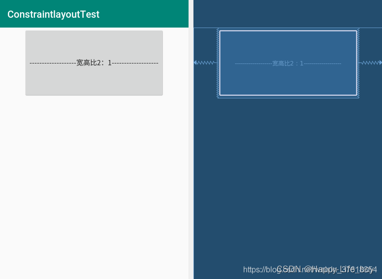
In ConstraintLayout, width can also be defined as a ratio of height or height can be defined as a ratio of width. First of all, you need to set the width or height to 0dp (that is, MATCH_CONSTRAINT) to adapt to the constraints. Then set a ratio through the layout_constraintDimensionRatio property. This ratio can be a "float", representing the ratio between width and height; it can also be a ratio of the form "width:height".
The code is as follows (example):
<android.support.constraint.ConstraintLayout
    xmlns:android="http://schemas.android.com/apk/res/android"
    xmlns:app="http://schemas.android.com/apk/res-auto"
    android:layout_width="match_parent"
    android:layout_height="match_parent">

    <Button
        android:layout_width="wrap_content"
        android:layout_height="0dp"
        android:text="-------------------宽高比2:1-------------------"
        app:layout_constraintDimensionRatio="2:1"
        app:layout_constraintLeft_toLeftOf="parent"
        app:layout_constraintRight_toRightOf="parent"/>
</android.support.constraint.ConstraintLayout>
Here the height of the button is set to half the width. As shown below:
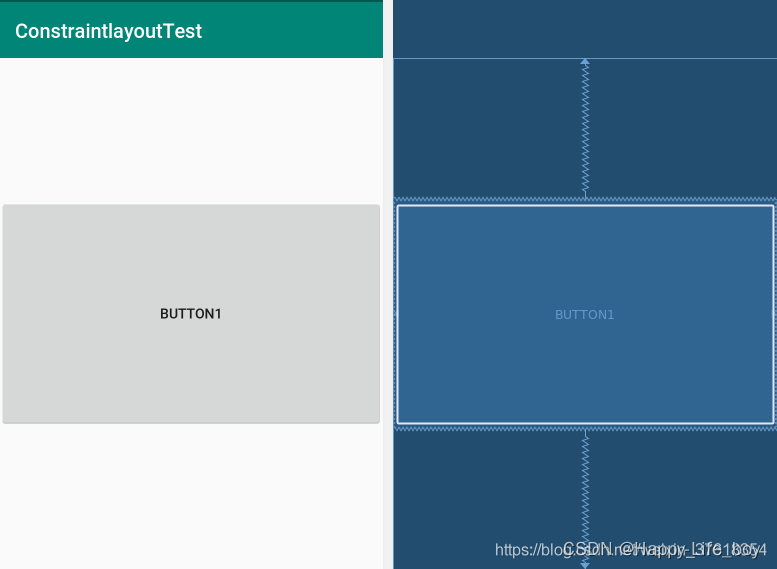
If both width and height are set to 0dp (MATCH_CONSTRAINT), then the value of layout_constraintDimensionRatio needs to be added with a "W, width: height" or "H, width: height" to indicate the constraint width or height, the code is as follows:
<android.support.constraint.ConstraintLayout
    xmlns:android="http://schemas.android.com/apk/res/android"
    xmlns:app="http://schemas.android.com/apk/res-auto"
    android:layout_width="match_parent"
    android:layout_height="match_parent">

    <Button
        android:layout_width="0dp"
        android:layout_height="0dp"
        android:text="Button1"
        app:layout_constraintBottom_toBottomOf="parent"
        app:layout_constraintDimensionRatio="h,10:6"
        app:layout_constraintLeft_toLeftOf="parent"
        app:layout_constraintRight_toRightOf="parent"
        app:layout_constraintTop_toTopOf="parent"/>

</android.support.constraint.ConstraintLayout>
The renderings are as follows:
2. View percentage width and height
ConstraintLayout can also use percentages to set the width and height of the view. To use percentage width or height, it needs to be set to 0dp (ie MATCH_CONSTRAINT).
Then set the following properties:
app:layout_constraintWidth_default="percent" //设置宽为百分比
app:layout_constraintWidth_percent="0.3" //0到1之间的值
或
app:layout_constraintHeight_default="percent" //设置高为百分比
app:layout_constraintHeight_percent="0.3" //0到1之间的值
5. Fuxing-Chain attribute of complex layout
The Chain chain is a special constraint that allows Views linked by multiple chain chains to equally share the remaining space. The most similar feature in the traditional layout of Android should be the weight ratio in LinearLayout, but the Chains chain can do far more than the weight ratio function. If we want to implement a chain structure between controls, we can establish a mutual constraint relationship between these controls, and choose to create a horizontal chain or a vertical chain on the basis of these relationships.
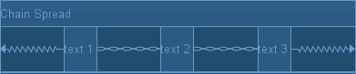
The official provides a total of 5 styles of chains:

We can set it in the following way:
app:layout_constraintHorizontal_chainStyle="spread|spread_inside|packed"
或者
app:layout_constraintVertical_chainStyle="spread|spread_inside|packed"
What needs to be noted here is: set chainStyle on the first component of Chain, remember to remember
1. Attribute parameters and values
For the type of Chian attribute, there are two types: horizontal direction (Horizontal) and vertical direction (Vertical)
| Attributes | describe |
|---|---|
| app:layout_constraintHorizontal_chainStyle | Chain in the horizontal direction |
| app:layout_constraintVertical_chainStyle | Chain in the vertical direction |
For the mode of the Chain attribute, there are three types in total: spread, spread_inside, and packed
2. Spread chain mode
The spread mode will distribute the space evenly, and each View occupies its own equally divided space. It is the default mode of the Chain attribute.
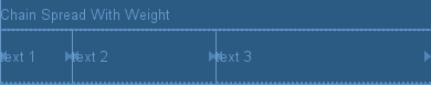
In this mode, when setting the width and height of the View to non-0dp, the display effect is as follows: When
using this mode, we can also set the weight of the spread with the weight attribute. When setting the weight, we need to set the width or height of the control to 0dp, and set the value of layout_constraintHorizontal_weight or layout_constraintVertical_weight:
| Attributes | describe |
|---|---|
| app:layout_constraintVertical_weight | vertical control weight |
| app:layout_constraintHorizontal_weight | The weight of the control in the horizontal direction |
Through the weight setting, as shown in the figure:
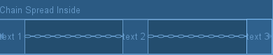
3. Spread Inside chain mode
The spread inside mode is based on Spread, removing the distance from the two most edge Views on both sides to the edge of the outward parent component, and then letting the remaining Views divide the space equally within the remaining space.
In this mode, when setting the width and height of the View to non-0dp, the display effect is as follows:
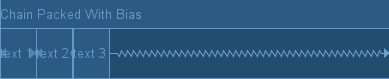
4. Packed chain mode
The packed mode is very intuitive, it gathers all Views together, leaves no gap between controls, and displays the gathered Views in the center.
In this mode, when setting the width and height of the View to non-0dp, the display effect is as follows: After
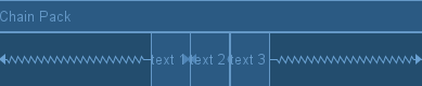
we use the Packed mode, we can also adjust the position of the gathered Views through the bias parameter.
5. Example of setting Chain in XML
Setting the Chain property needs to ensure two conditions:
- Define the constraints of the chain chain
- Set chainStyle on the first component of Chain.
<android.support.constraint.ConstraintLayout xmlns:android="http://schemas.android.com/apk/res/android"
    xmlns:app="http://schemas.android.com/apk/res-auto"
    xmlns:tools="http://schemas.android.com/tools"
    android:layout_width="match_parent"
    android:layout_height="match_parent">

    <Button
        android:id="@+id/button16"
        android:layout_width="wrap_content"
        android:layout_height="wrap_content"
        android:text="Button"
        app:layout_constraintEnd_toStartOf="@+id/button17"
        app:layout_constraintVertical_chainStyle="packed"
        app:layout_constraintStart_toStartOf="parent"
        tools:layout_editor_absoluteY="39dp" />

    <Button
        android:id="@+id/button17"
        android:layout_width="wrap_content"
        android:layout_height="wrap_content"
        android:text="Button"
        app:layout_constraintEnd_toStartOf="@+id/button18"
        app:layout_constraintStart_toEndOf="@+id/button16"
        tools:layout_editor_absoluteY="39dp" />

    <Button
        android:id="@+id/button18"
        android:layout_width="wrap_content"
        android:layout_height="wrap_content"
        android:text="Button"
        app:layout_constraintEnd_toEndOf="parent"
        app:layout_constraintStart_toEndOf="@+id/button17"
        tools:layout_editor_absoluteY="39dp" />
</android.support.constraint.ConstraintLayout>
6. Use of GuideLine
GuideLine is just a tool class used in the ConstraintLayout layout to assist the layout, similar to the auxiliary line, you can set the android:orientation attribute to determine whether it is horizontal or vertical.
The important thing is that the Guideline will not be displayed on the interface, and the default is GONE.
| direction | describe |
|---|---|
| android:orientation | direction |
After creating the GuideLine, we can set the initial position of the guideline:
| weight attribute | describe |
|---|---|
| app:layout_constraintGuide_begin | Taking the starting position of the View as the reference object, the upper boundary in the horizontal or vertical direction (dp) |
| app:layout_constraintGuide_end | Taking the end position of the View as the reference object, the upper boundary in the horizontal or vertical direction (dp) |
| app:layout_constraintGuide_percent | Percentage in horizontal or vertical direction (float ratio 0.0f - 1.0f) |
Summarize
The properties of the entire ConstraintLayout have been explained, let's use ConstraintLayout to learn in Android!