There are several ways of CSS three-column layout, mainly including float, position, and flex.
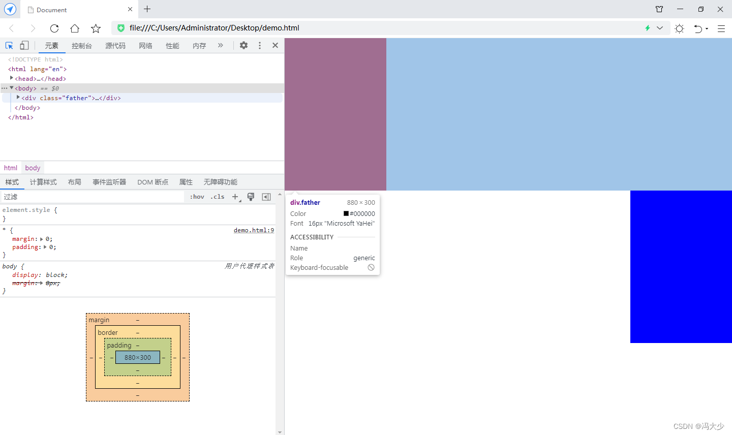
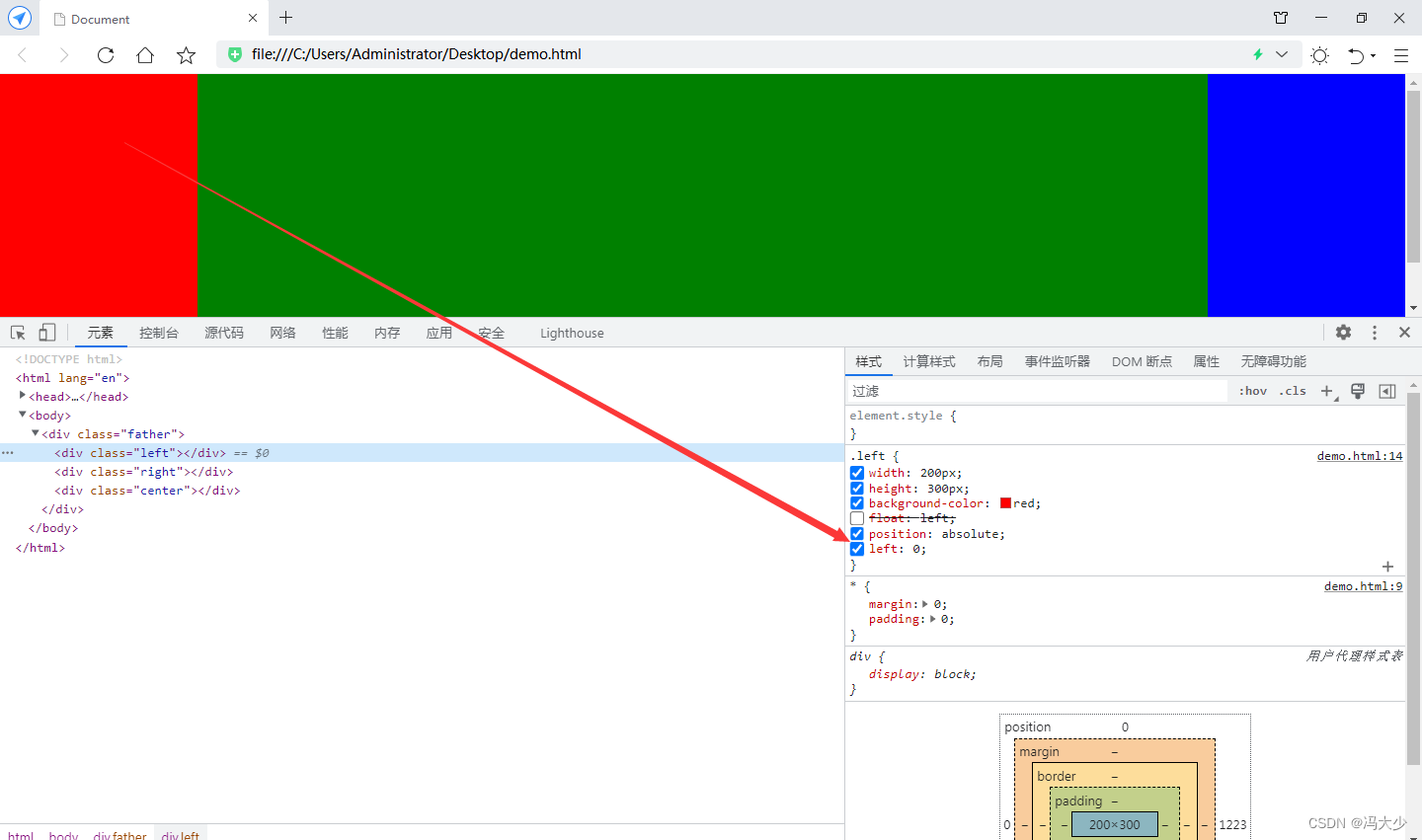
Set float for red and blue boxes, but not for green.
<style>
* {
margin: 0;
padding: 0;
}
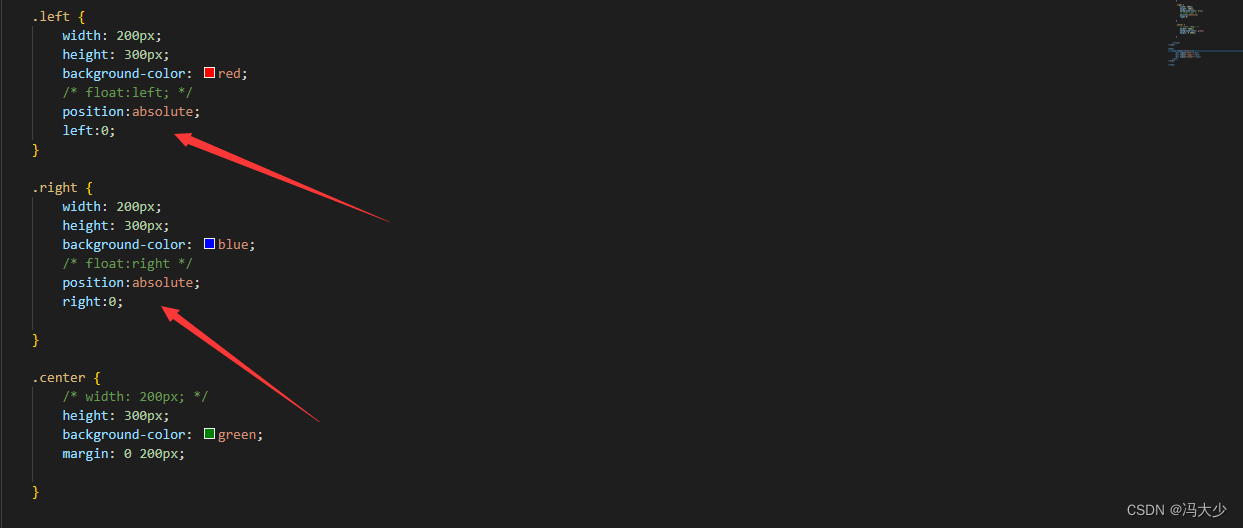
.left {
width: 200px;
height: 300px;
background-color: red;
float:left;
}
.right {
width: 200px;
height: 300px;
background-color: blue;
float:right
}
.center {
width: 200px;
height: 300px;
background-color: green;
}
</style>
<body>
<div class="father">
<div class="left"></div>
<div class="center"></div>
<div class="right"></div>
</div>
</body>
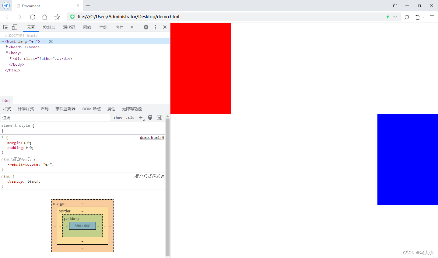
It can be seen that the green box seems to disappear as a result. In fact, it still maintains the attributes of block-level elements when float is not set. So the blue box is arranged under the elements of the green box.
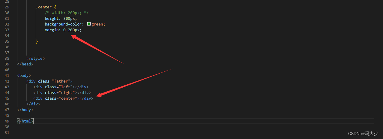
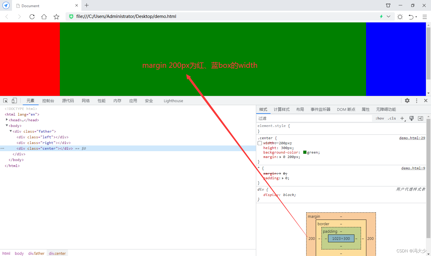
Move the green block element to the end and configure margin 0 200px for it
It can be seen that the green box is just automatically filled between the red and blue boxes. When the browser is zoomed, it is also the effect of 3 boxes next to each other.
position realization
<style>
        * {


            margin: 0;
            padding: 0;
        }

        .left {


            width: 200px;
            height: 300px;
            background-color: red;
            /* float:left; */
            position:absolute;
            left:0;
        }

        .right {


            width: 200px;
            height: 300px;
            background-color: blue;
            /* float:right */
            position:absolute;
            right:0;
        }

        .center {


            /* width: 200px; */
            height: 300px;
            background-color: green;
            margin: 0 200px;
        }

</style>

<body>
    <div class="father">
       <div class="left"></div>
       <div class="right"></div>
       <div class="center"></div>
    </div>
</body>
Set the absolute positioning method for the red and blue boxes to fix the position
flex implementation (the most convenient one)
<style>
* {
margin: 0;
padding: 0;
}
.left {
width: 200px;
height: 300px;
background-color: red;
/* float:left; */
/* position:absolute;
/* left:0; */
}
.right {
width: 200px;
height: 300px;
background-color: blue;
/* float:right */
/* position:absolute;
right:0;
*/
}
.center {
/* width: 200px; */
height: 300px;
background-color: green;
/* margin: 0 200px; */
}
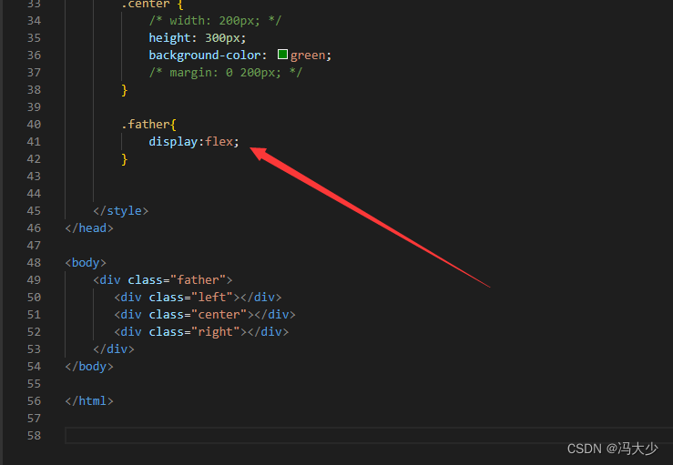
.father{
display:flex;
}
</style>
<body>
<div class="father">
<div class="left"></div>
<div class="center"></div>
<div class="right"></div>
</div>
</body>
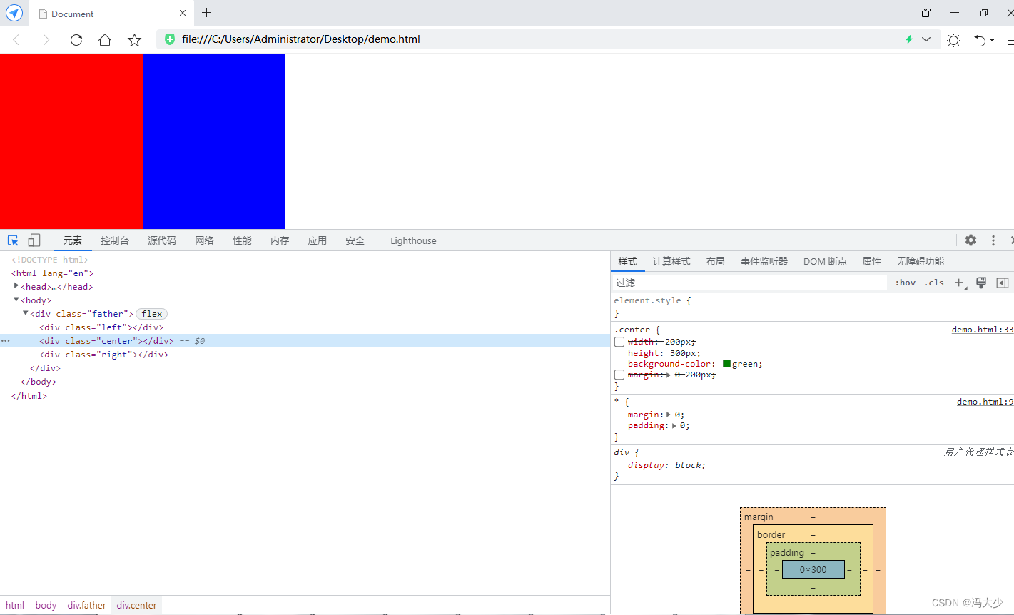
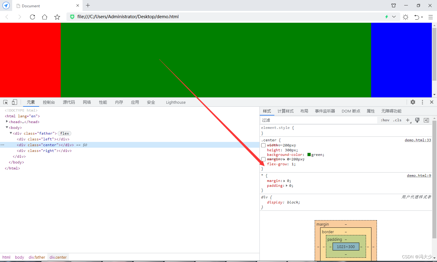
Set the style of the father parent element display: flex;
It can be seen that the green box seems to disappear again, because the green box has no width set. When the father element is set to flex, the block-level elements inside it cannot inherit the width of the father.
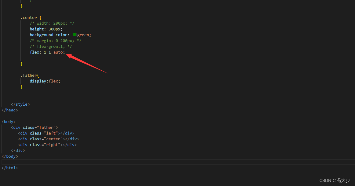
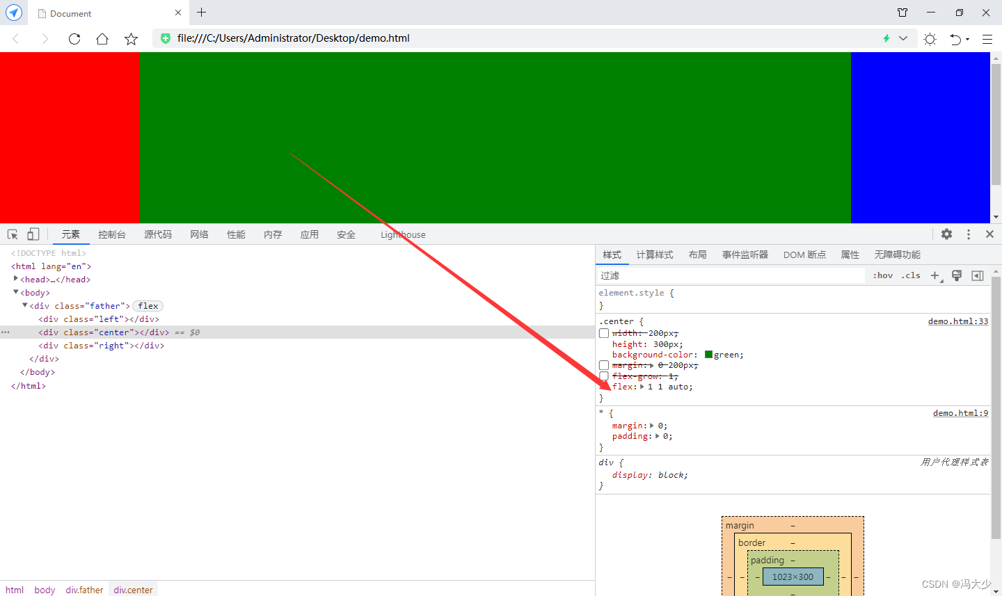
Add flex-grow : 1 to the green box to automatically fill the remaining space.
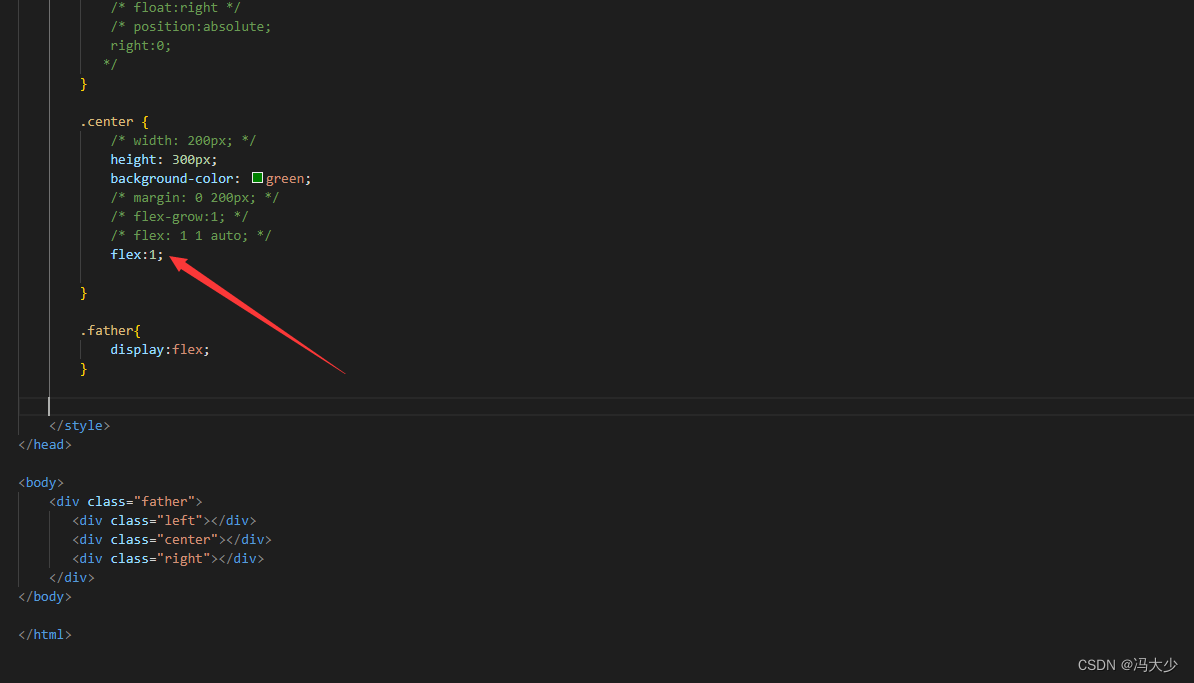
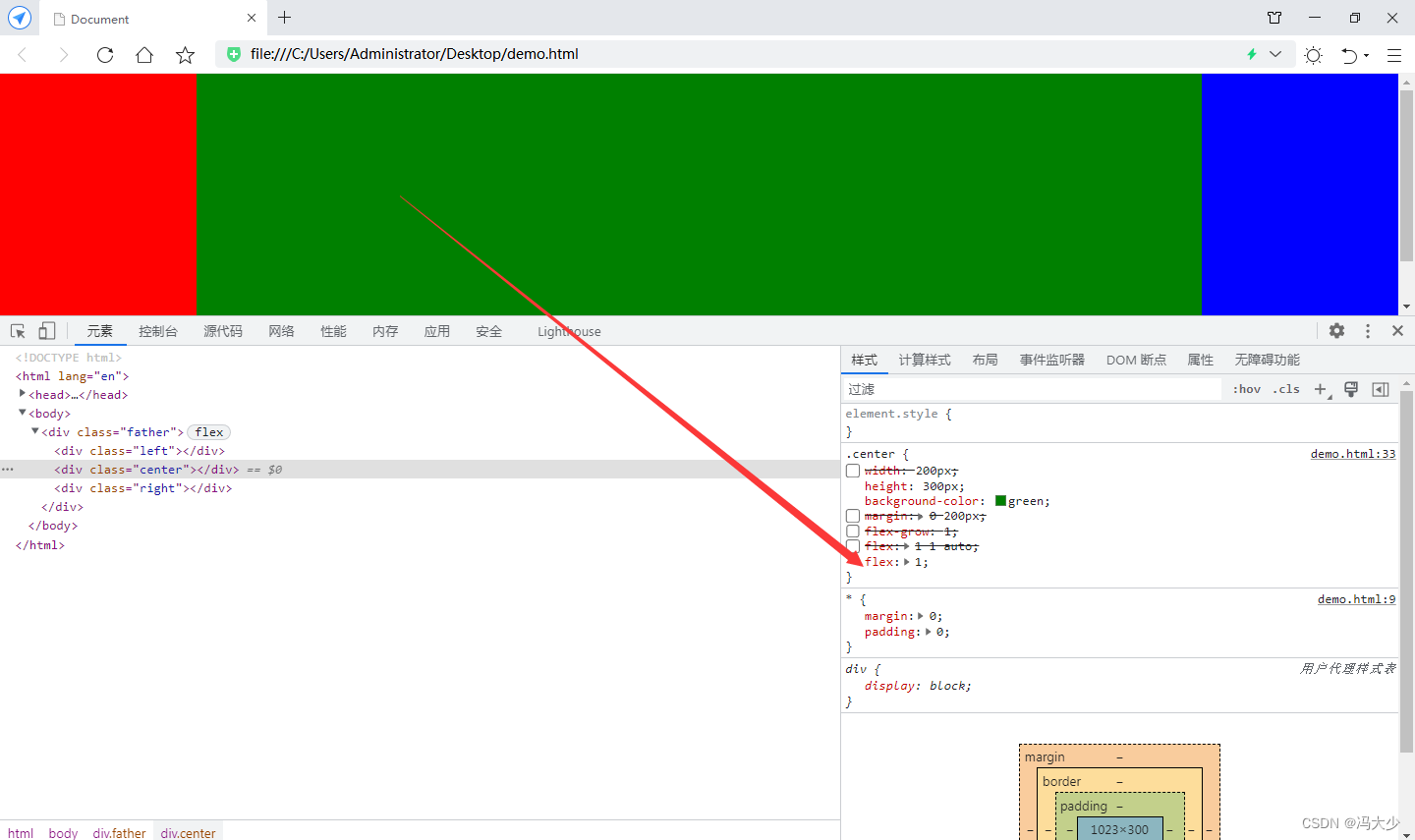
Finally, I would like to add that flex-grow: 1 can also be written as flex: 1 1 auto; or the more abbreviated flex:1; For this knowledge point, you can refer to the aspect of flex layout.