Table of contents
1.1 pandas library installation
Method 1: Install Anaconda software
Method 2: Install via the pip command
1.2 Introduction to the use of pandas library
3. Read files and draw simple charts with detailed codes
foreword
Xiaobai already knows some basic types and syntax of python after getting started with Pythonon. Today, let’s explain in detail how Python reads files and draws visual charts
1. Read file steps:
There are many standard libraries or third-party libraries for reading files in Python. The commonly used ones are:pandas、Numpy、lxml、xml、xlwt、openpyxl、open等。
Among them: open is a built-in function , which can be called directly in the compiler after downloading python; Compile is the standard libraryxml of Python , which is the default library that comes with pyhon when it is installed. It is downloaded and installed in the python installation directory. Different third-party libraries have different installation and usage methods. The reading file shared today uses the library.;pandas、Numpy、lxml、xlwt、openpyxl 属于第三方库,pandas
1.1 pandasLibrary installation
Method 1: Install Anaconda software
The most once-and-for-all method is not to install Pandas directly, but to install software that integrates various third-party libraries commonly used in the python programming process: Anaconda, which is a cross-platform (Linux, Mac OS X, Windows) Python distribution, uses for data analysis and scientific computing. After running the installer, users will be able to access any tools of Pandas and SciPyopen in new window toolkit without installing anything else, and without waiting for any software compilation, which is very convenient.
Method 2: Install via the pip command
Enter the command in the cmd window: pip install pandas
1.2 Introduction to the use of pandas library
After downloading the pandas library, first import it in the header of the code file: the command to import the package is: [ import package name as simplified name ] as shown in the figure:

You can add an alias after as , so that you can use the alias to call all the functions of the library. The following is a brief introduction to the functions to be used
1. Import CSV or xlsx files:
df = pd.read_csv(r'name.csv')
df = pd.read_excel(r'name.xlsx'))
2. View the imported form file information
df.info()3. View the null value of the table object
df.isnull()  #如果是空则为 ture ,非空为 false

df['列名'].isnull().sum()  #统计指定列的空值个数
4. Clean the table data
#删除表中空值所在行,并覆盖原表
df = df.dropna()

#删除表中重复值所在行,默认保留第一行,并覆盖原表
df['列名'] = df['列名'].pd.drop_duplicates()


#将指定数替换掉表中空值,并覆盖原表
df = df['年龄'].fillna(df['年龄'].mean())
5. Group and aggregate tabular data
#将表中数据按城市分组,并且统计各个城市的数量
df_gop = df.groupby('城市').count()

#将表中数据按城市分组后再按性别,并且统计各个性别的数量
df_gop = df.groupby(['城市','姓别'])['姓别'].count()
6. Sort table data
#按照表中某列数据进行排序
df = df.sort_values(by=['订单量'])

#按照索引进行排序
df = df.sort_index()
7. Reset the index on the table
df = df.reset_index()8. Find the data for specific requirements in the table
# loc 方法  查找df表格里面订单数大于等于3的数据
df1 = df.loc[df['订单数'] >= 3:]

# iloc 方法  查找df表格里面第4列到8列的数据
df2 = df.iloc[4:9]

# query 方法  查找df表格中地址为天津和南京的数据
df_inner.query('地址 == ["天津", "南京"]')
2. Draw a visual chart
Since python is an open source language, there are many third-party libraries. Commonly used charting libraries include: pyecharts library, query library, plotly library, matplotlib library, etc.
Echarts is a data visualization tool open sourced by Baidu. With its good interactivity and exquisite chart design, it has been recognized by many developers. And python is an expressive language, very suitable for data processing. When data analysis meets data visualization, pyecharts was born.
Pyecharts is divided into two major versions, v0.5 and v1. The two versions of v0.5 and v1 are incompatible. V1 is a brand new version, so our learning is based on the v1 version to demonstrate the process of drawing charts.
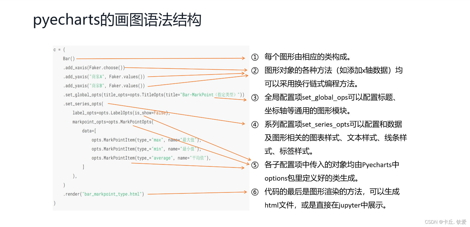
The grammar format is as shown in the figure:
3. Read files and draw simple charts with detailed codes
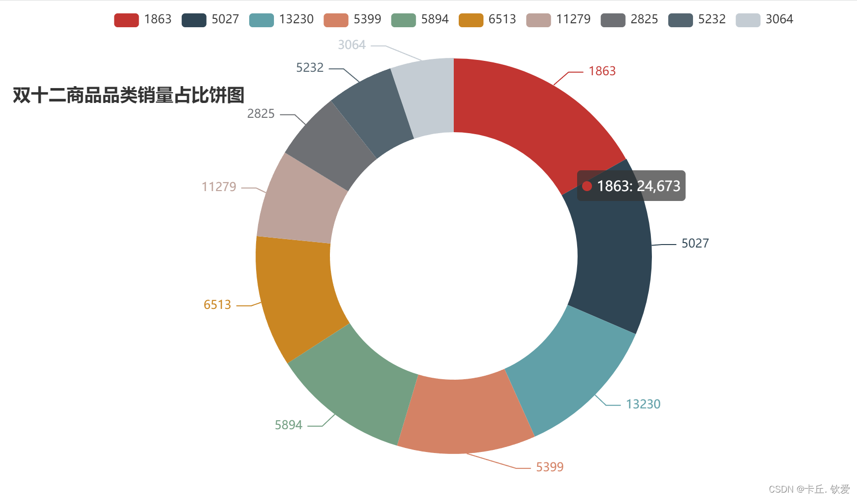
Every time you draw, the requirements are different, and the code will be different. This blog is for reference only. Here I take an example of drawing the top ten pie charts of a cat’s Double Twelve sales :
Topic: Count the top 10 commodity categories in sales on Double 12, and draw a donut chart of the sales ratio of commodity categories
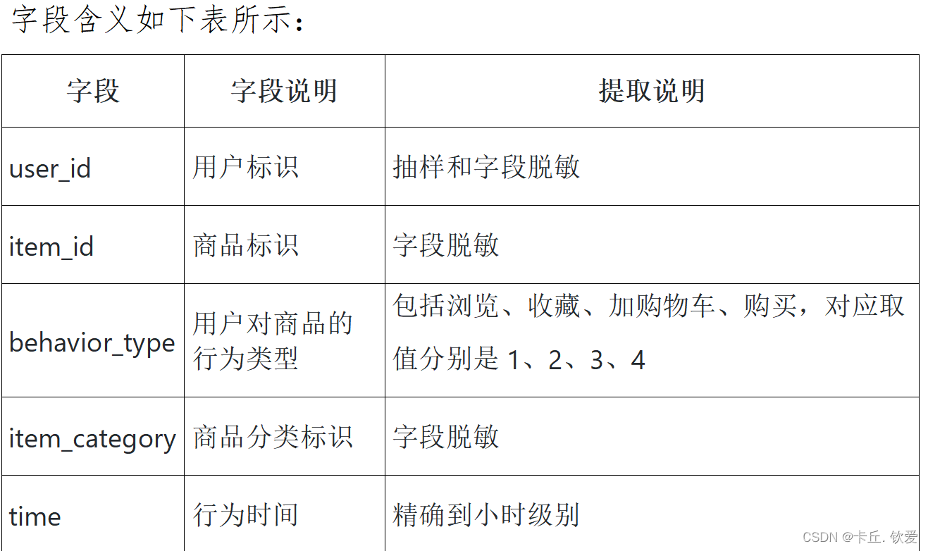
Data field meaning and partial data illustration:

Finally look at the finished product:
Summarize:
That's all for today's sharing, the content is not deep, and it is for Xiaobai. If this blog is helpful to you, welcome to leave a comment and forward it. I hope everyone can go further and further on the road they like!