Abstract: This article was originally published on CSDN by the technical team of Grape City. Grape City provides developers with professional development tools, solutions and services to empower developers.
It is said...
Every time you type out a line of code
Just one hair left me...
And every time a bug is solved
One hair follicle begins to rest and regenerate...
Program ape , a profession that people love and hate, as one of the largest hair loss groups in the world, in addition to doing long-term and massive mental work every day, they also have to uphold the principle that the moon does not sleep, I do not sleep, and the sun does not rise. The "good work and rest habits" that have been developed. If staying up late and working overtime is the primary ordeal for programmers, then the various unreasonable demands from product managers or customers every day are hell-like ordeals.

As the saying goes, a programmer who has not experienced the "torture" of a product manager cannot be called a qualified programmer. As the "enemy of life" of a programmer, he would put forward all kinds of brainless requests every time: "Can you give me a colorful black", "It's too ugly, can you change it", "This demand is so serious. Is it difficult?", every sentence is very heart-wrenching. Although my heart has been broken into tofu dregs, I still have to reply: "Okay, I will try it." Turn around, turn around and continue to comment out the rewrite in the code that has been changed many times, and then continue to curse and add another sentence "this code is written like *". For a long time, many programmers will slowly lose the joy of writing code in the repeated "addition, deletion, modification and query" operations.
Today, what I want to tell you is that it is already "3203", do you still need to rely on code to write the system? Gossip less, enter the text. Here, the editor introduces a low-code platform for a visual "no-code" system building system - Movable Type.

What is low code
In order to reduce readers' doubts during the reading process, the editor uses movable type grid products as an example to help readers understand low-code and how to use it.
The official explanation of low code : low code (Low-Code / Low-Code Development Platform / Low-Code Application Platform) was proposed in 2014, which refers to a development technology and tool that can be used to improve the speed of software delivery, with visualization as a typical example Features can reduce the workload and cost of coding development. From a practical point of view, low-code technology continues the metadata-driven design concept, provides multi-level component packaging, and at the expense of extreme performance optimization and refined interactive experience, in exchange for several times improved development efficiency. Therefore, low-code technology is mainly used in enterprise software development, and is usually not suitable for building Internet applications with a huge amount of data and concurrent users, and extreme requirements for user experience.
Generally speaking, low-code is a work that can be completed by previous codes through visual operations, thereby reducing the technical threshold for designing systems.
Movable type products
working principle
The movable type grid designer is used for the development and debugging of the application program website, and publishes the website to the movable type grid server. The type server acts as a web server to run the application website. End users who use the website access the website through a browser and perform operations to fulfill business needs.
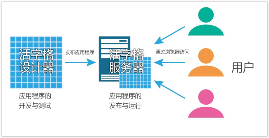
(Working principle of movable type grid)
Type Designer Layout
The pattern picture design divides the movable type grid server into 9 areas:
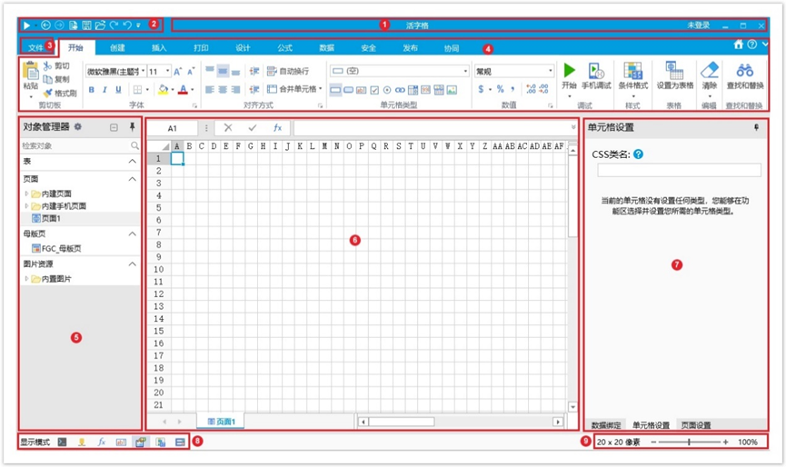
(The composition of the movable type grid designer interface)
-
Title bar: used to display the name of the file being edited and the name of the software currently in use, as well as the buttons of "Minimize", "Restore", and "Close".
-
Quick Access Toolbar: The Quick Access Toolbar mainly includes some common commands, such as Start, New, Save, Open, Undo, Redo, Forward, and Back buttons. The drop-down button at the far right of the Quick Access Toolbar, click this button to add frequently used commands.
-
File button: The file button is a button similar to a menu, located in the upper left corner of the movable type grid window. These include common commands such as New, Open, Save, Save As, Help, Settings, and Exit.
-
Functional area: The functional area mainly includes the functions of Start, Create, Insert, Design, Formula, Data, Security, Publish, and Collaborative function menus.
-
Object Manager: Displays tables, pages, master pages, server commands, scheduled tasks, reports, processes, components, server notifications, template commands, and image resources that you create.
-
Workspace: Displays the contents of the page or table you selected in the left rail. You can edit it. If you have multiple pages and sheets open, they are listed at the bottom of the workspace. Up to 5 pages are displayed at the bottom.
-
Property setting area: used for data binding, cell setting, page setting, table setting, etc.
-
Cell Display Mode: By changing the display mode of a cell, you can display various settings on that cell.
-
Pixel Size and Zoom Sliders: Pixel Size refers to the pixel size of the selection area, and the Zoom slider changes the zoom ratio of the workspace being edited.
Note: These 9 zone names will be referenced in the following tutorials.
How to build a system using a low-code platform
After introducing the composition of the movable type grid designer, use the movable type grid designer to build an item information management system.
Development environment : windows10, 11.
Development Tools : Movable Type Designer and Movable Type Server.
( Download link : https://www.grapecity.com.cn/solutions/huozige/download)
The information package that needs to be prepared : https://gitee.com/GrapeCity/typeface-file-20230605
(Gitee)
https://github.com/GrapeCityXA/huozigge (Github)
(There are two versions of the blank file and the complete file in the package, readers can choose by themselves)
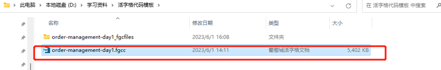
Open the file with the .fgcc suffix in the package with the movable type grid designer. The first time you open it, it will report version inconsistency information, just ignore it.
(required files)
System effect display diagram :

(PC item display page)
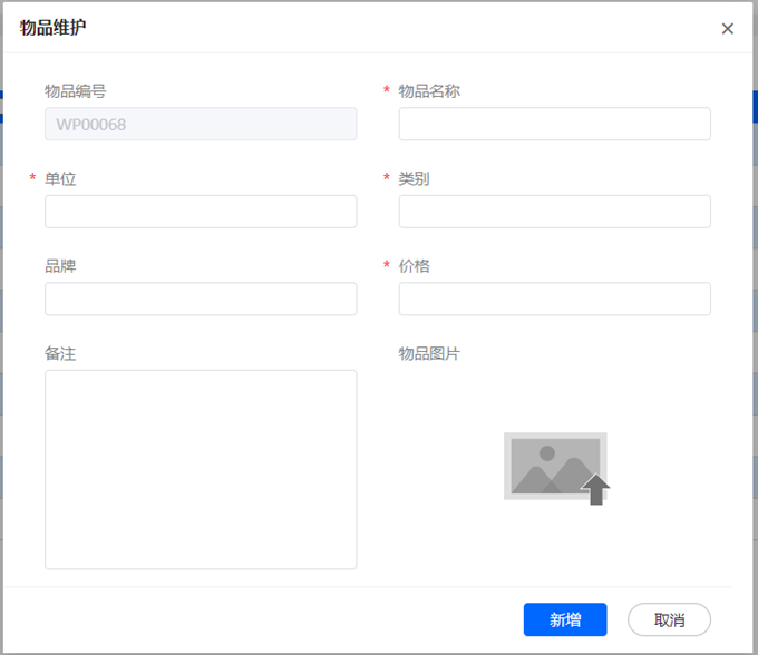
(PC item maintenance interface)
(Mobile item maintenance interface)
The demo displayed this time is composed of the item list display interface on the PC end, the item maintenance interface on the PC end, and the item maintenance interface on the mobile end. The editor will introduce how to use the movable type grid designer to design the style and button business of the three pages in sequence. logic.
Designing Page Styles Using Movable Type
1) Item list display page on PC:
Design query box and query button:
Use the shortcut key Ctrl+M to create two merged cells, which are used as the input box page and the query button respectively. Click the input box page with the mouse and select the input box type of the Element-Plus plug-in (downloaded in the plug-in management) of the functional area. Similarly, click the query button and select the button type of the functional area.
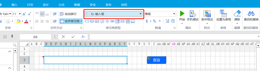
(creating merged cells)
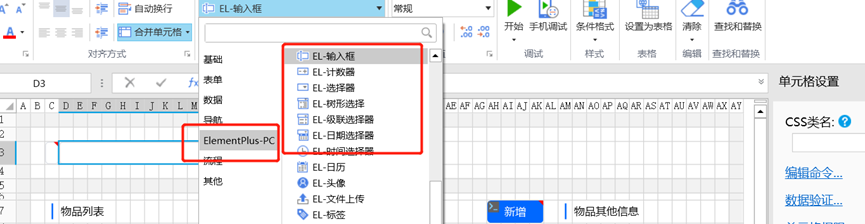
(set query box)
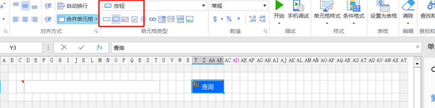
(Set query button)
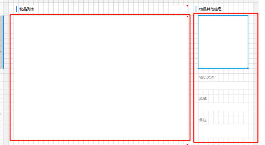
Design Item List and Item Additional Information:
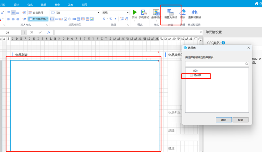
Use the shortcut keys Ctrl+M to create 5 merged cells, which are used as the item list display interface, item other information interface, item name interface, brand interface and note interface respectively. After clicking the item list display interface with the mouse, select the setting of the functional area as the table option. Similarly, click the item other information interface, item name interface, brand interface and note interface respectively and select the input box type of the Element-Plus plug-in in the functional area.
(creating merged cells)
(Set item list display interface)
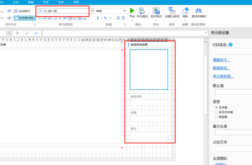
(Interface for setting other item information, item name, etc.)
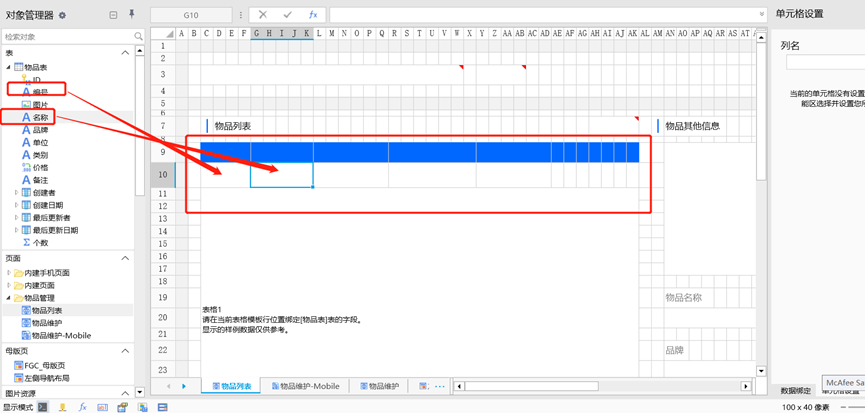
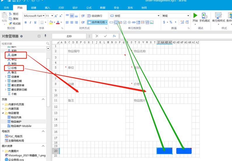
Add the data information to be displayed in the item list display interface, and drag the fields to be displayed in the item list to the interface in the item list.
(Add data information to the item list display interface)
Add hyperlinks for modification and deletion operations in the item list display interface, click the modified and deleted pages with the mouse and select the hyperlink type in the functional area.
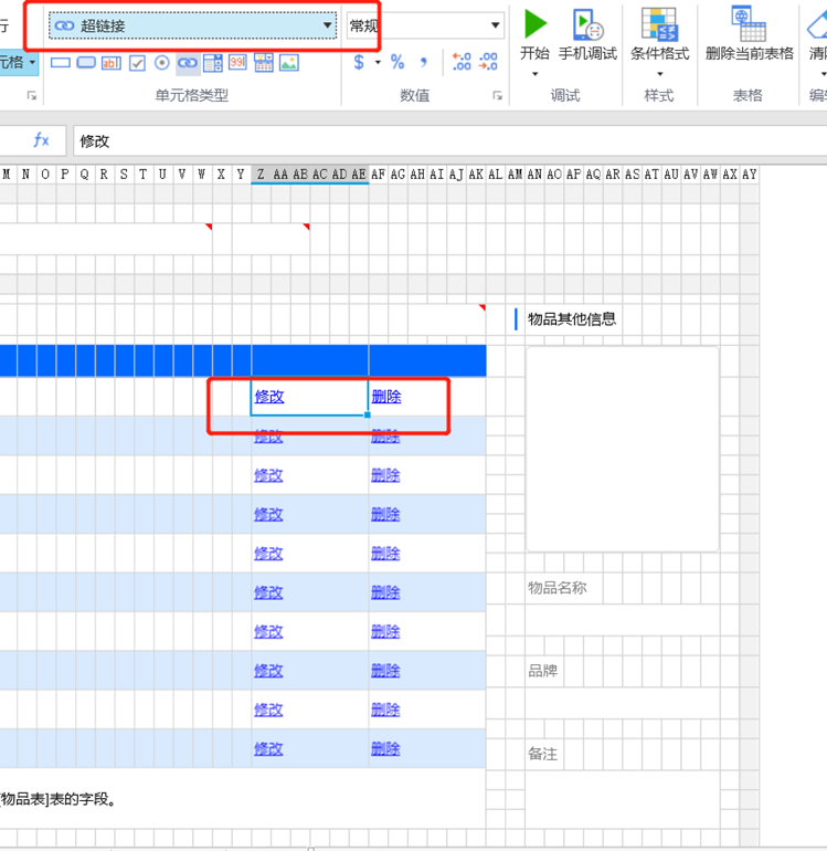
(A hyperlink is added to the item list display interface)
Design pagination pages:
Use the shortcut key Ctrl+M to create a merged cell as a pagination page, and then click the paging page to select the paging type of the Element-Plus plugin in the ribbon.

(Design pagination box)
2) Item maintenance page on PC
Design item maintenance data and jump and cancel buttons
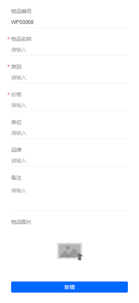
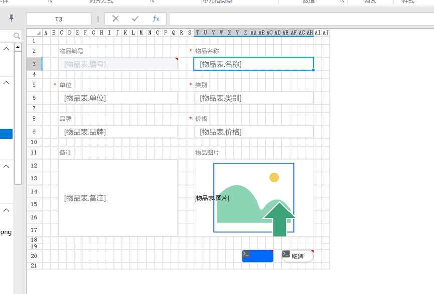
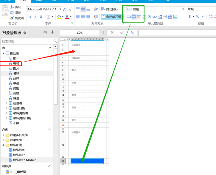
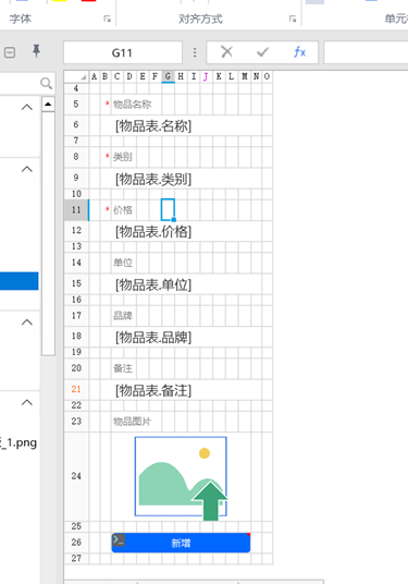
Use the shortcut key Ctrl+M to create 10 merged cells, which are respectively used as item number page, item name page, item unit page, category page, product page card, price page, remarks page, item image page, jump button and cancel button. Then click the 8 field pages that need to be displayed and select the input box type of the Element-Plus plug-in in the functional area. Similarly, click the jump button and cancel button respectively to select the button type of the functional area. Finally, drag and drop the fields of the item table to the corresponding field page.
(Design item maintenance data and jump, cancel button)
(Designed renderings)
3) Item maintenance interface on the mobile terminal
The design method is the same as the method for designing the item maintenance interface on the PC side. (Just learn from the method of item maintenance interface on PC)
(Design the item maintenance interface on the mobile terminal)
(Designed renderings)
Design Button Logic Functions Using Movable Type
1) Design the button logic function of the item list interface
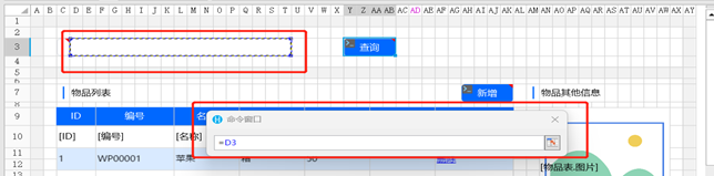
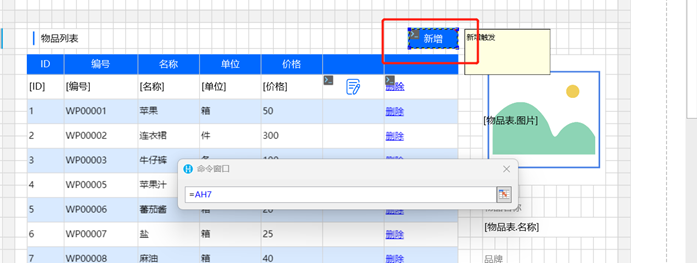
Design the query button function of the item list interface:
Right-click the query button and select the edit command, and select the query method in the opened command window.
(Right click on the query and select the edit command)
Click New Condition, select the field contained in the data table for the field, select the operation contains the specified string, and select the value
Query the coordinates of the box (click the box directly to display it in the command window), and click OK.

(Create query conditions)
(select query input box page as value)
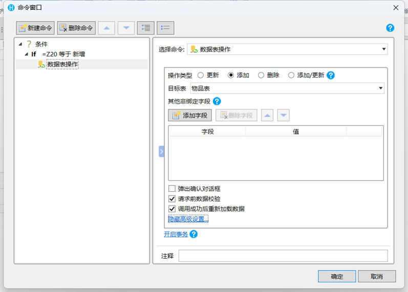
Design the logic of adding/modifying/deleting buttons
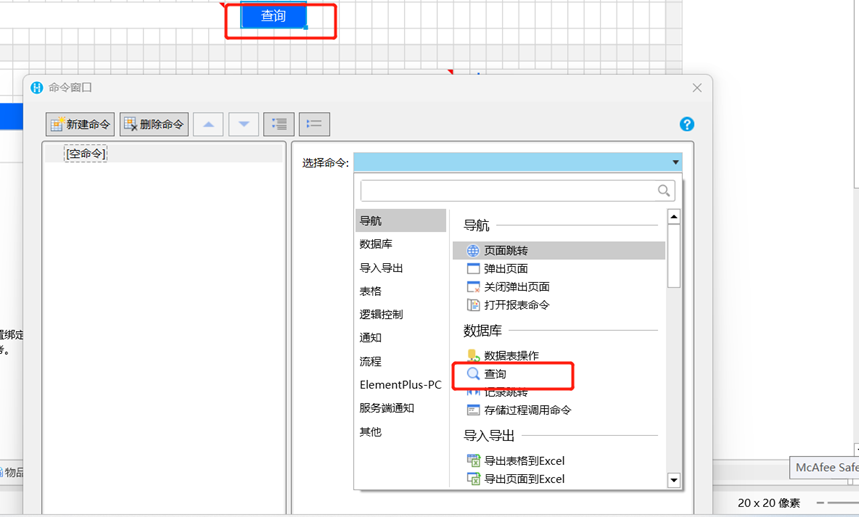
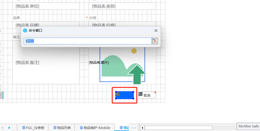
Right-click the Add/Modify button and click the Edit command to select the pop-up page and select Advanced Options.
(Add the business logic of the button)
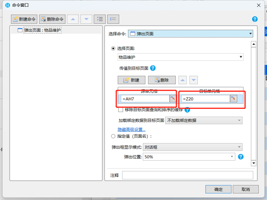
The source cell selects the coordinates of the newly added cell.
(The source cell selects the coordinates of the new button)
The target cell selects the button of the item maintenance interface.
(Target cell selection item maintenance page jump button)
Right-click on the Delete button and click on the Edit command, select the Delete Record button and confirm. ![GUI, text, application description has been automatically generated]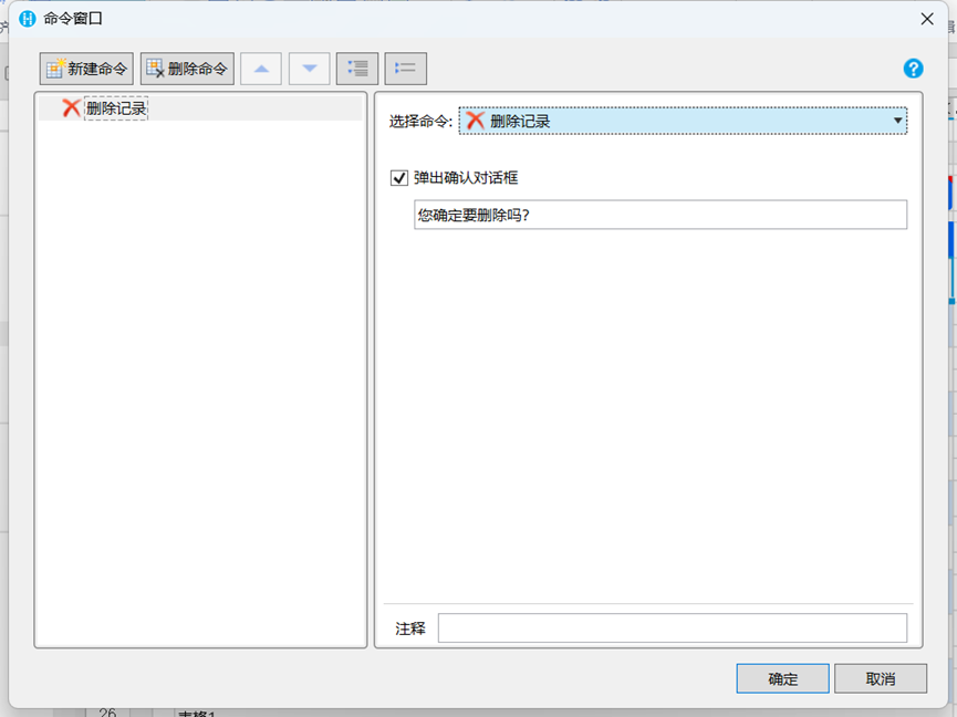
(delete button business logic)
2) Design the buttons on the item maintenance page
jump button
Right-click the jump button, click the edit command, select the condition command and click the if condition expression field to select the jump button, select equal to the operation, select new for the value, and then click the empty command below to select the data table operation and then select new. ![GUI, Application, Word description automatically generated]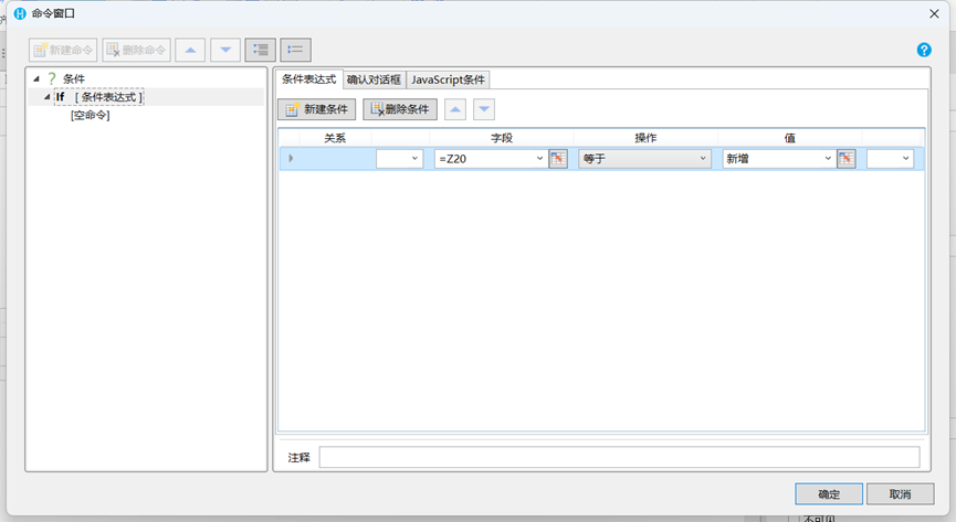
(select if condition expression)
(Select the data action sheet and select Add)
Click Add Else, select Data Table Operation, select Update and click OK.
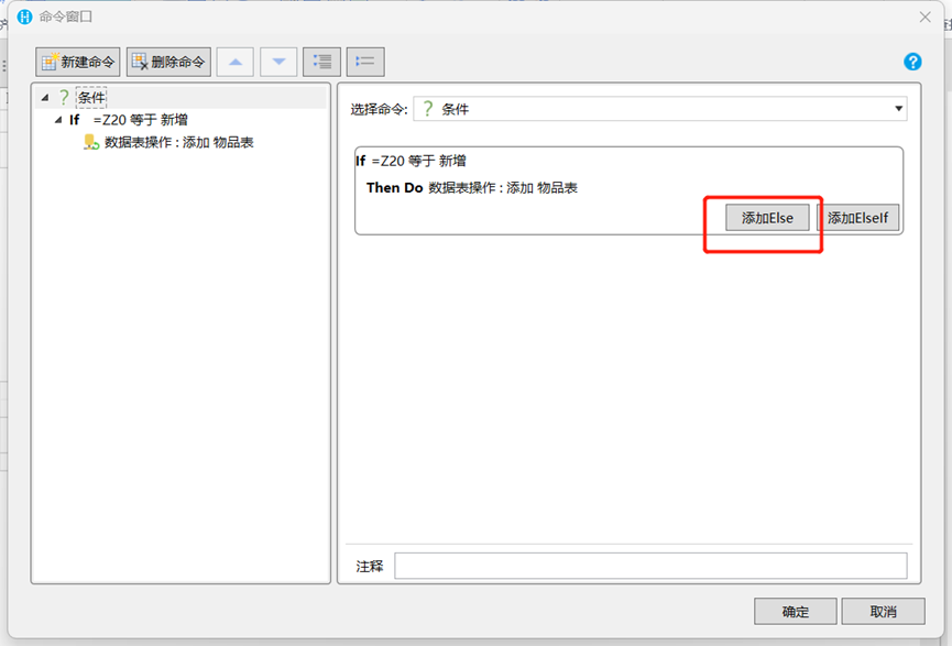
(Click to add Else)
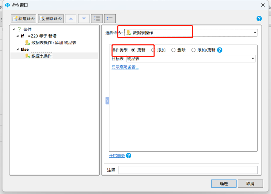
(Select Data Table Actions Select Update)
Click the New command and choose to close the pop-up page and check the parent page reload bound data option.
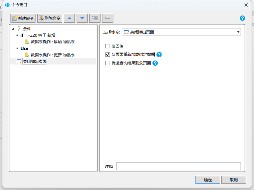
(add the function of closing the pop-up interface)
cancel button
Right-click the cancel button to edit the command and choose to close the pop-up window page.
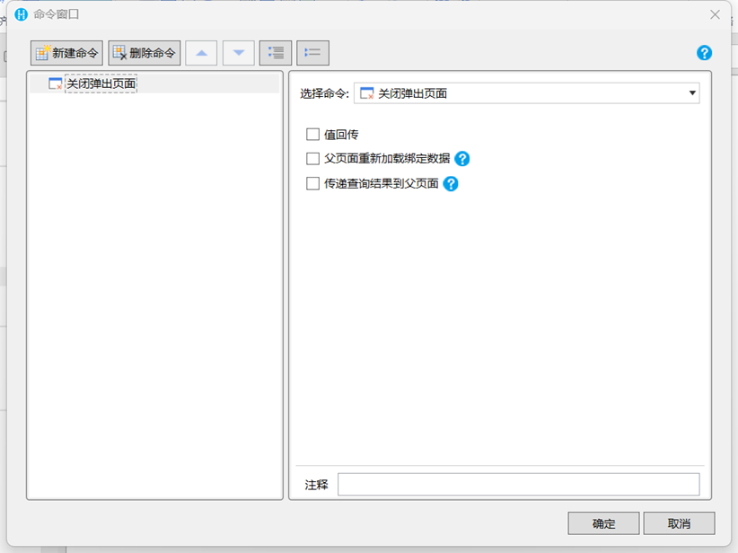
(logic of cancel button)
3) Design item maintenance page button logic on the mobile phone
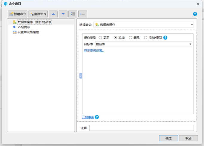
Right-click the Add button, select the Edit command, select Data Table Operations, and select Add.
Click on New Command Select V-Light Prompt Select.

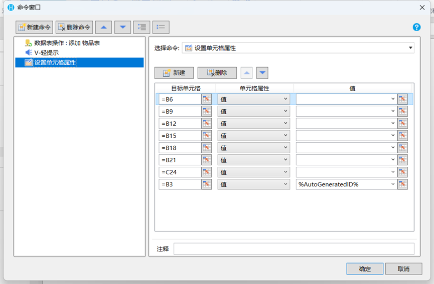
3. Select the setting cell for the new command, select the item table field for the target cell, select empty for the value, and select auto-increment for the item number. This step is to ensure that the data is cleared every time the Add button is clicked.
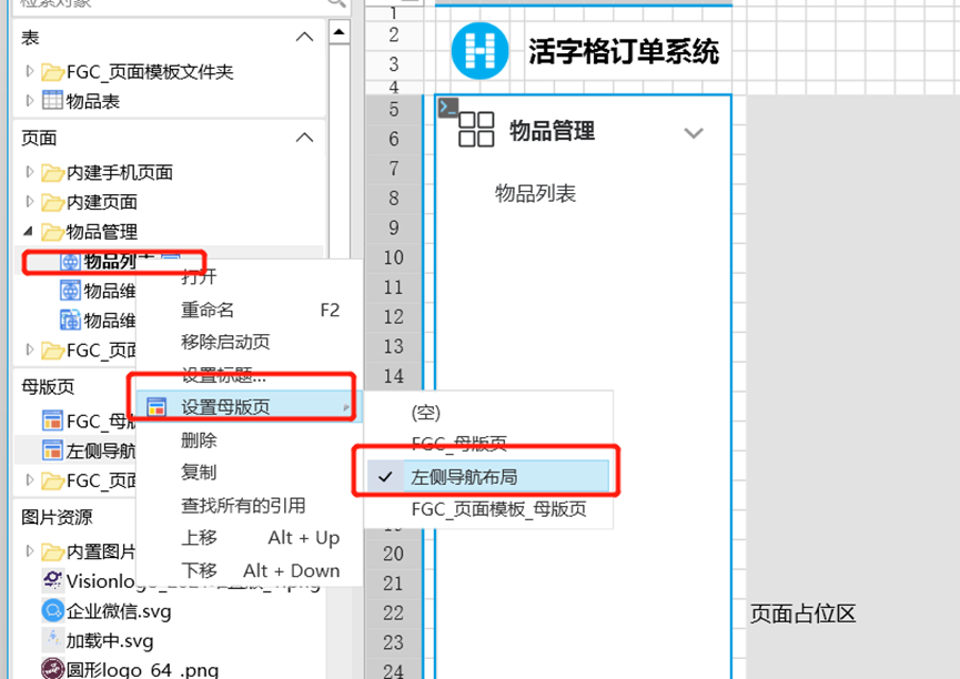
Set left navigation layout
Double-click the item list interface, select the item list in the pop-up interface and then select the edit command.
(edit navbar command)
Select the Page Jump command and choose Jump to List of Items.
(jump page command)
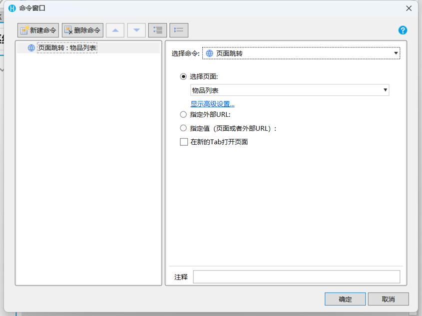
Right-click on the item list and select Set Master Page and select Left Navigation Layout.
Click the start button to run the program.
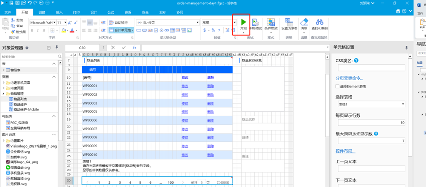
Then it can run on the browser and the operating system.
If you want to know more about movable type grids, you can go to the official website of Putaocheng movable type grids .
Extension link:
Kekai opens up new ideas, "moves" Excel into UFIDA U8+ CS portal with movable type