If you need source code and data sets, please like and follow the collection and leave a private message in the comment area~~~
1. Matplotlib visualizes passenger flow
It is one of the most commonly used Python software packages for 2D graphics, and it is the basis of many advanced visualization libraries. It is not a built-in python library and needs to be manually installed before calling, and it depends on the numpy library. At the same time, as a data visualization module in Python, it can create various types of charts, such as bar charts, scatter charts, pie charts, histograms, line charts, etc.
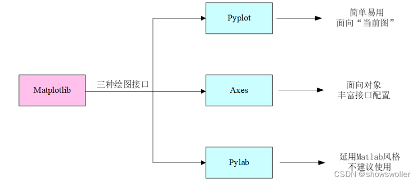
When using the matplotlib library to draw, the pyplot module is generally called, which integrates most of the common method interfaces to jointly complete various rich drawing functions. At the same time, it needs to be pointed out: figure and axes are also the interface forms. The former defines the top-level class object figure for all drawing operations, which is equivalent to providing a drawing board; the latter defines each drawing object axes in the drawing board, which is equivalent to drawing in the drawing board. each subgraph of . In addition, there is another important module in matplotlib - pylab, which is positioned as a substitute for Matlab in Python. It not only includes drawing functions, but also matrix operation functions. In short, all functions that can be realized by Matlab can be realized by pylab. Although pylab is powerful, it is not a wise choice to call directly because it integrates too many functions, and the official does not recommend using it for drawing.
The three drawing interface forms of Matplotlib introduced above are shown in Figure 1.15 The three drawing interfaces of Matplotlib
The basic operation of matplotlib will not be repeated here, just read my previous blog if you need it
The following is a visual drawing of the passenger flow data of the terrain
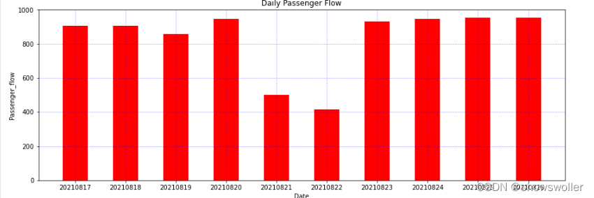
bar/barh: bar graph or histogram, often used to express the size relationship of a set of discrete data, such as the passenger flow data of a certain station every month within a year; the default vertical bar graph, optional barh to draw a horizontal bar graph .
The specific function and related parameters are: plt.bar ( x, height, width = 0.8, bottom = None, color).
Among them: x is a scalar sequence, which determines the number of x-axis scales; height is used to determine the scale of the y-axis; width is the width of a single histogram; bottom is used to set the starting point of the y-boundary coordinate axis; color is used to set the color of the histogram. (Giving only one value means that all the colors are used. If the color list is assigned, it will be dyed one by one. If the number of color lists is less than the number of histograms, it will be recycled).
Take the passenger flow data of a city subway in the past 10 days as an example, draw a histogram
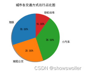
pie: pie chart, mainly used to express composition or proportional relationship, generally suitable for a small amount of comparison.
The specific function and related parameters are: plt.pie( x, labels, explode, startangle, shadow, labeldistance, radius).
Among them: x is the ratio (of each piece), if sum(x) > 1, the normalization of sum (x) will be used; labels is the explanatory text displayed on the outside of the pie chart (each piece); explode is (each piece) left Center distance, the default is 0; startangle is the starting drawing angle, the default graph is drawn counterclockwise from the positive direction of the x-axis, if set to 90, it is drawn from the positive direction of the y-axis; shadow means to draw a pie chart below the pie chart shadow. Default value: False, that is, no shadow is drawn; labeldistance is the drawing position of the label mark, relative to the ratio of the radius, the default is 1.1, if <1, it is drawn inside the pie chart; radius is used to control the radius of the pie chart, the default value is 1 .
Next, take the proportion of various transportation modes in the city as an example, and draw a pie chart
Part of the code is as follows
import matplotlib.pyplot as plt
import matplotlib

matplotlib.rcParams['axes.unicode_minus'] = False
# 确定柱状图数量,代表最近10天
x = [1, 2, 3, 4, 5, 6, 7, 8, 9, 10]
# 确定y轴刻度,代表每一天的地铁客流量
y = [904.8, 903.9, 857.13, 944.49, 498.72, 416.39, 930.74, 946.14, 953.54, 953.55]
x_label = ['20210817', '20210818', '20210819', '20210820', '20210821', '20210822', '2021082inestyle=':', color='b', alpha=0.6)

plt.xlabel('Date')
plt.ylabel('Passenger_flow')

plt.title('Daily Passenger Flow')
plt.show()
import matplotlib.pyplot as plt

plt.r= [30, 25, 35, 10]
plt.pie(sizes, labels=labels, shadow=True, autopct='%1.2f%%', startangle=90)

plt.title('城市各交通方式出行占比图')
plt.show()
2. Random forest for regression prediction
Random forest is an ensemble algorithm composed of multiple decision trees, which performs well on both classification and regression problems. Before explaining random forests, a brief introduction to decision trees is needed. Decision tree is a very simple algorithm, which is highly explanatory and conforms to human intuitive thinking. This is a supervised learning algorithm based on if-then-else rules.
Random forest is composed of many decision trees, and there is no correlation between different decision trees. When we perform a classification task, a new input sample enters, and each decision tree in the forest is judged and classified separately. Each decision tree will get its own classification result. Which one of the classification results has the most classification, the random forest will put this The result is considered final. As an integrated algorithm for solving classification and regression problems, random forest has the following advantages
(1) For most data, high-accuracy classifiers can be generated;
(2) Can handle a large number of input variables;
(3) The introduction of randomness is not easy to overfit;
(4) It can handle discrete and continuous data without normalization.
Similarly, when using random forests to solve classification and regression problems, there are also the following disadvantages:
(1) Overfitting on certain noisy classification or regression problems;
(2) Among data with different values for the same attribute, attributes with more value divisions will have a greater impact on the random forest, and the attribute weights produced on this type of data are not credible;
(3) When there are many decision trees in the forest, the time and space required for training will be larger
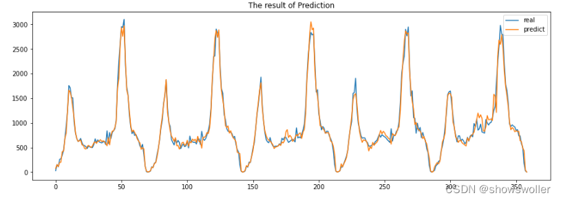
Here, taking the inbound passenger flow data of Xizhimen Subway Station in Beijing as an example, the passenger flow is predicted by sklearn's random forest algorithm
First, use Pandas to import the inbound passenger flow of Xizhimen subway station every 15 minutes, and use matplotlib to draw the passenger flow curve
Considering that the size of the passenger flow is affected by the previous passenger flow, the passenger flow of the first 15 minutes of the subway passenger flow at this time, the average passenger flow of the first five 15 minutes at this time, and the average passenger flow of the first ten 15 minutes are added here to improve the passenger flow forecast The accuracy rate, and delete the row where the abnormal data NULL is located, so as not to affect the prediction. Take 80% of the data set as the training set and 20% as the test set
Considering that the size of the passenger flow is affected by the previous passenger flow, the passenger flow of the first 15 minutes of the subway passenger flow at this time, the average passenger flow of the first five 15 minutes at this time, and the average passenger flow of the first ten 15 minutes are added here to improve the passenger flow forecast The accuracy rate, and delete the row where the abnormal data NULL is located, so as not to affect the prediction. Take 80% of the data set as the training set and 20% as the test set
It can be seen that the fitting effect is very good, except for some maximum value points, the other predictions are basically the same
Part of the code is as follows
import pandas as pd
import matplotlib.pyplot as plt
from sklearn.ensemble import RandomForestRegressor

# 导入西直门地铁站点15min进站客流
df = pd.read_csv('./xizhimen.csv', encoding="gbk", parse_dates=True)
len(df)
df.head()  # 观察数据集,这是一个单变量时间序列

plt.figure.iloc[:, 0], df.iloc[:, 1], label="XiZhiMen Station")
plt.legend()
plt.show()
# 增加前一天的数据
df['pre_date_flow'] = df.loc[:, ['p_flow']].shift(1)
# 5日移动平均
df['MA5'] = df['p_flow'].rolling(5).mean()
# 10日移动hape[0])

X_length = X.shape[0]
split = int(X_length * 0.8)
X_train, X_test = X[:split], X[split:]
y_train, y_test = y[:split], y[split:]
print()
random_forest_regressor = RandomForestRegressor(n_estimators=15)
# 拟合模型
random_forest_regressor.fit(X_train, y_train)
score = random_forest_regressor.score(X_test, y_test)
result = random_forest_regressor.predict(X_test)
ravel(), label='real')
plt.plot(result, label = 'predict')
plt.legend()
plt.show()
It's not easy to create and find it helpful, please like, follow and collect~~~