Design beautiful buttons based on color, shape, icon, and more
Use typethe , plain, roundand circleattributes to define the Button's style.

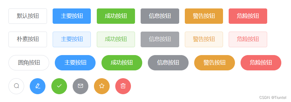
<el-row>
  <el-button>默认按钮</el-button>
  <el-button type="primary">主要按钮</el-button>
  <el-button type="success">成功按钮</el-button>
  <el-button type="info">信息按钮</el-button>
  <el-button type="warning">警告按钮</el-button>
  <el-button type="danger">危险按钮</el-button>
</el-row>
<el-row>
  <el-button plain>朴素按钮</el-button>
  <el-button type="primary" plain>主要按钮</el-button>
  <el-button type="success" plain>成功按钮</el-button>
  <el-button type="info" plain>信息按钮</el-button>
  <el-button type="warning" plain>警告按钮</el-button>
  <el-button type="danger" plain>危险按钮</el-button>
</el-row>
<el-row>
  <el-button round>圆角按钮</el-button>
  <el-button type="primary" round>主要按钮</el-button>
  <el-button type="success" round>成功按钮</el-button>
  <el-button type="info" round>信息按钮</el-button>
  <el-button type="warning" round>警告按钮</el-button>
  <el-button type="danger" round>危险按钮</el-button>
</el-row>
icon button
Buttons with icons for enhanced legibility (with text) or to save space (without text)

<el-row>
  <el-button icon="el-icon-search" circle></el-button>
  <el-button type="primary" icon="el-icon-edit" circle></el-button>
  <el-button type="success" icon="el-icon-check" circle></el-button>
  <el-button type="info" icon="el-icon-message" circle></el-button>
  <el-button type="warning" icon="el-icon-star-off" circle></el-button>
  <el-button type="danger" icon="el-icon-delete" circle></el-button>
</el-row>
Among them, the Icon icon provides a set of commonly used icon collections, which can be used directly by setting the class name el-icon-iconName. For example:
<i class="el-icon-edit"></i>
<i class="el-icon-share"></i>
<i class="el-icon-delete"></i>
<el-button type="primary" icon="el-icon-search">搜索</el-button>
text button
For buttons without borders and background colors, you can use disabledattributes to define whether the buttons are available.
<el-button type="text">文字按钮</el-button>
<el-button type="text" disabled>文字按钮</el-button>
button group
Use <el-button-group>labels to nest buttons

<el-button-group>
  <el-button type="primary" icon="el-icon-arrow-left">上一页</el-button>
  <el-button type="primary">下一页<i class="el-icon-arrow-right el-icon--right"></i></el-button>
</el-button-group>
<el-button-group>
  <el-button type="primary" icon="el-icon-edit"></el-button>
  <el-button type="primary" icon="el-icon-share"></el-button>
  <el-button type="primary" icon="el-icon-delete"></el-button>
</el-button-group>
The main parameters
| parameter | illustrate | type | optional value | Defaults |
|---|---|---|---|---|
| size | size | string | medium / small / mini | — |
| type | type | string | primary / success / warning / danger / info / text | — |
| plain | Whether plain button | boolean | — | false |
| round | Whether to round the button | boolean | — | false |
| circle | Whether the round button | boolean | — | false |
| loading | Is loading status | boolean | — | false |
| disabled | Is it disabled | boolean | — | false |
| icon | icon class name | string | — | — |
| autofocus | Whether to focus by default | boolean | — | false |
| native-type | native type attribute | string | button / submit / reset | button |