Several implementations of CSS text gradient and background gradient
In our daily page development, using appropriate CSS gradient effects can make our interface more beautiful and pleasing to the eye.
1. CSS text gradient:
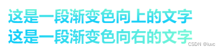
First of all, the text gradient is actually clipped to the foreground color of the text through the background gradient, and then the text fill color becomes transparent to display the background color to realize the text gradient. (Simply speaking, it is to crop the transparent text so that we can see the background color behind). So as long as we learn how to implement the background color, we can achieve most of the text gradient effects.
CSS code:
background-image: linear-gradient(to top, #00C6FF, #8AFFD2); /* 线性渐变背景,方向向上 */
-webkit-background-clip: text; /* 背景被裁剪成文字的前景色 */
-webkit-text-fill-color: transparent; /* 文字填充颜色变透明 */
Renderings:
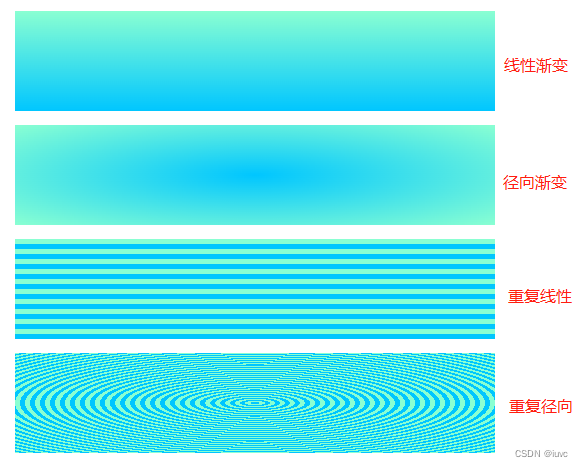
2. CSS background gradient: This is the part we focus on.
The background gradient methods are generally divided into linear gradient , radial gradient and repeated gradient (also divided into linear and radial ).
CSS code:
  /* 线性渐变背景,方向向上 */
  background-image: linear-gradient(to top, #00C6FF, #8AFFD2);
  /* 径向渐变背景,中心为圆心 */
  background-image: radial-gradient(#00C6FF, #8AFFD2);
  /* 重复渐变-线性,向上重复 */
  background-image: repeating-linear-gradient(to top,#00C6FF, #00C6FF 5px, #8AFFD2 5px, #8AFFD2 10px);
  /* 重复渐变-径向,中心为圆心 */
  background-image: repeating-radial-gradient(#00C6FF, #00C6FF 5px, #8AFFD2 5px, #8AFFD2 10px);
Renderings:
(1) Linear Gradient:
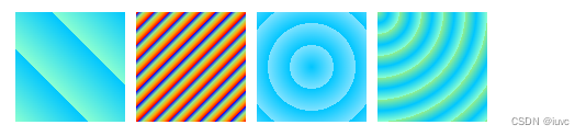
Linear gradient parameters include gradient direction, color value, color start and end range. Through these parameters, we can set some very distinctive front-end CSS effects.
CSS code:
  /* 方块一 */
  background-image: linear-gradient( 45deg,#00C6FF, #8AFFD2);
  /* 方块二 */
  background-image: linear-gradient(to top left, #00C6FF 50%, #8AFFD2 50%);
  /* 方块三 */
  background-image: linear-gradient( to top,rgba(0 ,198,255,0), rgba(0 ,198,255,0.5),rgba(0 ,198,255,0));
  /* 方块四 */
  background: linear-gradient(to right, red 20%, orange 20% 40%, yellow 40% 60%, green 60% 80%, blue 80%);
Renderings:

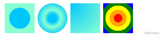
(2) Radial Gradient:
Radial gradient parameters include the center of the gradient (farthest-corner can specify the location of the center point, and the default center is the center of the circle), color value, and color start and end range.
CSS code:
  /* 方块一 */
  background-image: radial-gradient(#00C6FF 50%, #8AFFD2 50%);
  /* 方块二 */
  border-radius: 50%;
  background-image: radial-gradient(#00C6FF 20%, #8AFFD2 40%,#00C6FF 80%, #8AFFD2 100%);
  /* 方块三 */
  background-image: radial-gradient(farthest-corner at 0px 0px, #00C6FF 0%, #8AFFD2 100%);
  /* 方块四 */
  background-image: radial-gradient(red 20%, orange 20% 40%, yellow 40% 60%, green 60% 80%, blue 80%);
Renderings:
(3) Repeat the gradient:
The linear and radial parameters of the repeated gradient are similar to the parameters of the previous linear gradient and radial gradient, so I won’t go into details here.
CSS code:
  /* 方块一 线性 */
  background-image: repeating-linear-gradient(45deg, #8AFFD2, #00C6FF 33.3%);
  /* 方块二 线性 */
  background-image: repeating-linear-gradient(to top left, red , orange , lightgreen , blue 10px);
  /* 方块三 径向 */
  background-image: repeating-radial-gradient(circle at center, #00C6FF, rgba(0,198,255,0.5) 20px);
  /* 方块四 径向 */
  background-image: repeating-radial-gradient(farthest-corner at 0px 0px, lightgreen , #00C6FF, #8AFFD2 20px);
Renderings:
Summarize:
With a basic understanding of these gradient methods, we can achieve some regular front-end CSS effects. Combined with the text gradient method, we can get the following interesting text gradient style.
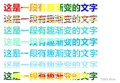
No, I feel that the simple text is also high-end and elegant!