This series of articles is based on "Machine Learning in Practical Combat" , combined with the UP master shuhuai008 of station B's machine learning whiteboard derivation series collection, to strengthen the understanding and application of basic machine learning algorithms.
If you are interested in computer vision, you can refer to the blogger's computer vision column: Python computer vision
In recent years, deep learning has become popular, and there is even a tendency to overwhelm other machine learning methods, but the foundation still needs to be laid firmly, so this article is used to introduce a relatively basic algorithm in machine learning - K-Nearest Neighbor Algorithm, I hope Can help everyone.

This article mainly refers to "Machine Learning in Practical Combat" , and adds some of my own understanding, trying to explain the basic principles of the algorithm and the implementation of Python code in an easy-to-understand manner.
Table of contents
Four data sets and the acquisition of "Machine Learning in Practice"
a basic concept
1 concept
Generally speaking, we are convinced that 'if you want to understand a person, then first understand the people around him' is a truth, which is also the main idea of the K-nearest neighbor algorithm. First of all, we have a training data set, which records various characteristic data of samples of different categories in detail. For example, if we want to distinguish boys and girls by characteristics such as height, weight and waist circumference, then we must first obtain a large number of boys and girls. The data of these characteristics; after processing these data, we now get the data of a classmate's height, weight and other characteristics, so how should we judge the gender of the classmate? The easiest way is to use the K-nearest neighbor algorithm. First, calculate the Euclidean distance between each feature of this classmate and the samples in the training set (that is, the distance between two simple points) , and select the closest distance to the test sample. K samples , and calculate the proportion of samples of different categories in the k samples , whichever category has a high proportion indicates that the test sample belongs to this sample. Still taking gender classification as an example, if we get 6 recent test sample points, 5 of which are girls, and only one sample is a boy, then we can be sure that the test sample is a girl.
Unless we're classifying based on features like hair length, clothing, etc.:

So in addition to the size of k, we also need to take into account the characteristics of the data set, try to be unique, hahahaha.
2 Implementation steps
step one: collect data (that is, get a large number of training samples)
step two: structure and analyze the test sample set
step three: Calculate the distance between the input test sample and the training sample
step four: Classify the test samples
step five: output result
Two code implementation
Suppose we need to classify the patient's condition level in the hospital. For the convenience of demonstration, we specify that the patient's condition is divided into two levels, A and B, and there are only two analysis indicators.
For example, the various data indicators and disease levels of the patients we obtained before are shown in the following table:
| patient number | Disease level | Indicator one | Indicator two |
| 1 | A | 1.0 | 1.1 |
| 2 | A | 1.0 | 1.0 |
| 3 | A | 0.9 | 1.0 |
| 4 | A | 0.8 | 1.1 |
| 5 | A | 1.1 | 1.0 |
| 6 | B | 0.2 | 0.13 |
| 7 | B | 0.1 | 0.11 |
| 8 | B | 0.1 | 0 |
| 9 | B | 0 | 0 |
| 10 | B | 0 | 0.1 |
Next, we need to design a classifier to judge the condition level of new patients in our hospital.
The first step is to get training samples and represent the samples in the graph:
"""
Author:XiaoMa
date:2021/12/1
"""
#导入需要的库
import numpy as np
import matplotlib.pyplot as plt
import operator
#得到训练样本集
def createDataSet():
    group = np.array([[1.0, 1.1], [1.0, 1.0], [0.9, 1], [0.8, 1.1], [1.1, 1], [0.2, 0.13], [0.1, 0.11], [0.1, 0], [0, 0], [0, 0.1]])
    labels = np.array(['A', 'A', 'A', 'A', 'A', 'B', 'B', 'B', 'B', 'B'])
    return group, labels  #返回病人的病情指标和病情等级
group, labels = createDataSet()

plt.rcParams['font.family'] = 'SimHei'       #将全局中文字体改为黑体
plt.rcParams['axes.unicode_minus'] = False   #正常表示负号
A = group[0:5] #A组是样本集中的前五个
B = group[5:]  #B组是样本集中的后五个
plt.scatter(A[:, 0], A[:, 1], color = 'aquamarine', label = 'A') #将数组中的前一列作为x轴,后一列作为y轴绘制在散点图中
plt.scatter(B[:, 0], B[:, 1], color = 'r', label = 'B')
plt.legend(loc = 'upper left') #添加图例
plt.show() 
The next step is to implement the K-nearest neighbor algorithm with code:
#K-近邻算法
def classify0(inX, dataSet, labels, k):  #四个参数分别为:用于分类的输入向量inX,训练样本集dataSet,标签向量labels,最近邻居数目K
    dataSetSize = dataSet.shape[0]       #取得训练样本数目
    diffMat = np.tile(inX, (dataSetSize, 1)) - dataSet    #将输入的待分类样本进行x轴方向的四次复制并减去样本集,如计算(x1, y1)和(x2, y2)之间的距离,首先需要计算(x2-x1, y2-y1)
    sqDiffMat = diffMat**2                                #对得到的差值进行平方
    sqDistances = sqDiffMat.sum(axis = 1)                 #求得(x2-x1)^2 + (y2-y1)^2
    distance = sqDistances**0.5                           #对平方和开根号得到两个数据之间的欧式距离
    sortedDistIndicies = distance.argsort()               #对距离进行argsort()默认的从小到大排列
    classCount = {}                                       #定义一个空的字典
    for i in range(k):                                    #开始选择距离最小的k个点
        voteIlabel = labels[sortedDistIndicies[i]]        #将原先的标签按照从小到大的顺序赋给voteIlabel
        classCount[voteIlabel] = classCount.get(voteIlabel, 0) + 1
    sortedClassCount = sorted(classCount.items(),
                              key = operator.itemgetter(1), reverse = True)#sorted()函数进行降序排列,最后返回发生频率最高的值
    return sortedClassCount[0][0]   #返回频率最高的样本点的标签
Using the above two modules, we can judge the condition of the new patient, assuming that the two indicators of the new patient are (0.2, 0.5):
"""
Author:XiaoMa
date:2021/12/1
"""
#导入需要的库
import numpy as np
import matplotlib.pyplot as plt
import operator
#得到训练样本集
def createDataSet():
    group = np.array([[1.0, 1.1], [1.0, 1.0], [0.9, 1], [0.8, 1.1], [1.1, 1], [0.2, 0.13], [0.1, 0.11], [0.1, 0], [0, 0], [0, 0.1]])
    labels = np.array(['A', 'A', 'A', 'A', 'A', 'B', 'B', 'B', 'B', 'B'])
    return group, labels  #返回病人的病情指标和病情等级
group, labels = createDataSet()

plt.rcParams['font.family'] = 'SimHei'       #将全局中文字体改为黑体
plt.rcParams['axes.unicode_minus'] = False   #正常表示负号
A = group[0:5] #A组是样本集中的前五个
B = group[5:]  #B组是样本集中的后五个
plt.scatter(A[:, 0], A[:, 1], color = 'aquamarine', label = 'A') #将数组中的前一列作为x轴,后一列作为y轴绘制在散点图中
plt.scatter(B[:, 0], B[:, 1], color = 'r', label = 'B')
plt.legend(loc = 'upper left') #添加图例
plt.show()

#K-近邻算法
def classify0(inX, dataSet, labels, k):  #四个参数分别为:用于分类的输入向量inX,训练样本集dataSet,标签向量labels,最近邻居数目K
    dataSetSize = dataSet.shape[0]       #取得训练样本数目
    diffMat = np.tile(inX, (dataSetSize, 1)) - dataSet    #将输入的待分类样本进行x轴方向的四次复制并减去样本集,如计算(x1, y1)和(x2, y2)之间的距离,首先需要计算(x2-x1, y2-y1)
    sqDiffMat = diffMat**2                                #对得到的差值进行平方
    sqDistances = sqDiffMat.sum(axis = 1)                 #求得(x2-x1)^2 + (y2-y1)^2
    distance = sqDistances**0.5                           #对平方和开根号得到两个数据之间的欧式距离
    sortedDistIndicies = distance.argsort()               #对距离进行argsort()默认的从小到大排列
    classCount = {}                                       #定义一个空的字典
    for i in range(k):                                    #开始选择距离最小的k个点
        voteIlabel = labels[sortedDistIndicies[i]]        #将原先的标签按照从小到大的顺序赋给voteIlabel
        classCount[voteIlabel] = classCount.get(voteIlabel, 0) + 1
    sortedClassCount = sorted(classCount.items(),
                              key = operator.itemgetter(1), reverse = True)#sorted()函数进行降序排列,最后返回发生频率最高的值
    return sortedClassCount[0][0]   #返回频率最高的样本点的标签

#对新来的病人进行判断
ind = [0.2, 0.5]#病人指标
grade = classify0(ind, group, labels, 6)#分类器进行判断并返回频率最高的标签
print('The patient\'s grade of illness is:', grade)  #得到结果
The output that can be obtained is:

We can also draw the patient's indicators in a scatter plot for judgment:
plt.scatter(0.2, 0.5, color = 'b', label = '待分析病人')#将待分析病人的数据绘制到散点图中。此行代码添加到前面的得到训练样本集那里就行

It can be seen that the patients to be analyzed are closer to category B, so our classifier judgment is not wrong.
Three Dating Sites Analysis
Helen has been using dating websites to find a date she likes, but she has not found a suitable date. After analyzing her past dates, she divides her previous dates into three categories: people who don’t like people, people who are average Attractive people, extremely attractive people , and she also has some data she collects herself to record various indicators of those dates. She saves these data in a file named datingTsetSet.txt . The characteristics of her observation samples mainly include annual flight mileage, weekly game time percentage, and weekly liters of ice cream consumed .
The first thing we need to do is to analyze the read data file:
#分析数据文件
def file2matrix(filename):  #创建分析函数
    fr = open(filename)#打开数据集文件使用
    array0Lines = fr.readlines()#读取文件的内容
    number0fLines = len(array0Lines)#得到文件中数据的行数
    returnMat = np.zeros((number0fLines, 3))#返回的NumPy矩阵,解析完成的数据:numberOfLines行,3列,两个括号,不然格式错误
    classLabelVector = []
    index = 0  #行数索引
    for line in array0Lines:
        line = line.strip()#截取所有回车字符
        listFromLine = line.split('\t')#将整行数据分割成元素列表
        returnMat[index, :] = listFromLine[0:3]#选取前三列元素存储到特征矩阵中
        # 根据文本中标记的喜欢的程度进行分类,1代表不喜欢,2代表魅力一般,3代表极具魅力
        if listFromLine[-1] == 'didntLike':
            classLabelVector.append(1)
        elif listFromLine[-1] == 'smallDoses':
            classLabelVector.append(2)
        elif listFromLine[-1] == 'largeDoses':
            classLabelVector.append(3)
        index += 1
    return returnMat, classLabelVector#返回特征矩阵和标签
Visualize the data, plotting it into a graph:
#将数据两两选择绘制到图中,并进行标签标记
datingDataMat, datingLabels = file2matrix('E:\Python\Machine Learning\ML\datingTestSet.txt')
#print(datingDataMat)#打印数据矩阵

numberOfLabels = len(datingLabels)
#对颜色和图例进行设置
LabelsColors = []
for i in datingLabels:
    if i == 1:
        LabelsColors.append('black')
    if i == 2:
        LabelsColors.append('orange')
    if i == 3:
        LabelsColors.append('red')
didntLike = plt.Line2D([], [], color = 'black', marker = '.',
                      markersize = 6, label = 'didntLike')#对图例进行设置
smallDoses = plt.Line2D([], [], color = 'orange', marker = '.',
                      markersize = 6, label = 'smallDoses')
largeDoses = plt.Line2D([], [], color = 'red', marker = '.',
                      markersize = 6, label = 'largeDoses')

a = plt.figure(figsize=(30, 10)) #创建画布
plt.subplot(131)
plt.scatter(datingDataMat[:, 1], datingDataMat[:, 2], c = LabelsColors)#第二例数据(玩游戏时间占比)和第三列数据(消耗的冰淇淋公升数)绘制散点图
plt.xlabel('玩游戏消耗的时间占比')#设置x轴
plt.ylabel('每周消耗的冰激凌升数')#设置y轴
plt.legend(handles = [didntLike, smallDoses, largeDoses])#添加图例
plt.subplot(132)
plt.scatter(datingDataMat[:, 0], datingDataMat[:, 1], c = LabelsColors)#第一列数据(每年的飞行里程)和第二列数据(玩游戏时间占比)绘制散点图
plt.xlabel('每年的飞行里程')
plt.ylabel('玩游戏消耗的时间占比')
plt.legend(handles = [didntLike, smallDoses, largeDoses])
plt.subplot(133)
plt.scatter(datingDataMat[:, 0], datingDataMat[:, 2], c = LabelsColors)#第一列数据(每年的飞行里程)和第三列数据(消耗的冰淇淋公升数)绘制散点图
plt.xlabel('每年的飞行里程')
plt.ylabel('每周的冰激凌升数')
plt.legend(handles = [didntLike, smallDoses, largeDoses])
plt.savefig('E:\From Zhihu\data.png', dpi = 960)#保存图像
plt.show()
The resulting image is as follows:
Normalize the data:
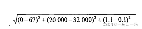
We know that the K-nearest neighbor algorithm is the calculated Euclidean distance. If you want to calculate the distance between 3 and 4 in the table below, then the annual flight mileage will take a large weight, resulting in the other two has little power to decide, so we have to normalize it:

In general, the difference between the original data and the minimum data is compared to the difference between the maximum data and the minimum data is to normalize the data:
def autoNorm(dataSet):
    minVals = dataSet.min(0)    #获得数据的最小值
    maxVals = dataSet.max(0)    #获得数据的最大值
    ranges = maxVals - minVals    #最大值和最小值的差值
    normDataSet = np.zeros(np.shape(dataSet))    #shape(dataSet)返回dataSet的矩阵行数列数
    m = dataSet.shape[0]    #返回dataSet的行数
    normDataSet = dataSet - np.tile(minVals, (m, 1))    #原始值减去最小值
    normDataSet = normDataSet / np.tile(ranges, (m, 1))    #除以最大和最小值的差,得到归一化矩阵
    return normDataSet, ranges, minVals #返回归一化后的特征矩阵、数据范围、最小值
Print it to get:
datingDataMat, datingLabels = file2matrix('E:\Python\Machine Learning\ML\datingTestSet.txt')
nor, ran, min = autoNorm(datingDataMat)
print(nor)
print(ran)
print(min)
Build a classifier to help identify dating partners
Using this classifier, Helen can directly input the characteristics of the dating object and determine the charm of this person ( if you don't like the output : you don't like this person, if this person is attractive, the output is : you will like this person, if this person The person's charm is overwhelming, the output is : you will be addicted to this person.)
def classifyPerson():  #定义分类器
    #输出结果
    resultList = ['don\'t like this person', 'will like this person', 'will be addicted to this person']
    #三种特征用户输入
    precentTats = float(input("玩视频游戏所耗时间百分比:"))
    ffMiles = float(input("每年获得的飞行常客里程数:"))
    iceCream = float(input("每周消费的冰激淋公升数:"))
    #打开的文件名
    filename = "datingTestSet.txt"
    #打开并处理数据
    datingDataMat, datingLabels = file2matrix(filename)
    #训练集归一化
    normMat, ranges, minVals = autoNorm(datingDataMat)
    #生成NumPy数组,测试集
    inArr = np.array([precentTats, ffMiles, iceCream])
    #测试集归一化
    norminArr = (inArr - minVals) / ranges
    #返回分类结果
    classifierResult = classify0(norminArr, normMat, datingLabels, 3)
    #打印结果
    print("You %s" % (resultList[classifierResult - 1]))

classifyPerson()#运行分类器
Try to run and output the result:

It can be seen that this person is a person with average charm. In fact, it can also be classified from the previous pictures. The points near the origin in the three pictures are all orange points with general charm.
Four data sets and the acquisition of "Machine Learning in Practice"
There are many bloggers who have provided a lot of information, you can go to get it, or you can get it in my network disk:
Link: https://pan.baidu.com/s/1zrsXMEQjB18dgaAtXw-KOQ
Extraction code: jmh3
Five conclusions
This article mainly introduces the K-Nearest Neighbor Algorithm and its implementation, and simply implements the analysis of dating websites. The book also includes the recognition of handwritten fonts. If you are interested in 1, you can also try it, and update it when you have time.