Table of contents
2. The appearance of the control
3. Customize the size of the control
4. The inner margin of the control
5. Set the fixed position of the text
I. Overview
The Label control is the most commonly used control in winform development. It is generally used to display text, and sometimes used to open links and other operations.
2. Basic usage
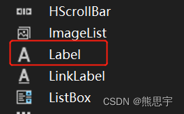
Create a new winform project, click on the form1 interface, find the toolbox, find Label in the toolbox, and drag it into the interface.
1. Control content display
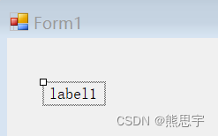
Label dragged into the interface, as follows, click on the property interface to see the specific control properties
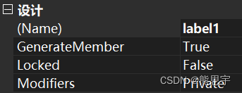
There are two important properties here:
1.Name
In winform, all controls are accessed through Name. In the figure below, the name of the current Label control is label1. Here you can customize the name of the control. The name of the control must be defined according to the specification of the variable, otherwise it will be For error reporting, the best standard is to define the control name + purpose, for example: Label_UserName
After changing the name

2.Text
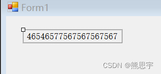
It is used to define the content to be displayed by the Label, as shown in the figure below

The following is the code to modify the content of the label1 control
Double-click the interface of form1, it will automatically add a Form1_Load method to form1, the Load method is executed once by default after the interface is started, we will write the demonstration here
using System;
using System.Collections.Generic;
using System.ComponentModel;
using System.Data;
using System.Drawing;
using System.Linq;
using System.Text;
using System.Threading.Tasks;
using System.Windows.Forms;

namespace WinFormsTest
{
    public partial class Form1 : Form
    {
        public Form1()
        {
            InitializeComponent();
        }

        private void Form1_Load(object sender, EventArgs e)
        {
            Label_UserName.Text = "老王";
        }
    }
}
In the Form1_Load method, we assign a value to the Text property of the Label_UserName control.
After running:

2. The appearance of the control
There are too many attributes below, and some of them are rarely used. I will introduce some commonly used ones. In the following chapters, I will also introduce the specific use of some attributes.

BackColor is the background color of the control
BorderStyle is the style of the border of the control, this property is not commonly used and can be ignored
Cursor is the mouse style displayed when the mouse pointer moves to this control, as follows

FlatStyle Gets or sets the flat style appearance of the label control. This property is not commonly used and can be ignored
ForeColor text color
Image displays pictures on the control, this function is rarely used in Label
ImageAlign The alignment of the image
ImageList custom image list
TextAlign The alignment of the text
The following are text-related settings
name font
Size The size of the text
Bold whether to set bold
Italic whether to set italics
3. Customize the size of the control
With the default setting of Label, the control will automatically adjust the size according to the content of the text, as follows

There is a disadvantage here, that is, the text will be extended to the right in a single line, and if you want to display text in multiple lines, you must modify some properties to do so.
We find the layout-AutoSize in the property interface and set it to false.

At this time, the size of the control can be adjusted

We can modify it directly in the attribute
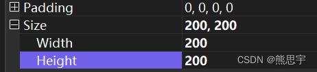
The interface is displayed as follows
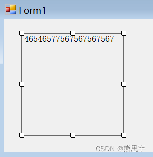
At this time, if you enter some messy text, it will automatically wrap

4. The inner margin of the control
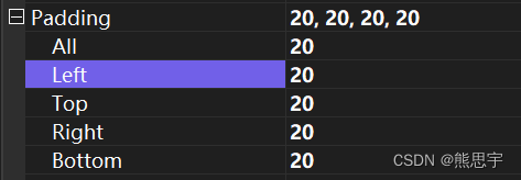
If you want to leave some blank content inside the control, you can set the padding.
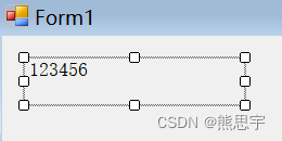
Fill in 20 here for All. At this time, the inner margins of top, bottom, left and right will all be increased by 20 pixels. Of course, you can set the inner margins in these four directions separately.
Effect

5. Set the fixed position of the text
In the default setting, the alignment of the text is in the upper left corner, as shown below
If you want to modify the alignment of the text, you need to use a property here: TextAlign

After clicking the drop-down box, you can see 9 directions, just select the alignment method you need.
6. Events of the control
In the property window, click on a thunderbolt icon. This is the event system. Generally speaking, most of the various events of the control are common. Knowing one, the usage of other controls is the same.

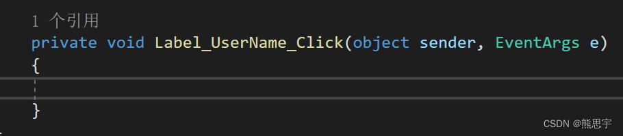
As far as the Label control is concerned, there are very few events used, mainly click events, as long as you double-click the left mouse button at the position of the arrow with the mouse, the event will be added automatically


After double-clicking, a method will be automatically added in the Form1 code
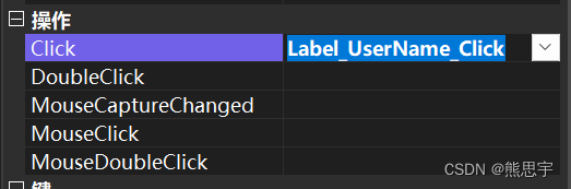
What to do if you don’t want this method, if you delete it directly, an error will be reported, we can delete the method in Click here on the property interface
Select the method and click the delete button
You can also delete the corresponding reference
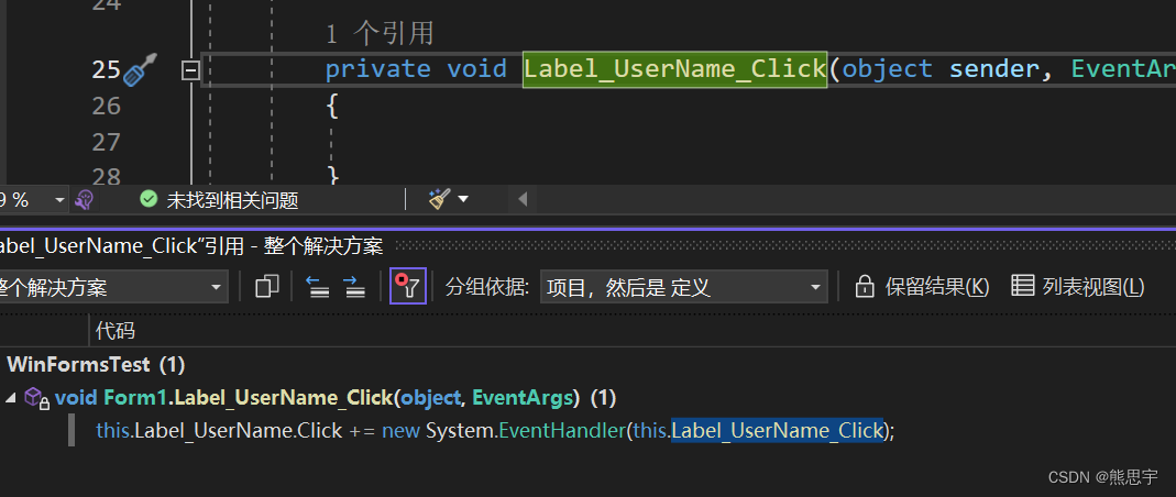
delete the entire line

Finish
If this post is helpful to you, please follow + like + leave a message, thank you! Or if you have any questions about the article, you can private message me at any time.
end