The login and registration process is often the First Sight of products and users, so the login and registration entrance is the key to leaving a good first impression on users. Following the principle of "all designs should have evidence to follow", the following is our design team's discussion on "should the registration box or login box be placed on the login interface".

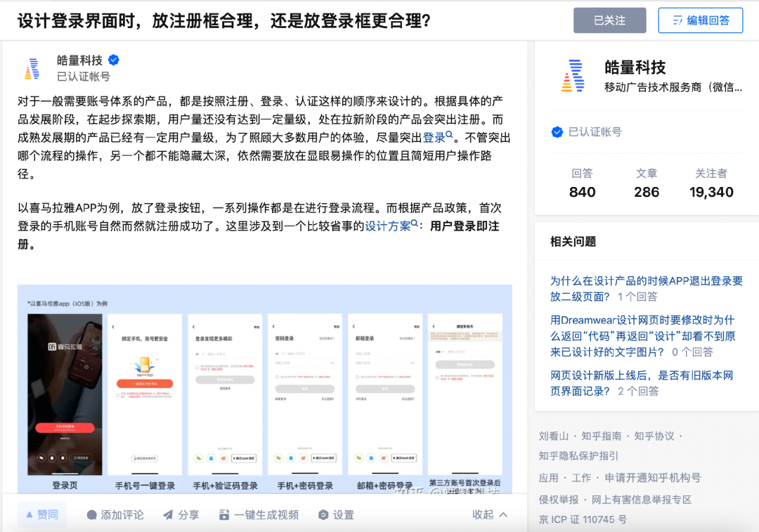
For products that generally require an account system, they are designed in the order of registration, login, and authentication. According to the specific product development stage, in the initial exploration stage, the number of users has not yet reached a certain level, and products in the new stage will be prominently registered. Products in the mature development stage already have a certain number of users. In order to take care of the experience of most users, try to highlight the login. No matter which process operation is highlighted, the other cannot be hidden too deeply, and it still needs to be placed in a conspicuous and easy-to-operate position with a short user operation path.
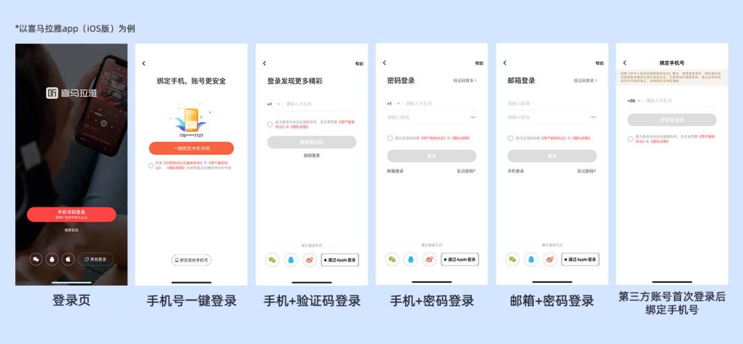
Take Himalaya APP as an example, put the login button, and a series of operations are in the login process. According to the product policy, the mobile phone account that logs in for the first time is automatically registered successfully. This involves a more convenient design solution: user login is registration.

In order to reduce the cost of user registration, many apps simplify user operations. Users log in with one click at the front desk, and the background only needs to make judgments. New users go through the registration process when they log in for the first time, while old users’ mobile phone numbers and third-party accounts go directly. Login flow. Users only need to use the product, follow the operation guide and click OK to use it smoothly.

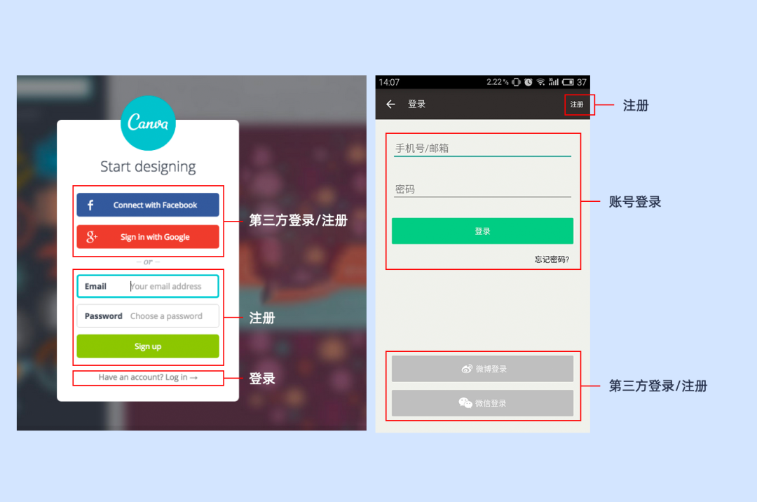
As shown in the figure above, both examples actually include third-party login/registration. The use of third-party login can save the trouble of registration, allowing users to quickly pass the login threshold, and then use the main services provided by the product, reducing the loss of users caused by login and registration. At the same time, using third-party account login is conducive to the initial promotion of the product.
Common third-party logins in China include WeChat, QQ, Weibo, Apple ID login, etc. These three-party login platforms with a large user base or a high degree of user matching provide open platforms for access.
Its advantage is that the user's operation path is short, and the operation is simple and trouble-free.
The disadvantage is that it is easy to cause the problem of multiple accounts for one person, and only limited user information can be obtained, and more accurate operation activities cannot be provided.
Here, Himalaya uses "pseudo-third-party login". After users log in using a third-party platform for the first time, they continue to ask users to bind mobile phone numbers or improve user information to obtain more effective and authentic user data, which is pseudo-third-party registration. Doing so also prevents the problem of multiple accounts for one person.
After the release of the "Personal Information Protection Specification" in 2016, users must now check the "User Agreement" and "User Service Agreement" when using the product, and users cannot be checked by default. The prerequisite for user registration and login is to tick the box. This mechanism will remind you again when the APP is newly downloaded or a new version is updated. The APP privacy agreement/policy is similar to the "product manual" for our food purchases. It must clearly indicate the reason, purpose, etc. of the personal information requested, and manage the corresponding permissions.
This has two advantages: the product removes unreasonable permission applications or personal information collection; and the regulatory agency has a "grasp" and a basis for supervision. We must be compliant and legal when designing login/registration pages, and be responsible for users and products.
How to judge whether the user has logged in more or registered more, or whether the operation is easy? In addition to judging according to the product stage, you can also bury the page data in the login and registration to detect and view the user's access depth to judge whether the path of product design is too high. Long, how the user operates.
References:
《Why are the username and password on two different pages?》,KELLEY ROBINSON
"From 0 to 1, Create an Account System by Login and Registration", Kevin
"Suggested Collection|The key nodes of product design for login and registration are here", Kevin