Python paper drawing tool seaborn.lineplot
提示:前言
Python paper drawing tool seaborn.lineplot
提示:写完文章后,目录可以自动生成,如何生成可参考右边的帮助文档
Article directory
foreword
提示:以下是本篇文章正文内容,下面案例可供参考
1. Import package
import numpy as np
import pandas as pd
import matplotlib.pyplot as plt
import seaborn as sns
sns.set_theme(style="darkgrid")
sns.set()
The specific parameters are as follows
seaborn.lineplot(data=None, *, x=None, y=None, hue=None, size=None, style=None, units=None, palette=None, hue_order=None, hue_norm=None, sizes=None, size_order=None, size_norm=None, dashes=True, markers=None, style_order=None, estimator='mean', errorbar=('ci', 95), n_boot=1000, seed=None, orient='x', sort=True, err_style='band', err_kws=None, legend='auto', ci='deprecated', ax=None, **kwargs)
2. Load data
Read the original dataset (as a dataframe) available at this link
https://www.kaggle.com/datasets/mlg-ulb/creditcardfraud.
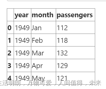
# 该flights数据集有 10 年的月度航空公司乘客数据:

flights = sns.load_dataset("flights")
flights.head()
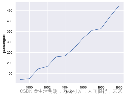
To plot a line graph using long-form data, assign x and y variables:
may_flights = flights.query("month == 'May'")
sns.lineplot(data=may_flights, x="year", y="passengers")
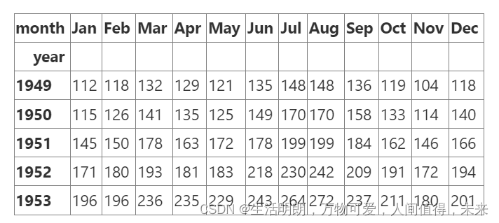
Convert a data frame to a wide format representation:
flights_wide = flights.pivot("year", "month", "passengers")
flights_wide.head()
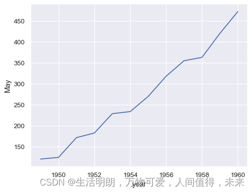
To plot a single vector, pass it data. If the vector is a pandas.Series, it will be plotted according to its index:
sns.lineplot(data=flights_wide["May"])
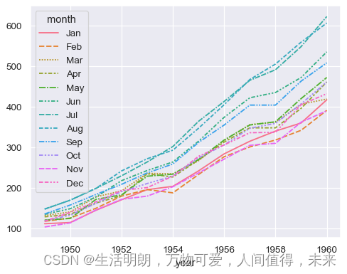
Passing the entire wide-format dataset, data draws a separate line for each column:
sns.lineplot(data=flights_wide)
3. Interval visualization
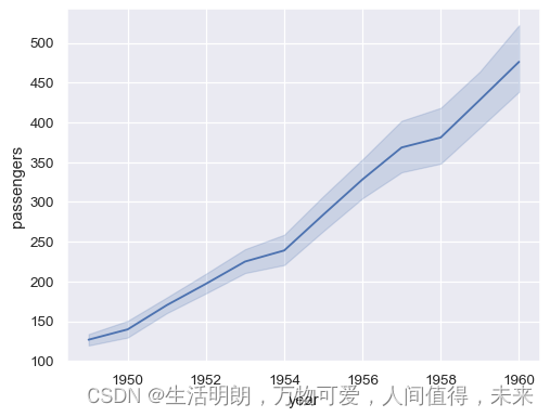
Passing the entire dataset in long-form mode will aggregate replicate values (for each year) to show the mean and 95% confidence interval:
sns.lineplot(data=flights, x="year", y="passengers")
Each semantic variable can also represent a different column. For this, we need a more complex dataset:
fmri = sns.load_dataset("fmri")
fmri.head()

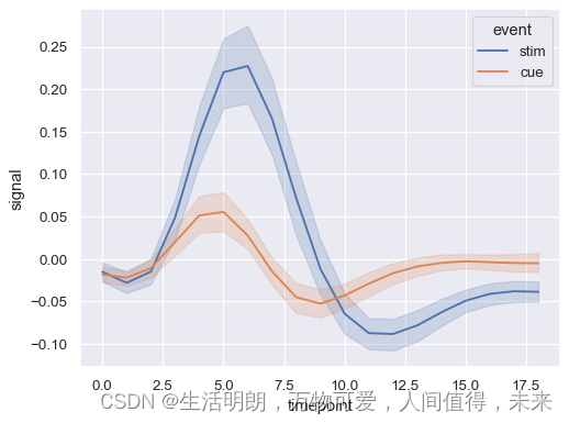
Duplicate observations are aggregated even with semantic grouping:
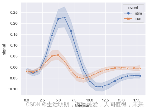
sns.lineplot(data=fmri, x="timepoint", y="signal", hue="event")
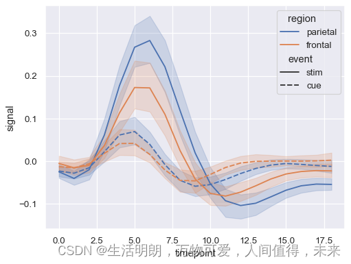
Assign hue and style to represent two different grouping variables:
sns.lineplot(data=fmri, x="timepoint", y="signal", hue="region", style="event")
When assigning style variables, tokens can be used instead of (or in addition to) dashes to differentiate groups:
sns.lineplot(
    data=fmri,
    x="timepoint", y="signal", hue="event", style="event",
    markers=True, dashes=False
)
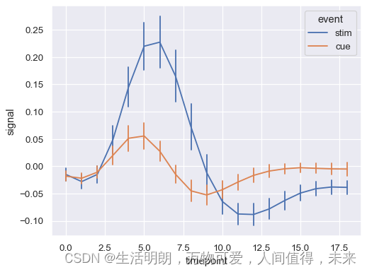
show residual plot
sns.lineplot(
    data=fmri, x="timepoint", y="signal", hue="event", err_style="bars", errorbar=("se", 2),
)
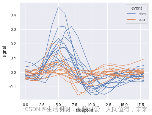
Assigning the units variable will draw multiple lines without applying the semantic mapping:
sns.lineplot(
    data=fmri.query("region == 'frontal'"),
    x="timepoint", y="signal", hue="event", units="subject",
    estimator=None, lw=1,
)
4. More exciting content
参考:https://seaborn.pydata.org/generated/seaborn.lineplot.html#seaborn-lineplot
http://www.deeprlhub.com/d/114
https://blog.csdn.net/weixin_43483381/article/details/115209576