Compose was briefly introduced in the previous article "Jetpack Compose Technology Quick Start" , so here we come to learn the layout of Compose. Since the layout involves more content, it will be written separately.
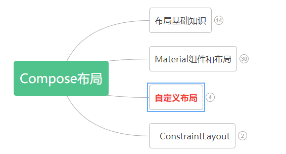
The layout mainly includes: layout basics , Material components and layouts , custom layouts, and using ConstraintLayout in Compose .
Knowledge points involved in custom layout :
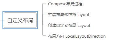
The process of Compose layout
In Compose, interface elements are represented by composable functions, which will emit a part of the interface after being called, and this part of the interface will then be added and presented in the interface tree on the screen. Every interface element has a parent element and possibly multiple child elements. Additionally, each element has a position within its parent element, specified as the (x, y) position, and a size, specified as width and height.
A parent element defines constraints on its child elements. Elements need to define dimensions within these constraints. Constraints limit the minimum and maximum width and height of an element. If an element has children, it may measure each child to help determine its size. Once an element has determined and reported its own dimensions, it has the opportunity to define how its children are positioned relative to itself.
The process of arranging each node in the interface tree is divided into three steps:
1.测量所有子项
2.确定自己的尺寸
3.放置其子项
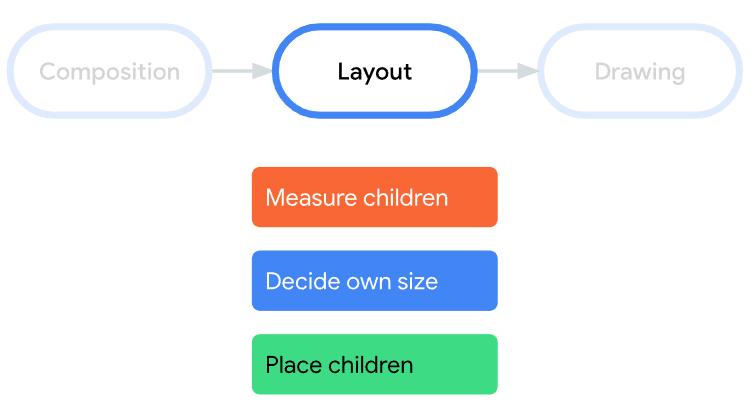
★注意:Compose 界面不允许多遍测量。这意味着,布局元素不能为了尝试不同的测量配置而多次测量任何子元素。
Extended layout modifiers layout
uses layoutmodifiers to modify how elements are measured and laid out. Layout is a lambda; its parameters include the elements you can measure (passed as measurable) and the incoming constraints for that composable (passed as constraints). A custom layout modifier might look like this:
fun Modifier.customLayoutModifier(...) =
    this.layout { measurable, constraints ->
        ...
    })
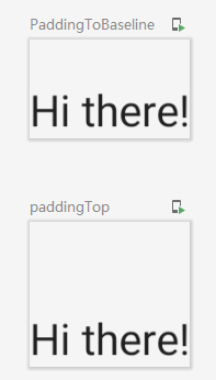
Let’s take Textthe top padding as an example. If there is such a requirement: set the padding with reference to the baseline of the first line of text, as shown in the figure below:
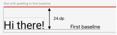
文字位置Y = 设置高度 - 文字高度
The code is as follows:
/**
 * 1.自定义布局修饰符-修改文字基线距离顶部距离
 */
fun Modifier.firstBaselineToTop(firstBaselineToTop: Dp)=layout { measurable, constraints ->
    //先测量
    val placeable = measurable.measure(constraints)
    check(placeable[FirstBaseline] != AlignmentLine.Unspecified)
    val firstBaseLine = placeable[FirstBaseline]
    //文字位置Y
    val placeableY = firstBaselineToTop.roundToPx() - firstBaseLine
    val height = placeable.height + placeableY
    //重新布局
    layout(placeable.width,height){
        placeable.placeRelative(0,placeableY)
    }
}
The final effect is compared with the pading effect, as shown in the following figure:
Create a custom layout Layout
If you want to customize the layout in the Android View system, you must inherit ViewGroup and implement measurement and layout functions, while customizing the layout in Compose is much simpler, and you can directly use composable items to achieve it, allowing Layoutmanual Layoutmeasurement and layout children. ColumnAnd Rowis Layoutbuilt from.
Pay attention to the difference from custom modifiers here layout.
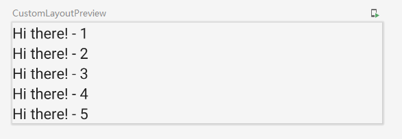
Let's take customizing a vertical layout as an example (similar Column), the code is as follows:
/**
 * 2.自定义Layout实现组件垂直布局
 */
@Composable
fun MyBasicColumn(
    modifier: Modifier = Modifier,
    content:@Composable ()->Unit
){
    //步骤一:
    //其中measurables,constraints为Layout最后一个参数的lambda写法
    Layout(content = content, modifier = modifier){ measurables,constraints ->
        //步骤二:通过给点的约束条件constraints对组件进行测量
        val placeables = measurables.map {
            it.measure(constraints)
        }
        //获取所有元素的高度总和
        val wrapHeight = placeables.sumOf {
            it.height
        }
        //步骤三:布局,设置可允许的布局大小
        layout(constraints.maxWidth,wrapHeight){
            var yPosition = 0
            //步骤四:设置每个组件的位置
            placeables.forEach {placeable->
                //设置组件的x,y坐标
                placeable.placeRelative(x = 0,y=yPosition)
                //计算下一个组件的y坐标
                yPosition += placeable.height
            }
        }
    }
}
Worth noting: Similar Layoutto layoutmodifier , but the first argument measurablesis a list of children that need to be measured, and constraints are the constraints from the parent.
The example effect is as follows:
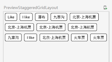
In addition, a waterfall flow layout is customized here , you can take a look if you are interested.
Renderings:
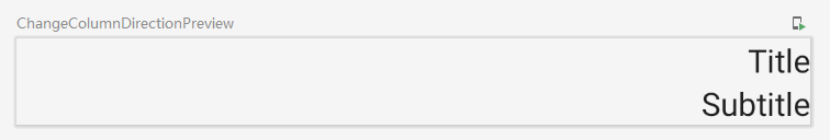
Layout Orientation
If you need to change the orientation of your layout, you can use LocalLayoutDirectionthe implementation. Modified layout directions are supported: Ltr(由左到右), Rtl(由右到左).
For example:
/**
 * 3.布局方向
 */
@Composable
fun ChangeColumnDirection(){
    CompositionLocalProvider(LocalLayoutDirection provides LayoutDirection.Rtl ) {
        Column(Modifier.fillMaxWidth()) {
            Text("Title")
            Text("Subtitle")
        }
    }
}
Example effect:
The custom layout is introduced here, and the content is relatively small.