1 Introduction to ECharts
ECharts is an open source JavaScript-based data visualization chart library that can run smoothly on PCs and mobile devices and is compatible with most current browsers. It relies on the vector graphics library ZRender at the bottom , supports more than 12 types of charts, and provides 7 interactive components with flexible . Features such as roaming greatly enhance the user experience, endow users with the ability to mine and integrate data, and present intuitive, vivid, interactive, and highly customizable data visualization charts. Because of the excellent features of ECharts, it has a wide range of application scenarios and is a popular front-end data visualization chart library.
2. ECharts quick start
(1). Get ECharts
ECharts provides multiple installation methods, which can be obtained from GitHub, npm or CDN. This book introduces the installation method obtained from GitHub.
Open the ECharts official website, click Source code (zip) in Assets at the bottom of the download page (see Figure 11-1), and after decompression, "echarts.js" in the dist directory is a file with complete ECharts functions.

Figure 11-1 ECharts official website download page
Among them, echarts.js is the version containing the source code, and echarts.min.js is the compressed version. It is recommended to use the compressed version in the project to save resources.
(2). Introduce ECharts
<!-- 引入下载的 ECharts 文件 -->
<script src="echarts.js"></script>
3 configuration items
After introducing echarts.js, you can start drawing charts. Before drawing, you first need to prepare a DOM container with defined height and width for ECharts. Examples are as follows:
<body>
  <!-- 为 ECharts 准备一个定义了宽高的 DOM -->
  <div id="main" style="width: 600px;height:400px;"></div>
</body>
Then initialize an ECharts instance through the ECharts.init() method, and generate a chart through the setOption() method. The setOption() method requires a configuration item as a parameter. The configuration item uses the configuration in JSON data format to draw the chart, including options such as title, prompt information, legend component, X axis, Y axis, and series list.
[Example 11-1] ECharts quick start
1 <!-- 引入ECharts 文件 -->
 2 <script src="echarts.min.js"></script>
 3 <body>
 4  <!-- 为 ECharts 准备一个定义了宽高的 DOM -->
 5  <div id="main" style="width: 600px;height:400px;"></div>
 6  <script type="text/javascript">
 7    // 基于准备好的DOM,初始化ECharts实例
 8    var myChart = echarts.init(document.getElementById('main'));
 9    // 指定图表的配置项和数据
10    var option = {
11      //图表标题
12      title: {
13        text: 'ECharts 入门示例'
14      },
15      //图例
16      legend: {
17        data: ['销量']
18      },
19      //X轴
20      xAxis: {
21        data: ['衬衫', '羊毛衫', '雪纺衫', '裤子', '高跟鞋', '袜子']
22      },
23     //系列列表
24      series: [
25        {
26          name: '销量',// legend对应的名称
27          type: 'bar',// 图形类型
28          data: [5, 20, 36, 10, 10, 20]// 数值
29        }
30      ]
31   };
32    // 使用刚指定的配置项和数据显示图表。
33   myChart.setOption(option);
34  </script>
35 </body>
36 </html>
In Example 11-1, the second line of code imports the ECharts file; the fifth line of code prepares a DOM with defined width and height for ECharts; the eighth line of code calls the ECharts.init() method to initialize an ECharts instance; lines 10~31 The code specifies the configuration items and data of the chart, including options such as title, legend, X- axis, series list, etc.; the code on line 33 calls the setOption() method to display the chart using the configuration items and data just specified. The running effect of Example 11-1 in the Chrome browser is shown in Figure 11-2.

Figure 11-2 [Example 11-1] Operation effect
4 Common chart configuration items
ECharts provides regular line charts, histograms, scatter charts, pie charts, candlestick charts, box charts for statistics, maps, heat maps, and line charts for geographic data visualization, and relational data visualizations. Relationship diagrams, treemaps, sunburst diagrams, parallel coordinates for multidimensional data visualization, as well as funnel diagrams and dashboards for BI, and support for mashup between diagrams. The main difference between the charts is the different configuration items. This section will introduce configuration items for common charts such as line charts, pie charts, and maps for geographic data visualization.
(1). Line chart
Commonly used configuration items, examples are as follows:
[Example 11-2] Common configuration items for ECharts line chart
var option = {
    //提示信息
    tooltip: {
        trigger: 'axis',//触发类型:坐标轴触发
        //指示器
        axisPointer: {
            type: 'line',//直线指示器
            lineStyle: {
                color: '#7171C6'//指示器颜色
            }
         },
    },
    //X轴
    xAxis: {
        type: 'category',//类目轴,适用于离散的类目数据,为该类型时必须通过 data 设置类目数据
        data: ['Mon', 'Tue', 'Wed', 'Thu', 'Fri', 'Sat', 'Sun']//X轴数据
    },
    //Y轴
    yAxis: {
        type: 'value'//数值轴,适用于连续数据
    },
    //系列列表
    series: [
        {
            data: [150, 230, 224, 218, 135, 147, 260],//系列数据
            type: 'line'// 图形类型
        }
    ]
};
The most important options are the X-axis data xAxis.data and the series data series[0].data. Filling different data can achieve different line chart data effects. The effect of configuration items is shown in Figure 11-3. For the complete code, see Example 11-2.

Figure 11-3 [Example 11-2] Running effect
(2). Pie chart
Commonly used configuration items, examples are as follows:
[Example 11-3] ECharts pie chart common configuration items
option = {
    title: {
        text: 'Referer of a Website',
        subtext: 'Fake Data',//子标题
        left: 'center'
    },
    tooltip: {
        trigger: 'item'
    },
    legend: {
        orient: 'vertical',
        left: 'left'
    },
    series: [
        {
            name: 'Access From',//系列名称,用于tooltip的显示
            type: 'pie',// 图形类型
            radius: '50%',//饼图的半径
            data: [//饼图数据
                { value: 1048, name: 'Search Engine' },
                { value: 735, name: 'Direct' },
                { value: 580, name: 'Email' },
                { value: 484, name: 'Union Ads' },
                { value: 300, name: 'Video Ads' }
            ]
        }
    ]
};
The most important option is the series data series[0].data, filling different data can achieve different pie chart data effects. The effect of configuration items is shown in Figure 11-4. For the complete code, see Example 11-3.
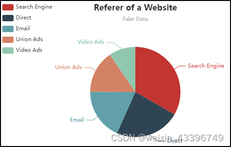
Figure 11-4 [Example 11-3] Operation effect
Video explanation: HTML+CSS+JavaScript+Ajax+ECharts realizes real-time monitoring of the epidemic on a large screen_哔哩哔哩_bilibili