Introduction
To quote the first sentence in the official introduction of G6, G6 is a graph visualization engine. It provides the basic capabilities of graph visualization such as graph drawing, layout, analysis, interaction, and animation. Designed to make relationships transparent and simple. Allows users to gain insight into relational data.
background
In the general development process, most people will use chart plug-ins such as echarts or highcharts to develop "beautiful" data display. Then, some time ago, I also came into contact with a demand task about beautifully displaying data with topological graphs. In fact, the graph relationship diagram in echarts can indeed achieve the basic effect required by the demand.
So when developing the first topology map, due to time constraints (the development time is well understood), I hurriedly used echarts to realize it. The renderings are as follows:
The topology map (relationship map) made with echarts can be zoomed in and out, and the icon also supports SVG, and the details can be displayed by sliding (here the details are not requested asynchronously, but are originally provided by the node. If you want to request asynchronously, you may only To update the entire view data, the view needs to be reloaded), and the icon will also have a sliding zoom effect, and the entire map can also support drag and drop.
After developing the entire topology map, as a developer, I actually think everything is fine. But the shortcoming is that the demand wants to be able to drag and drop a single icon to achieve the effect of moving the position. I read all the configurations of echarts, checked it again, and found that there really is no function to provide this effect. After all, the position of each icon in the echarts topology map is located at the time of initialization. I give their x and y data one by one in the nodes data, that is, their positions are calculated by me personally ( It feels like I’m back to the time when I started to learn coding in college and used C++ to draw cats).
echarts develops topological diagrams (relationship diagrams), and the summary is that the configuration is simple, but the location calculation is troublesome, and there are too few functions. (echarts is not a chart plug-in for relationship diagrams, and the requirements are indeed not too high)
Therefore, when developing the topology map in the new module later, we can only find a new love.
I searched a lot of plug-ins for front-end topology diagrams on the Internet, most of which are difficult to satisfy me. There are three main points of dissatisfaction:
1. The plug-in is too old and the style is not good-looking. The import method only supports script tag import, and it is too old and has not been updated.
For example, jtopo :
Looking at this rendering, I feel that I have returned to the era of looking at xp system computers in the computer room of elementary school. . .
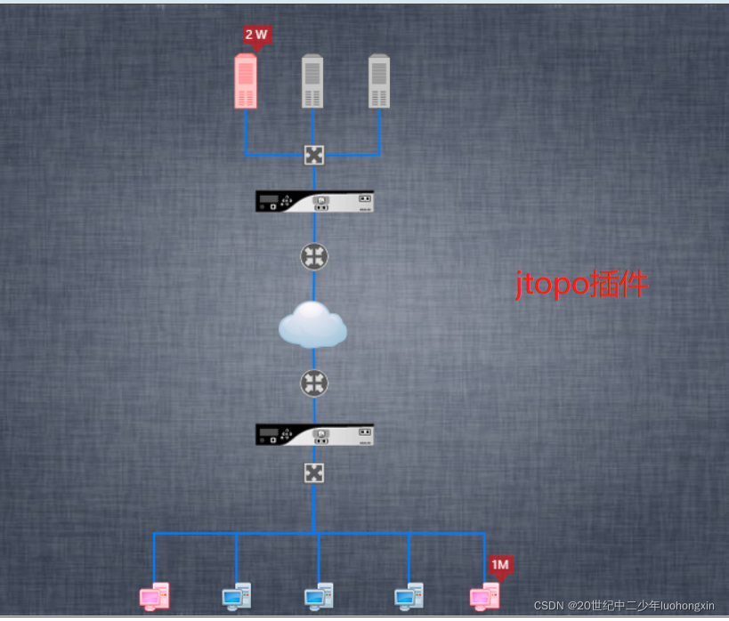
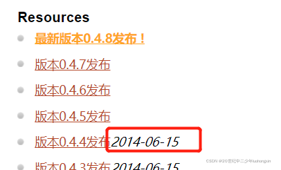
The latest version is 0.4.8. Although the time is not marked, it is 2014, which is four versions away from 0.4.4. It is now the end of 2021, almost seven years away, and there are only four minor versions of the update iteration. . . (I wonder if the author gave up, or... In fact, there are still many people on the Internet who promote this plug-in. The configuration is simple and the functions are rich. It is indeed suitable for some old projects)
2. There are few configuration documents or they are all in English
. Although my English level is not very high, it is still easy to read the documents (Cantonese, no pressure), such as the visjs plug-in . But I am Chinese (actually, the documents are a bit sparse and not detailed enough, and I don’t know if more detailed documents have to be over the wall, and English reading is not as fast as reading Chinese directly, so I don’t have much time to slowly study English documents) , I want to support domestic plug-ins! (Chinese backbone)
3. Personally developed plug-ins are not maintained by a professional team.
This is more fatal, not to mention whether there are many functions or not, just the lack of iterative maintenance is enough, and there may be a lot of bugs. Almost no one is willing to use an unreliable plug-in to develop important business of the company!
Based on the above three points, I screened out most topology map plug-ins, and finally found G6. A domestic development, with specific Chinese documents (many people on the Internet said that the G6 documents are not detailed enough, in fact, it is not detailed enough, but a bit "messy", it has many functions, but the document is a bit messy, jump around to see , and the configurations used in different G6 versions are not the same, and the documents are not updated in time, so what you see in Baidu or examples may not work if you use it, but you can still understand it if you look carefully and combine your own development experience), Ant Financial's professional team develops and maintains a plug-in with rich functions and beautiful styles.
basic concept
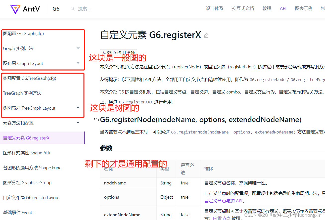
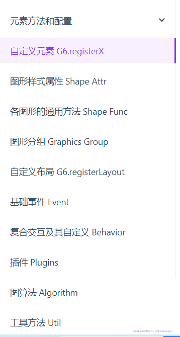
We can see from the G6 chart example directory that there are actually two types of G6 charts, one is a general chart and the other is a tree chart . I have used both of these when developing topology maps. From the data point of view, the biggest difference is that a general graph needs two data nodes and edges relationship, while a tree graph is just a tree-structured data object, and the relationship will be simpler.
How to view the document
If you are using G6 for development for the first time, it is recommended to read the core concepts in the G6 tutorial first . There is a map in it. Take a few minutes to look at this map to understand the configuration and functions of G6.
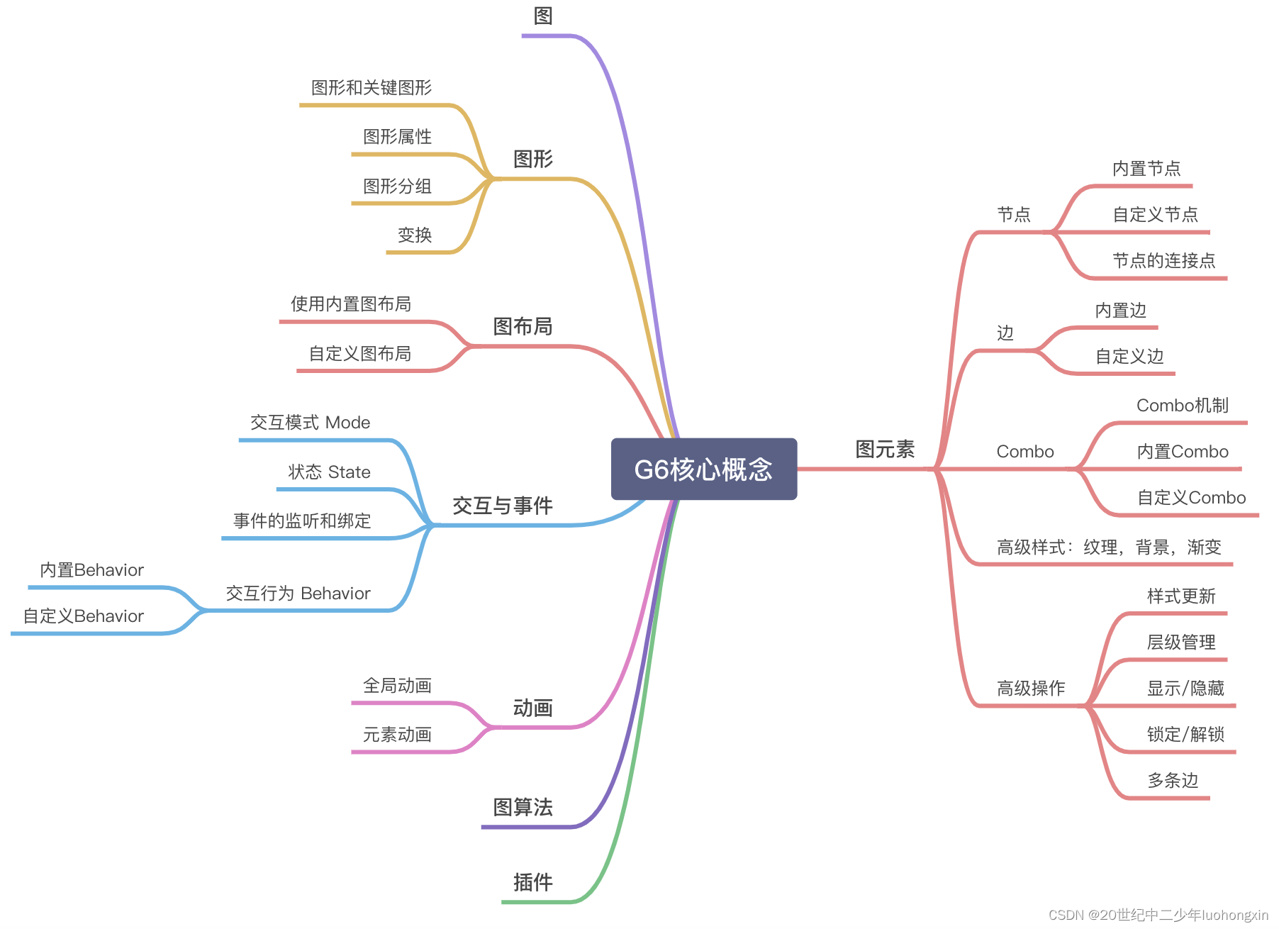
As I said before, the G6 documentation will feel messy when I read it for the first time, and the descriptions in some places are not detailed enough, and there is always a situation where one side is mentioned and the other side is talked about, so the first time I read it Sometimes, it is a little uncomfortable.
But if you understand the basic concepts I mentioned above, after G6 is generally divided into the difference between general graphs and tree graphs , and then you look at the API documentation of the documentation in this way, it will be much clearer, at least not doing general graphs. When looking at the diagram, let's look at the configuration of the tree diagram. API documentation link
When you determine what kind of graph you want to make, you can only look at the configuration and general configuration of the corresponding graph, and don’t look at anything else. The configurations of the two graphs are still very different, and they are easy to be confused confused.
how to use
I don't need to talk nonsense here, I still go to the documentation for details, and I will only briefly explain the process below.
1, the first is the installation.
npm install --save @antv/g6
2. Then there is the reference
import G6 from '@antv/g6';
3. Make sure that the page has an element as a chart container
<div id="mountNode"></div>
4. Initialize Graph and generate a graph instance.
General graph (Graph):
const graph = new G6.Graph({


  container: 'mountNode', // 容器
  width: 500,
  height: 500,
  modes: {


    default: ['drag-canvas'], // 这有好几个配置,支持拖拽画布、节点,还有放大缩小画图都可以在这设置
  },
  layout: {


    type: 'radial', // 布局类型,echarts需要你设置xy定位,而这个类型可以帮你实现各种布局类型
    unitRadius: 50,
    center: [500, 300],
  },
});
TreeGraph (TreeGraph):
const treeGraph = new G6.TreeGraph({


  container: 'mountNode',
  width: 800,
  height: 600,
  modes: {


    default: [
      {


        type: 'collapse-expand',
        onChange(item, collapsed) {


          const icon = item.get('group').findByClassName('collapse-icon');
          if (collapsed) {


            icon.attr('symbol', EXPAND_ICON);
          } else {


            icon.attr('symbol', COLLAPSE_ICON);
          }
        },
      },
      'drag-canvas',
      'zoom-canvas',
    ],
  },
  layout: {


    type: 'dendrogram',
    direction: 'LR', // H / V / LR / RL / TB / BT
    nodeSep: 50,
    rankSep: 100,
    radial: true,
  },
});
In fact, the above four steps have been completed. It's just that you need to customize some things according to your needs, so you still have to look at the general configuration in the picture below of the API document. (It can only be said that the function is very powerful, it depends on how carefully you read the document)
Looking at the configuration documents in the picture, it is better than writing too many miscellaneous things, otherwise you can refer to me here and refer to the documents, it is unnecessary.
Summarize
Using G6 to develop topology maps is much better than echarts. At least the functions are much richer, which basically meets the needs. However, there will be some problems during the development process. For example, if there are too many nodes, its internal calculation and positioning will consume more performance. Poor computers (some of the company’s computers, you know) may take several minutes to load, and it will also affect the rendering of the page (after I turn on the GPU, I have a value that specifically controls page loading, true for display, false for hidden , I printed that value and checked that it was false, but the page still had a loading effect, which was removed after the G6 finished positioning, then obviously this GPU acceleration affected the update of the page).
Sure enough, if you want to have a cool effect on the page, you still need to keep up with the performance of your computer, otherwise it will be too difficult for others.
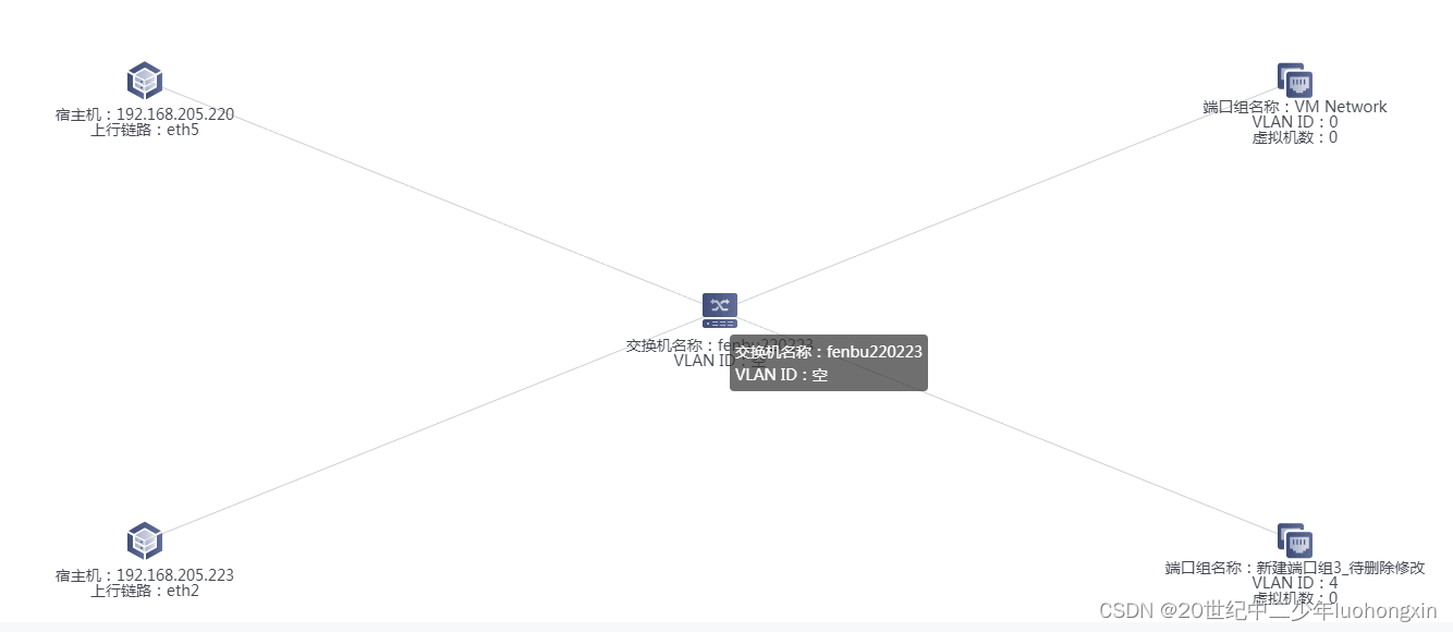
Finally, look at the final rendering I made:
My development this time includes the following functions:
-
Node supports drag and drop
-
Blank canvas supports drag and drop
-
Different nodes can have different icons and states (custom nodes are used here)
-
The icon in the lower right corner will change when it is collapsed and expanded, the number will be displayed when it is collapsed, and the minus sign will be displayed when it is expanded (this is also using a custom node, and the icon is positioned relative to the main icon)
-
Collapsing and expanding will hide and display the child nodes of the current node (combining the click event of the node and the showItem and hideItem under the graph instance to control the display and hiding of the node)
-
The search-related data will be highlighted. In fact, this is also configured in the custom node. I only need to update the attributes of the search-related data in the data.
-
It can be displayed in full screen. Here, the changeSize method under the graph instance is used. When the full screen button is clicked, the width and height of the view can be updated again, and there will be no secondary loading.
-
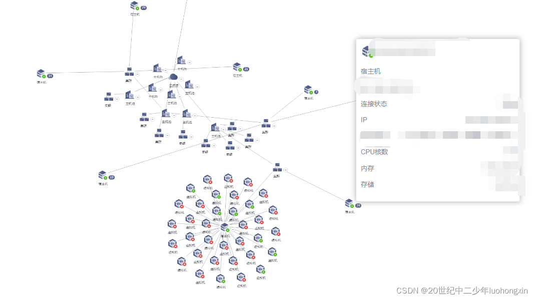
Swipe into a node to show details. Utilize the node entry event, asynchronously request the back-end data, cooperate with the G6 Tooltip plug-in, and
refreshItem to update its configuration after the data request comes back, a bit like a custom node. -
Magnifying glass effect. The G6 plug-in also provides the effect of a fisheye magnifying glass, but after using it, it feels so-so, which is much worse than the expectation of being able to magnify the specified range of nodes.
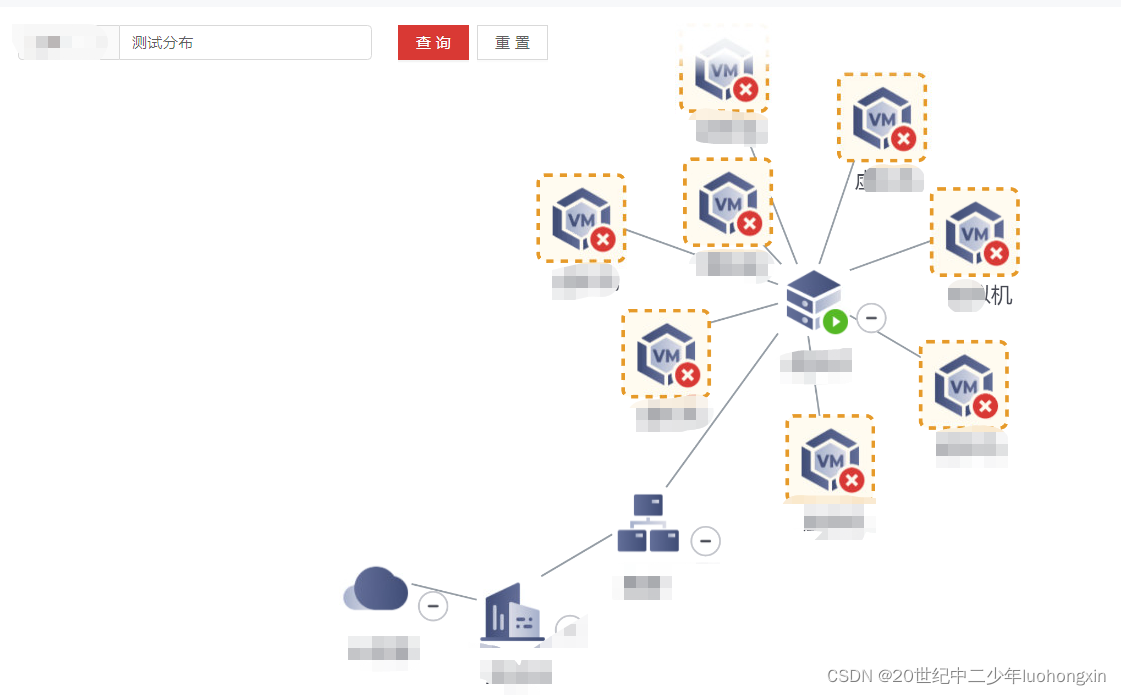
As mentioned above, I also made a tree diagram. After all, the data in the tree diagram is simple. I don’t need to set the edges myself, and it also meets my needs. A node has only one parent node or child node, which is not too complicated. The relationship (if you have a many-to-many relationship with nodes, you cannot use a tree diagram). In terms of data structure, it is very suitable for the business needs I have developed. But the final result is very bad, because the last layer of my data will be a lot, there are dozens, so no matter what tree type or layout I choose for the tree map, it cannot solve the problem of too many nodes.
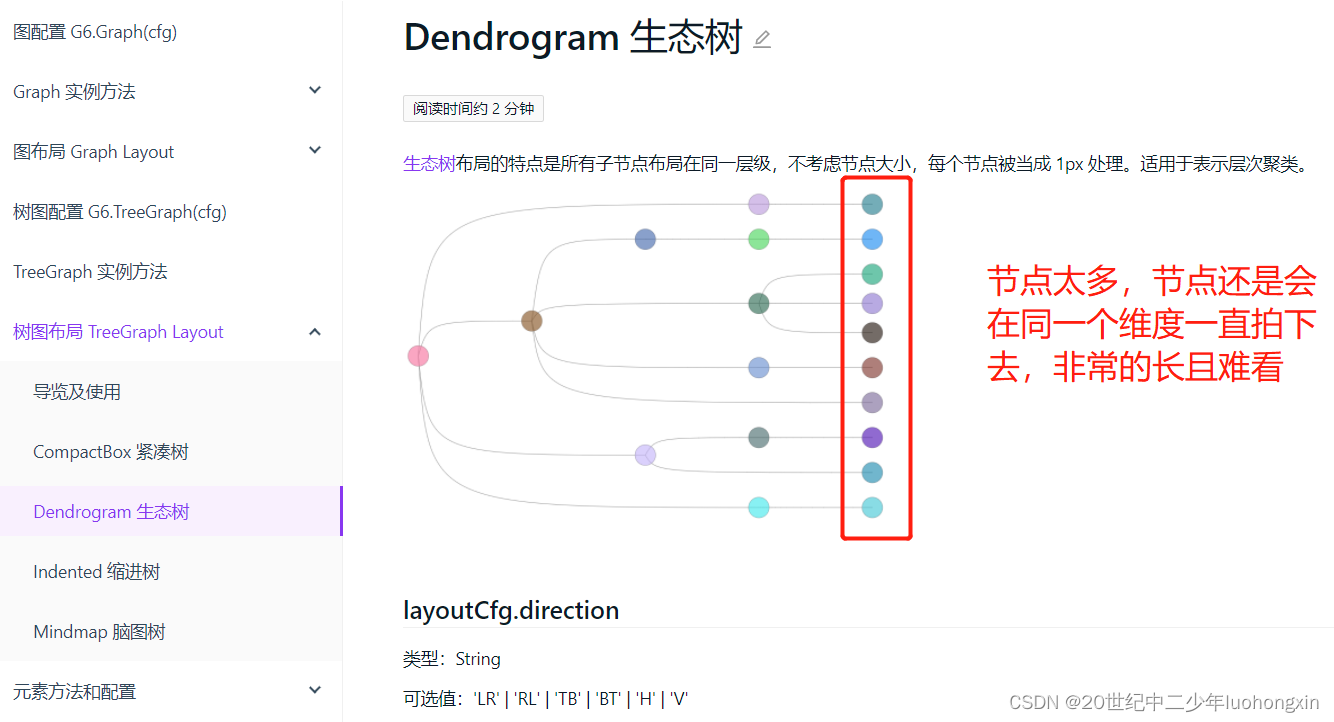
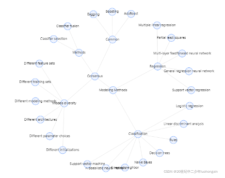
Of course, I also tried to use the radial one (as shown in the picture below), but if there are too many, it will form a dense circle outside (still in the same dimension, but it has changed from horizontal to vertical), and the demand does not like it. planted.
So in the end, only general graphs can be used. Fortunately, the final result is still very good!