Simple input box
foreword
In daily work development, we will encounter various needs for a long time. Some of the needs can be solved by Android's native View, and some cannot be solved. At this time, we need to customize the View. Let's first Take a look at the demo rendering of this custom View in this article.

text
Still create in EasyView, create a new one com.easy.viewbelow EasyEditText, inherit from View, and implement the construction method inside.
① Construction method
Then we inherit from Viewand rewrite the constructor inside, the code is as follows:
public class EasyEditText extends View implements NumberKeyboardListener {


    private Context mContext;

    public EasyEditText(Context context) {


        this(context, null);
    }

    public EasyEditText(Context context, @Nullable AttributeSet attrs) {


        this(context, attrs, 0);
    }

    public EasyEditText(Context context, @Nullable AttributeSet attrs, int defStyleAttr) {


        super(context, attrs, defStyleAttr);
		mContext = context;
    }
}
Below you can add styles.
② XML style
Before setting the style, we need to know what our custom View will do. This is a simple input box that can be used for verification code input or password input. There are 4 to 6 input boxes, mainly for digital input. In the file attrs.xml, Inside we can write custom styles, the code is as follows:
    <!--简易输入框-->
    <declare-styleable name="EasyEditText">
        <!-- 方框大小,宽高一致 -->
        <attr name="boxWidth" />
        <!-- 方框背景颜色 -->
        <attr name="boxBackgroundColor" />
        <!-- 方框描边颜色 -->
        <attr name="boxStrokeColor" />
        <!-- 方框焦点描边颜色 -->
        <attr name="boxFocusStrokeColor" format="color|reference"/>
        <!-- 方框描边宽度 -->
        <attr name="boxStrokeWidth" />
        <!--文字颜色-->
        <attr name="textColor" />
        <!--文字大小-->
        <attr name="textSize" />
        <!-- 方框数量 4-6 个-->
        <attr name="boxNum" format="integer"/>
        <!--是否密文-->
        <attr name="ciphertext" format="boolean"/>
    </declare-styleable>
Because I still have three View styles before this, the repeated styles are extracted, you can refer to the source code to understand.
Next, let's go back to View to use, first declare variables, the code is as follows:
    /**
     * 方框大小,因为它是相同的宽度和高度,它只需要一个值
     */
    private int mBoxWidth;
    /**
     * 方框背景颜色
     */
    private int mBoxBackgroundColor;
    /**
     * 方框默认描边颜色
     */
    private int mBoxStrokeColor;
    /**
     * 方框获取焦点描点颜色
     */
    private int mBoxFocusStrokeColor;
    /**
     * 方框描边大小
     */
    private final int mBoxStrokeWidth;
    /**
     * 文字颜色
     */
    private int mTextColor;
    /**
     * 文字大小
     */
    private float mTextSize;
    /**
     * 方框数量,最少4个 - 最多6个
     */
    private int mBoxNum;
    /**
     * 方框之间的间距
     */
    private int mBoxMargin = 4;
    /**
     * 方框画笔
     */
    private Paint mBoxPaint;
    /**
     * 方框描边画笔
     */
    private Paint mBoxStrokePaint;
    /**
     * 文字画笔
     */
    private Paint mTextPaint;
    /**
     * 文字矩形
     */
    private final Rect mTextRect = new Rect();
    /**
     * 方框圆角
     */
    private float mBoxCornerRadius = 8f;
    /**
     * 描边圆角
     */
    private float strokeRadius;

    /**
     * 输入长度
     */
    private final int mInputLength;
    /**
     * 输入数组
     */
    private final String[] inputArray;
    /**
     * 当前输入位置
     */
    private int currentInputPosition = 0;
    /**
     * 焦点边框列表
     */
    private final List<RectF> focusList = new ArrayList<>();
    /**
     * 是否获取焦点
     */
    private boolean isFocus = false;
    /**
     * 是否密文显示
     */
    private boolean ciphertext = false;
    /**
     * 密文显示 *
     */
    private String ciphertextContent = "*";
Then modify the third constructor, the code is as follows:
    public EasyEditText(Context context, @Nullable AttributeSet attrs, int defStyleAttr) {


        super(context, attrs, defStyleAttr);
        mContext = context;
        @SuppressLint("CustomViewStyleable")
        TypedArray typedArray = context.obtainStyledAttributes(attrs, R.styleable.EasyEditText);
        mBoxWidth = (int) typedArray.getDimensionPixelSize(R.styleable.EasyEditText_boxWidth, 48);
        mBoxBackgroundColor = typedArray.getColor(R.styleable.EasyEditText_boxBackgroundColor, ContextCompat.getColor(context, R.color.white));
        mBoxStrokeColor = typedArray.getColor(R.styleable.EasyEditText_boxStrokeColor, ContextCompat.getColor(context, R.color.box_default_stroke_color));
        mBoxFocusStrokeColor = typedArray.getColor(R.styleable.EasyEditText_boxFocusStrokeColor, ContextCompat.getColor(context, R.color.box_default_stroke_color));
        mBoxStrokeWidth = (int) typedArray.getDimensionPixelSize(R.styleable.EasyEditText_boxStrokeWidth, 2);
        mTextColor = typedArray.getColor(R.styleable.EasyEditText_textColor, ContextCompat.getColor(context, R.color.tx_default_color));
        mTextSize = typedArray.getDimensionPixelSize(R.styleable.EasyEditText_textSize, (int) TypedValue
                .applyDimension(TypedValue.COMPLEX_UNIT_SP, 14, getResources().getDisplayMetrics()));
        int number = typedArray.getInteger(R.styleable.EasyEditText_boxNum, 4);
        ciphertext = typedArray.getBoolean(R.styleable.EasyEditText_ciphertext, false);
        mBoxNum = (number > 6 || number < 4) ? 4 : number;
        mInputLength = mBoxNum;
        inputArray = new String[mInputLength];
        typedArray.recycle();
        //初始化画笔
        initPaint();
    }
Here, through EasyEditTextthe acquisition TypedArray, through TypedArraythe acquisition EasyEditTextof the attributes, and then assign values, it should be noted that the size of the input box is processed here, the number of input boxes is the length of the input, and then the brush is initialized, and the new method is added. The code is as follows initPaint():
    private void initPaint() {


        //设置边框画笔
        mBoxPaint = new Paint();
        mBoxPaint.setAntiAlias(true);// anti-aliasing
        mBoxPaint.setColor(mBoxBackgroundColor);//Set color
        mBoxPaint.setStyle(Paint.Style.FILL);//Style filling
        //设置描边画笔
        mBoxStrokePaint = new Paint();
        mBoxStrokePaint.setAntiAlias(true);
        mBoxStrokePaint.setColor(mBoxStrokeColor);
        mBoxStrokePaint.setStyle(Paint.Style.STROKE);//Style stroke
        mBoxStrokePaint.setStrokeWidth(mBoxStrokeWidth);//Stroke width
        //设置文字画笔
        mTextPaint = new Paint();
        mTextPaint.setAntiAlias(true);
        mTextPaint.setStyle(Paint.Style.FILL);
        mTextPaint.setColor(mTextColor);
        mTextPaint.setTextSize(mTextSize);//Text size
        mTextPaint.setTextAlign(Paint.Align.CENTER);//Center the text
    }
③ Measurement
We know the number of boxes and the distance between boxes through variables and attributes, and then we rewrite onMeasure()the method, the code is as follows:
    /**
     * View的测量
     *
     * @param widthMeasureSpec  宽度测量
     * @param heightMeasureSpec 高度测量
     */
    @Override
    protected void onMeasure(int widthMeasureSpec, int heightMeasureSpec) {


        super.onMeasure(widthMeasureSpec, heightMeasureSpec);
        int width = 0;
        int margin = EasyUtils.dp2px(mContext, mBoxMargin);
        switch (MeasureSpec.getMode(widthMeasureSpec)) {


            case MeasureSpec.UNSPECIFIED:
            case MeasureSpec.AT_MOST:   //wrap_content
                width = mBoxWidth * mBoxNum + margin * (mBoxNum - 1);
                break;
            case MeasureSpec.EXACTLY:   //match_parent
                width = MeasureSpec.getSize(widthMeasureSpec);
                mBoxWidth = (width - margin * (mBoxNum - 1)) / mBoxNum;
                break;
        }
        //设置测量后的值
        setMeasuredDimension(width, mBoxWidth);
    }
④ draw
After measuring, you can start drawing below. Drawing is equivalent to drawing on paper. For drawing, you must first have a brush and declare variables first. The code is as follows:
    private Paint mBoxPaint;
    private Paint mBoxStrokePaint;
    private Paint mTextPaint;
    private final Rect mTextRect = new Rect();
Then we need to set up 3 brushes (box, box border, text), because drawing text is a little different, so we added one. Next, Rectwe add a new method of initializing the brush in View. The code is as follows :
    /**
     * 初始化画笔
     */
    private void initPaint() {


        //设置方框画笔
        mBoxPaint = new Paint();
        mBoxPaint.setAntiAlias(true);// 抗锯齿
        mBoxPaint.setColor(mBoxBackgroundColor);//设置颜色
        mBoxPaint.setStyle(Paint.Style.FILL);//风格填满
        //设置方框描边画笔
        mBoxStrokePaint = new Paint();
        mBoxStrokePaint.setAntiAlias(true);
        mBoxStrokePaint.setColor(mBoxStrokeColor);
        mBoxStrokePaint.setStyle(Paint.Style.STROKE);//风格描边
        mBoxStrokePaint.setStrokeWidth(mBoxStrokeWidth);//描边宽度
        //设置文字画笔
        mTextPaint = new Paint();
        mTextPaint.setAntiAlias(true);
        mTextPaint.setStyle(Paint.Style.FILL);
        mTextPaint.setColor(mTextColor);
        mTextPaint.setTextSize(mTextSize);//文字大小
        mTextPaint.setTextAlign(Paint.Align.CENTER);//文字居中对齐
    }
Then call it in the third construction method, as shown in the following figure:

The next step is to draw.
    @Override
    protected void onDraw(Canvas canvas) {


        //绘制边框
        drawBox(canvas);
        //绘制文字
        drawText(canvas);
    }
The drawing here is divided into two steps, drawing a box and drawing text.
1. Draw the box
drawBox()The first is to draw a box, and add a new method in the custom View , the code is as follows:
    /**
     * 绘制方框
     */
    private void drawBox(Canvas canvas) {


        //每个方框的间距
        int margin = EasyUtils.dp2px(mContext, mBoxMargin);
        int radius = EasyUtils.dp2px(mContext, mBoxCornerRadius);
        //Draw a rounded rectangle border
        float strokeWidth = mBoxStrokeWidth / 2;
        for (int i = 0; i < mBoxNum; i++) {


            //To draw a rectangular box, you need the positions of the left, top, right and bottom points
            float left = i * mBoxWidth + i * margin;
            float top = 0f;
            float right = (i + 1) * mBoxWidth + i * margin;
            float bottom = mBoxWidth;
            RectF rectF = new RectF(left, top, right, bottom);
            //画一个圆角矩形框
            canvas.drawRoundRect(rectF, radius, radius, mBoxPaint);
            RectF strokeRectF = new RectF(left + strokeWidth, top + strokeWidth, right - strokeWidth, bottom - strokeWidth);
            //添加到列表
            focusList.add(strokeRectF);
        }

        for (int i = 0; i < mBoxNum; i++) {


            strokeRadius = radius - strokeWidth;
            //根据当前绘制位置和是否获取焦点设置画笔颜色
            if (i <= currentInputPosition && isFocus) {


                mBoxStrokePaint.setColor(mBoxFocusStrokeColor);
            } else {


                mBoxStrokePaint.setColor(mBoxStrokeColor);
            }
            //绘制边框
            canvas.drawRoundRect(focusList.get(i), strokeRadius, strokeRadius, mBoxStrokePaint);
        }
    }
Here first draw the rounded background, then get the drawn border through the parameters of drawing the background, save the border, and then set the brush color according to the current drawing position and whether to get the focus, so that the color change of the current input box can be realized. For example, I don’t have When I input, it has a black border. When I enter the first value, the border color of the first input box turns green. After entering the first one, the border of the second box turns green, indicating that you should enter the first value. There are two boxes, so that the user can be prompted in a friendly manner.
2. Draw text
drawText()Now there is a box, and we need to draw the text in the middle of the box, and add a new method in the custom View .
    /**
     * 绘制文字
     */
    private void drawText(Canvas canvas) {


        int boxMargin = EasyUtils.dp2px(mContext, mBoxMargin);
        for (int i = 0; i < inputArray.length; i++) {


            if (inputArray[i] != null) {


                //绘制的文字
                String content = ciphertext ? ciphertextContent : inputArray[i];
                //获取绘制的文字边界
                mTextPaint.getTextBounds(content, 0, content.length(), mTextRect);
                //绘制的位置
                int offset = (mTextRect.top + mTextRect.bottom) / 2;
                //绘制文字,需要确定起始点的X、Y的坐标点
                float x = (float) (getPaddingLeft() + mBoxWidth * i + boxMargin * i + mBoxWidth / 2);
                float y = (float) (getPaddingTop() + mBoxWidth / 2) - offset;
                //绘制文字
                canvas.drawText(content, x, y, mTextPaint);
            }
        }
    }
Drawing text is similar to the operation in the previous MacAddressEditText, so I won't repeat it, let's look at the input.
⑤ input
The drawing process has been completed. The simple address input box we said before only enters numbers, and the input data is: , 0、1、2、3、4、5、6、7、8、9so for convenience, I plan to make a keyboard for input.
1. Keyboard layout
First create one under layout lay_number_keyboard.xml, which is used as the layout of the keyboard. The code is as follows:
<?xml version="1.0" encoding="utf-8"?>
<androidx.constraintlayout.widget.ConstraintLayout xmlns:android="http://schemas.android.com/apk/res/android"
    xmlns:app="http://schemas.android.com/apk/res-auto"
    android:layout_width="match_parent"
    android:layout_height="wrap_content"
    android:background="#eff4f9">

    <Button
        android:id="@+id/btn_1"
        android:layout_width="0dp"
        android:layout_height="48dp"
        android:layout_marginStart="8dp"
        android:layout_marginLeft="8dp"
        android:layout_marginTop="8dp"
        android:backgroundTint="@color/key_bg_color"
        android:insetTop="0dp"
        android:insetBottom="0dp"
        android:text="@string/num_1"
        android:textColor="@color/key_tx_color"
        android:textSize="16sp"
        app:layout_constraintEnd_toStartOf="@+id/btn_2"
        app:layout_constraintHorizontal_bias="0.5"
        app:layout_constraintStart_toStartOf="parent"
        app:layout_constraintTop_toTopOf="parent" />

    <Button
        android:id="@+id/btn_2"
        android:layout_width="0dp"
        android:layout_height="48dp"
        android:layout_marginStart="4dp"
        android:layout_marginLeft="4dp"
        android:backgroundTint="@color/key_bg_color"
        android:insetTop="0dp"
        android:insetBottom="0dp"
        android:text="@string/num_2"
        android:textColor="@color/key_tx_color"
        android:textSize="16sp"
        app:layout_constraintEnd_toStartOf="@+id/btn_3"
        app:layout_constraintHorizontal_bias="0.5"
        app:layout_constraintStart_toEndOf="@+id/btn_1"
        app:layout_constraintTop_toTopOf="@+id/btn_1" />

    <Button
        android:id="@+id/btn_3"
        android:layout_width="0dp"
        android:layout_height="48dp"
        android:layout_marginStart="4dp"
        android:layout_marginLeft="4dp"
        android:layout_marginEnd="8dp"
        android:layout_marginRight="8dp"
        android:backgroundTint="@color/key_bg_color"
        android:insetTop="0dp"
        android:insetBottom="0dp"
        android:text="@string/num_3"
        android:textColor="@color/key_tx_color"
        android:textSize="16sp"
        app:layout_constraintEnd_toEndOf="parent"
        app:layout_constraintHorizontal_bias="0.5"
        app:layout_constraintStart_toEndOf="@+id/btn_2"
        app:layout_constraintTop_toTopOf="@+id/btn_2" />

    <Button
        android:id="@+id/btn_4"
        android:layout_width="0dp"
        android:layout_height="48dp"
        android:layout_marginTop="4dp"
        android:backgroundTint="@color/key_bg_color"
        android:insetTop="0dp"
        android:insetBottom="0dp"
        android:text="@string/num_4"
        android:textColor="@color/key_tx_color"
        android:textSize="16sp"
        app:layout_constraintEnd_toStartOf="@+id/btn_5"
        app:layout_constraintHorizontal_bias="0.5"
        app:layout_constraintStart_toStartOf="@+id/btn_1"
        app:layout_constraintTop_toBottomOf="@+id/btn_1" />

    <Button
        android:id="@+id/btn_5"
        android:layout_width="0dp"
        android:layout_height="48dp"
        android:layout_marginStart="4dp"
        android:layout_marginLeft="4dp"
        android:backgroundTint="@color/key_bg_color"
        android:insetTop="0dp"
        android:insetBottom="0dp"
        android:text="@string/num_5"
        android:textColor="@color/key_tx_color"
        android:textSize="16sp"
        app:layout_constraintEnd_toStartOf="@+id/btn_6"
        app:layout_constraintHorizontal_bias="0.5"
        app:layout_constraintStart_toEndOf="@+id/btn_4"
        app:layout_constraintTop_toTopOf="@+id/btn_4" />

    <Button
        android:id="@+id/btn_6"
        android:layout_width="0dp"
        android:layout_height="48dp"
        android:layout_marginStart="4dp"
        android:layout_marginLeft="4dp"
        android:layout_marginEnd="8dp"
        android:layout_marginRight="8dp"
        android:backgroundTint="@color/key_bg_color"
        android:insetTop="0dp"
        android:insetBottom="0dp"
        android:text="@string/num_6"
        android:textColor="@color/key_tx_color"
        android:textSize="16sp"
        app:layout_constraintEnd_toEndOf="parent"
        app:layout_constraintHorizontal_bias="0.5"
        app:layout_constraintStart_toEndOf="@+id/btn_5"
        app:layout_constraintTop_toTopOf="@+id/btn_5" />

    <Button
        android:id="@+id/btn_7"
        android:layout_width="0dp"
        android:layout_height="48dp"
        android:layout_marginTop="4dp"
        android:backgroundTint="@color/key_bg_color"
        android:insetTop="0dp"
        android:insetBottom="0dp"
        android:text="@string/num_7"
        android:textColor="@color/key_tx_color"
        android:textSize="16sp"
        app:layout_constraintEnd_toStartOf="@+id/btn_8"
        app:layout_constraintHorizontal_bias="0.5"
        app:layout_constraintStart_toStartOf="@+id/btn_4"
        app:layout_constraintTop_toBottomOf="@+id/btn_4" />

    <Button
        android:id="@+id/btn_8"
        android:layout_width="0dp"
        android:layout_height="48dp"
        android:layout_marginStart="4dp"
        android:layout_marginLeft="4dp"
        android:backgroundTint="@color/key_bg_color"
        android:insetTop="0dp"
        android:insetBottom="0dp"
        android:text="@string/num_8"
        android:textColor="@color/key_tx_color"
        android:textSize="16sp"
        app:layout_constraintEnd_toStartOf="@+id/btn_9"
        app:layout_constraintHorizontal_bias="0.5"
        app:layout_constraintStart_toEndOf="@+id/btn_7"
        app:layout_constraintTop_toTopOf="@+id/btn_7" />

    <Button
        android:id="@+id/btn_9"
        android:layout_width="0dp"
        android:layout_height="48dp"
        android:layout_marginStart="4dp"
        android:layout_marginLeft="4dp"
        android:backgroundTint="@color/key_bg_color"
        android:insetTop="0dp"
        android:insetBottom="0dp"
        android:text="@string/num_9"
        android:textColor="@color/key_tx_color"
        android:textSize="16sp"
        app:layout_constraintEnd_toEndOf="@+id/btn_6"
        app:layout_constraintHorizontal_bias="0.5"
        app:layout_constraintStart_toEndOf="@+id/btn_8"
        app:layout_constraintTop_toTopOf="@+id/btn_8" />

    <Button
        android:id="@+id/btn_del"
        android:layout_width="0dp"
        android:layout_height="48dp"
        android:layout_marginTop="4dp"
        android:layout_marginBottom="8dp"
        android:backgroundTint="@color/key_bg_color"
        android:insetTop="0dp"
        android:insetBottom="0dp"
        android:text="@string/delete"
        android:textColor="@color/key_tx_color"
        android:textSize="16sp"
        app:layout_constraintBottom_toBottomOf="parent"
        app:layout_constraintEnd_toStartOf="@+id/btn_0"
        app:layout_constraintHorizontal_bias="0.5"
        app:layout_constraintStart_toStartOf="@+id/btn_7"
        app:layout_constraintTop_toBottomOf="@+id/btn_7" />

    <Button
        android:id="@+id/btn_0"
        android:layout_width="0dp"
        android:layout_height="48dp"
        android:layout_marginStart="4dp"
        android:layout_marginLeft="4dp"
        android:backgroundTint="@color/key_bg_color"
        android:insetTop="0dp"
        android:insetBottom="0dp"
        android:text="@string/num_0"
        android:textColor="@color/key_tx_color"
        android:textSize="16sp"
        app:layout_constraintEnd_toStartOf="@+id/btn_complete"
        app:layout_constraintHorizontal_bias="0.5"
        app:layout_constraintStart_toEndOf="@+id/btn_del"

        app:layout_constraintTop_toTopOf="@+id/btn_del" />

    <com.google.android.material.button.MaterialButton
        android:id="@+id/btn_complete"
        android:layout_width="0dp"
        android:layout_height="48dp"
        android:layout_marginStart="4dp"
        android:layout_marginLeft="4dp"
        android:backgroundTint="@color/key_complete_bg_color"
        android:insetTop="0dp"
        android:insetBottom="0dp"
        android:text="@string/complete"
        android:textColor="@color/white"
        android:textSize="16sp"
        app:iconGravity="start|end"
        app:layout_constraintEnd_toEndOf="@+id/btn_9"
        app:layout_constraintHorizontal_bias="0.5"
        app:layout_constraintStart_toEndOf="@+id/btn_0"
        app:layout_constraintTop_toTopOf="@+id/btn_0" />

</androidx.constraintlayout.widget.ConstraintLayout>
The preview effect of the layout is shown in the figure below:

This layout is very simple in terms of use, and it is basically clear at a glance. Here we can write an interface to handle the button click event on the keyboard.
2. Keyboard interface
Create a new interface com.llw.easyviewbelow , the code is as follows:NumberKeyboardListener
public interface NumberKeyboardListener {


    /**
     * 数字字符
     * @param num 0~9
     */
    void onNum(String num);

    /**
     * 删除
     */
    void onDelete();

    /**
     * 完成
     */
    void onComplete();

    /**
     * 弹窗关闭
     */
    void onDialogDismiss();

    /**
     * 弹窗显示
     */
    void onDialogShow();
}
Now that the interface is available, the methods in the interface basically cover the event processing triggered when all buttons on the keyboard are clicked, and then process the closing and display of the pop-up window. Why do we need to close and display this, because we need to get the status of whether to input, Let's write a popup window to pop up the keyboard when the simple input box is clicked.
3. Keyboard popup
I wrote this pop-up window in EasyUtilsthe class, and added the following method code in it:
    /**
     * 显示数字键盘弹窗
     *
     * @param listener 数字键盘监听
     */
    public static void showNumKeyboardDialog(@NonNull Context context, @NonNull NumberKeyboardListener listener) {


        BottomSheetDialog dialog = new BottomSheetDialog(context);
        //从xml中获取布局视图
        View view = LayoutInflater.from(context).inflate(R.layout.lay_number_keyboard, null, false);
        //单击按钮触发接口回调
        view.findViewById(R.id.btn_0).setOnClickListener(v -> listener.onNum("0"));
        view.findViewById(R.id.btn_1).setOnClickListener(v -> listener.onNum("1"));
        view.findViewById(R.id.btn_2).setOnClickListener(v -> listener.onNum("2"));
        view.findViewById(R.id.btn_3).setOnClickListener(v -> listener.onNum("3"));
        view.findViewById(R.id.btn_4).setOnClickListener(v -> listener.onNum("4"));
        view.findViewById(R.id.btn_5).setOnClickListener(v -> listener.onNum("5"));
        view.findViewById(R.id.btn_6).setOnClickListener(v -> listener.onNum("6"));
        view.findViewById(R.id.btn_7).setOnClickListener(v -> listener.onNum("7"));
        view.findViewById(R.id.btn_8).setOnClickListener(v -> listener.onNum("8"));
        view.findViewById(R.id.btn_9).setOnClickListener(v -> listener.onNum("9"));
        view.findViewById(R.id.btn_del).setOnClickListener(v -> listener.onDelete());
        view.findViewById(R.id.btn_complete).setOnClickListener(v -> {


            listener.onComplete();
            dialog.dismiss();
        });
        //点击外面消失
        dialog.setCancelable(true);
        //设置内容视图
        dialog.setContentView(view);
        if (dialog.getWindow() != null) {


            //设置弹出窗口背景透明
            WindowManager.LayoutParams params = dialog.getWindow().getAttributes();
            params.dimAmount = 0.0f;
            dialog.getWindow().setAttributes(params);
        }
        dialog.setOnShowListener(dialog1 -> listener.onDialogShow());
        dialog.setOnCancelListener(dialog12 -> listener.onDialogDismiss());
        dialog.setOnDismissListener(dialog13 -> listener.onDialogDismiss());
        dialog.show();
    }
Here is a pop-up window at the bottom, then set the layout view, set the interface callback, set the background to be transparent, and finally display it. Then the next thing to do is to click the input box to call this pop-up window to display the keyboard.
4. Show keyboard
The click and touch events can be obtained in the View, so we can add the following code in the custom View:
    /**
     * 触摸事件
     */
    @SuppressLint("ClickableViewAccessibility")
    @Override
    public boolean onTouchEvent(MotionEvent event) {


        if (event != null) {


            if (event.getAction() == MotionEvent.ACTION_DOWN) {


                //显示数字键盘
                EasyUtils.showNumKeyboardDialog(mContext, this);
                return true;
            }
        }
        return super.onTouchEvent(event);
    }
The code here is that when our mobile phone clicks on this simple input box, the touch event will be triggered first, and then the click event, and here we will display the keyboard pop-up window when it is touched, and then return true, here will be Intercept events. This this here is the callback interface that our current custom View needs to implement. Put the mouse behind this this, and then press the key combination, a Alt + Enterpop-up window will appear, as shown in the following figure:
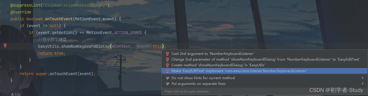
Click the fourth item here, a pop-up window will appear, check all the methods, and then click OK to quickly realize the callback of this interface, rewrite the method of the interface, and you will see that the custom View has added 5 methods ,code show as below:
    @Override
    public void onNum(String num) {


        if (currentInputPosition == mInputLength) return;
        inputArray[currentInputPosition] = num;
        currentInputPosition++;
        //Refresh View
        postInvalidate();
    }

    @Override
    public void onDelete() {


        if (currentInputPosition == 0) return;
        currentInputPosition--;
        inputArray[currentInputPosition] = null;
        //Refresh View
        postInvalidate();
    }

    @Override
    public void onComplete() {


        Log.d("TAG", "onComplete: " + getText());
    }

    @Override
    public void onDialogShow() {


        isFocus = true;
        postInvalidate();
    }

    @Override
    public void onDialogDismiss() {


        isFocus = false;
        postInvalidate();
    }
When the method is called postInvalidate(), it will be redrawn, so follow the previous logic.
5. Related APIs
Let's add a few more API methods that can be called by the code, as follows:
    /**
     * 设置输入框个数
     */
    public void setBoxNum(int num) {


        if (num < 4 || num > 6) {


            throw new IllegalArgumentException("The number of input boxes ranges from 4 to 6");
        }
        mBoxNum = num;
    }

    /**
     * 获取输入总长度
     */
    public int getBoxNum() {


        return mBoxNum;
    }

    /**
     * 设置是否密文
     * @param flag true 密文、false 明文
     */
    public void setCiphertext(boolean flag) {


        ciphertext = flag;
        postInvalidate();
    }

    /**
     * 设置密文时显示的内容
     * @param content 密文内容,默认是 *
     */
    public void setCiphertextContent(String content) {


        if (content == null) return;
        if (content.isEmpty()) return;
        if (content.length() > 1) return;
        ciphertextContent = content;
    }

    /**
     * 获取输入内容
     */
    public String getText() {


        StringBuilder builder = new StringBuilder();
        for (String number : inputArray) {


            if (number == null) continue;
            if (number.isEmpty()) continue;
            builder.append(number);
        }
        return builder.toString();
    }
Fourth, use a custom View
Regarding the use, this custom View has been added to the warehouse when I read this article. It can be used by introducing dependencies, such as using it in a module app, then open the app module build.gradleand dependencies{}add it under the closure. After that Remember to Sync Now.
dependencies {


    implementation 'io.github.lilongweidev:easyview:1.0.3'
}
Or if you have completed all the above-mentioned steps in your own project, then you don’t need to introduce dependencies, just call it directly, but pay attention to changing the corresponding package name, otherwise it will become popular.
It can be used, modify the code in activity_easy_edittext.xml as follows:
<?xml version="1.0" encoding="utf-8"?>
<LinearLayout xmlns:android="http://schemas.android.com/apk/res/android"
    xmlns:app="http://schemas.android.com/apk/res-auto"
    xmlns:tools="http://schemas.android.com/tools"
    android:layout_width="match_parent"
    android:layout_height="match_parent"
    android:gravity="center"
    android:orientation="vertical"
    tools:context=".used.EasyEditTextActivity">

    <!--简易输入框-->
    <com.easy.view.EasyEditText
        android:id="@+id/et_content"
        android:layout_width="wrap_content"
        android:layout_height="wrap_content"
        app:boxBackgroundColor="@color/white"
        app:boxFocusStrokeColor="@color/green"
        app:boxNum="6"
        app:boxStrokeColor="@color/black"
        app:boxStrokeWidth="2dp"
        app:boxWidth="48dp"
        app:ciphertext="false"
        app:textColor="@color/black"
        app:textSize="16sp" />

    <CheckBox
        android:id="@+id/cb_flag"
        android:layout_width="wrap_content"
        android:layout_height="wrap_content"
        android:layout_marginTop="30dp"
        android:text="明文" />

    <Button
        android:id="@+id/btn_get_content"
        android:layout_width="wrap_content"
        android:layout_height="wrap_content"
        android:layout_marginTop="12dp"
        android:text="获取内容" />
</LinearLayout>
If you find that you can’t preview the XML, you can’t see this custom View, just Rebuild Projectclick it, and you can see it. The preview effect is shown in the following figure:

Next, enter EasyEditTextActivity to use, modify the code as follows:
public class EasyEditTextActivity extends EasyActivity<ActivityEasyEdittextBinding> {


    @Override
    protected void onCreate() {


        getSupportActionBar().setDisplayHomeAsUpEnabled(true);
        binding.cbFlag.setOnCheckedChangeListener((buttonView, isChecked) -> {


            binding.etContent.setCiphertext(isChecked);
            binding.cbFlag.setText(isChecked ? "密文" : "明文");
        });
        //输入框
        binding.btnGetContent.setOnClickListener(v -> {


            String content = binding.etContent.getText();
            if (content.isEmpty()) {


                showMsg("请输入内容");
                return;
            }
            if (content.length() < binding.etContent.getBoxNum()) {


                showMsg("请输入完整内容");
                return;
            }
            showMsg("输入内容为:" + content);
        });
    }
}
The code here is very simple. Get the View, then get the value of the input box when the button is clicked, and display the value on the button. Run the test below.
Five, source code
If it is helpful to you, you may wish to Star or Fork, the mountains are high and the waters are long, and there will be a period later~
Source address: EasyView