foreword
In our development process, the use of controls is usually implemented through styles, and the following controls are implemented using styles.
QComboBox
/* 未下拉时,QComboBox的样式 */
QComboBox
{


    border: 1px solid gray;   /* 边框 */
    border-radius: 5px;   /* 圆角 */
    padding: 1px 18px 1px 3px;   /* 字体填衬 */
    color: white;
    font: normal normal 24px "Microsoft YaHei";
    background:rgb(54,54,54);
}

/* 下拉后,整个下拉窗体样式 */
QComboBox QAbstractItemView
{


    outline: 0px solid gray;   /* 选定项的虚框 */
    border: 1px solid yellow;   /* 整个下拉窗体的边框 */
    color: rgb(250,251,252);
    background-color: rgb(70,80,90);   /* 整个下拉窗体的背景色 */
    selection-background-color: lightgreen;   /* 整个下拉窗体被选中项的背景色 */
}

/* 下拉后,整个下拉窗体每项的样式 */
/* 项的高度(设置pComboBox->setView(new QListView(this));后该项才起作用) */
QComboBox QAbstractItemView::item
{


    height: 50px;
}

/* 下拉后,整个下拉窗体越过每项的样式 */
QComboBox QAbstractItemView::item:hover
{


    color: rgb(90,100,105);
    background-color: lightgreen;   /* 整个下拉窗体越过每项的背景色 */
}

/* 下拉后,整个下拉窗体被选择的每项的样式 */
QComboBox QAbstractItemView::item:selected
{


    color: rgb(12, 23, 34);
    background-color: lightgreen;
}

/* QComboBox中的垂直滚动条 */
QComboBox QAbstractScrollArea QScrollBar:vertical
{


    width: 13px;
    background-color: #d0d2d4;   /* 空白区域的背景色*/
}

QComboBox QAbstractScrollArea QScrollBar::handle:vertical
{


    border-radius: 5px;   /* 圆角 */
    background: rgb(60,60,60);   /* 小方块的背景色深灰lightblue */
}

QComboBox QAbstractScrollArea QScrollBar::handle:vertical:hover
{


    background: rgb(90, 91, 93);   /* 越过小方块的背景色yellow */
}

/* 设置为可编辑(setEditable(true))editable时,编辑区域的样式 */
QComboBox:editable
{


    background: green;
}

/* 设置为非编辑(setEditable(false))!editable时,整个QComboBox的样式 */
QComboBox:!editable
{


     background: rgb(54,54,54);
}

/* 设置为可编辑editable时,点击整个QComboBox的样式 */
QComboBox:editable:on
{


    background: rgb(54,54,54);
}

/* 设置为非编辑!editable时,点击整个QComboBox的样式 */
QComboBox:!editable:on
{


     background: rgb(54,54,54);
}

/* 设置为可编辑editable时,下拉框的样式 */
QComboBox::drop-down:editable
{


    background: rgb(54,54,54);
}

/* 设置为可编辑editable时,点击下拉框的样式 */
QComboBox::drop-down:editable:on
{


    background: rgb(54,54,54);
}

/* 设置为非编辑!editable时,下拉框的样式 */
QComboBox::drop-down:!editable
{


    background: rgb(54,54,54);
}

/* 设置为非编辑!editable时,点击下拉框的样式 */
QComboBox::drop-down:!editable:on
{


    background: rgb(54,54,54);
    image: url(:/resources/up.png); /* 显示上拉箭头 */
}

/* 下拉框样式 */
QComboBox::drop-down
{


    subcontrol-origin: padding;   /* 子控件在父元素中的原点矩形。如果未指定此属性,则默认为padding。 */
    subcontrol-position: top right;   /* 下拉框的位置(右上) */
    width: 32px;   /* 下拉框的宽度 */

    border-left-width: 1px;   /* 下拉框的左边界线宽度 */
    border-left-color: darkgray;   /* 下拉框的左边界线颜色 */
    border-left-style: solid;   /* 下拉框的左边界线为实线 */
    border-top-right-radius: 3px;   /* 下拉框的右上边界线的圆角半径(应和整个QComboBox右上边界线的圆角半径一致) */
    border-bottom-right-radius: 3px;   /* 同上 */
    image: url(:/resources/down.png);
}

/* 越过下拉框样式 */
QComboBox::drop-down:hover
{


    background: rgb(80, 75, 90);
}

/* 下拉箭头样式 */
QComboBox::down-arrow
{


    width: 32px; /* 下拉箭头的宽度(建议与下拉框drop-down的宽度一致) */
    background: rgb(54,54,54); /* 下拉箭头的的背景色 */
    padding: 0px 0px 0px 0px; /* 上内边距、右内边距、下内边距、左内边距 */
    image: url(:/resources/down.png);
}

/* 点击下拉箭头 */
QComboBox::down-arrow:on
{


    image: url(:/resources/up.png); /* 显示上拉箭头 */
}
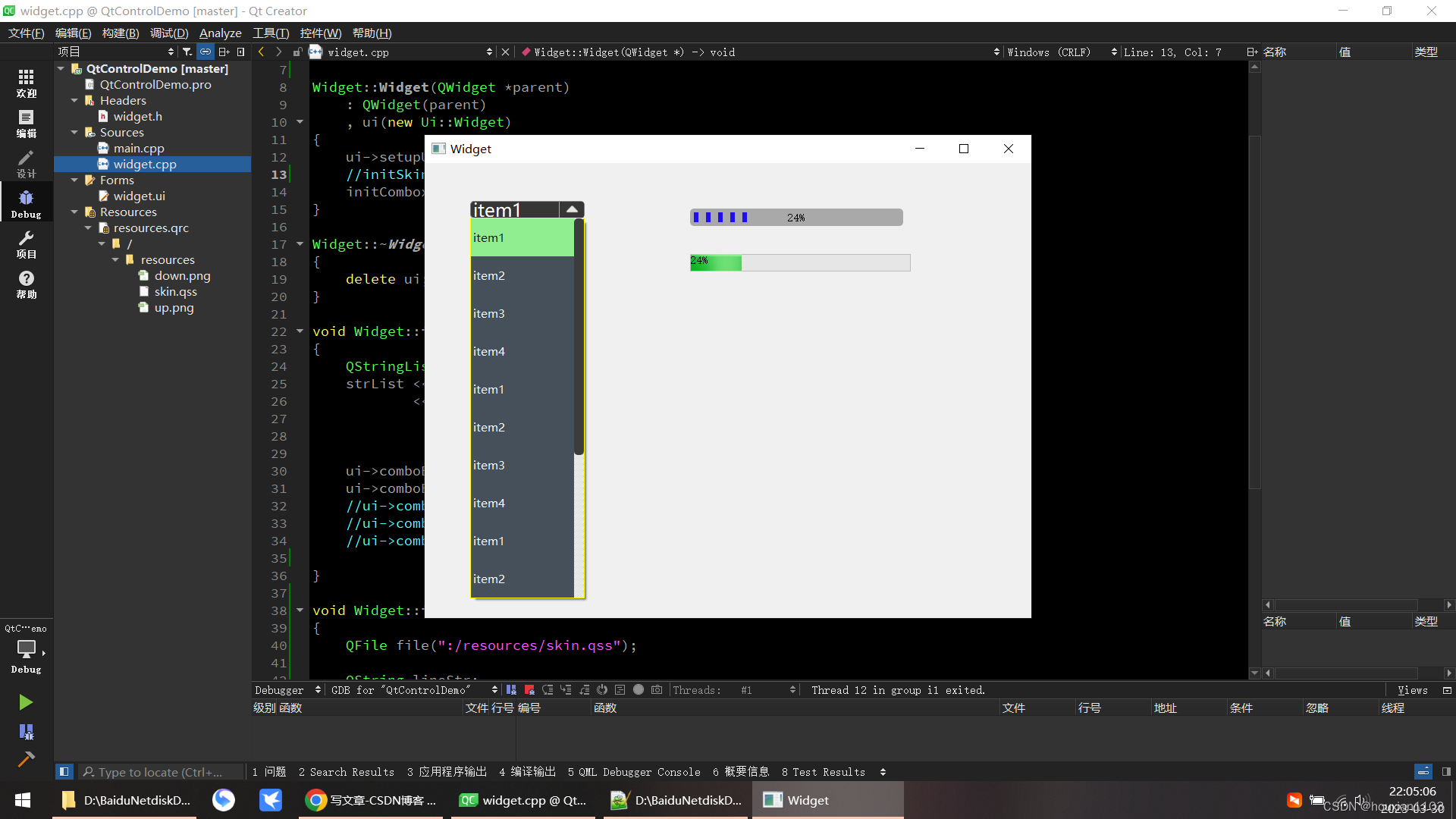
The effect is as follows:
code initialization
void Widget::initCombox()
{


    QStringList strList;
    strList << "item1" << "item2" << "item3" << "item4"
            << "item1" << "item2" << "item3" << "item4"
               << "item1" << "item2" << "item3" << "item4"
                  << "item1" << "item2" << "item3" << "item4";

    ui->comboBox->addItems(strList);
    ui->comboBox->setView(new QListView(this));
    //ui->comboBox->setEditable(true);
    //ui->comboBox->insertSeparator(10);
    //ui->comboBox->insertSeparator(12);

}
QprogressBar
QProgressBar:vertical
{


	border-radius:5px;
	background-color:darkgray;
	text-align:center;
	padding-left: 5px; padding-right: 4px; padding-bottom: 20px;
}

QProgressBar::chunk:vertical
{


	background-color:#06B025;
	margin:10px;
}
Loading of style sheets
void Widget::initSkin()
{


    QFile file(":/resources/skin.qss");

    QString lineStr;
    if(file.open(QIODevice::ReadOnly | QIODevice::Text))
    {


        QTextStream txtInput(&file);
        while(!txtInput.atEnd())
        {


            lineStr += txtInput.readLine(); //逐行读取qss代码
        }
    }
    file.close();

    this->setStyleSheet(lineStr);

}
skin.qss
QWidget
{


    background-color: rgb(54,54,54);
    border-top:2px;
    border-bottom:2px;
    border-left:2px;
    border-right:2px;
}

QLineEdit
{


    background-color: rgb(249,249,249);
    border: 1px solid black;
    border-radius:5;
    font:14px;
}

QLabel
{


    background-color: rgb(54,54,54);
    font:12px;
    color:white;
}

QPushButton
{


    color:rgb(251,251,251);
    font:12px, "微软雅黑";
    background-color:rgb(105,105,105);
    border-radius:4px;
	padding:2px;
}


QPushButton:hover
{


    color:#0000ff;
    background-color:rgb(210, 205, 205); /*改变背景色*/
    border-style:inset;/*改变边框风格*/
    padding-left:2px;
    padding-top:2px;
}

QPushButton:flat
{


    border:2px solid red;
}

QPushButton:pressed
{


    color:green;
}

QPlainTextEdit
{


    background-color: rgb(169,169,169);
    font:14px;
    color:white;
}
Introduction to qss
# 一、什么是qss?
Qt style sheet, 简写就是qss, Qt样式表,不需要用C++代码控件进行重载,就可以修改控件外观,美化界面,类似于前端的css, 但是没有css功能强大.
例如下面QLabel的样式设置
```css
QLabel
{
background-color: rgb(54,54,54); /*背景色*/
color: rgb(230,230,230); /*字体颜色,前景色*/
font-family: "Microsoft YaHei"; /*字体类型*/
font-size: 14px; /*字体大小*/
}
Annotation form:
/*我是qss注释*/
In addition to the above styles, there are many, qss is ever-changing, and you can write all kinds of fancy styles.
2. Common styles
font style
font-family: "Microsoft YaHei";
font-size: 14px;
font-style: italic;
font-weight: bold;
color: #123456;
The explanation is as follows:
- font-family : In order to set the font type, the standard form needs to add double quotes, and it may take effect if it is not added. It depends on whether the system supports it. Both Chinese and English are supported, but the font encoding support must be guaranteed. The general program encoding is "utf-8" no problem.
- font-size : To set the font size, the unit generally uses px pixels
- font-style : to set the font italic style, italic is italic, normal is not italic
- font-weight : To set the font bold style, bold is bold, normal is not bold
- color : To set the font color, you can use hexadecimal numbers to represent the color, or you can use some special font colors: red, green, blue, etc., or use rgb(r,g,b) and rgba(r,g ,b,a) to set, where the values of r, g, b, and a are 0~255, if you don’t want to display the color, you can set the value to be transparent; note: the font color uses the color attribute, there is no font-color attribute
Fonts can also be set together:
font: bold italic 18px "Microsoft YaHei";
When setting the style of font style weight size family at the same time, style (whether italic or not) and weight (whether bold or not) must appear at the beginning, size and family must appear after, and size must be before family, otherwise the style will not take effect.
border style
QLabel
{


    border-style: solid;
	/*单独设置某一边 border-right-style:dotted;*/

	border-width: 2px;
	border-color: red;
}
can also be set together
border: 2px solid red;
solid is a solid line, dashed is a dotted line, dotted is a dotted line, and none is not displayed (if border-style is not set, it will have a border by default)
individual property settings
border-top-style: solid;
border-top-width: 2px;
border-top-color: red;
border-top: 2px solid red;
border-right-style: solid;
border-right-width: 3px;
border-right-color: green;
border-right: 3px solid green;
border-bottom-style: solid;
border-bottom-width: 2px;
border-bottom-color: blue;
border-bottom: 2px solid blue;
border-left-style: solid;
border-left-width: 3px;
border-left-color: aqua;
border-left: 3px solid aqua;
border radius (rounded corners)
border-top-left-radius: 5px;
border-top-right-radius: 10px;
border-bottom-left-radius: 15px;
border-bottom-right-radius: 20px;
border-radius: 20px;  /*统一的半径*/
text position
In qss, there is no alignment method, and the display position of the text can only be realized by setting padding; generally padding-left is equivalent to x coordinates, padding-top is equivalent to y coordinates, setting these two can be displayed at any position (default In this case, the text is displayed in the center of the top, bottom, left, and right)
padding-left: 10px;
padding-top: 8px;
padding-right: 7px;
padding-bottom: 9px;
background style
Other controls also apply
background-color: rgb(54,54,54);
background-image: url(:/imgs/picture/0.png);   /*显示背景图片, 也可以不用引号*/
background-repeat: no-repeat;  /*不重复显示*/
background-position: left center;
The explanation is as follows:
- background-color To set the background color, you can use hexadecimal numbers to represent the color, or you can use some special font colors: red, green, blue, etc., or use rgb(r,g,b) and rgba(r, g, b, a) to set, where r, g, b, a value is 0~255, if you want not to display the color, you can set the value to transparent transparent
- background-image is to set the background image, and the image path is url(image-path)
- background-repeat is to set whether the background image is repeated to fill the background. If the size of the background image is smaller than the actual size of the background, the image will be automatically repeated by default. It can be set to no-repeat for no repetition, repeat-x on the x-axis, repeat-y on the y-axis repeat
- background-position is to set the display position of the background image, only supports left right top bottom center; the value left right center is to set the horizontal position, and the value top bottom center is to set the vertical position
Unified settings
background: url(":/imgs/picture/0.png") no-repeat left center #363636;
background is to set all the attributes of the background, color image repeat position The order of these attribute values can be arbitrary
Dynamic floating style
QLabel:hover
{


	color: red;
	border-color: green;
    background-color: #363636;
}
Prohibited styles
QLabel:disabled
{


	color: blue;
	border-color: brown;
    background-color: #363636;
}
3. Control application
QLabel
renderings
[External link picture transfer failed, the source site may have an anti-theft link mechanism, it is recommended to save the picture and upload it directly (img-ELm0RcdG-1680185686349)(D:\TyporaImageSave\image-20220620000419677.png)]
qss code
QLabel {
    font-family: "Microsoft YaHei";
    font-size: 18px;
    color: #BDC8E2;
    font-style: normal;
    font-weight: normal;

    border-style: solid;
    border-width: 2px;
    border-color: aqua;
    border-radius: 20px;

    padding-left: 20px;
    padding-top: 3px;

    background-color: #2E3648;
    background-image: url("./image.png");
    background-repeat: no-repeat;
    background-position: left center;
}
In addition, we can also set dynamic styles, the style when the mouse hovers
QLabel:hover
{
    color: red;
    border-color: green;
    background-color: aqua;
}
QLineEdit
Common property settings
setReadOnly(false);  // 只读
setFocusPolicy(Qt::NoFocus); // 无法获得焦点

setMaxLength(10); // 最多输入10个字符
text alignment
lineedit->setAlignment(Qt::AlignLeft)    //左对齐
lineedit->setAlignment(Qt::AlignRight)   //右对齐
lineedit->setAlignment(Qt::AlignCenter)  //居中对齐
regular control
The first number is 1-9, the second number and the following are 0-9
QRegExp regx("[1-9][0-9]+$");
QValidator *validator = new QRegExpValidator(regx, ui->lineEdit);
lineEdit->setValidator(validator);
style settings
[External link picture transfer failed, the source site may have an anti-theft link mechanism, it is recommended to save the picture and upload it directly (img-N0WdlJ9w-1680185686355)(D:\TyporaImageSave\image-20220620001144196.png)]
qss code
QLineEdit{
	border: 1px solid #ABCDA0;      /* 边框宽度为1px,颜色为#A0A0A0 */
	border-radius: 3px;         /* 边框圆角 */
	padding-left: 5px;           /* 文本距离左边界有5px */
	background-color: #F2F2F2;     /* 背景颜色 */
	color: #A0A0A0;     /* 文本颜色 */
	selection-background-color: #A0A0A0;     /* 选中文本的背景颜色 */
	selection-color: #F2F2F2;    /* 选中文本的颜色 */
	font-family: "Microsoft YaHei";    /* 文本字体族 */
	font-size: 10pt;    /* 文本字体大小 */
}

QLineEdit:hover { /* 鼠标悬浮在QLineEdit时的状态 */
	border: 1px solid #298DFF;
	border-radius: 3px;
	background-color: #F2F2F2;
	color: #298DFF;
	selection-background-color: #298DFF;
	selection-color: #F2F2F2;
}

QLineEdit[echoMode="2"] { /* QLineEdit有输入掩码时的状态 */
	lineedit-password-character: 9679;
	lineedit-password-mask-delay: 2000;
}

QLineEdit:disabled { /* QLineEdit在禁用时的状态 */
	border: 1px solid #CDCDCD;
	background-color: #CDCDCD;
	color: #B4B4B4;
}

QLineEdit:read-only { /* QLineEdit在只读时的状态 */
	background-color: #CDCDCD;
	color: #F2F2F2;
}
QPushButton button style
[External link picture transfer failed, the source site may have an anti-theft link mechanism, it is recommended to save the picture and upload it directly (img-hvBY6O0H-1680185686356)(D:\TyporaImageSave\image-20220620001543055.png)]
basic style
QPushButton
{


    /* 前景色, 文字的颜色 */
    color:green;

    /* 背景色 */
    background-color:rgb(223,223,223);

    /* 边框风格 */
    border-style:outset;

    /* 边框宽度 */
    border-width:0.5px;

    /* 边框颜色 */
    border-color:rgb(10,45,110);

    /* 边框倒角 */
    border-radius:10px;

    /* 字体 */
    font:bold 22px;

    /* 控件最小宽度 */
    min-width:100px;

    /* 控件最小高度 */
    min-height:20px;

    /* 内边距 */
    padding:4px;
}

/* 鼠标按下时的效果 */
QPushButton#pushButton:pressed
{


    /* 改变背景色 */
    background-color:rgb(40,85,20);

    /* 改变边框风格 */
    border-style:inset;

    /* 使文字有一点移动 */
    padding-left:6px;
    padding-top:6px;
}

/* 按钮样式 */
QPushButton:flat
{


    border:2px solid red;
}

/*鼠标悬浮时的效果*/
QPushButton:hover
{


    color:#0000ff;
    background-color:rgb(210, 205, 205); /*改变背景色*/
    border-style:inset;/*改变边框风格*/
    padding-left:8px;
    padding-top:8px;
}
Buttons can also be specified individually, #for example:
/*鼠标悬浮时的效果*/
QPushButton#btn2:hover
{


    color:#0000ff;
    background-color:rgb(100, 100, 20); /*改变背景色*/
    border-style:inset;/*改变边框风格*/
    padding-left:8px;
    padding-top:8px;
}
related status
:checked      button部件被选中
:unchecked    button部件未被选中
:disabled     部件被禁用
:enabled      部件被启用
:focus        部件获得焦点
:hover        鼠标位于部件上
:pressed      部件被鼠标按下
:indeterminate    checkbox或radiobutton被部分选中
:off              部件可以切换,且处于off状态
:on               部件可以切换,且处于on状态
Prohibited styles
When the button is disabled ui->pushButton->setEnabled(false);
QPushButton:disabled
{


	color: blue;
	border-color: brown;
    background-color: #363636;
}
Background picture
[External link picture transfer failed, the source site may have an anti-leeching mechanism, it is recommended to save the picture and upload it directly (img-zc2qkbED-1680185686357)(D:\TyporaImageSave\image-20220620001830796.png)]
qss code
QPushButton
{
	background-image:url(":/resources/user.png");
	background-position:center;
	background-repeat: no-repeat;
	border:none
}

QPushButton:hover
{
	background-color:rgb(10,210,210);
	background-image:url(":/resources/user_hover.png")
}

QPushButton:pressed
{
	background-color:rgb(10,210,210);
	background-image:url(":/resources/user.png");
	padding-left:8px;
    padding-top:8px;
}
QSlider
[External link image transfer failed, the source site may have an anti-leeching mechanism, it is recommended to save the image and upload it directly (img-nvq8g7BI-1680185686358)(D:\TyporaImageSave\image-20220620004412799.png)]
Horizontal QSlider
QSlider
{
    background-color: #363636;
	border-style: outset;
	border-radius: 10px;
}

QSlider::groove:horizontal
{
	height: 12px;
	background: qlineargradient(x1:0, y1:0, x2:0, y2:1, stop:0 #B1B1B1, stop:1 #c4c4c4);
	margin: 2px 0
}

QSlider::handle:horizontal
{
	background: QRadialGradient(cx:0, cy:0, radius: 1, fx:0.5, fy:0.5, stop:0 white, stop:1 green);
	width: 16px;
	height: 16px;
	margin: -5px 6px -5px 6px;
	border-radius:11px;
	border: 3px solid #ffffff;
}
Vertical
QSlider
{
	background-color: rgba(22, 22, 22, 0.7);
	padding-top: 15px;  /*上面端点离顶部的距离*/
	padding-bottom: 15px;
	border-radius: 5px; /*外边框矩形倒角*/
}

QSlider::add-page:vertical
{
	background-color: #FF7826;
	width:5px;
	border-radius: 2px;
}

QSlider::sub-page:vertical
{
	background-color: #7A7B79;
	width:5px;
	border-radius: 2px;
}

QSlider::groove:vertical
{
	background:transparent;
	width:6px;
}

QSlider::handle:vertical
{
	height: 14px;
	width: 14px;
	margin: 0px -4px 0px -4px;
	border-radius: 7px;
	background: white;
}
QComboBox
Style 1:
[External link picture transfer failed, the source site may have an anti-theft link mechanism, it is recommended to save the picture and upload it directly (img-1FubTiDd-1680185686358)(D:\TyporaImageSave\image-20220621013451271.png)]
qss code
/* 未下拉时,QComboBox的样式 */
QComboBox
{
    background:rgb(54,54,54);
    border: 1px solid gray;   /* 边框 */
    border-radius: 5px;   /* 圆角 */
    padding: 1px 18px 1px 3px;   /* 字体填衬 */
    color: white;
    font: normal normal 24px "Microsoft YaHei";
}
style 2
[External link picture transfer failed, the source site may have an anti-leeching mechanism, it is recommended to save the picture and upload it directly (img-zHn5FCLX-1680185686359)(D:\TyporaImageSave\image-20220621015716948.png)]
qss code
/* 未下拉时,QComboBox的样式 */
QComboBox
{
    border: 1px solid gray;   /* 边框 */
    border-radius: 5px;   /* 圆角 */
    padding: 1px 18px 1px 3px;   /* 字体填衬 */
    color: white;
    font: normal normal 24px "Microsoft YaHei";
    background:rgb(54,54,54);
}

/* 下拉后,整个下拉窗体样式 */
QComboBox QAbstractItemView
{
    outline: 0px solid gray;   /* 选定项的虚框 */
    border: 1px solid yellow;   /* 整个下拉窗体的边框 */
    color: rgb(250,251,252);
    background-color: rgb(70,80,90);   /* 整个下拉窗体的背景色 */
    selection-background-color: lightgreen;   /* 整个下拉窗体被选中项的背景色 */
}

/* 下拉后,整个下拉窗体每项的样式 */
/* 项的高度(设置pComboBox->setView(new QListView(this));后该项才起作用) */
QComboBox QAbstractItemView::item
{
    height: 50px;
}

/* 下拉后,整个下拉窗体越过每项的样式 */
QComboBox QAbstractItemView::item:hover
{
    color: rgb(90,100,105);
    background-color: lightgreen;   /* 整个下拉窗体越过每项的背景色 */
}

/* 下拉后,整个下拉窗体被选择的每项的样式 */
QComboBox QAbstractItemView::item:selected
{
    color: rgb(12, 23, 34);
    background-color: lightgreen;
}

/* QComboBox中的垂直滚动条 */
QComboBox QAbstractScrollArea QScrollBar:vertical
{
    width: 13px;
    background-color: #d0d2d4;   /* 空白区域的背景色*/
}

QComboBox QAbstractScrollArea QScrollBar::handle:vertical
{
    border-radius: 5px;   /* 圆角 */
    background: rgb(60,60,60);   /* 小方块的背景色深灰lightblue */
}

QComboBox QAbstractScrollArea QScrollBar::handle:vertical:hover
{
    background: rgb(90, 91, 93);   /* 越过小方块的背景色yellow */
}

/* 设置为可编辑(setEditable(true))editable时,编辑区域的样式 */
QComboBox:editable
{
    background: green;
}

/* 设置为非编辑(setEditable(false))!editable时,整个QComboBox的样式 */
QComboBox:!editable
{
     background: rgb(54,54,54);
}

/* 设置为可编辑editable时,点击整个QComboBox的样式 */
QComboBox:editable:on
{
    background: rgb(54,54,54);
}

/* 设置为非编辑!editable时,点击整个QComboBox的样式 */
QComboBox:!editable:on
{
     background: rgb(54,54,54);
}

/* 设置为可编辑editable时,下拉框的样式 */
QComboBox::drop-down:editable
{
    background: rgb(54,54,54);
}

/* 设置为可编辑editable时,点击下拉框的样式 */
QComboBox::drop-down:editable:on
{
    background: rgb(54,54,54);
}

/* 设置为非编辑!editable时,下拉框的样式 */
QComboBox::drop-down:!editable
{
    background: rgb(54,54,54);
}

/* 设置为非编辑!editable时,点击下拉框的样式 */
QComboBox::drop-down:!editable:on
{
    background: rgb(54,54,54);
    image: url(:/resources/up.png); /* 显示上拉箭头 */
}

/* 下拉框样式 */
QComboBox::drop-down
{
    subcontrol-origin: padding;   /* 子控件在父元素中的原点矩形。如果未指定此属性,则默认为padding。 */
    subcontrol-position: top right;   /* 下拉框的位置(右上) */
    width: 32px;   /* 下拉框的宽度 */

    border-left-width: 1px;   /* 下拉框的左边界线宽度 */
    border-left-color: darkgray;   /* 下拉框的左边界线颜色 */
    border-left-style: solid;   /* 下拉框的左边界线为实线 */
    border-top-right-radius: 3px;   /* 下拉框的右上边界线的圆角半径(应和整个QComboBox右上边界线的圆角半径一致) */
    border-bottom-right-radius: 3px;   /* 同上 */
    image: url(:/resources/down.png);
}

/* 越过下拉框样式 */
QComboBox::drop-down:hover
{
    background: rgb(80, 75, 90);
}

/* 下拉箭头样式 */
QComboBox::down-arrow
{
    width: 32px; /* 下拉箭头的宽度(建议与下拉框drop-down的宽度一致) */
    background: rgb(54,54,54); /* 下拉箭头的的背景色 */
    padding: 0px 0px 0px 0px; /* 上内边距、右内边距、下内边距、左内边距 */
    image: url(:/resources/down.png);
}

/* 点击下拉箭头 */
QComboBox::down-arrow:on
{
    image: url(:/resources/up.png); /* 显示上拉箭头 */
}
QProgressBar
horizontal style 1
QProgressBar is a horizontal effect by default
[External link picture transfer failed, the source site may have an anti-theft link mechanism, it is recommended to save the picture and upload it directly (img-GGh6gwDI-1680185686360)(D:\TyporaImageSave\image-20220619231030170.png)]
qss code
QProgressBar
{
      background:rgb(54,54,54);
      border:none;   /*无边框*/
      border-radius:5px;
      text-align:center;   /*文本的位置*/
      color: rgb(229, 229, 229);  /*文本颜色*/
}

QProgressBar::chunk
{
      background-color:rgb(58, 154, 255);
      border-radius:4px;
}
Chunk represents the rounded corners of the progress inside
horizontal style 2
[External link picture transfer failed, the source site may have an anti-theft link mechanism, it is recommended to save the picture and upload it directly (img-wCEjj5LC-1680185686361)(D:\TyporaImageSave\image-20220619233341762.png)]
qss code
QProgressBar
{
	border-radius:5px;
	background-color:darkgray;
	text-align:center
}

QProgressBar::chunk
{
	background-color:#1F0FEF;
	width:6px;
	margin:5px;
}
vertical style sheet
C++ settings
ui->progressBar_2->setOrientation(Qt::Vertical);
ui->progressBar_2->setFixedWidth(60);
ui->progressBar_2->setFixedHeight(300);
For example the following effect
[External link image transfer failed, the source site may have an anti-leeching mechanism, it is recommended to save the image and upload it directly (img-jllSpeU1-1680185686361)(D:\TyporaImageSave\image-20220619233924079.png)]
qss code
QProgressBar:vertical
{
	border-radius:5px;
	background-color:darkgray;
	text-align:center;
	padding-left: 5px; padding-right: 4px; padding-bottom: 2px;
}

QProgressBar::chunk:vertical
{
	background-color:#06B025;
	margin:1px;
}
other vertical styles
Gradient
[External link image transfer failed, the source site may have an anti-leeching mechanism, it is recommended to save the image and upload it directly (img-Jn9NCndf-1680185686362)(D:\TyporaImageSave\image-20220619234053854.png)]
qss code
QProgressBar:vertical
{
	border-radius:5px;
	background-color:darkgray;
	text-align:center;
	padding-left: 5px; padding-right: 4px; padding-bottom: 2px;
}

QProgressBar::chunk:vertical
{
	background-color:QLinearGradient( x1: 0, y1: 0, x2: 0, y2: 1,stop: 0 #00ff58,stop: 1 #034f1f);
	margin:1px;
}
QMenu menu style
[External link image transfer failed, the source site may have an anti-leeching mechanism, it is recommended to save the image and upload it directly (img-Womz9OOK-1680185686363)(D:\TyporaImageSave\image-20220620001957419.png)]
qss code
QMenu::item
{


     font:16px;
     background-color:rgb(253,253,253);
     padding:8px 32px;
     margin:0px 8px;
     border-bottom:1px solid #DBDBDB;
}

/*选择项设置*/
QMenu::item:selected
{


     background-color: #FFF8DC;
}
Four, qss selector
1 wildcard selector
Match all controls, indicated by an asterisk
* {


        background-color:yellow;
}
After setting, the background color of the control window has been modified;
or specify a subclass
* QPushButton{


        background-color:yellow;
}
after setting
[External link picture transfer failed, the source site may have an anti-leeching mechanism, it is recommended to save the picture and upload it directly (img-e63a1joy-1680185686363)(D:\TyporaImageSave\image-20220620002734951.png)]
2 type selector
Match controls by control type ( including subclasses )
QWidget {


        background-color:yellow
}
If you want to prevent subclasses, such as windows from being modified, you can set properties
//禁止父窗口影响子窗口样式
setAttribute(Qt::WA_StyledBackground);
The class selector also matches controls by the control type, but the difference is that it does not contain subclasses , and the syntax is to add a . (a dot) in front of the class
.QWidget {


        background-color:yellow
}
注意类前面有个点
This will only take effect for QWidget, and will not take effect if there are other controls on the interface.
3 ID selector
The ID selector is combined with the objectname of the control to match the control. Add a pound sign before the objectname in qss to indicate that the objectname of different controls can be the same
#blue {
        background-color:blue
}
4 Attribute selectors
The attribute selector is combined with the attribute value of the control to match the control. First, the attribute of the control must be set. The attribute in qss is limited by [proterty = attitude]
qt code
label1.setProperty('notice_level','error')
label2.setProperty('notice_level','warning')
qss
.QLabel {
        background-color:pink;
}

.QLabel[notice_level='warning'] {
        border:5px solid yellow;
}

.QLabel[notice_level='error'] {
        border:5px solid red;
}
There is another usage here, that is, only the attribute value is defined in qss, as long as the control with this attribute can be selected
.QLabel [notice_level]{
        background-color:pink;
}

.QLabel[notice_level='warning'] {
        border:5px solid yellow;
}

.QLabel[notice_level='error'] {
        border:5px solid red;
}
As long as there is the attribute novice_level, the price control will take effect.