interlaced animation

Sometimes, we need to add the same animation to multiple elements. After playing, it is not difficult to find that they will move together and end together, which will look very ordinary.
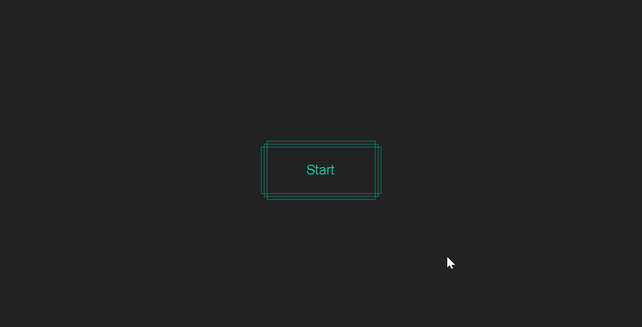
So how do you make the animation a little bit more interesting? It's very simple, since they all start to move at the same time, wouldn't it be okay to let them not move at the same time? How to make them not move at the same time? Note that CSS animations have a delay( delay) property. For example, if ten elements play ten animations, set the animation playback time of the second element to be 0.5 seconds later than the first element (that is, set the delay to 0.5 seconds), and so on for other elements , so that they will be staggered to form a unique visual effect.
This is the so-called interlaced animation: by setting different delay times, the effect of interlaced animation can be achieved.
Address of this demo: Staggered Wave Loading
Split text with JS
There is also a game that is often used: use JS to divide sentences or words into letters, and add animations with different delays to each letter, which is also very gorgeous
Address of this demo: Staggered LandIn Text
Staggered animations at different positions
Generally, we start to interleave from the first element. But if you want to interleave from the middle element, you need to add a value to the delay of the current element. This value is the distance from the subscript of the middle element to the subscript of the current element (that is, the absolute value of the difference between the subscripts) multiplied by the step size

Address of this demo: Reveal Text
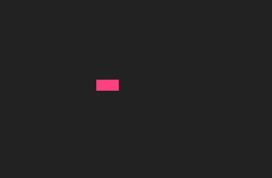
Random particle animation
Speaking of randomness, we can achieve a crazier effect: add interlaced animation to hundreds of particles, and the interlaced time is random, and the position and size are also random. In this way, we can simulate the effect of snow with pure CSS.
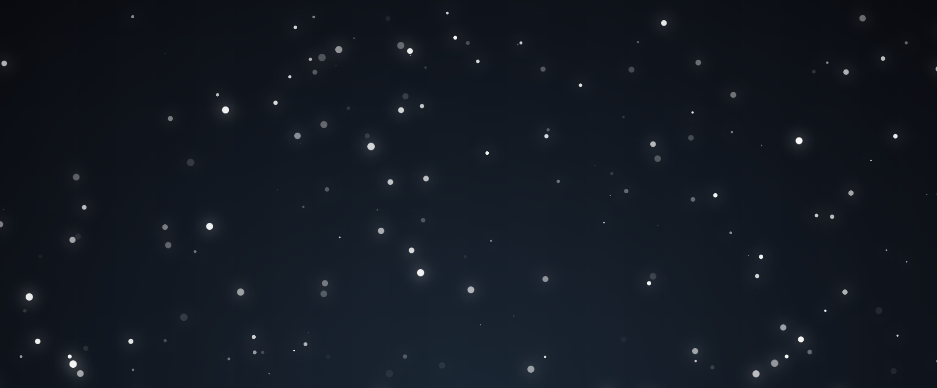
Address of this demo: Snow (Pure CSS)
Pseudo-classes and pseudo-elements
pseudo class
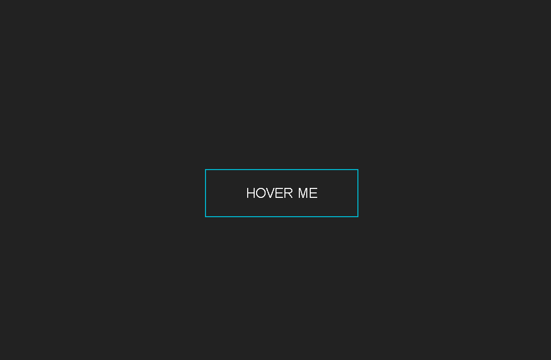
The state of HTML elements can be changed dynamically. For example, when your mouse hovers over a button, the button will become in a "floating" state. At this time, we can use the pseudo-class :hoverto select the button in this state and change its style.
:hoverIt is the most commonly used pseudo-class by the author. Another very commonly used pseudo-class is :nth-childto select a sub-element of an element. Other similar :focus, :focus-withinetc. are also used to a certain extent.
This demo address: Button Hover Border Stroke With Float Text
Absolute positioning for multiple borders
Who stipulates that buttons can only have one set of borders? Using absolute positioning and padding, we can make 3 sets of borders of different sizes for the button, which makes the effect more dazzling
Address of this demo: Button Hover Multiple Border Stroke
pseudo element
In short, a pseudo-element is to insert an additional element on the basis of the original element, and this element does not act as an HTML tag, so that the HTML structure can be kept clean.
We know that each element has ::beforeand ::afterthese two pseudo-elements, that is to say, each element provides 3 rectangles (1 for the element itself, 2 for the pseudo-element) for us to draw the shape. Now with clip-paththis property again, almost any shape can be drawn, depending on your imagination
The above animation is the animation of the strip passing through the text. The strip is the pseudo-element corresponding to each text. Applying animation to each text and its pseudo-element can achieve the effect of the above picture
Address of this demo: Header With Slide Bar
attr() generates text content
Elements can have custom attribute values, and its naming format is usuallydata-*
attr()Used to get the custom attribute value of the element and assign it to its pseudo-element contentas its generated content
Using this function, we can use pseudo-elements to "copy" another text based on the original text, as shown in the following figure
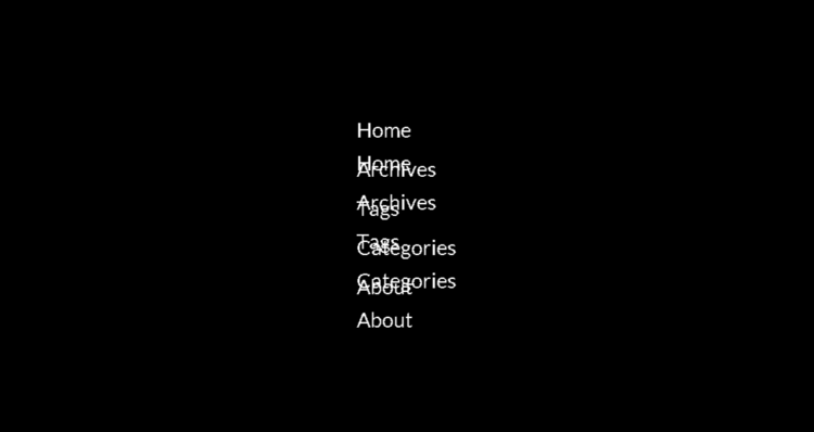
Looks a bit messy, right? It's ok, add it overflow: hidden, cover up the extra text. By splitting the text with JS and applying interlaced animation, the following effect is obtained, which is also overflowthe blindfold method to be discussed in the following article

Address of this demo: Staggered Float Text Menu
overflow cover-up
There is an effect of flashing buttons before: when the mouse hovers over the button, a light flashes from left to right.
I used the gradient to simulate that light by transform: translateX()translating it to the right
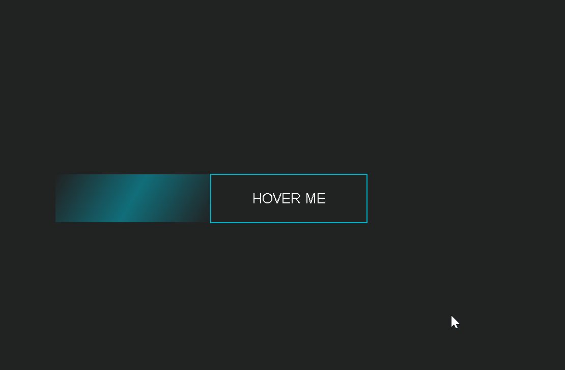
But this is obviously wrong, why can this light be seen? Shouldn't it be "blocked"?
So, adding to the button overflow: hidden, the light is hidden when it is outside the button
Address of this demo: Button Hover Shining
custom input
inputWhat if the default is too ugly? Then erase it first and set opacity: 0it
Closely inputrelated to labelElements, as they labelalso trigger inputstate changes when the user clicks on them. Using this feature, you can give labelcustom styles, not only that, but you can also labeladd more elements next to them, ~select them with sibling selectors to define styles, use :checkedpseudo-classes to monitor the original inputstate changes, and add a little animation. Finished inputcustomizing the right
At present, inputelements also support pseudo-elements, which brings another way of thinking: use the appearance: noneeliminated inputdefault style, and then customize it with pseudo-elements, so that labelits original style can be retained.
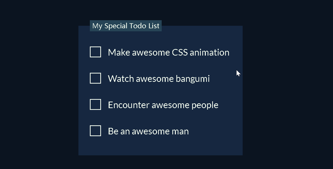
Address of this demo: Todo List
CSS properties
Making good use of certain CSS features can also add a lot to your work
animation
include transitionandtransform
Below is my personal business card, guess what tricks are used in it?
First of all, the animation that appeared in the first four borders used overflowa blindfold method
Secondly, the text used pseudo-element animation
Finally, the sequential appearance of social icons uses a staggered animation
Address of this demo: Profile Card
border-radius
Add rounded corners to the box, often used to beautify components such as buttons
If it is set to 50%be a circle, it is also very common
irregular curved shape
Adjusting multiple vertices border-radiuscan make irregular curved edge shapes
Address of this demo: Nav Tab
box-shadow
Add shadows to the box to increase the three-dimensionality of the box, which can be multi-layered and make the shadows smoother

Address of this demo: Pagination