Row means horizontal layout, which can arrange the sub-controls it contains in the horizontal direction
code show as below:
class _TestState extends State<Test> {
@override
Widget build(BuildContext context) {
return MaterialApp(
home: Scaffold(
body: Container(
width: MediaQuery.of(context).size.width,
height: MediaQuery.of(context).size.height,
color: Colors.lightGreen,
child: Row(
children: [
Container(
width: 100,
height: 120,
color: Colors.red,
),
Container(
width: 100,
height: 150,
color: Colors.yellow,
),
Container(
width: 100,
height: 180,
color: Colors.blue,
),
],
),
),
),
);
}
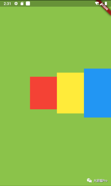
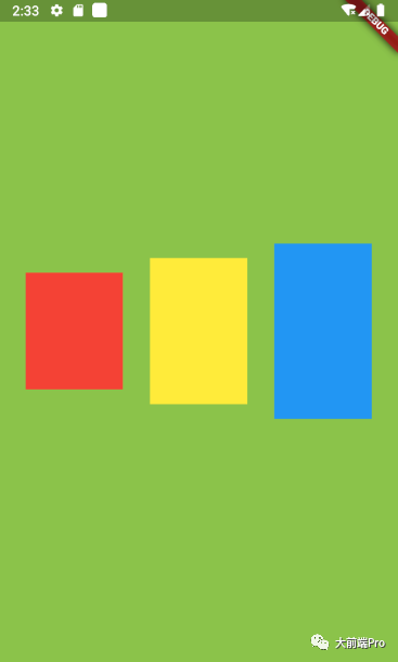
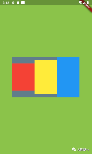
}The effect is as follows:

As shown in the figure above, we can see that three controls are arranged horizontally in the middle of the screen
----------------Dividing line---------------
This basic use can not meet the demand in most cases, let's look at a few parameters that Row has
Row({
    Key? key,
    MainAxisAlignment mainAxisAlignment = MainAxisAlignment.start,
    MainAxisSize mainAxisSize = MainAxisSize.max,
    CrossAxisAlignment crossAxisAlignment = CrossAxisAlignment.center,
    TextDirection? textDirection,
    VerticalDirection verticalDirection = VerticalDirection.down,
    TextBaseline? textBaseline, // NO DEFAULT: we don't know what the text's baseline should be
    List<Widget> children = const <Widget>[],
  })
MainAxisAlignment: The main axis alignment is the horizontal alignment of Row neutron controls (PS: for Row, the main axis is horizontal, and for Column, the main axis is vertical)
mainAxisAlignment has the following optional values
MainAxisAlignment.start: Arrange to the left (this is the default value as can be seen from the Row structure)
MainAxisAlignment.end: align to the right. code show as below:
class _TestState extends State<Test> {
  @override
  Widget build(BuildContext context) {
    return MaterialApp(
      home: Scaffold(
        body: Container(
          width: MediaQuery.of(context).size.width,
          height: MediaQuery.of(context).size.height,
          color: Colors.lightGreen,
          child: Row(
            mainAxisAlignment:MainAxisAlignment.end,
            children: [
              Container(
                width: 100,
                height: 120,
                color: Colors.red,
              ),
              Container(
                width: 100,
                height: 150,
                color: Colors.yellow,
              ),
              Container(
                width: 100,
                height: 180,
                color: Colors.blue,
              ),
            ],
          ),
        ),
      ),
    );
  }
}
The effect is as follows:
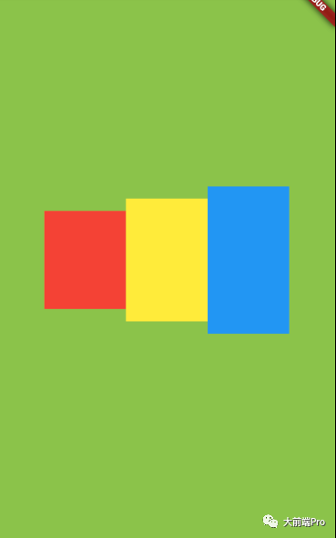
MainAxisAlignment.center: Centered.
The code is almost the same as above, so I won't paste it. The effect is as follows:
MainAxisAlignment.spaceAround: The left and right intervals of each subcomponent are equal, that is, the margin is equal. The effect is as follows:
MainAxisAlignment.spaceBetween: both ends are aligned, that is, the first subcomponent is on the left, the last subcomponent is on the right, and the remaining components are evenly distributed in the middle. The effect is as follows:
MainAxisAlignment.spaceEvenly: Each sub-component is evenly distributed, that is, the horizontal space is evenly distributed. The effect is as follows:
CrossAxisAlignment: The cross axis alignment is the vertical alignment of Row neutron controls. The so-called cross axis is the direction perpendicular to the main axis (PS: for Row, its cross axis is the vertical direction, for Column, Its cross axis is the horizontal direction)
crossAxisAlignment has the following optional values
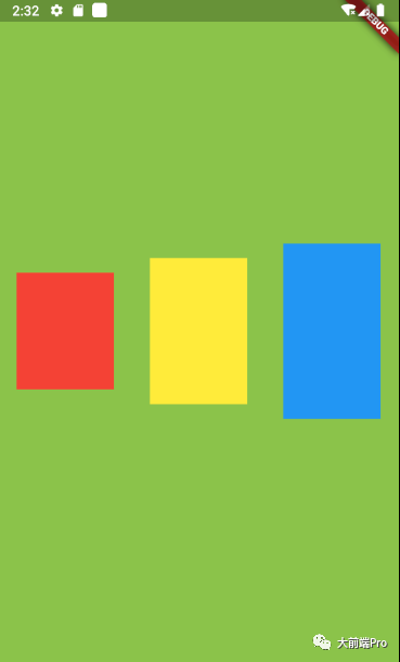
CrossAxisAlignment.center: The sub-components are centered in the Row (this is the default value as can be seen from the Row structure), so the sub-controls in Figure 1 will be centered in the vertical direction.
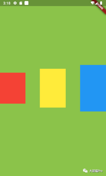
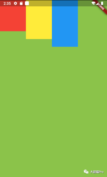
CrossAxisAlignment.start: Subcomponents are aligned at the top of the Row, the effect is as follows
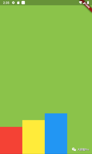
CrossAxisAlignment.end: Subcomponents are aligned at the bottom of the Row.
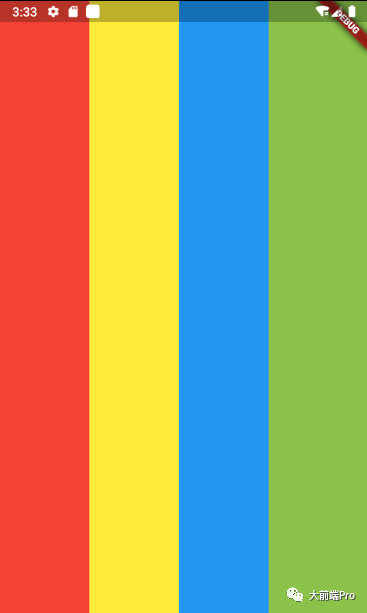
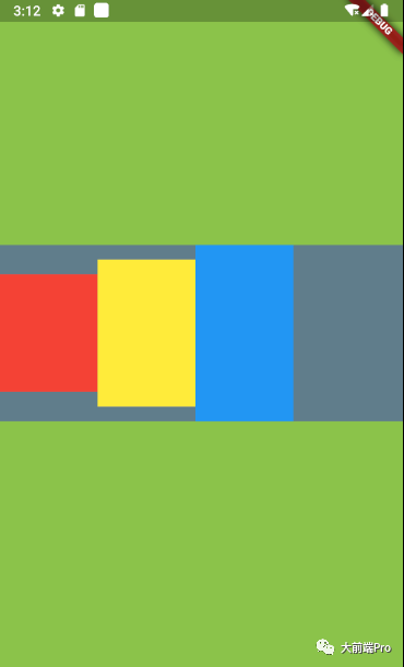
CrossAxisAlignment.stretch: The cross axis is stretched to fill the parent layout.
The effect is as follows:
CrossAxisAlignment.baseline: Based on baseline alignment, not commonly used, meaning unclear...
MainAxisSize: Main axis size adaptation, there are two optional values
MainAxisSize.min: The width is consistent with the child control
code show as below
class _TestState extends State<Test> {
  @override
  Widget build(BuildContext context) {
    return MaterialApp(
      home: Scaffold(
        body: Container(
          width: MediaQuery.of(context).size.width,
          height: MediaQuery.of(context).size.height,
          alignment: Alignment.center,
          color: Colors.lightGreen,
          child: Container(
            color: Colors.blueGrey,
            child: Row(
              mainAxisSize: MainAxisSize.min,
              children: [
                Container(
                  width: 100,
                  height: 120,
                  color: Colors.red,
                ),
                Container(
                  width: 100,
                  height: 150,
                  color: Colors.yellow,
                ),
                Container(
                  width: 100,
                  height: 180,
                  color: Colors.blue,
                ),
              ],
            ),
          ),
        ),
      ),
    );
  }
}
The effect is as follows:
MainAxisSize.max: The width covers the main axis direction (this is the default value)
The effect is as follows:
TextDirection: The horizontal arrangement order of subcomponents (PS: As can be seen from the above, the subcontrols in our Row are sorted from left to right by default. If this parameter is set, the default sorting direction can be changed)
Possible values are:
--TextDirection.ltr: Arrange from left to right (this is the default direction)
--TextDirection.rtl: Arrange from right to left
code show as below:
class _TestState extends State<Test> {
  @override
  Widget build(BuildContext context) {
    return MaterialApp(
      home: Scaffold(
        body: Container(
          width: MediaQuery.of(context).size.width,
          height: MediaQuery.of(context).size.height,
          color: Colors.lightGreen,
          child: Row(
            textDirection: TextDirection.rtl,
            children: [
              Container(
                width: 100,
                height: 120,
                color: Colors.red,
              ),
              Container(
                width: 100,
                height: 150,
                color: Colors.yellow,
              ),
              Container(
                width: 100,
                height: 180,
                color: Colors.blue,
              ),
            ],
          ),
        ),
      ),
    );
  }
}
The effect is as follows:
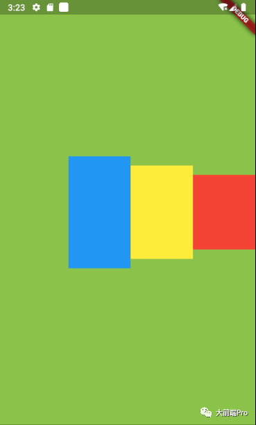
From the picture above, we can see that the first red control in our code is now the first one on the right.
VerticalDirection: The order in which subcomponents are arranged vertically. This has nothing to do with Row. We will introduce this property in Column..
The introduction is over~