When using the vant framework for project development, the mobile project can use the postcss-pxtorem plug-in to convert px to rem units. Because this project is a mobile terminal, it needs to adapt to different mobile phone screens.
-
Change all px units to rem, using postcss-pxtorem , which is a postcss plug-in for converting px to rem.
-
According to the width of different mobile phone screens, dynamically set the reference value of rem: the size of font-size on the html tag. Implemented with lib-flexible , used to set the rem benchmark value
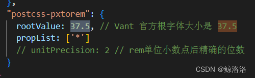
The conversion relationship is: design draft (mobile design draft is generally 670*1098) element size/37.5, for example, the element width is 375px, and the final page will be converted to 10rem. If the prototype design draft gives a specific px value, then it can only be directly Element size/(67/37.5), where 67 is the font-size value of html, for example, the element width is 375px, and the front-end page setting size is 375/(67/3735), which is about 210px.