Author: Wang Jiaojiao
When: October 20, 2017
I saw a good video about border some time ago, so I thought I'd write a blog and share it with you~
Speaking of borders, everyone must be familiar with them, so I won't go into details.
1. Why does border-width not support percentage values?
Let me ask you a question first, do you know why border-width does not support percentage values? Like the well-known width and height that support percentages, has anyone used percentages for border-width? Or have it been used and it doesn't work?
Let me give you a chestnut, everyone knows why border-width does not support percentages. The mobile phones and displays we are familiar with are one small and one large, right, but their borders are all the same, so the border is actually It shouldn't change with the increase or decrease of the element. Since it doesn't change, then why is the percentage, hehehehe, do you feel like you've been fooled, hahaha, but that's the reason, um. Similar to outline, box-shadow, text-shadow , etc.
Among them, border-width has 3 property values, which are thin, medium and thick , which are 1px, 3px and 5px respectively. Guess which property is the default value for border-width. thin? Isn't it 1px, no no no, it's medium! Hey? This is different from what I imagined. Why? This is determined by another CSS property, border-style: double; at least 3px is effective. == Huh? border-style: double; What the hell, don't worry, I'll talk about it later.
2、border-style
The border-style attribute describes the style of the border. It has many attribute values, which are introduced one by one below.
(1)border-style:solid;
This is the most familiar to everyone. It's just a solid line, which has been passed.
(2)border-style:dashed;
The dotted line, this one has also been passed, qo du ma dei, who said this is very simple, in fact, it is still a bit interesting, see the picture below:
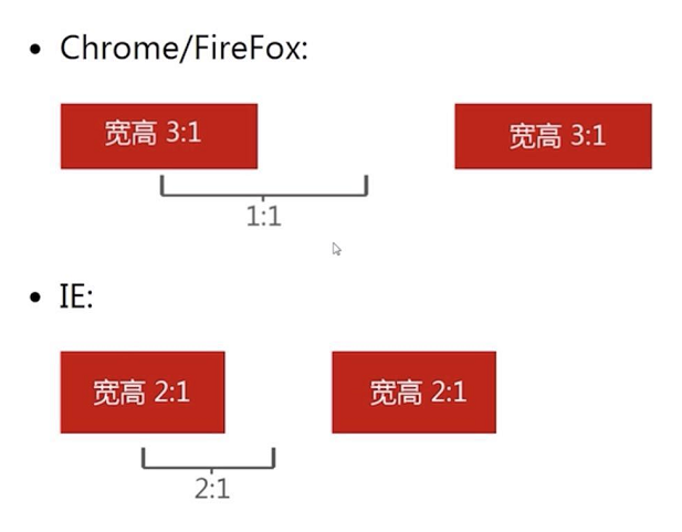
In Chrome and FF, the aspect ratio of dotted line points is 3:1, and the interval between dotted line points is 1:1, that is, the ratio of dotted line points to blank spaces is 1:1; in IE, the dotted line points are The aspect ratio is 2:1, and the ratio of dotted lines to blank spaces is 2:1.
(3)border-style:dotted;
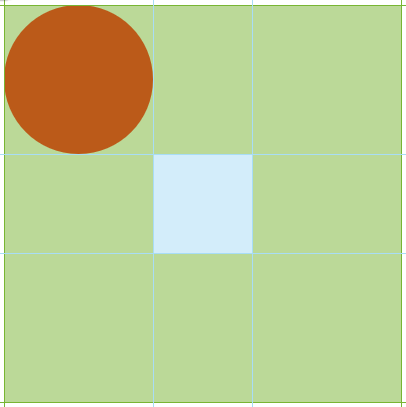
This is not a dotted line, but this is more interesting. In Chrome and FF, this dot is a small square , and in IE, this dot is a small circle . So le, you can use this difference to make fun things in IE nei.
For example, to achieve rounded corners, as well as arbitrary rounded corners. code show as below:
<div class="box">
	<div class="dotted"></div>
</div>
.box{
width: 150px;
height: 150px;
overflow: hidden;
}
.dotted{
width: 100px;
height: 100px;
border: 150px dotted #f00;
}Originally, all four corners have a circle, but the overflow of the box: hidden; In the end, there is only one circle left. Here, the rounded corners are realized.
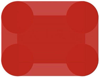
How to realize it at any angle is actually very simple, you only need to cover it with any graphics. Looking at the picture below, I hope it can stimulate your imagination, hahaha.
(4)border-style:double;
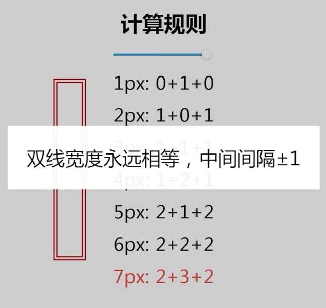
No, the protagonist mentioned above has finally come out. This is the famous double line. Let's take a look at its calculation rules first:
The double line width is always equal, plus or minus 1 in the middle.
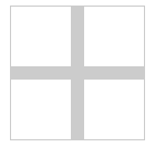
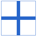
Of course, we can also use it to do some small graphics, for example: three bars. In particular, the compatibility of border-style: double ; is very good, and you can use it with confidence.
code show as below:
<div class="double"></div>.double{
width: 120px;
height: 20px;
border-top: 60px double;
border-bottom: 20px solid;
}(5)border-style:inset;
border-style: inset ; concave
border-style:outset; 外凹
border-style:groove; 沟槽
border-style: ridge ; ridge
All you need to know about these four is that you almost never use them, because they are not very compatible and are not beautiful, so, if you want to understand this strange shape, you can experiment by yourself, let alone know me, hahaha.
3、border-color与color
border-color is color. To be clear, the default color of border-color is color.
For example, we set the color to red without setting a color for the border-color of the div, but the result is still a red border.
<div class="color-border"></div>.color-border{
width: 100px;
border: 1px solid;
color: #f00;
}So what's the benefit of this, just take a chestnut to know.
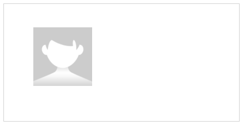
First look at the picture above. The graph itself is gray, and it turns blue when hovered. How to achieve it? The following code:
<a href="javascript:" class="add"></a>.add{
width: 100px;
height: 100px;
display: block;
color: #ccc; /*color*/
transition: color .2s;
border: 1px solid; /*border*/
position: relative;
}
.add:before{
content: "";
width: 100px;
display: block;
border-top: 10px solid; /*border-top*/
position: absolute;
left: 0;
top: 45px;
}
.add:after{
content: "";
height: 100px;
display: block;
border-left: 10px solid; /*border-left*/
position: absolute;
left: 45px;
top: 0;
}
/* 一个地方hover,整个图形区域都变色 */
.add:hover{
color: #06c;
}Using the relationship between border-color and color, one place hovers, and the entire graphics area changes color, which is simple and convenient, and easy to maintain. Don't write it down quickly.
4. Border and background positioning
I don't know if you know the limitations of background positioning: that is, it can only be positioned relative to the upper left corner value, not relative to the lower right corner, for example:
<div class="box"></div>.box{
width: 400px;
height: 200px;
border: 1px solid #ccc;
background: url("img.png") no-repeat;
background-size: 100px 100px;
background-position: 50px 40px; /* background-position,只能相对于左上角定位 */
}This background can only be positioned relative to the upper left corner, but sometimes we want to position it in the lower right corner. What should we do? There are actually many ways. Let's talk about how to use border to solve it.
.box{
	width: 400px;
	height: 200px;
	border: 1px solid #ccc;
	background: url("img.png") no-repeat;
	background-size: 100px 100px;
    /* 上面代码不动 */

	background-position: 100% 40px;  /* background-position第一个参数改成100% */
	border-right: 50px solid transparent;   /* 设置一个右边的透明border就可以啦 */
}
Just change one line of code and add one line of code. Why is this possible, because 100% right positioning does not count the border area, which is equivalent to padding, so it is so easy~
5. Graphic construction such as border and triangle
Let's review the previous border-style first, dotted can be used for rounded corners (IE7/8), double can be used as three-stripe icon, then this section will talk about solid, what can it do.
Using border to make triangles and other graphics, I think everyone has done it, here is a brief introduction to how to make triangles, trapezoids and simulated rounded corners (border-radius in IE is useless, you can consider using border to do it).
(1) Triangle
Let's take a look at the initial look, before the triangle is made:
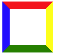
code show as below:
<div class="triangle"></div>.triangle{
width: 100px;
height: 100px;
border-width: 20px;
border-style: solid;
border-color: red yellow green blue; /* 四个边框的颜色,分别对应上、右、下、左的颜色 */
}
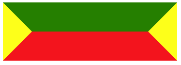
What if we first set both width and height to 0? This is the cute multi-colored quadrilateral below.

I believe everyone has seen something. At this time, we only need to set the color of the corresponding four sides to the color we want to get the triangle. The specific method is that if we want the lower triangle (that is, the picture below), we only need You need to keep the top border red, and set the other sides to be transparent, and the triangles of other shapes can be done in the same way.
border-color: red transparent transparent transparent;It can also be made into a right angle:

border-color: red red transparent transparent;Any other angle, you can try it yourself.
(2) Trapezoid
The trapezoid is simpler, just go directly to the code:
Let's first look at the appearance of a color on all four sides. As with the triangle, just set the color of the unwanted side to transparent and Euler.
<div class="triangle"></div>.triangle{
width: 200px;
border: 50px solid;
border-color: green yellow red;
}Trapezoid play:
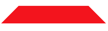
border-color: transparent transparent red;Is it very simple, is it fun, hahaha.
(3) Simulate rounded corners
This is the easiest, hey, I have four small rounded corners.
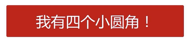
How to do pinch, of course, is so easy:
Look carefully, hahaha, it turns out that the upper and lower shapes are trapezoids with very small heights, so this is simple. I have already mentioned how to make trapezoids. This rounded corner only needs to be 2 trapezoids and the middle rectangle. La.
6, border and transparent border
What is the transparent border? It is the transparent used many times above. Transparent started with IE7, so the compatibility is very good.
Next, let's talk about its benefits, give 2 small chestnuts.
(1) Gracefully increase the size of the corresponding area
For the commonly used checkboxes, we all know that the selectable area is small and easy to miss. That’s all? How is it possible, we are programmers, we have to solve it by racking our brains, that is, the visual size of the checkbox is 16px*16px, the actual size is 20px*20px, then how to do this, no doubt, of course it is Our border is transparent.
Go directly to the code:
<div class="checkbox"></div>.checkbox{
width: 16px;
height: 16px;
border: 2px solid transparent; /* 增加2像素的透明border,增大响应区域 */
box-shadow: inset 0 1px, inset 1px 0, inset -1px 0, inset 0 -1px;
background-clip: content-box;
color: #f00;
}The result is as follows:
It looks like a 16px box, but in fact there is an additional 2px transparent area, which greatly increases the responsive area~
(2) Increase the renderable area
What does it mean to increase the renderable area?
Let me tell you about another attribute, drop-shadow, what is this attribute for? Drop-shadow is a filter, which can give color to png icons.
Let's first take a look at the magic of drop-shadow:
<i class="icon"></i>.icon{
display: block;
background: url("delete.png") no-repeat center;
width: 50px;
height: 50px;
filter: drop-shadow(50px 0 #f00);
-webkit-filter: drop-shadow(50px 0 #f00);
}This will tint the small icons:
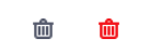
The dark gray on the left is the original image, and the right is the small red icon after dyeing. Although it's amazing, it's not good. After dyeing, the original small icon is still there? ! This is definitely not what we want, and transparent comes in handy at this time. Just add a few lines of code and you're done.
.icon{
	display: block;
	background: url("delete.png") no-repeat center;
	width: 50px;
	height: 50px;

	filter: drop-shadow(50px 0 #f00);
	-webkit-filter: drop-shadow(50px 0 #f00);

	/* 让它相对定位,把左边的小图标盖住就可以啦 */
	position: relative;
	left: -50px;
	border-right: 50px solid transparent;
}
Done, you're done!
There may be other methods, but many people have tried them, such as margin-left hiding and the like, but they can't find it, because drop-shadow cannot color hidden elements, so transparent should be the best method at present. Now, it is not hidden, it has always existed, it is just transparent, hahahahahahahahahahaha.
Okay, so far all the things about borders are finished. If you like it, just collect it. If you have any questions, just point it out. Thank you~~~~