Dual axis
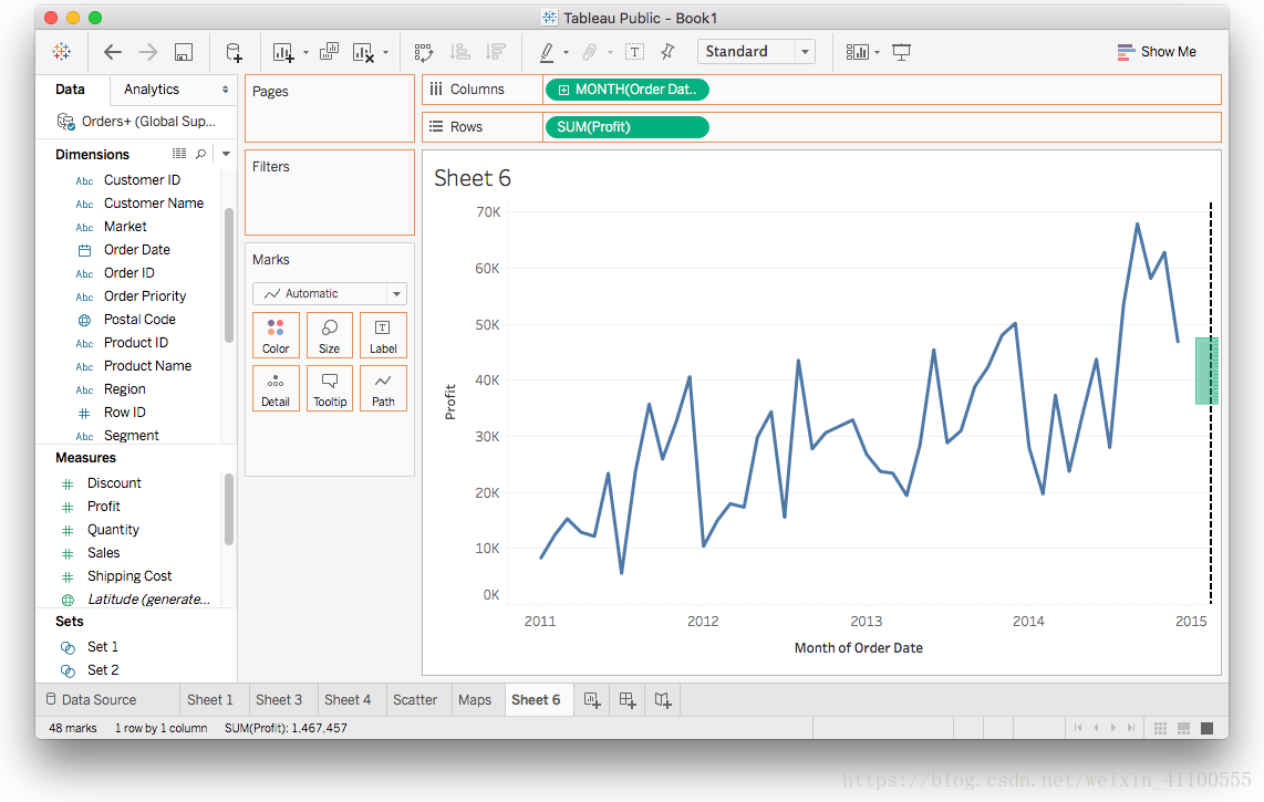
Sometimes, you need to compare two variables on a graph. If you drag two measures onto the Rows shelf, two charts appear instead of one. For example, let's try to graph Profit and Sales on one graph. Drag Profit and Sales onto the Rows ribbon, and the result looks like the image below:
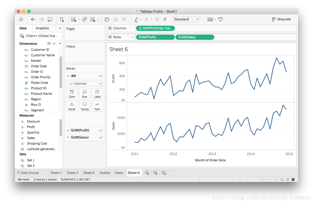
There are two charts below, but we only want one. You can put two lines on a chart by right-clicking on one of the measures to open the menu and selecting "Dual Axis".
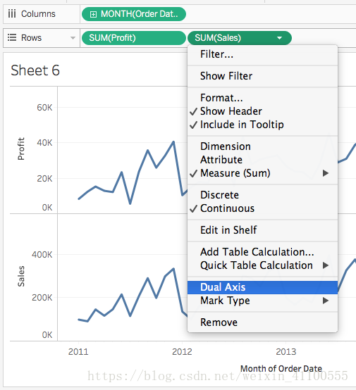
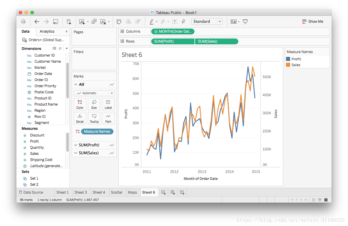
It should look like the image below:
You can take a quick action: drag the second measure to the right side of the view.