The qq graph has two functions: 1. Test whether a set of data obeys a certain distribution. 2. Test whether the two distributions follow the same distribution. The full name of the qq graph is quantile-quantile plot, which can be understood from the name as a graph related to quantiles. Since it was used in data analysis recently, but after reading some blogs, either the qq diagram is explained in detail but Python is not used; or the Python language is used but the principle is not explained clearly. Based on this, I want to write a blog to explain the principle as clearly as possible and implement it in Python.
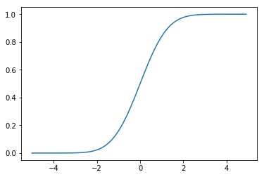
The principle of the qq graph is to compare the cumulative distribution function of the two sets of data to determine whether the two sets of data obey the same distribution, so the first step we should do the cumulative distribution of the two sets of data. First, as a comparison we look at the cumulative distribution plot of the standard normal distribution.
from scipy import stats
import numpy as np
x = np.arange(-5, 5, 0.1)
y = stats.norm.cdf(x, 0, 1)
plt.plot(x, y)
Then, plot the cumulative distribution function of the target data (here using the churn dataset from the UCI machine learning database).
import pandas as pd
churn_raw_data = pd.read_csv('churn.txt')
day_minute = churn_raw_data['Day Mins']
sorted_ = np.sort(day_minute)
yvals = np.arange(len(sorted_))/float(len(sorted_))
plt.plot(sorted_, yvals)
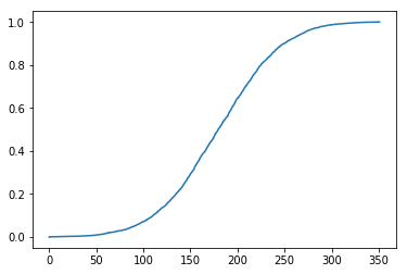
Intuitively, there is little difference between the target cumulative distribution function graph and the standard normal cumulative distribution function graph. Is that true? Finally, we can make a qq map for comparison.
x_label = stats.norm.ppf(yvals) # Find the inverse of the standard normal distribution cumulative distribution function for the target cumulative distribution function value
plt.scatter(x_label, sorted_)
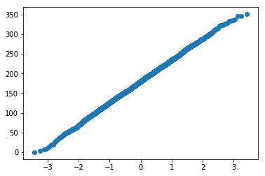
Since the comparison is made, what is the standard of comparison? We say that if all points are basically on a straight line, we can say that the two distributions are the same distribution. Therefore, according to the qq graph, we conclude that the target data set follows a normal distribution.
The above is to explain the principle of qq graphs and how to use pyhton for manual operations. As a more versatile Python in the field of data analysis, of course, it also has a package that can directly draw qq graphs.
stats.probplot(day_minute, dist="norm", plot=plt)
plt.show()
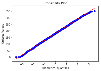
It is more convenient to draw, then comparing the two qq diagrams finds that our understanding is no problem. The qq chart can intuitively compare whether two distributions are the same, and is also commonly used in data analysis.
references:
https://stackoverflow.com/questions/3209362/how-to-plot-empirical-cdf-in-matplotlib-in-python
https://stats.stackexchange.com/questions/139708/qq-plot-in-python
https://docs.scipy.org/doc/scipy-0.16.0/reference/generated/scipy.stats.probplot.html