◆
Able to use structural pseudo-class selector to select elements in HTML Able to use clear float method
1. Structural pseudo-class selector
Goal: To be able to locate elements in HTML using structural pseudo-class selectors
- Functions and advantages:
- Role: Find elements based on their structural relationships in HTML
- Advantages: Reduce dependencies on classes in HTML, which helps keep code clean
- Scenario: Often used to find child elements in a parent selector
- Selector
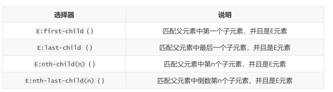
nth-child(n){}
nth-last-child(n){}
Note points for
n:
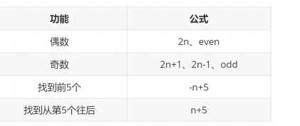
6. n is: 0, 1, 2, 3, 4, 5, 6, ...
7. Pass n Can form common formulas
(Extended) Error-prone point of structural pseudo-class selectors

<!DOCTYPE html>
<html lang="en">
<head>
    <meta charset="UTF-8">
    <meta http-equiv="X-UA-Compatible" content="IE=edge">
    <meta name="viewport" content="width=device-width, initial-scale=1.0">
    <title>Document</title>
    <style>
        * {


            margin: 0;
            padding: 0;
            box-sizing: border-box;
        }

        .login {


            width: 356px;
            /* height: 300px;
            background-color: pink; */
            margin: 50px auto;
            /* 让logo向下移动 */
            padding-top: 10px;
        }

        /* 定义一个负责内容居中的类, 将来哪个内容居中调佣 */
        .center {


            text-align: center;
        }

        .login h1 a {


            display: inline-block;
            width: 50px;
            height: 50px;
            background-color: #ff4c00 ;
        }

        .login h2 {


            margin-top: 35px;
            line-height: 1;
            font-size: 26px;
            font-weight: 400;

            margin-bottom: 48px;
        }

        .login input {


            width: 356px;
            height: 50px;
            border: 1px solid #e0e0e0;
            margin-bottom: 15px;
            padding-left: 13px;
        }

        .login button {


            width: 356px;
            height: 50px;
            background-color: #ff4c00;
            /* border: 0; */
            border:none;
            color: #fff;
            font-size: 14px;
        }
    </style>
</head>
<body>
    <div class="login">
        <h1 class="center">
            <a href="#"><img src="./images/mi-logo.png" alt=""></a>
        </h1>

        <h2 class="center">小米账号登录</h2>

        <!-- 表单域, 未来加了form才有真正的发送的功能 -->
        <form action="">
            <input type="text" placeholder="请输入邮箱">
            <input type="password" placeholder="请输入密码">
            <button>登录</button>
        </form>
    </div>
</body>
</html>
<!DOCTYPE html>
<html lang="en">
<head>
    <meta charset="UTF-8">
    <meta http-equiv="X-UA-Compatible" content="IE=edge">
    <meta name="viewport" content="width=device-width, initial-scale=1.0">
    <title>Document</title>
    <style>
        /* 选中第一个 */
        /* li:first-child {


            background-color: green;
        } */

        /* 最后一个 */
        /* li:last-child {


            background-color: green;
        } */

        /* 任意一个 */
        /* li:nth-child(5) {


            background-color: green;
        } */

        /* 倒数第xx个 */
        li:nth-last-child(1) {


            background-color: blue;
        }
    </style>
</head>
<body>

    <!-- ul>li{

    这是第$个li}*8 -->
    <ul>
        <li>这是第1个li</li>
        <li>这是第2个li</li>
        <li>这是第3个li</li>
        <li>这是第4个li</li>
        <li>这是第5个li</li>
        <li>这是第6个li</li>
        <li>这是第7个li</li>
        <li>这是第8个li</li>
    </ul>
</body>
</html>
li:first-child
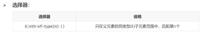
(Understanding) nth-of-type structural pseudo-class selector
E: nth-of-type(n){} is only selected in the range of child elements of the same type of the parent element, matching n
➢ Differences:
• :nth-child → directly count the number in all children
• :nth-of -type → First find a bunch of matching sub-elements by this type, and then count the number in this bunch of sub-elements
First find a composite bunch of resources by this type, and then count the numbers in this bunch of sub-elements
<!DOCTYPE html>
<html lang="en">
<head>
    <meta charset="UTF-8">
    <meta http-equiv="X-UA-Compatible" content="IE=edge">
    <meta name="viewport" content="width=device-width, initial-scale=1.0">
    <title>Document</title>
    <style>
        /* ** 偶数 */
        /* li:nth-child(2n) { */

            /* *** 奇数 */
        /* li:nth-child(2n+1) { */
            /* 找到前3个 */
        /* li:nth-child(-n+3) { */

            /* *** 4的倍数 */
        li:nth-child(4n) {


            background-color: green;
        }
    </style>
</head>
<body>
    <ul>
        <li>这是第1个li</li>
        <li>这是第2个li</li>
        <li>这是第3个li</li>
        <li>这是第4个li</li>
        <li>这是第5个li</li>
        <li>这是第6个li</li>
        <li>这是第7个li</li>
        <li>这是第8个li</li>
    </ul>
</body>
</html>
li:nth-child(4n){background-color:green;}
2. Pseudo-elements
Goal: To be able to use pseudo-elements to create content in web pages
➢ Pseudo-elements: Non-main content in general pages can use pseudo-elements
➢ Differences:
- Element: HTML set tag
- Pseudo-elements: Label effects simulated by CSS
Elements: tags set by HTML, pseudo elements, tag effects simulated by CS
➢ Types:
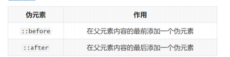
::before Add a pseudo element
at the beginning of the parent element content ::after Add a pseudo element at the end of the parent element content
➢ Note:
3. The content attribute must be set to take effect
4. Pseudo elements are inline elements by default
The content attribute must be set to take effect, pseudo elements are inline elements by default
summary
➢ What are the mandatory attributes of pseudo-elements?
• content attribute
➢ What is the default display mode after the pseudo element is created?
•
Inline element The attribute that must be added to the pseudo-element: content attribute. After the pseudo-element is created, the default display mode is the inline element
. The attribute that must be added to the pseudo-element is the content attribute.
<!DOCTYPE html>
<html lang="en">
<head>
    <meta charset="UTF-8">
    <meta http-equiv="X-UA-Compatible" content="IE=edge">
    <meta name="viewport" content="width=device-width, initial-scale=1.0">
    <title>Document</title>
    <!-- <style>
        /* 第一个li里面的a */
        li:first-child a {


            /* background-color: green; */
            color: red;
        }
    </style> -->
    <style>
        /* 找到第一个li 里面的  第三个a  设置文字颜色是红色 */
        li:first-child a:nth-child(3) {


            color: red;
        }
    </style>
</head>
<body>
    <ul>
        <li>
            <a href="#">这是第1个li里面的a1</a>
            <a href="#">这是第1个li里面的a2</a>
            <!-- 选中第三个a -->
            <a href="#">这是第1个li里面的a3</a>
            <a href="#">这是第1个li里面的a4</a>
            <a href="#">这是第1个li里面的a5</a>
        </li>
        <li><a href="#">这是第2个li里面的a</a></li>
        <li><a href="#">这是第3个li里面的a</a></li>
        <li><a href="#">这是第4个li里面的a</a></li>
        <li><a href="#">这是第5个li里面的a</a></li>
        <li><a href="#">这是第6个li里面的a</a></li>
        <li><a href="#">这是第7个li里面的a</a></li>
        <li><a href="#">这是第8个li里面的a</a></li>
    </ul>
</body>
</html>
li:first-child a:nth-child(3){color:red;}
<!DOCTYPE html>
<html lang="en">
<head>
    <meta charset="UTF-8">
    <meta http-equiv="X-UA-Compatible" content="IE=edge">
    <meta name="viewport" content="width=device-width, initial-scale=1.0">
    <title>Document</title>
    <style>
        .father {


            width: 300px;
            height: 300px;
            background-color: pink;
        }

        .father::before {


            /* 内容 */
            /* content属性必须添加, 否则伪元素不生效 */
            content: '';
            color: green;
            width: 100px;
            height: 100px;
            background-color: blue;

            /* 默认是行内元素, 宽高不生效 */
            display: block;
        }

        .father::after {


            content: '大米';
        }
    </style>
</head>
<body>
    <!-- 伪元素 通过css创建标签, 装饰性的不重要的小图 -->

    <!-- 找父级, 在这个父级里面创建子级标签 -->

    <div class="father">爱</div>

    <!-- 老鼠爱大米 -->
</body>
</html>
. father::before{ content:''; color:green; width:100px;height:100px;background-color:blue;display:block;} is an inline element by default, if the width and height do not take effect, the default is an inline element. Invalid .father ::after{content:'rice';} . father:before{content:'';color:green;width:100px;height:100px;background-color:blue;}
3. Standard flow
Goal: To be able to understand the default layout and characteristics of
standard streams ➢ Standard streams: Also known as document streams, is a set of scheduling rules that browsers use by default when rendering and displaying web page content, which specifies how they should be arranged. Elements,
common standard flow typography rules:
- Block-level elements: from top to bottom, vertical layout, exclusive line
- Inline elements or inline block elements: from left to right, horizontal layout, automatic line wrapping if there is not enough space
Block-level elements: from top to bottom, vertical layout, exclusive line Inline
elements or inline block elements: from the left netizen, horizontal layout, the control is not enough to automatically wrap
summary
➢ What are the layout rules for block-level elements in the standard flow?
• Top-to-bottom, vertical layout, exclusive line
➢ What are the layout rules for inline elements or inline block elements in standard flow?
• Left-to-right, horizontal layout, auto-wrapping if space is insufficient
<!DOCTYPE html>
<html lang="en">
<head>
    <meta charset="UTF-8">
    <meta http-equiv="X-UA-Compatible" content="IE=edge">
    <meta name="viewport" content="width=device-width, initial-scale=1.0">
    <title>Document</title>
    <style>
        /* img {


            float: left;
        } */

        div {


            width: 100px;
            height: 100px;
        }

        .one {


            background-color: pink;
            float: left;
        }

        .two {


            background-color: skyblue;
            /* flr */
            /* float: right; */
            float: left;
        }
    </style>
</head>
<body>
    <!-- 1. 图文环绕 -->
    <!-- <img src="./images/1.jpg" alt="">
    阿里的萨里肯定是福建安老师看见了阿里的萨里肯定是福建安老师看见了阿里的萨里肯定是福建安老师看见了阿里的萨里肯定是福建安老师看见了阿里的萨里肯定是福建安老师看见了阿里的萨里肯定是福建安老师看见了阿里的萨里肯定是福建安老师看见了阿里的萨里肯定是福建安老师看见了阿里的萨里肯定是福建安老师看见了阿里的萨里肯定是福建安老师看见了阿里的萨里肯定是福建安老师看见了阿里的萨里肯定是福建安老师看见了阿里的萨里肯定是福建安老师看见了阿里的萨里肯定是福建安老师看见了阿里的萨里肯定是福建安老师看见了阿里的萨里肯定是福建安老师看见了阿里的萨里肯定是福建安老师看见了阿里的萨里肯定是福建安老师看见了阿里的萨里肯定是福建安老师看见了阿里的萨里肯定是福建安老师看见了阿里的萨里肯定是福建安老师看见了阿里的萨里肯定是福建安老师看见了阿里的萨里肯定是福建安老师看见了阿里的萨里肯定是福建安老师看见了阿里的萨里肯定是福建安老师看见了阿里的萨里肯定是福建安老师看见了阿里的萨里肯定是福建安老师看见了阿里的萨里肯定是福建安老师看见了阿里的萨里肯定是福建安老师看见了阿里的萨里肯定是福建安老师看见了阿里的萨里肯定是福建安老师看见了阿里的萨里肯定是福建安老师看见了阿里的萨里肯定是福建安老师看见了阿里的萨里肯定是福建安老师看见了阿里的萨里肯定是福建安老师看见了阿里的萨里肯定是福建安老师看见了阿里的萨里肯定是福建安老师看见了阿里的萨里肯定是福建安老师看见了阿里的萨里肯定是福建安老师看见了阿里的萨里肯定是福建安老师看见了阿里的萨里肯定是福建安老师看见了阿里的萨里肯定是福建安老师看见了阿里的萨里肯定是福建安老师看见了阿里的萨里肯定是福建安老师看见了阿里的萨里肯定是福建安老师看见了阿里的萨里肯定是福建安老师看见了阿里的萨里肯定是福建安老师看见了阿里的萨里肯定是福建安老师看见了阿里的萨里肯定是福建安老师看见了阿里的萨里肯定是福建安老师看见了阿里的萨里肯定是福建安老师看见了阿里的萨里肯定是福建安老师看见了阿里的萨里肯定是福建安老师看见了阿里的萨里肯定是福建安老师看见了阿里的萨里肯定是福建安老师看见了阿里的萨里肯定是福建安老师看见了阿里的萨里肯定是福建安老师看见了阿里的萨里肯定是福建安老师看见了阿里的萨里肯定是福建安老师看见了阿里的萨里肯定是福建安老师看见了阿里的萨里肯定是福建安老师看见了阿里的萨里肯定是福建安老师看见了阿里的萨里肯定是福建安老师看见了阿里的萨里肯定是福建安老师看见了阿里的萨里肯定是福建安老师看见了阿里的萨里肯定是福建安老师看见了阿里的萨里肯定是福建安老师看见了阿里的萨里肯定是福建安老师看见了阿里的萨里肯定是福建安老师看见了阿里的萨里肯定是福建安老师看见了阿里的萨里肯定是福建安老师看见了阿里的萨里肯定是福建安老师看见了 -->


    <!-- 2. 网页布局: 块在一行排列 -->
    <div class="one">one</div>
    <div class="two">two</div>
</body>
</html>
<!DOCTYPE html>
<html lang="en">
<head>
    <meta charset="UTF-8">
    <meta http-equiv="X-UA-Compatible" content="IE=edge">
    <meta name="viewport" content="width=device-width, initial-scale=1.0">
    <title>Document</title>
    <style>
        /* 浮动的标签  顶对齐 */
        /* 浮动: 在一行排列, 宽高生效 -- 浮动后的标签具备行内块特点 */
        .one {


            width: 100px;
            height: 100px;
            background-color: pink;

            float: left;

            margin-top: 50px;
        }

        .two {


            width: 200px;
            height: 200px;
            background-color: skyblue;

            float: left;

            /* 因为有浮动, 不能生效 - 盒子无法水平居中 */
            margin: 0 auto;
        }

        .three {


            width: 300px;
            height: 300px;
            background-color: orange;
        }
    </style>
</head>
<body>
    <div class="one">one</div>
    <div class="two">two</div>
    <div class="three">three</div>
</body>
</html>
Floating: Arrange in one line, the width and height take effect, and the floating label has the characteristics of inline block
. two{width:200px;height:200px;background-color:skyblue;float:left;margin:0 auto;
4. Floating
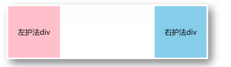
1.1 The role of floating
➢ Early role: image and text wrapping
➢ Current role: web page layout
• Scenario: make vertical layout boxes become horizontal layout, such as: one on the left and one on the right
2.1 Floating code
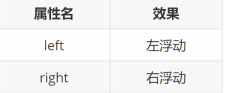
➢ Property name: float
➢ Property value:
summary
What is the function of float?
- Early role: graphics and text surround
- Current function: used for layout, to make vertical layout boxes into horizontal layout, such as: one on the left and one on the right
➢ What is the property of left floating? What is the property of right float? - Float left: float : left
- Float right: float : right
For layout, let the vertical layout box become horizontal layout, such as one on the left and one on the right
3.1 Features of floating
- Floating elements will detach from the standard flow (abbreviation: off-label) and do not occupy a position in the standard flow
Equivalent to floating from the ground to the air - Floating elements are half a level higher than the standard flow and can cover elements in the standard flow
- Floating to find floating, the next floating element will float left and right behind the previous floating element
- Floating elements have special display effects
• One line can display multiple
• You can set width and height
Floating to find floating, the next floating element will float on the previous one ➢ Note:
• Floating elements cannot pass text-align:center or margin:0 auto
summary
➢ What are the characteristics of floating elements?
- Floating elements will be unlabeled and will not occupy a place in the standard flow
- Floating elements are half a level above the standard flow and can overwrite elements in the standard flow
- Floating to find floating, the next floating element will float left and right behind the previous floating element
- Floating elements have special display effects: ① One line can display multiple ② The width and height can be set