前言:本篇博客主要介绍了前端页面的一些消息提示框,均是element-ui中的组件,查找起来比较方便。详细文档可以查看element-ui官网:Element-ui
Message消息提示框
- 用来显示不同状态的提示框(不可手动点击关闭)
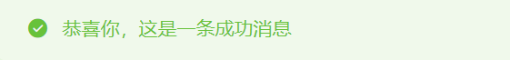
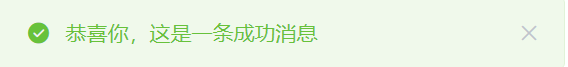
// 显示成功的操作
this.$message({
message: '恭喜你,这是一条成功消息',
type: 'success'
});
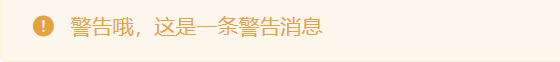
// 显示警告的操作
this.$message({
message: '警告哦,这是一条警告消息',
type: 'warning'
});
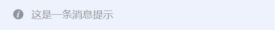
// 从顶部出现,3秒后自动消失
this.$message('这是一条消息提示');
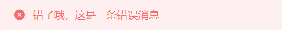
// 显示错误的操作
this.$message.error('错了哦,这是一条错误消息');
- 用来显示不同状态的提示框(可手动点击关闭)
如果需要手动关闭提示框,可以使用showClose字段
 this.$message({


          showClose: true,
          message: '恭喜你,这是一条成功消息',
          type: 'success'
        });
如果文字需要居中,可以使用center属性
this.$message({


          message: '居中的文字',
          center: true
        });

弹框
弹框会中断用户的操作,用户点击关闭方可关闭
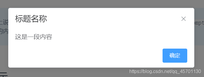
普通弹框
this.$alert('这是一段内容', '标题名称', {


          confirmButtonText: '确定',
        });
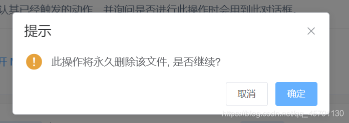
确认消息
this.$confirm('此操作将永久删除该文件, 是否继续?', '提示', {


          confirmButtonText: '确定',
          cancelButtonText: '取消',
          type: 'warning'
        }).then(() => {


          // 点击确定进行的操作
        }).catch(() => {


          // 点击取消进行的操作
        });
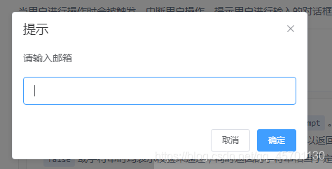
提交内容
提示用户进行输入的对话框。使用inputPattern字段规定匹配模式,或者使用inputValidator规定校验函数。
this.$prompt('请输入邮箱', '提示', {


          confirmButtonText: '确定',
          cancelButtonText: '取消',
          inputPattern: /[\w!#$%&'*+/=?^_`{|}~-]+(?:\.[\w!#$%&'*+/=?^_`{|}~-]+)*@(?:[\w](?:[\w-]*[\w])?\.)+[\w](?:[\w-]*[\w])?/,
          inputErrorMessage: '邮箱格式不正确'
        }).then(({

     value }) => {


          this.$message({


            type: 'success',
            message: '你的邮箱是: ' + value
          });
        }).catch(() => {


          this.$message({


            type: 'info',
            message: '取消输入'
          });
        });

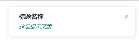
Notification通知
悬浮出现在页面的角落,显示全局的通知提醒消息
基本用法
可自动关闭
this.$notify({


          title: '标题名称',
          message: h('i', {

     style: 'color: teal'}, '这是提示文案')
        });
不会自动关闭
duration属性可以控制关闭的时间间隔,单位为毫秒,如果设置为0,则不会自动关闭
this.$notify({


          title: '提示',
          message: '这是一条不会自动关闭的消息',
          duration: 0
        });

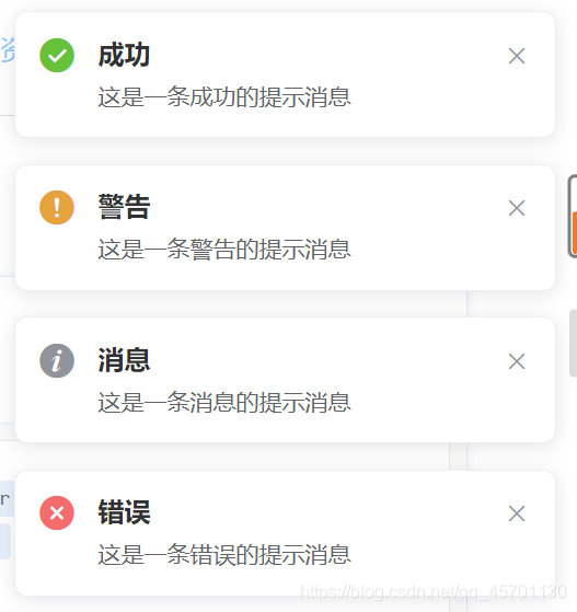
带有倾向性的
成功
this.$notify({


          title: '成功',
          message: '这是一条成功的提示消息',
          type: 'success'
        });
警告
this.$notify({


          title: '警告',
          message: '这是一条警告的提示消息',
          type: 'warning'
        });
消息
this.$notify.info({


          title: '消息',
          message: '这是一条消息的提示消息'
        });
错误
this.$notify.error({


          title: '错误',
          message: '这是一条错误的提示消息'
        });
自定义弹出的位置
使用position属性定义弹出的位置,支持四个选项:
top-right、top-left、bottom-right、bottom-left,默认为top-right
带有偏移
通过设置
offset字段,可以使弹出的消息距屏幕边缘偏移一段距离。
this.$notify({


          title: '偏移',
          message: '这是一条带有偏移的提示消息',
          offset: 100
        });
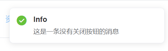
隐藏关闭按钮
可设置showClose字段
this.$notify.success({


          title: 'Info',
          message: '这是一条没有关闭按钮的消息',
          showClose: false
        });