One. Text
1) Alignment
text-left text-align left=======> text-align: left
text-center text center-aligned
text-right
text-justify right text-justify text justified
text-nowrap no line break
text- lowercase lowercase
text-uppercase uppercase
text-capitalize first letter capitalized
2) Text color
text-muted gray
text-primary main blue
text-success success green
text-info information blue
text-warning warning yellow
text-danger dangerous red
3) Background color
bg-muted gray
bg-primary main blue
bg-success success green
bg-info information blue
bg-warning warning yellow
bg-danger dangerous red
two. Page layout
1) List layout
ul class
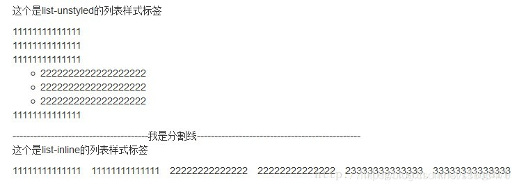
list-unstyled remove the default style
list-inline and set it to inline
dl class
dl-horizontal horizontal arrangement description list definition list
2) table
table basic table style
table-striped striped table (prerequisite table class must be present)
table-bordered add border to the table (prerequisite table class must be present)
table-hover let the mouse under the table hover to achieve the background Effect (prerequisite must have an existing table class)
You can add any of the following classes to tr to achieve different colors for each row
<tr class=”success”></tr>
Status category
Style description
active Hover the mouse over a row or cell.
Success indicates a successful or positive action.
info indicates a general prompt message or action.
Warning indicates a warning or requires the user's attention.
Danger indicates a dangerous or potentially negative action.
<tr class="sr-only"> Hidden row
3) form form
Inline form
form class
form-inline allows the form to be left aligned and float
Horizontally arrange the
form class
form-horizontal to keep the elements in the form arranged horizontally
form-group Forms are displayed in groups. The forms in the group can also be displayed using the grid system
form-control. Any label in the form can be added.
<div class="form-group">
<label>电子邮件</label>
<input type="email" class="form-control" placeholder="请输入您的电子邮件">
</div>
Add fragments before and after form grouping
input-group input-group-addon
<div class="input-group">
<div class="input-group-addon">¥</div>
<input type="text" class="form-control">
<div class="input-group-addon">.00</div>
</div>
disabled
Form validation status
<div class=“form-group has-error”>
Style description
has-error error status
has-success success status
has-warning warning status
You can add a small icon of the verification status after the form. For example: a check mark is displayed after the verification is successful.
form-control-feedback
<div class="form-group has-feedback">
<label>电子邮件</label>
<input type="email" class="form-control">
<span class="glyphicon glyphicon-ok form-control-feedback"></span>
</div>
Span class
Style description
glyphicon-ok success status
glyphicon-warning-sign warning status
glyphicon-remove error status
The size of Input can be controlled by class.
Input-lg large input
Input-sm small input
can also be adjusted by setting parent elements form-group-lg, form-group-sm
4) Picture
img-rounded square
img-circle round (the picture is elliptical when the length and width are not equal)
img-thumbnail
img-responsive picture with border
5) Button/hyperlink
button/a
style description
btn-default default style
btn-success success style
btn-info general information style
btn-warning warning style
btn-danger danger style
btn-primary preference style
btn-link link style
btn-block block-level button
active activation button
Button size
btn-lg large button
btn-md medium button
btn-sm small button
btn-xs super small button
Multiple buttons can be grouped.
Use a div to wrap the button with the div class as btn-group
<div class="btn-group">
<button type="button" class="btn btn-default">左</button>
<button type="button" class="btn btn-default">中</button>
<button type="button" class="btn btn-default">右</button>
</div>
Button group size
btn-group-lg
btn-group-md
btn-group-sm
btn-group-xs
Button groups are arranged vertically
btn-group-vertical
Button groups are aligned at both ends
btn-group-justified
Close button
<button type="button" class="close">×</button>
Center
-block ========>margin:0 auto
clearfix clean up floats
three. Grid system
container
ultra-small screen mobile phone (<768px) xs 100% col-xs-digital (number of copies)
small-screen tablet (≥768px) sm 750px col-sm-digital
medium-screen desktop display (≥992px) md 970px col- md-number
Large screen large desktop display (≥1200px) lg 1170px col-lg-number
One line can have up to 12 copies
Container-fluid 100%
If you do not specify that each column on the mobile phone occupies a row, the
column offset
col-md-offset-2
pushes
col-md-push-2
to the right and pulls
col-md-pull-2 to the left
If md is specified and lg is not specified,
then the column width percentage specified by md will be used under the lg screen
If lg is specified and md is not specified,
then the width of each column under md is 100%
Left float
pull-left ===> float:left!important
right float
pull-right
Responsive tool
hidden-xs hides visible on other screens on ultra-small screens
hidden-sm hides on small screens visible on other screens
hidden-md hides on medium screens visible on other screens
hidden-lg hides on large screens visible on other screens
visible-xs shows other screens hidden on super small screens
visible-sm visible on small screens hides on other screens
visible-md visible on small screens hides on other screens
visible-lg visible on small screens hides on other screens
four. Components
1) Navigation components:
1 Basic navigation
<ul class="nav nav-tabs">
<li class="active"><a href="#">首页</a></li>
<li><a href="#">资讯</a></li>
<li><a href="#">产品</a></a></li>
<li><a href="#">关于</a></li>
</ul>
2 capsule navigation
<ul class="nav nav-pills">
3Vertical capsule navigation
<ul class="nav nav-pills nav-stacked">
4 breadcrumb navigation
<ol class="breadcrumb">
<li><a href="#">首页</a></li>
<li><a href="#">产品列表</a></li>
<li class="active">韩版 2015 年羊绒毛衣</li>
</ol>
5 Navigation with drop-down menu
<ul class="nav nav-tabs">
<li class="active"><a href="#">首页</a></li>
<li><a href="#">资讯</a></li>
<li class="dropdown">
<a href="#" class="dropdown-toggle" data-toggle="dropdown">下拉菜单
<span class="caret"></span></a>
<ul class="dropdown-menu">
<li><a href="#">菜单一</a></li>
<li><a href="#">菜单二</a></li>
</ul>
</li>
</ul>
2) Paging components:
1 Default paging
<ul class="pagination">
<li><a href="#">«</a></li>
<li><a href="#">1</a></li>
<li><a href="#">2</a></li>
<li><a href="#">»</a></li>
</ul>
2 Page turning effect
<ul class="pager">
<li><a href="#">上一页</a></li>
<li><a href="#">下一页</a></li>
</ul>
3 align page turning links
<ul class="pager">
<li class="previous"><a href="#">上一页</a></li>
<li class="next"><a href="#">下一页</a></li>
</ul>
3) Badge badge of
unread information quantity
<a href="#">信息 <span class="badge">10</span></a>
Set size, four kinds of lg, default, sm and xs
<ul class="pagination pagination-lg">
4) Drop-down menu
1 basic format
<div class="dropdown">
<button class="btn btn-default" data-toggle="dropdown">
下拉菜单
<span class="caret"></span>
</button>
<ul class="dropdown-menu">
<li><a href="#">首页</a></li>
<li><a href="#">资讯</a></li>
<li><a href="#">产品</a></li>
<li><a href="#">关于</a></li>
</ul>
</div>
Buttons and menus need to be wrapped in a container of .dropdown, and as the element button to be clicked,
data-toggle="dropdown" must be set to be effective. For the menu part, set class="dropdown-menu" to automatically hide and add a fixed style. Set class="caret" to indicate an arrow, which can be up or down.
//设置向上触发
<div class="dropup">
//菜单项居右对齐,默认值是 dropdown-menu-left
<ul class="dropdown-menu dropdown-menu-right">
2-button drop-down menu
<div class="btn-group">
<button type="button" class="btn btn-default dropdown-toggle" data-toggle="dropdown">
下拉菜单<span class="caret"></span>
</button>
<ul class="dropdown-menu">
<li><a href="#">首页</a></li>
<li><a href="#">资讯</a></li>
</ul>
</div>
3 Split button drop-down menu
<div class="btn-group">
<button type="button" class="btn btn-default">下拉菜单</button>
<button type="button" class="btn btn-default dropdown-toggle" data-toggle="dropdown">
<span class="caret"></span>
</button>
<ul class="dropdown-menu">
<li><a href="#">首页</a></li>
<li><a href="#">资讯</a></li>
</ul>
</div>
Pop-up
<div class="btn-group dropup">
5) Warning frame component
1 basic warning frame
<div class="alert alert-success">Bootstrap</div>
<div class="alert alert-info">Bootstrap</div>
<div class="alert alert-warning">Bootstrap</div>
<div class="alert alert-danger">Bootstrap</div>
2Warning box with closed
<div class="alert alert-success">
Bootstrap
<button type="button" class="close" data-dismiss="alert">
<span>×</span>
</button>
</div>
Auto-adapted hyperlink
<div class="alert alert-success">
Bootstrap,请到官网 <a href="#" class="alert-link">下载</a>
</div>
6) Giant screen components
Giant screen components are mainly used to display the key areas of the website.
jumbotron
has rounded corners within a fixed range
<div class="container">
<div class="jumbotron">
<h2>网站标题</h2>
<p>这是一个学习性的网站!</p>
<p><a href="#" class="btn btn-default">更多内容</a></p>
</div>
</div>
100% full screen, no rounded corners
<div class="jumbotron">
<div class="container">
<h2>网站标题</h2>
<p>这是一个学习性的网站!</p>
<p><a href="#" class="btn btn-default">更多内容</a></p>
</div>
</div>
7) Progress bar component The
progress bar component provides constant feedback for the current workflow or action.
Basic progress bar
<div class="progress">
<div class="progress-bar" style="width: 60%;">60%</div>
</div>
最低值进度条
<div class="progress">
<div class="progress-bar" style="min-width:20px">0%</div>
</div>
Stripe shape, IE10+ support
<div class="progress">
<div class="progress-bar progress-bar-success
progress-bar-striped" style="min-width:20px;width:60%">60%</div>
</div>
动画效果
<div class="progress">
<div class="progress-bar progress-bar-success progress-bar-striped
active" style="min-width:20px;width:60%">60%</div>
</div>
8) Media object components
Media objects can contain media such as pictures, videos or audios to achieve the style effect of combined display of objects and text.
Basic example
<div class="media">
<div class="media-left">
</div>
<div class="media-body">
<h4 class="media-heading">标题</h4>
<p>企鹅(学名:Spheniscidae):有“海洋之舟”美称的企鹅是一种最古老
的游禽,它们很可能在地球穿上冰甲之前,就已经在南极安家落户。全世界的企鹅共有 17
种,大多数都分布在南半球。主要生活在南半球,属于企鹅目,企鹅科。特征为不能飞翔;
脚生于身体最下部,故呈直立姿势;趾间有蹼;跖行性(其他鸟类以趾着地);前肢成鳍状;
羽毛短,以减少摩擦和湍流;羽毛间存留一层空气,用以保温。背部黑色,腹部白色。各个
种的主要区别在于头部色型和个体大小。</p>
</div>
</div>
Media object on the right
<div class="media">
<div class="media-body">
<h4 class="media-heading">标题</h4>
<p>企鹅(学名:Spheniscidae):有“海洋之舟”美称的企鹅是一种最古老
的游禽,它们很可能在地球穿上冰甲之前,就已经在南极安家落户。全世界的企鹅共有 17
种,大多数都分布在南半球。主要生活在南半球,属于企鹅目,企鹅科。特征为不能飞翔;
脚生于身体最下部,故呈直立姿势;趾间有蹼;跖行性(其他鸟类以趾着地);前肢成鳍状;
羽毛短,以减少摩擦和湍流;羽毛间存留一层空气,用以保温。背部黑色,腹部白色。各个
种的主要区别在于头部色型和个体大小。</p>
</div>
<div class="media-right"></div>
</div>
Fives. Plug-in
1) Scroll monitoring
<body data-spy="scroll" data-target="#mynav">
// mynav 就要监听的元素

<div id="mynav">
<ul class="nav"> class必须要有nav
<li><a href="#对应滚动区域的id">
<li><a href="#section2">
bootstrap will automatically add an active class to the current li
Different styles can be set according to active
2) Pop-up box
<a href="" data-target="#myM" data-toggle="modal">打开</a>

<div class="modal" id="myM">
<div class="modal-dialog">
<div class="modal-header">弹出标题 <a href="" class="pull-right" data-target="#myM" data-toggle="modal">×</a></div>
<div class="modal-body">弹出内容</div>
</div>
</div>
3) Carousel diagram
<div class="carousel slide" id="banner">
	<div class="carousel-inner">
		<div class="item active"></div>
		<div class="item "></div>
	</div>

            <ol class="carousel-indicators">
            <li href="#banner" data-slide-to="0" class="active" ></li>
            <li href="#banner" data-slide-to="1"></li>
            </ol>

                <a href="#banner" data-slide="prev" class="left carousel-control">上一张</a>
                <a href="#banner" data-slide="next" class="right carousel-control">下一张</a>

          </div>
Note:
1. Do not write down the class style name.
2. Do not use bootstrap to solve all the problems (you still have to write some css yourself)
3. If it is an irregular website, do not use bootstrap
4, and do not try to solve both the mobile terminal and the computer terminal at the same time. Pages (you can do it when you are familiar)
Author: lovelydong
link: https: //www.jianshu.com/p/ffc1589d35ac
Source: Jane books