The front end is compatible with Apple Liu Haiping and Android Liu Haiping water drop bottle
With the continuous updating of ios and android. Various screen adaptations are really a headache.
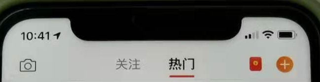
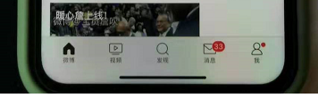
As various projects are packaged into apps, they go online. We always encounter the following situations on some full-screen phones. 1, 3 are normal conditions (iphone11 Weibo), 2, and 4 are adaptation problems (iphone11 certain app). Android will also have this problem. For such a problem, we are uncomfortable at the front end. Below we provide a solution to this problem.


In fact, w3c has long provided us with a solution (CSS3 new feature viewport-fit)
In the standard about round display given by w3c.org, the attribute of viewport-fit is mentioned. This attribute indicates how the browser should perform the viewport-fit for some devices with a screen that is not a rectangular shape. display. LOL transmission: viewport-fit official reference document
CSS3 new features env and var predefined variables.
After defining the viewport-fix, the browser will automatically generate four padding variables, which are used to squeeze the page inward to a position where it can be displayed normally. At this time, you need to use env or constant to convert variables into CSS property values and assign them to properties. ps:env seems to be under development, it seems to only support IOS 11.2 and above. The current safer method is to use constant and env together. LOL transmission: env and var variable description
Detailed approach
| The value of viewport-fit is as follows: | |
|---|---|
| auto | Default: viewprot-fit: contain; the content of the page is displayed in the safe area |
| cover | viewport-fit: cover, page content fills the screen |
First of all, we add this attribute
viewport-fit=cover" (the most important code is, there may be problems if the code below is not added)
<meta name="viewport" content="width=device-width,initial-scale=1.0, minimum-scale=1.0, maximum-scale=1.0, user-scalable=no, viewport-fit=cover">
/* body 在横屏底下和竖屏底下一定要做好定位,不然*/
    /* 竖屏底下的查询 */
    @media screen and (orientation: portrait) {


        body {


            /* 防止页面被刘海遮住 */
            padding-top: constant(safe-area-inset-top);
            //以防万一写一个你本身适配其他手机的
            padding-top:0px;
        }
    }
    /* 横屏底下的查询 */
    @media screen and (orientation: landscape) {


        body {


            /* IOS 11支持*/
            padding-right: constant(safe-area-inset-right);
            padding-left: constant(safe-area-inset-left);
            padding-bottom: constant(safe-area-inset-bottom);//为底下圆弧的高度 34px
            /*IOS 11.2版本版本支持*/
            padding-right: env(safe-area-inset-right);
            padding-left: env(safe-area-inset-left);
            padding-bottom: env(safe-area-inset-bottom);
            //以防万一写一个你本身适配其他手机的
            padding-right:0px;
            padding-left:0px;
            padding-bottom:0px;
        }
    }
如果用header和footer请单独定义