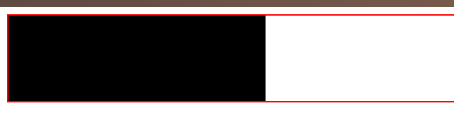
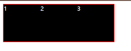
1. For a box with three block elements, the effect of non-floating is this
source code
	<div class="box">
        <div class="content">1</div>
        <div class="content">2</div>
        <div class="content">3</div>
    </div>

	<style type="text/css">
        .content {


            width: 100px;
            height: 100px;
            background-color: black;
            color: #fff;
            float: left;
        }

        .box {


            border: 2px solid red;
        }

	</style>
2. After adding the left float to the three block elements, you will find that the height of the box collapses.
Solution
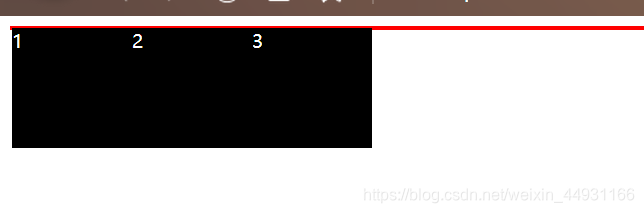
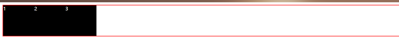
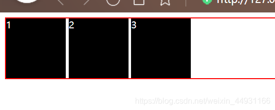
1. Add a pseudo class to the big box.
You can see that the collapse problem is solved and the width of the box is full.
        .box::after {


            clear: both;/*清除浮动*/
            content: "";/*在伪类中必须存在的,不存在content则伪类不生效*/
            display: block;/*clear: both;只对块元素生效,而所有的伪类都是行元素*/
        }
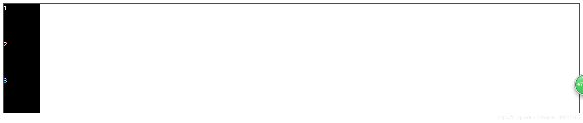
2. Turn the box into a floating element (generally the floating stream is used for the layout of the text in the navigation bar, and the picture and text are surrounded).
Finally, the collapse problem is solved. The difference is that the width of the box is adaptive and not full.
Or turn the box into an absolute positioning, the effect is the same.
Principle
Define the box as
position: absolute;
float: left/right;
it will turn the element into display: inline-block;
into a floating element
	.box {


            border: 2px solid red;
            float: left;
        }
Become absolute positioning
	.box {


            border: 2px solid red;
            position: absolute;
        }
3. But if you only define the block element inside as display: inline-block;, the effect is different.
Why is it different? That is because as long as there is a space or carriage return in the inline-block element, there will be a gap.
	.content {


            width: 100px;
            height: 100px;
            background-color: black;
            color: #fff;
            display: inline-block;
        }
How to cancel the gap in the block element. Add font-size: 0px to the parent element;
but the font size of the content inside it becomes 0, so the content inside will disappear
	.box {


            border: 2px solid red;
            font-size: 0px;
        }