In the last development, we completed the ETH transfer function of the wallet. In this development, we plan to complete the account export function.
1. This development plan
Because our wallet is a web version, the account private key is encrypted and stored in the local storage. When the user clears the browser local storage, the account will be lost. Therefore, an account export function is needed to export the user's private key or mnemonic, and the user can copy it and save it elsewhere to prevent account loss. The pages under development are as follows:
After the user logs in, click on the account option in the upper right corner, and a selection menu will pop up:

click to 在EtherScan上查看open a new browser window and go to EtherScan to display account details. If we click on the account details, the following page is displayed:

Scanning the QR code on WeChat will display the account address. This page also provides the same 在EtherScan上查看functions. At the bottom is the export mnemonic and export private key buttons.
prompt:
The Export mnemonic button will only be displayed when the mnemonic phrase is used to import the account, and the mnemonic phrase cannot be obtained using the private key to import the account. Because our wallet only saves the private key, we use the private key to log in when logging in. If the mnemonic phrase cannot be obtained, the mnemonic phrase cannot be exported.
Click Export Private Key, and the following interface will appear:

Enter your password and click OK, and your private key will be displayed in the text box. Click the private key to copy it to the pasteboard, and save it elsewhere.

Click Finish to return to the main wallet interface, and click the return button in the upper left corner to return to the account details interface.
Second, the realization of the user address Icon
As we can see in MetaMask, each account has a different round icon to represent it, such as the main network account, Kovan account 1 and 2 in the figure below.

We use the jazziconlibrary to implement this function . This is its document address: => https://www.npmjs.com/package/jazzicon . It returns an HTML node object (a contains svga div). Usually use the parent element (usually one div) appendChildmethod to add icon.
In React, positioning an element usually uses the following methods:
const ref = useRef()
......
<div ref={

    ref} />
Then add child nodes and use ref.current.appendChild(node). But in our wallet, the account details interface is Dialogimplemented using a component. Due to unknown reasons, Dialogthe refproperties of the child elements in the component cannot be bound ( Dialognor does the component itself), so the above method cannot be used to display the account icon. We took a detour: first convert the node object into a string, and then set the innerHTML property of the parent object. The relevant code is listed below:
- Code to generate icon
import {

    useMemo} from 'react';
import Jazzicon from 'jazzicon'

export function useAddressIcon(address,size) {


  return useMemo(() => {


      return Jazzicon(size, parseInt(address.slice(2, 8), 100))
  }, [address,size])
}
As can be seen from the code, given an address and icon size, it will return a node object. Because it is used useMemo, if the address and size as the parameter do not change, it directly returns the last return value without recalculating.
- Node object to string, this refers to the implementation of others
//将一个html节点对象转换成字符串
function nodeToString(node) {


    let tmpNode = document.createElement( "div" );
    tmpNode.appendChild( node.cloneNode( true ) );
    let str = tmpNode.innerHTML;
    tmpNode = node = null; // prevent memory leaks in IE
    return str;
}
divDisplay the Icon string in
<div dangerouslySetInnerHTML={

    {

    __html: nodeToString(icon)}}  />
There is another small difference compared to MetaMask. This is the account details interface of MetaMask:

you can see that half of the account icon is displayed paperabove the bottom of the details . Because we directly use the Dialogcomponent here , the icon papercannot be displayed after being moved out of the border, so the icon is not moved up. I also hope that readers point out the cause of the problem or give a solution.
Third, the realization of the QR code
The realization of the QR code is very simple, just use qrcode-reactthis library. Here is the relevant code:
import QRCode from 'qrcode-react';
......
<QRCode size={

    150} value={

    ETHEREUM_PREv + address}/>
It is OK to set the sizeattributes and display directly value.
Four, customize the appearance of Material UI components
From the initial plan, we can see that the background color of the menu is black and transparent after clicking the button, and the default background of the menu is white. This requires modification of some properties of Material UI components. Here is a detailed guide for custom components in the official document: https://material-ui.com/zh/customization/components/ .
Here we take the approach mentioned in the document 用类覆盖样式. Applied to this development is to change the background color of the menu. First, open the API guide of the menu component: https://material-ui.com/zh/api/menu/ . At the bottom of the page, the CSS style sheet rules that
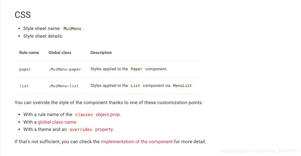
can be rewritten are listed: you can see that the paperrules are applied to Paperelements (including the menu background), so we need to set it, the relevant code is:
const useStyles = makeStyles(theme => ({


    menuPaper:{


        border: '1px solid #d3d4d5',
        backgroundColor:"#000000BB",
        color:'white'
    }
}));
......
const classes = useStyles();
......
<Menu
    id="customized-menu-account"
    anchorEl={

    anchorRefAccount.current}
    keepMounted
    open={

    state.accountOpen}
    onClose={

    handleCloseAccount}
    onKeyDown={

    handleListKeyDownAccount}
    classes={

    {


        paper:classes.menuPaper
    }}
    elevation={

    0}
    getContentAnchorEl={

    null}
    anchorOrigin={

    {


      vertical: 'bottom',
      horizontal: 'right',
    }}
    transformOrigin={

    {


      vertical: 'top',
      horizontal: 'right',
    }}
>
There are many attributes set for the menu component, you can see the specific meaning of each attribute in the menu API, the link has been given above. Now let's just focus on the classesattributes, here paperwe set the rules to our preset named menuPaperstyles.
Five, other details
- Because the password needs to be verified when exporting the account, in order to simplify, we save the password of the account login (including creating an account, importing an account) in a global variable, that is
GlobalProvider.js, medium, and compare it directly when using it. - We have created a new
hooks\index.jsHook to store user-defined, such as the Hook that generates the address Icon. Itutils\index.jsis different from tools and needs to be separated. - Because our wallet occupies only a small part of the middle of the web page on the desktop, the message bar is displayed a little far away in the lower left corner. So our message bar on the desktop is changed to display in the middle of the bottom.
- Account export is to directly display the wallet's private key or mnemonic. Of course, it can be further expanded and choose to export as an encrypted json wallet, which is not included in the development plan here.
Six, summary
In this development, we implemented the account export function and changed the background color of the pop-up menu. The applied knowledge points are mainly the generation and addition of address Icon, the generation of two-dimensional code, and the customization of component appearance with class coverage styles.
Two problems were encountered in the development: One is the inability to bind refattributes in the sub-elements of the Dialog component (including itself) . Second, the child elements in the Dialog component Papercannot be displayed beyond the bottom border. Due to time issues, there is no further in-depth study, and I will take a closer look later when I have time. I also hope that experienced readers can point out the root cause or give a solution, which is greatly appreciated.
In the next development, we plan to implement the function of adding ERC20 tokens to users.
This wallet code cloud (gitee) warehouse address is: => https://gitee.com/TianCaoJiangLin/khwallet
Readers are welcome to leave a message to point out errors or suggest improvements.