Article Directory
Reference:
component styles isolation
bottom-modal components
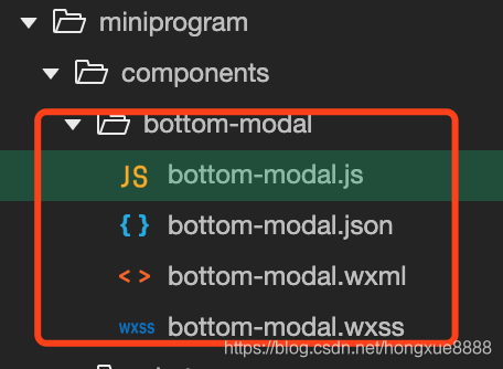
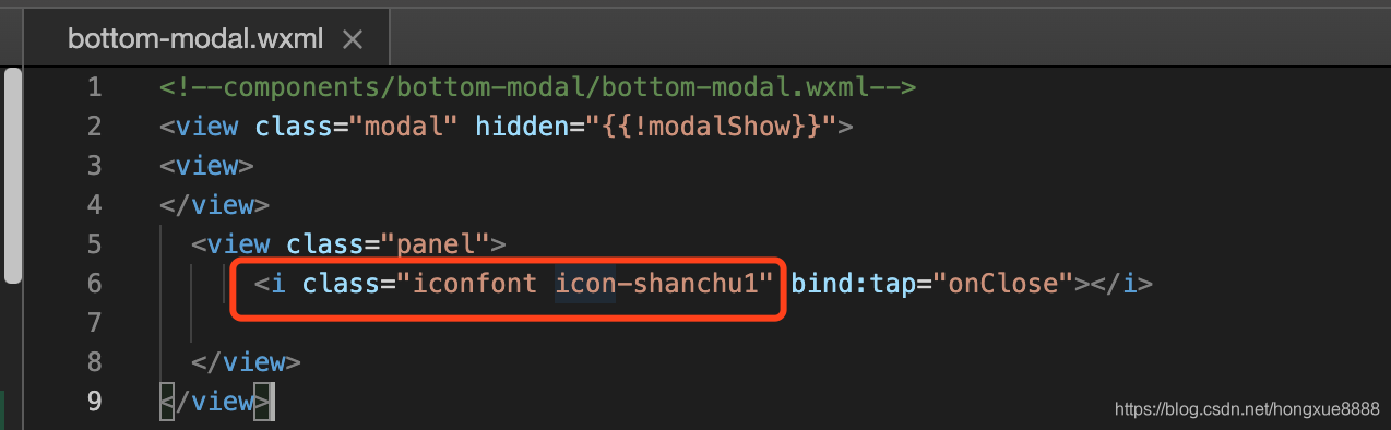
bottom-modal.wxml
<!--components/bottom-modal/bottom-modal.wxml-->
<view class="modal" hidden="{{!modalShow}}">
<view>
</view>
  <view class="panel">
      <i class="iconfont icon-shanchu1" bind:tap="onClose"></i>

  </view>
</view>
bottom-modal.wxss
.modal {
  position: fixed;
  top: 0;
  right: 0;
  bottom: 0;
  left: 0;
  z-index: 99;
  text-align: center;
  background: rgba(0, 0, 0, 0.6);
}

.panel {
  position: absolute;
  bottom: 0rpx;
  left: 0;
  width: 100%;
  min-height: 300rpx;
  box-sizing: border-box;
  background-color: #f8f8f8;
}

/* 可以直接对外部样式修改 */

.modal .icon-shanchu1 {
  position: absolute;
  right: 10rpx;
  top: 10rpx;
  padding: 20rpx; /* 为了增加点击区域大小 */
}
bottom-modal.js
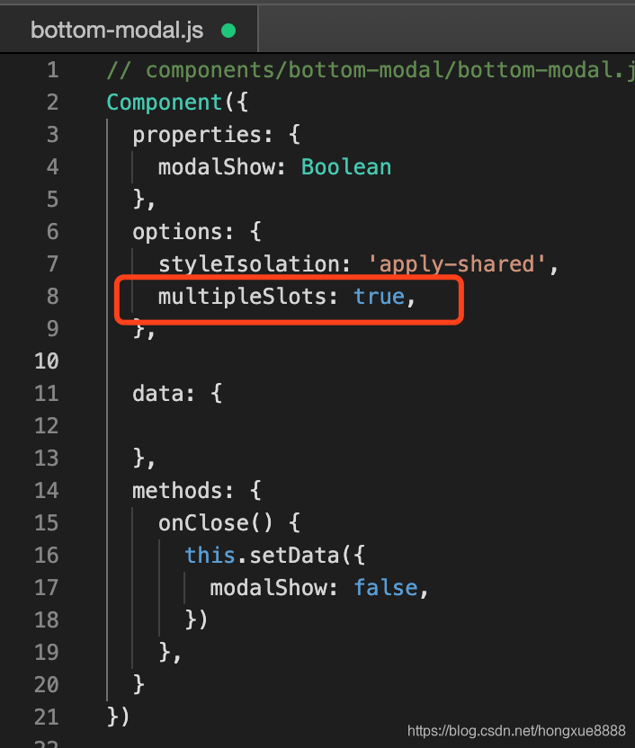
// components/bottom-modal/bottom-modal.js
Component({
properties: {
modalShow: Boolean
},
options: {
styleIsolation: 'apply-shared'
},
data: {
},
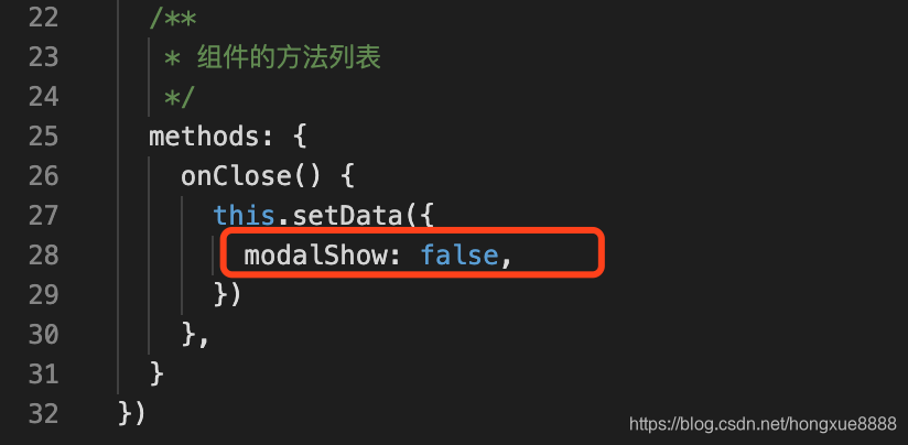
methods: {
onClose() {
this.setData({
modalShow: false,
})
},
}
})
Introducing components
Introducing the assembly demo.json
{
  "usingComponents": {
    "x-bottom-modal": "/components/bottom-modal/bottom-modal"
  }
}
demo.wxml
<view>
  <view class="publish-container" bind:tap="onPublish">
    <i class="iconfont icon-fabu"></i>
  </view>
  <view>
    <x-bottom-modal modalShow="{{modalShow}}" />
  </view>
</view>
demo.js
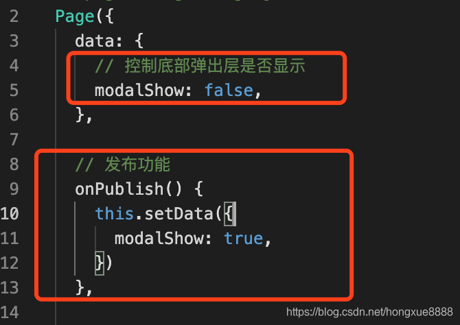
Page({
  data: {
    // 控制底部弹出层是否显示
    modalShow: false,
  },

  // 发布功能
  onPublish() {
    this.setData({
      modalShow: true,
    })
  },

  onLoad: function(options) {

  },

})
Component style isolation
Added iconfont.wxss in the root directory of the project, iconfont.wxss which is used in the project icon.
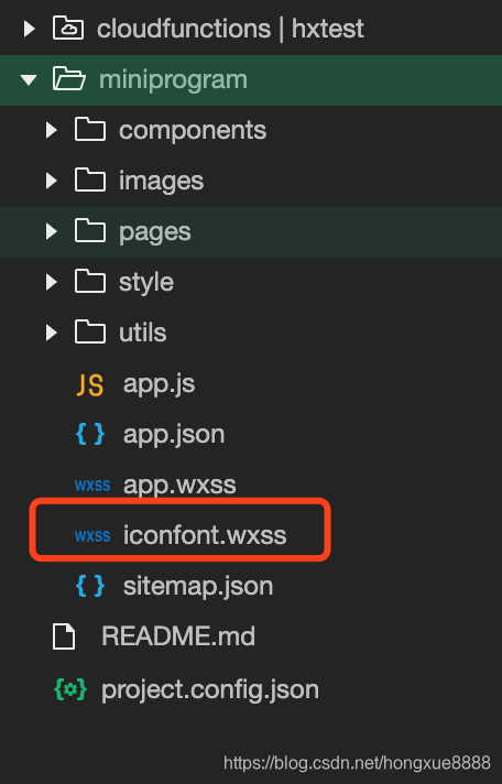
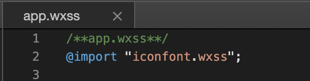
In app.wxss in import import iconfont.wxss file icon on this project can be used in iconfont.wxss
But there will be components used in iconfont.wxss component style isolated problem.
The following is a bottom-modal component icons used iconfont.wxss of:
using external iconfont.wxss properties bottom-modal components, the components necessary to form isolation processing.
- isolated indicates enabling style isolation, from both inside and outside the definition of component class using the specified style will not affect each other (the default general case);
- apply-shared page represents wxss style will affect the custom component, but custom components wxss style specified does not affect the page;
- shared representation page wxss style will affect the custom component, custom components wxss specified in the style pages and other settings will also affect the apply-shared or shared custom components. (This option is not available in the plugin.)
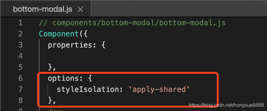
  options: {
    styleIsolation: 'apply-shared'
  },
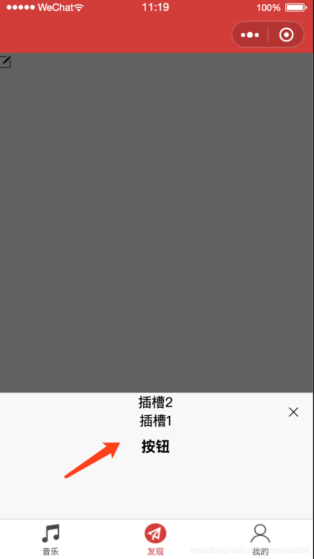
Control pop show and hide layers
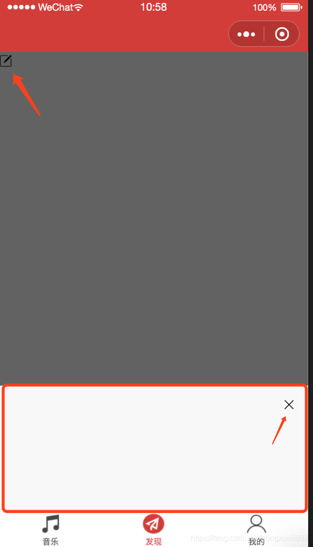
Click the Publish button to display the pop-up bottom layer; click on the Close button to close the bottom of the popup.
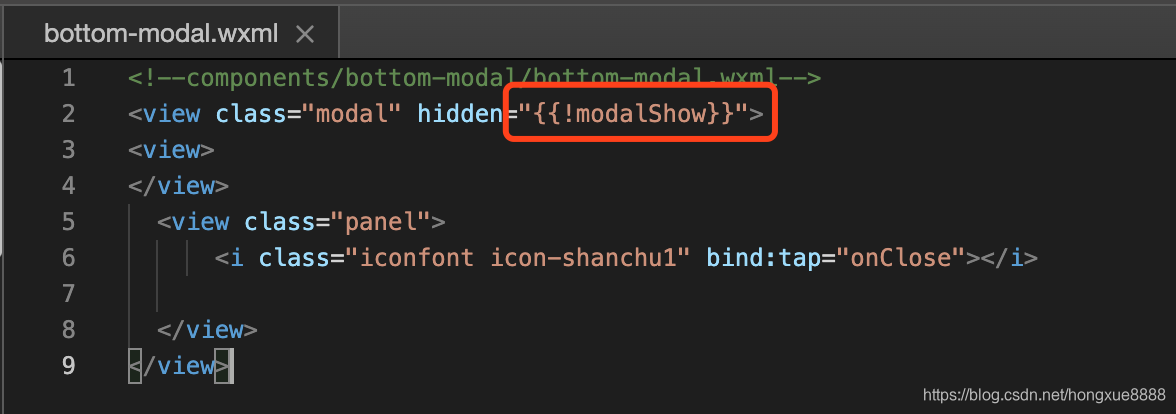
Use modalShow control to show and hide, modalShow = display true.
Set onPublish method demo.js, when click the Publish button, modalShow = true, display pop-up layer.
The method provided in bottom-modal onClose assembly, when the close button is clicked, modalShow = false, pop hidden layer.
Components of slot slot wxml
In wxml slot assembly may comprise a node for carrying wxml structural components provided by the user.
By default, wxml a component can have only one slot. Need to use the multi-slot, can be declared in the assembly to enable the js.
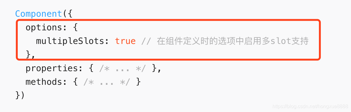
Add js bottom-modal assembly multipleSlots: true
add two named slots wxml bottom-modal assembly
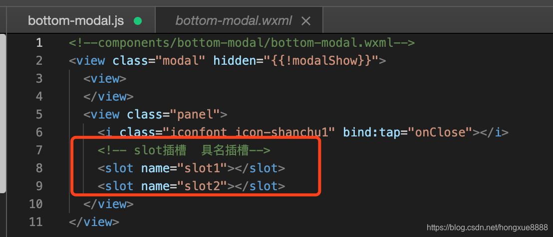
    <!-- slot插槽  具名插槽-->
    <slot name="slot1"></slot>
    <slot name="slot2"></slot>
Use of named slot demo.wxml the
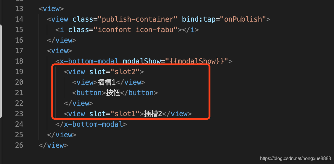
results are as follows: