首先我们拿一个例子来解释:
import numpy as np
from sklearn import metrics
y = np.array([1, 1, 2, 2])
scores = np.array([0.1, 0.4, 0.35, 0.8])
fpr, tpr, thresholds = metrics.roc_curve(y, scores, pos_label=2)

(array([0. , 0. , 0.5, 0.5, 1. ]),
 array([0. , 0.5, 0.5, 1. , 1. ]),
 array([1.8 , 0.8 , 0.4 , 0.35, 0.1 ]))
fpr:真实类别为1,预测类别为1的比列。
tpr:真实类别为0,预测结果为1的比例。
y 就是标准值,scores 是每个预测值对应的阳性概率,比如0.1就是指第一个数预测为阳性的概率为0.1,很显然,y 和 socres应该有相同多的元素,都等于样本数。pos_label=2 是指在y中标签为2的是标准阳性标签,其余值是阴性。
所以在标准值y中,阳性有2个,后两个;阴性有2个,前两个。
接下来选取一个阈值计算TPR/FPR,阈值的选取规则是在scores值中从大到小的以此选取,于是第一个选取的阈值是0.8
scores中大于阈值的就是预测为阳性,小于的预测为阴性。所以预测的值设为y_=(0,0,0,1),0代表预测为阴性,1代表预测为阳性。可以看出,真阴性都被预测为阴性,真阳性有一个预测为假阴性了。
FPR = FP / (FP+TN) = 0 / 0 + 2 = 0
TPR = TP/ (TP + FN) = 1 / 1 + 1 = 0.5
下面以此类推。
我们画图来看下。
from matplotlib import pyplot as plt
plt.plot(fpr,tpr,label = 'train LR')
plt.plot([0,1],[0,1],'k--')
plt.xlabel('False positive rate')
plt.ylabel('True positive rate')
plt.title('ROC Curve')
plt.legend(loc = 'best')
plt.show()
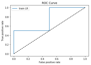
因为样本比较少,所以数据不是很连贯。
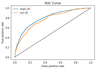
下面选择一个大样本数据来观察。