小程序自定义组件之popupwindow
1、场景
小程序开发过程中,我们经常遇到《发布须知》,需要弹popupwindow展示一段文字描述的需求。如下图所示:


2、自定义popupwindow弹窗
2.1 新建Component.
首先新建popupwindow目录,然后右键,新建Component,结构如下图所示:
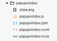
close.png,是关闭按钮,可自行修改成自己的。
2.2 popupwindow.wxss
自定义组件的样式
.i-modal-mask {
  position: fixed;
  top: 0;
  left: 0;
  right: 0;
  bottom: 0;
  background: rgba(0, 0, 0, 0.7);
  z-index: 1000;
  transition: all 0.2s ease-in-out;
  opacity: 0;
  visibility: hidden;
  width: 100%;
  height: 100%;
  display: flex;
  flex-direction: column;
  align-items: center;
  justify-content: center;
}

.i-modal-mask-show {
  opacity: 1;
  visibility: visible;
}
.centerView {
  width: 85%;
  padding: 20rpx;
  background-color: #fff;
  border-radius: 10rpx;
  display: flex;
  flex-direction: column;
  align-items: center;
}

.titleText {
  width: 100%;
  color: #000;
  font-size: 16px;
  text-align: center;
  word-break: break-all;
  margin-bottom: 20rpx;
}

.contentText {
  width: 100%;
  color: #8a8a8a;
  font-size: 14px;
  word-break: break-all;
}

.imageClose{
  margin-top: 60rpx;
  height: 50rpx;
  width: 50rpx;
}
2.3 popupwindow.wxml
自定义组件的布局
<view class="i-modal-mask {{ visible ? 'i-modal-mask-show' : '' }}" catchtap='outClick'>
  <view class='centerView'>
    <view class='titleText'>{{titleString}}</view>
    <textarea wx:if="{{contentString.length > 0}}" class='contentText' style='height: {{contentHeight > 0 && contentHeight <= 700 ? contentHeight:700}}rpx;' value='{{contentString}}' maxlength="-1" disabled="true" fixed="true"></textarea>
  </view>

  <image class='imageClose' src='close.png' catchtap='closePopup'></image>
</view>
这里设置了内容的高度contentHeight最大是700rpx,这个可根据需要自行调整,超出最大高度后内容可滚动。
2.4 popupwindow.json
这里默认就行
{
  "component": true,
  "usingComponents": {}
}
2.5 popupwindow.js
自定义组件的属性、点击事件都在.js里。
注释都比较清楚。
Component({
  /**
   * 组件的属性列表
   */
  properties: {
    //是否弹出显示
    visible: {
      type: Boolean,
      value: false
    },
    //展示的标题
    titleString: {
      type: String,
      value: ''
    },
    //展示的内容
    contentString: {
      type: String,
      value: ''
    },
    //内容的最大高度,超出高度可滚动。
    contentHeight: {
      type: Number,
      value: 700
    },
    //点击外部的遮罩层是否允许关闭
    outClickCanClose: {
      type: Boolean,
      value: false
    }
  },

  /**
   * 组件的初始数据
   */
  data: {

  },

  /**
   * 组件的方法列表
   */
  methods: {
    closePopup() {
      this.triggerEvent("close", {
        visible: this.data.visible
      })
    },
    outClick(){
      if (this.data.outClickCanClose){
        this.triggerEvent("close", {
          visible: this.data.visible
        })
      }
    }
  }
})
至此,自定义的popupwindow组件就算完成了,是不是很简单呢?下面的使用会更简单。
3、自定义popupwindow组件的使用
3.1 引入组件
1、在需要使用此组件的界面的.json中引入组件:
{
  "usingComponents": {
    "popupwindow": "component/popupwindow/popupwindow"
  }
}
2、也可以在app.json中引入组件,这样所有界面都可以使用这个组件:
"usingComponents": {
    "popupwindow":"component/popupwindow/popupwindow"
  },
注意: "component/popupwindow/popupwindow"是组件所在路径,这个根据自己所放的位置,自行修改.
3.2 组件的使用
在需要使用的界面的.xml中插入一下代码:
<view class='page'>
//这里写自己的界面
</view>
<popupwindow visible="{{visible}}" titleString="发布须知" contentString="须知显示的内容" contentHeight="350" bindclose="closeClick" outClickCanClose="false"></popupwindow>
visible:是否弹出popupwindow。可根据自己的点击事件来设置是否显示。默认false:不显示
titleString:标题
contentString:内容
contentHeight:最大高度,默认700rpx
bindclose:关闭的点击事件,关闭逻辑自行处理(将visible设置成false就是关闭)
outClickCanClose:点击外部遮罩层是否允许关闭。默认false:不关闭
3.3 关闭点击事件
/**
   * 关闭popupwindow
   */
  closeClick: function() {
    this.setData({
      visible: false
    })
  },
4、结语
小程序自定义组件之popupwindow就完成了,使用的方法也是及其的简单。这个popupwindow的弹出UI是很简单的,按照这个popupwindow的自定义组件,我们可以自定义一些自己需要的、比较常用的组件。这里只是一个简单的示例,有兴趣的同学,自己动手试试吧。
5、本人公众号,关注一波,共同交流吧。