一 块级元素
1.HTML标签分为两类:块级元素,内联元素
2.常见块级元素:div,li,table
补充div、p、h1~h6、ul、ol、dl、li、dd、table、hr、
blockquote、address、table、menu、pre,
HTML5新增的header、section、aside、footer等
注意:块级元素和display=block不是一个概念。里默认display=list-item,table默认display=table,但他们都是块级元素。即一个水平线上只能单独显示一个元素,多个块级元素则换行显示
3.块级元素有换行的特性。可以配合clear属性清除浮动带来的影响
代码:
<!DOCTYPE html>
<html lang="en">
<head>
    <meta charset="UTF-8">
    <title>test</title>
    <style>
        .box {
            /*盒子中图片与背景的间隔*/
            padding: 10px;
            background-color: #83c44e;
            border-bottom: 1px solid #2e2e2e;
        }
        .box > img {
            float: left;
        }

        .clear:after {
            content: "";
            /*这里也可以用block,list-item*/
            display: table;
            clear: both;
        }
    </style>
</head>
<body>
<div class="box clear">
    <img src="images/xmad_14926528960147_wJMsC.png">
</div>
<div class="box clear">
    <img src="images/xmad_14926528960147_wJMsC.png">
</div>
</body>
</html>
注意:要是用display:list-item会多一个前面的圆圈字符

块级盒子负责结构,内联盒子负责内容
4.值为block的元素的盒子实际由外在的“块级盒子”和内在的“块级容器盒子”组成,
值为:inline-block的元素则由外在的“内联盒子”和内在的“块级容器盒子”组成,
值为inline的元素则内外均是“内联盒子”
inline-block的元素既能和图文一行显示,又能直接设置width/height(因为有两个盒子,外面盒子是inline级别,里面盒子是block级别)
外在盒子除了inline-block还有run-in
5.display:inline-table,文字和表格在一行(没有使用浮动的情况)
代码:
正常情况下:
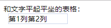
和文字平起平坐的表格:<div class="inline-table">
    <p>第1列</p>
    <p>第2列</p>
</div>
增加display:inline-table
<!DOCTYPE html>
<html lang="en">
<head>
    <meta charset="UTF-8">
    <title>test</title>
    <style>
        .inline-table {
            display: inline-table;
            width: 128px;
            margin-left: 10px;
            border: 1px solid #cad5eb;
        }
        .inline-table > p {
            display: table-cell;
        }
    </style>
</head>
<body>
和文字平起平坐的表格:<div class="inline-table">
    <p>第1列</p>
    <p>第2列</p>
</div>
</body>
</html>

二.width/height作用在哪个盒子上
1.块级元素的流体特性主要体现在水平方向上
2.width默认auto
3.限制(收缩到最小)
<!DOCTYPE html>
<html lang="en">
<head>
<meta charset="UTF-8">
<title>test</title>
<style>
table {
width: 280px;
margin: 0 auto;
text-align: left;
}
</style>
</head>
<body>
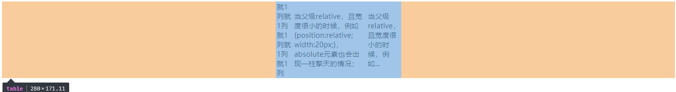
<table>
<tr>
<td>就1列就1列就1列就1列就1列</td>
<td>当父级relative,且宽度很小的时候,例如{position:relative; width:20px;},absolute元素也会出现一柱擎天的情况;</td>
<td>当父级relative,且宽度很小的时候,例如...</td>
</tr>
</table>
</body>
</html>
4.超出容器限制
<!DOCTYPE html>
<html lang="en">
<head>
<meta charset="UTF-8">
<title>test</title>
<style>
.father {
width: 150px;
padding: 10px;
background-color: #cd0000;
white-space: nowrap;
}
.child {
display: inline-block;
padding: 5px;
background-color: #f0f3f9;
}
</style>
</head>
<body>
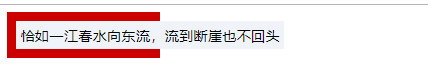
<div class="father">
<span class="child">恰如一江春水向东流,流到断崖也不回头</span>
</div>
</body>
</html>
5.a标签默认是display:inline,设置为block使其块状化也就不用写width:100%。
外部尺寸与流体特征:
(1)正常流宽度
代码:
<!DOCTYPE html>
<html lang="en">
<head>
    <meta charset="UTF-8">
    <title>test</title>
    <style>
        .width {
            width: 100%;
        }

        .nav {
            background-color: #cd0000;
        }

        .nav-a {
            text-decoration: none;
            display: block;
            margin: 0 10px;
            padding: 9px 10px;
            border-bottom: 1px solid #b70000;
            border-top: 1px solid #de3636;
            color: #fff;
        }

        .nav-a:first-child {
            border-top: 0;
        }

        .nav-a + .nav-a + .nav-a {
            border-bottom: 0;
        }
    </style>
</head>
<body>
<h4>无宽度,借助流动性</h4>
<div class="nav">
    <a href="" class="nav-a">导航1</a>
    <a href="" class="nav-a">导航2</a>
    <a href="" class="nav-a">导航3</a>
</div>
<h4>width:100%有尺寸超出的问题</h4>
<div class="nav">
    <a href="" class="nav-a width">导航1</a>
    <a href="" class="nav-a width">导航2</a>
    <a href="" class="nav-a width">导航3</a>
</div>
</body>
</html>
(2)格式化宽度
仅出现在“绝对定位模型”中,也就是出现在position属性值为absolute或fixed中。
格式化宽度具有完全的流体性,也就是margin,border,padding,content内容区域会自动分配水平(和垂直)空间

6.内部尺寸与流体特性
6-1(包裹性)
自适应性:是指元素尺寸由内部元素决定,但永远小于“包含块”容器的尺寸。
包裹性元素中 max-width:100%
按钮是css世界中极具代表性的inline-block元素,极具有包裹性,具体表现:按钮文字越多宽度越宽(内部尺寸特性),但若文字过多,则会在容器的宽度处自动换行。
只有<button>才能自动换行,<input>不能换行
代码
<!DOCTYPE html>
<html lang="en">
<head>
    <meta charset="UTF-8">
    <title>test</title>
    <style>
        .box {
            width: 240px;
            margin: 20px auto;
        }
    </style>
</head>
<body>
<div class="box">
    <button>按钮</button>
</div>
<div class="box">
    <button>文字再多一点</button>
</div>
<div class="box">
    <button>按钮是css世界中极具代表性的inline-block元素,极具有包裹性,具体表现:按钮文字越多宽度越宽(内部尺寸特性)</button>
</div>
</body>
</html>

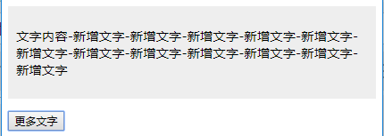
代码:增加js功能每次点击按钮 按钮的内容会增加!!,随宽度会自动换行!
<!DOCTYPE html>
<html lang="en">
<head>
    <meta charset="UTF-8">
    <title>test</title>
    <style>
        .box {
            padding: 10px;
            background-color: #eee;
            text-align: center;
        }
        .content {
            display: inline-block;
            text-align: left;
        }
    </style>
</head>
<body>
<div class="box">
    <p id="conMore" class="content">文字内容</p>
</div>
<!-- 按钮 -->
<p><button id="btnMore">更多文字</button></p>
</body>
<script>
    var btn = document.getElementById('btnMore'),
        content = document.getElementById('conMore');

    if (btn && content) {
        btn.onclick = function() {
            content.innerHTML += '-新增文字';
        };
    }
</script>
</html>
初始状态
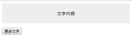
点击按钮之后的状态
注意:除了inline-block元素,浮动元素以及绝对定位元素都具有包裹性,均具有类似的智能宽度
6-2首选最小宽度,是元素最适合的最小宽度。
类似图片这样的替换元素的最小宽度就是该元素内容本身的宽度
<!DOCTYPE html>
<html lang="en">
<head>
    <meta charset="UTF-8">
    <title>test</title>
    <style>
        .ao, .tu {
            display: inline-block;
            width: 0;
            font-size: 14px;
            line-height: 18px;
            margin: 35px;
            color: #fff;
        }
        .ao:before, .tu:before {
            outline: 2px solid #cd0000;
            font-family: Consolas, Monaco, monospace;
        }
        .ao:before {
            content: "love你love";
            color: #0c80dc;
        }
        .tu {
            direction: rtl;
        }
        .tu:before {
            content: "我love你";
            color: green;
        }
    </style>
</head>
<body>
<span class="ao"></span>
<span class="tu"></span>
</body>

</html>

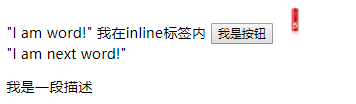
6-3 最大宽度
若内部没有块级元素或者块级元素没有设定宽度值,则“最大宽度”实际上是最大的连续内联盒子的宽度
br处换行,即不再连续
<!DOCTYPE html>
<html lang="en">
<head>
    <meta charset="UTF-8">
    <title>test</title>
    <style>

    </style>
</head>
<body>
    <div>
        "I am word!"
        <span>我在inline标签内</span>
        <button>我是按钮</button>
        <img src="images/5Battery1.jpg" alt="我是图片">
        <br>
        "I am next word!"
        <p>我是一段描述</p>
    </div>
</body>

</html>
IScroll实现平滑的滚动效果
引入iscroll.js
<!DOCTYPE html>
<html lang="en">
<head>
    <meta charset="UTF-8">
    <title>test</title>
    <style>
        .wrap {
            width: 300px; height: 320px;
            position: relative;
            overflow: hidden;
        }
        .wrap > ul {
            position: absolute;
            white-space: nowrap;
        }
        .wrap li {
            display: inline-block;
        }
    </style>
    <script src="iscroll.js"></script>
</head>
<body>
<div id="wrap" class="wrap">
    <ul>
        <li><img src="images/5e2eb710-a99f-4235-ac5c-1b20b1e6c3b6.png"></li>
        <li><img src="images/5e2eb710-a99f-4235-ac5c-1b20b1e6c3b6.png"></li>
        <li><img src="images/5e2eb710-a99f-4235-ac5c-1b20b1e6c3b6.png"></li>
        <li><img src="images/5e2eb710-a99f-4235-ac5c-1b20b1e6c3b6.png"></li>
        <li><img src="images/5e2eb710-a99f-4235-ac5c-1b20b1e6c3b6.png"></li>
    </ul>
</div>
</body>
<script>
    new IScroll('#wrap', {
        scrollbars: true,
        scrollX: true,
        scrollY: false
    });
</script>
</html>
实现滑动效果

7.width值作用的细节
width作用在内在盒子,内在盒子分成4个(content-box,padding-box,border-box,margin-box)
width:100px作用在content-box上,
由于div元素的默认padding、border、margin都是0,
因此div呈现的宽度就是100px
代码:
<!DOCTYPE html>
<html lang="en">
<head>
    <meta charset="UTF-8">
    <title>test</title>
    <style>
        .div {
            width: 100px;
            padding: 20px;
            border: 20px solid;
            margin: auto;
        }
    </style>
    <script src="iscroll.js"></script>
</head>
<body>
<div class="div">
    此时元素的offsetWidth是:<span id="divWidth"></span>
</div>
</body>
<script>
    var eleShowWidth = document.getElementById('divWidth');
    if (eleShowWidth) {
        eleShowWidth.innerHTML = eleShowWidth.parentNode.offsetWidth;
    }
</script>
</html>


8.CSS流体布局下的宽度分离原则
宽度分离原则就是css中的width属性不与影响宽度的padding、border和margin
写法:分离,width 独占一层标签,而padding、border、margin利用流动性在内部自适应呈现
代码
<!DOCTYPE html>
<html lang="en">
<head>
<meta charset="UTF-8">
<title>test</title>
<style>
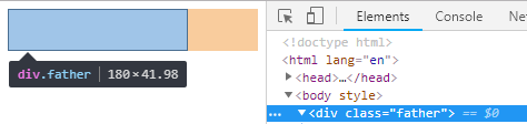
.father{
width: 180px;
}
.son{
margin: 0 auto;
padding: 20px;
border: 1px solid ;
}
</style>
</head>
<body>
<div class="father">
<div class="son"></div>
</div>
</body>
</html>

代码:
<!DOCTYPE html>
<html lang="en">
<head>
<meta charset="UTF-8">
<title>test</title>
<style>
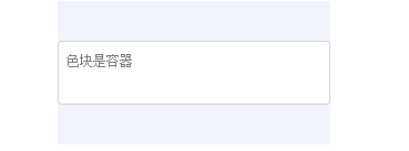
.container {
width: 280px;
margin: 0 auto;
padding: 40px 0;
background-color: #f0f3f9;
animation: width 2s infinite alternate;
}
@keyframes width {
from { width: 200px; }
to { width: 280px; }
}
.textarea {
padding: 9px 8px;
border: 1px solid #d0d0d5;
border-radius: 4px;
background-color: #fff;
}
.textarea > textarea {
width: 100%;
line-height: 20px;
padding: 0;
border: 0 none;
outline: 0 none;
background: none;
resize: none;
}
</style>
</head>
<body>
<div class="container">
<div class="textarea">
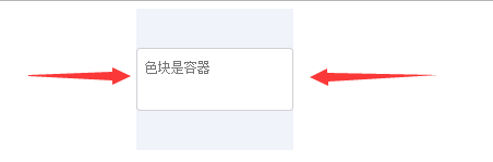
<textarea rows="2" placeholder="色块是容器"></textarea>
</div>
</div>
</body>
</html>
9.box-sizing被发明出来最大的初衷是解决替换元素宽度自适应问题
10.height:auto也有外部尺寸特性,仅存在于绝对定位中,也就是“格式化高度”,与格式化宽度类似。
11.height:100%是无效的,width:100%才有效
代码:
<!DOCTYPE html>
<html lang="en">
<head>
    <meta charset="UTF-8">
    <title>test</title>
    <style>
        .box {
            display: inline-block;
            white-space: nowrap;
            background-color: #cd0000;
        }
        .text {
            display: inline-block;
            width: 100%;
            background-color: #34538b;
            color: #fff;
        }
    </style>
</head>
<body>
<div class="box">
    <img src="images/xmad_14926528960147_wJMsC.png">
    <span class="text">红色背景是父级</span>
</div>
</body>
</html>

12.想让height:100%有效的方法
- 设定显式的高度值
- 使用绝对定位
<!DOCTYPE html>
<html lang="en">
<head>
    <meta charset="UTF-8">
    <title>test</title>
    <style>
        .box {
            height: 160px;
            padding: 30px;
            box-sizing: border-box;
            background-color: #beceeb;
            /*border-bottom: 1px solid #0c80dc;*/
        }
        .child {
            height: 100%;
            background: #cd0000;
        }
        .rel {
            position: relative;
        }
        .rel > .child {
            width: 100%;
            position: absolute;
        }
    </style>
</head>
<body>
<div class="box">
    <div class="child">高度100px</div>
</div>
<div style="margin-top: 10px"></div>
<div class="box rel">
    <div class="child">高度160px</div>
</div>
</body>
</html>

代码:
<!DOCTYPE html>
<html lang="en">
<head>
    <meta charset="UTF-8">
    <title>test</title>
    <style>
        .box {
            display: inline-block;
            position: relative;
        }
        .prev,
        .next {
            width: 50%; height: 100%;
            position: absolute;
            top: 0;
            opacity: .5;
            color: black;
            text-decoration: none;
            font-size: 2rem;
        }
        .prev {
            left: 0;
            background-color: #cd0000;
        }
        .next {
            right: 0;
            background-color: #34538b;
        }
    </style>
</head>
<body>
<div class="box">
    <a href="javascript:" class="prev" title="上一张">上一张</a>
    <a href="javascript:" class="next" title="下一张">下一张</a>
    <img src="images/xmad_14926528960147_wJMsC.png">
</div>
</body>
</html>
